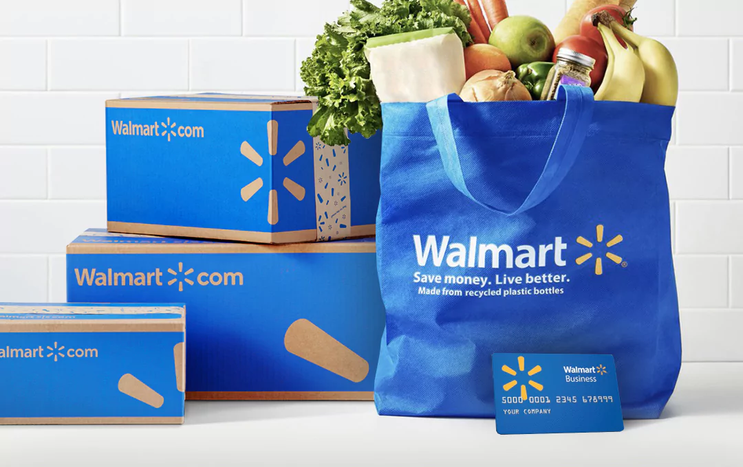
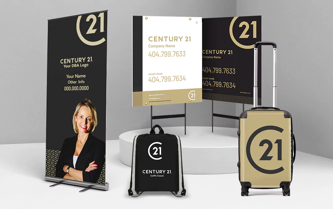
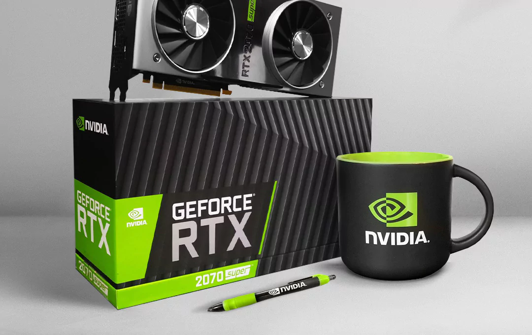
Branding packages keep all touchpoints aligned to nail first impressions and sustain emotional connection. What do they entail? Are they a worthy investment? Find out!
Unless you’ve not been living under a rock, you must’ve heard of Netflix’s plans to increase prices across the US and Canada, which makes it roughly a year after the last price increment in spite of stiff competition from other streaming services.
Now, despite this increase, it’s unlikely Netflix sees a drop-off in sales and revenue given how they’ve been able to leverage brand packaging to garner enough recognition and awareness — the kind that has made it a household name throughout America and beyond.
By nature, humans are fickle. We’re very likely to pass snap judgments on people or things while relying on just one or two senses, the most common of which is our vision. The way our visual system processes sensory information like the visual cues of a brand informs customer behavior.
… This explains the science behind branding packages.
Ever thought about how, when you think Vogue, your mind quickly reverts to the most exquisite fashion pieces the world has ever seen with the trendiest celebrities posing in them? Ever wondered why? That’s brand packaging in action, which is why this aspect of branding is the secret of every successful business owner to securing optimum appeal, recognition, customer retention, and increased bottom line.
The development process usually involved when branding packages help you present a uniform front while securing the highest level of visual appeal when your target audience comes into contact with it.
So when they experience your brand through any touchpoint, or they come in contact with any product offerings carrying your brand identity, they are immediately impacted by the presence and value your brand represents.
If your business will create a lasting impression in the minds of everyone, you need an image that is both professional and unique. But to achieve this, you cannot merely think it — you need to actualize it. And this is where branding packages come in!
Branding packages are the visual (whether physical or digital) resources that ensure your business maintains a consistent theme or a unified experience for customers across all layers of interaction with your target audience. It is a set of all the physical and digital resources required to establish a standard brand identity.
Brand packaging could range from your brand colors to your logo, your typography, and even down to the experience you create for your users on your website. A well-done branding package takes all of these elements and markedly ties them together using a consistent theme or visual concept.
Also, if you need guidance on how to go about branding, or you simply want to learn about it for future use, kindly read on, as we’re set to show you all there is to know about why you need a branding package, and what to expect in terms of its components and how it impacts your bottom line and overall business strategy:
What is a branding package?
It’s a collection of physical and digital resources that create a unique identity. It’s made up of various elements that jointly establish a consistent theme across all channels.
Why do you need a branding package?
The real question is: Do you want your brand to be an unforgettable industry leader in the hearts of your target audience? If yes, then you have uncovered why brand packaging is a must-have.
What is included in a branding package?
The standard offered by most branding companies is a package that includes a personalized logo and a style guide, which your brand can use in creating a uniform theme.
Branding package vs. Separate branded items?
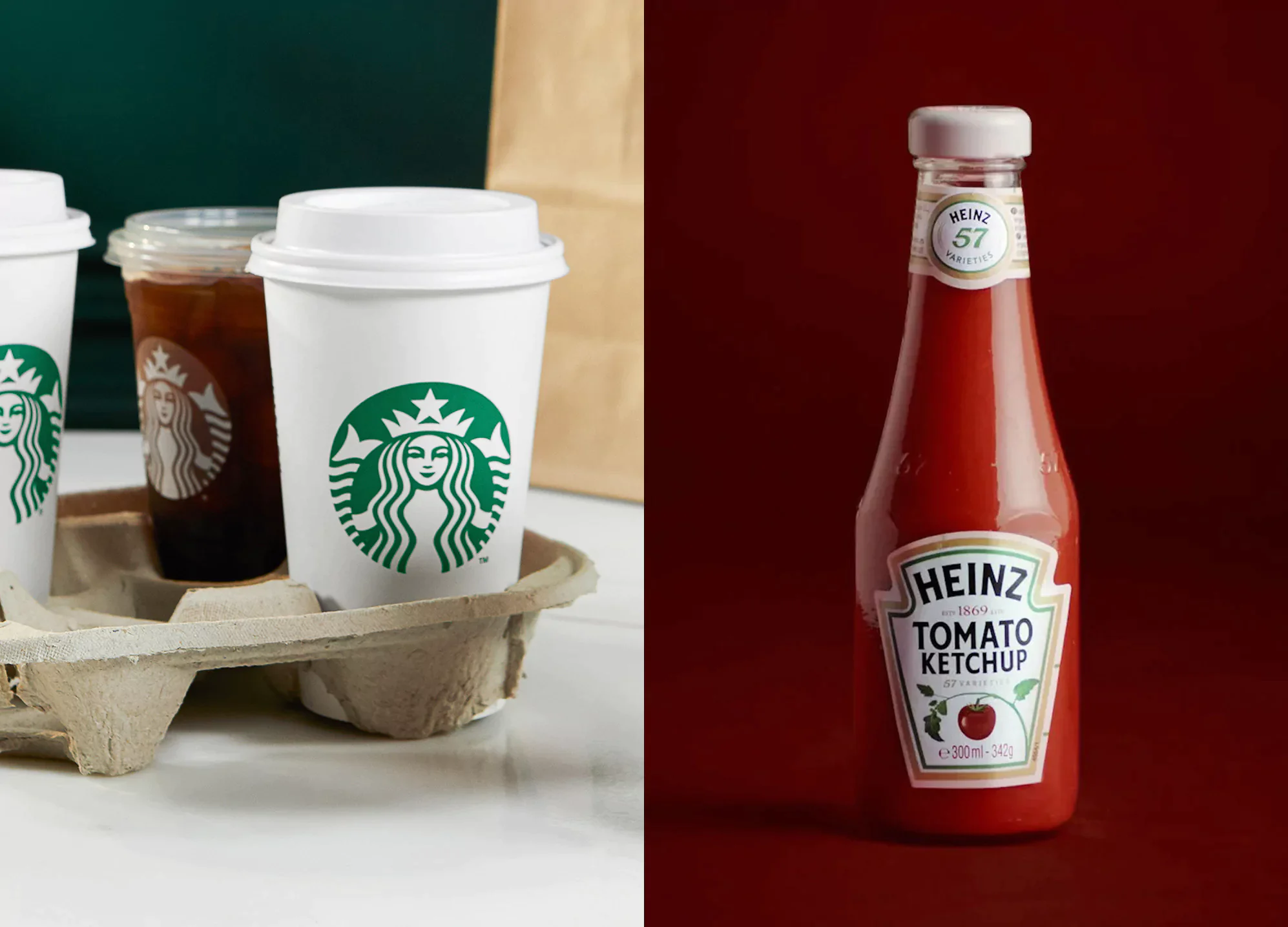
As a business owner, you’re likely to be faced with having to choose between a branding package and separate branded items at least once. These choices have the potential to make or marr your chances of business success — think Starbucks with their signature disposable cups, or Heinz with their iconic packaging design.
Image source: https://www.starbucks.com/, https://hotelinsidermv.com/2019/05/16/top-five-heinz-products-at-standard-origin/
The initial impression we get during discussions with many of our clients is that separate branded items might seem the more appealing option, especially if their business is still at the early stage of development and you’re trying to cut costs, and probably cut corners ahead of their funding or launch!
Since their company is young, they probably assume that branding only some aspects of their business should suffice during this initial stage. If you agree with some of our customers, we’re sorry to break this to you, but you’re wrong.
A branding package is always the better option, and here’s why — a branding package gives you a set of brand assets that’ll last a long period. It employs the all-important 3 Cs that help a business grow: Convenience, Cost-effectiveness, Consistency.
Convenience
When you get a branding package, you get style guidelines and visual templates for subsequent branding projects all at once.
So, rather than frantically looking to find a branding agency each time you need branding consultation, you simply refer to your style guide!
Cost-effectiveness
Branding packaging projects are one-and-done. Since you have all you need for future branding projects at the tip of your fingers, you’re able to cut down on the cost of hiring a branding agency every time you require branding advice.
Your corporate entity continues to benefit from the initial branding package, at no extra cost. Think of it as a one-off, one-and-done investment that will help you avoid the financial burden of recurring expenses.
Consistency
As the business continues to grow, the only way it can maintain a consistent theme across digital and physical channels is through a branding package. Without this, there may be weird variations and fluctuations in the brand’s appearance.
So, which would you rather have? Separate branded items that’re not uniform with your brand identity OR branded packages that blend in seamlessly and consistently to present a bold, beautiful front to your target audience? 90% of our clients choose the latter, and understandably so!
Now, let’s take you on a revealing journey to know what your branding package should cover. But before we progress, it’s worth mentioning that our interaction with most of our clients reveals that brand packaging is often considered an afterthought, especially as other aspects demand attention — whether it’s getting their supply chain up and running, or their marketing strategy, or even website design.
… So much effort goes into making ensuring business components are efficient, but little attention is paid to how their brand is presented as a whole. This is a costly error on their part. And you might ask, “why?”.
Well, according to The Dotcom Distribution Packaging Report, 40% of online shoppers will likely recommend products to friends if they found the brand package appealing. So, if you’re not working on this aspect of your branding, then chances are that you’re harming your marketing strategy in the process.
Take the example of a manufacturer of bouquet flowers. If he wrapped them in a newspaper, he could make a few sales, but if tucked away in a branded bouquet men can instantly gift to their wives, the manufacturer could command premium prices, with a higher probability of retaining customer loyalty (recall, since the branded bouquets, are a worthy reminder of the manufacturers that produced the flowers).
Though commonly overlooked, brand packaging remains a golden opportunity to influence customer perception. Plus, it needs to be carried out by an expert team with a high-level of creativity and attention to detail to be well-aligned across all touchpoints of interaction with your target audience.
Branding packages form a significant chunk of the 300+ unique completed projects by our award-winning branding agency with proven results. Have you got any questions based on what you’ve read so far? Our expert team is on hand to help you answer them in detail once you click here.
What does a Branding package include?
As mentioned earlier, a branding package includes a logo design and a style guide. But these are just umbrella terms. Here’s the full breakdown:
Logo Design
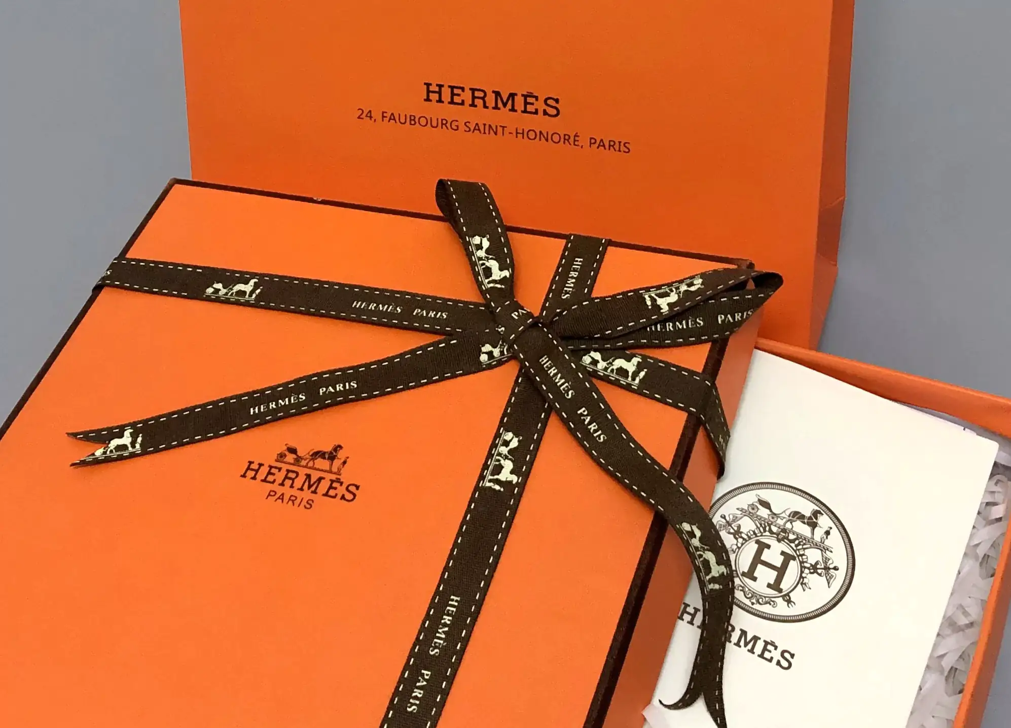
A logo is the central piece of a brand’s visual identity. Think about some of the most famous commercial giants like Hermes. The Hermes logo — a symbolic horse-drawn carriage waiting for the groom — embodies the brand story in a way that also typifies their flawless expertise in accessorizing their customers.
Image source: https://www.buyechina.com/en/goods/detail/624132378996
A logo is a brand’s digital mark, its badge, and a source of immediate reference altogether. You can tell if a product belongs to a company simply by looking closely at its logo. As the cornerstone of your brand identity, your logo should be as memorable as possible.
Customers need ‘a face to match’ with the brand name, which is exactly what a logo gives them. That’s why your business needs a quality logo design that will attract a large swarm of digital & physical eyeballs — one that will easily always communicate the top-tier position your brand occupies in the market to the public.
To demonstrate, one of the most notable elements of McDonald’s logo design is this: it takes the semblance of two of the restaurant’s french fries shaped like an ‘M.’ The logo practically represents McDonald’s as an elite fast-food company, and they’ve reaped the rewards surely, with the outfit netting an income of about $7.55 billion in 2021 alone.
The logo design must be completed executed before other branding elements are worked on — given that all other branding elements lean on the logo to derive their attributes.
Now, the logo is a major player in creating a high-quality visual identity, but that is not all. You also need to invest in your brand’s color palette, logo variations, typography, and any photography used in displaying what it represents.
These elements, when expertly combined with the logo design, help convey a consistent and unique theme.
Brand Colors
This is a must-have within your branding kit, especially if your’re not just launching. We strongly advise you do not accept a branding package without a color palette. Colors are essential parts of your complete brand identity and they influence the perception around your business.
In selecting your brand color palette, you need to take care to choose colors that will endure as the business continues. Just like NIKE has used red, white, and black colors since 1995. Remember, your logo is the first visual image that people associate with your business, so you need to invest in a quality logo design made with appealing colors.
How do you do this? You engage the services of professionals. Preferably, a branding agency with years of experience in creating logos. You shouldn’t consider cutting corners with this to save costs. After all, logos, just like your entire branding, should be considered an investment bound to yield the highest ROI attainable.
While trying to save costs, you can end up in the hands of quacks or a cheap designer.
But you’ll probably end up having to fork out twice the amount of money (and time) in redos or revisions. If you want a professionally done branding package, get it right from the start with a branding agency that will partner with you to get the best results.
7 global awards for unique branding package decisions reinforce our experience in providing value in this area, both locally and across borders. Thus, our expert team is vastly experienced in this niche. Even better, we are open to sharing creative outlines and ideas specifically tailored to your project.
Fill out this brief to get a free project pre-development from the chief analyst of our creative agency CEO.
Also, your colors shouldn’t be chosen without considering the nature of your business and how you chose to represent yourself. To illustrate, companies in the B2B have different values, and they will rather portray this appeal to other businesses, which might not work in the case of B2C companies.
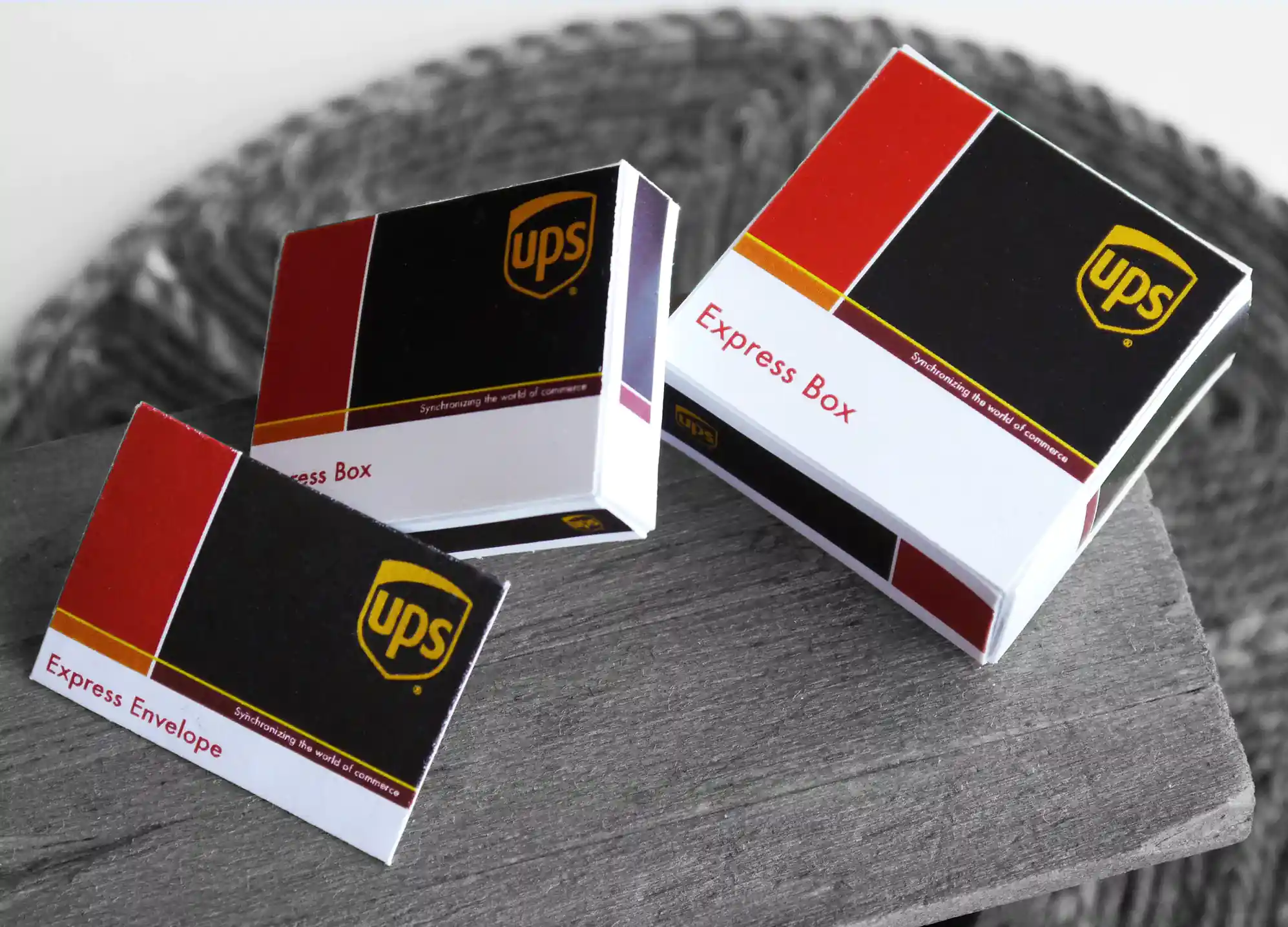
A worthy reference here would be the company, UPS — their selection of muted browns and yellows as their main colors perfectly signifies their aim to foster trust, ease of service, and credibility.
Image source: https://www.etsy.com/listing/799910822/instant-download-ups-express-mail-box
And it doesn’t end there. The color palette belongs to the entire brand. Which means, whatever your brand does — whether website design or other touchpoints — must be carried out using a consistent color choice to ensure uniformity.
To avoid customer confusion, if you’ve taken a particular color, stick with it. Deloitte in 2003 transformed their logo design by adding a single green dot. Today, the green dot is still recognized as a constant representation of their visual identity all over the world.
Email Templates
A good branding agency will provide branded email templates, since a lot of your business correspondences will be digital. The email templates will add a special feel to your newsletters, making it a more powerful marketing tool.
Website
Websites are a part of a brand’s digital presence as they are your digital storefront. These days, if you lack a website, then you’re missing out not just on a huge marketing opportunity, but also a giant market share.
And to instill customer trust and loyalty, it must segue into your brand identity. According to a web credibility research conducted by Stanford University, 75% of website visitors passed judgment about the credibility of a business merely by looking at the web design.
What’s the takeaway here? A professionally done branding package should include a website design that is consistent with your overarching theme, personality, or identity. If it doesn’t, request!
Typography
A font style is another powerful tool most big brands use in distinguishing themselves from other competitors. Gillette’s use of the futura extra black italic font is a worthy example of such brand positioning through dominant typography.
Oftentimes, substandard branding agencies ignore typography because they think it’s not significant. But professional agencies know better, so they make sure to include fonts that pair nicely and follow basic & advanced typography rules in their branding kit.
Business cards
Business cards are a good asset for marketing purposes, especially when it comes to sharing your business contact information. But they also pull double duty as another touchpoint that can etch your brand’s personality, values, and serve as a notable reminder of your brand.
Most corporate branding agencies are aware of this, so naturally, they include business cards in their branding packages. Whichever branding agency you partner with must make it a point of duty to provide your brand with a customizable template to ensure uniformity in the designs of employees’ business cards.
Style Guide
‘Style guide’ refers to a comprehensive rulebook with instructions on how your brand should be handled. It gives direction to its visual elements by providing information about what you should or shouldn’t display.
Simply put, a style guide is an instructive document explaining your ‘branding standards’. The development of a consistent theme begins with the style guide. It highlights in clear terms the standard your business intends to maintain and oversees the direction of your websites, ads, and other marketing assets.
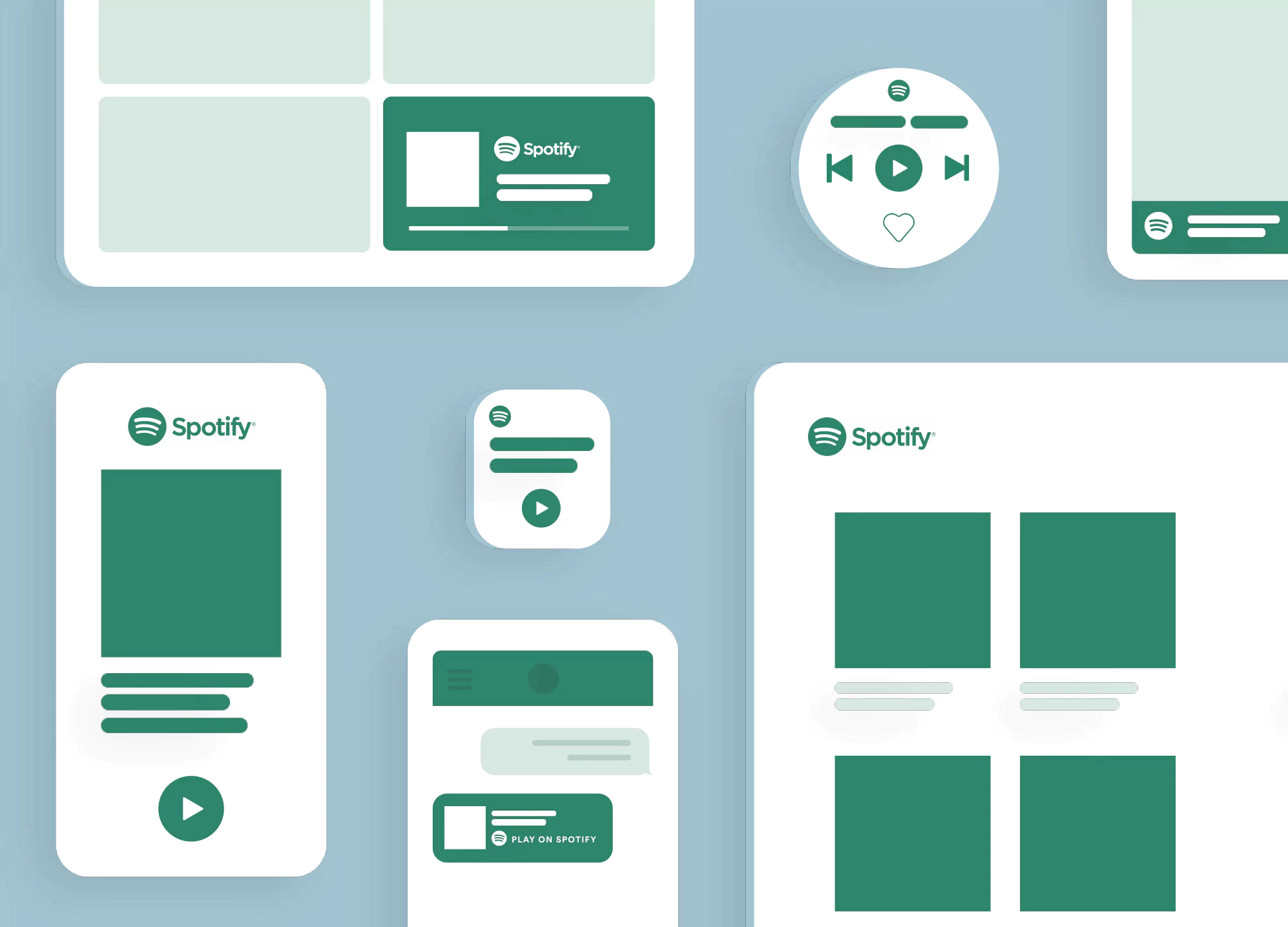
Spotify’s design guidelines were developed to ensure all their users enjoy the same delightful user experience regardless of the platform they listen on.
Image source: https://developer.spotify.com/assets/branding-guidelines/attribution.svg
So when you hire a graphics designer, web developer, or put together a sales team, you simply hand over your brand’s style guide to them.
In a style guide, you don’t need lengthy explanations or elaborate comments — the guide is straight to the point with the necessary information any professional working with your business needs to remain consistent.
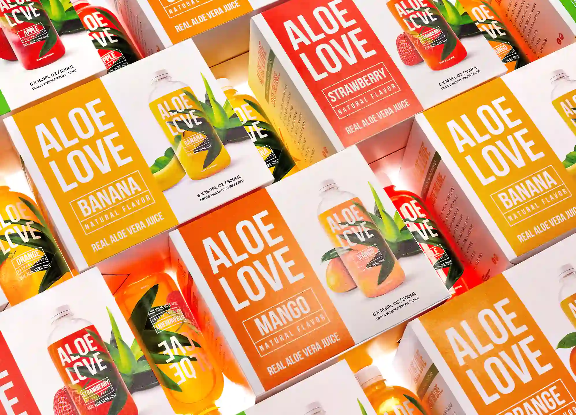
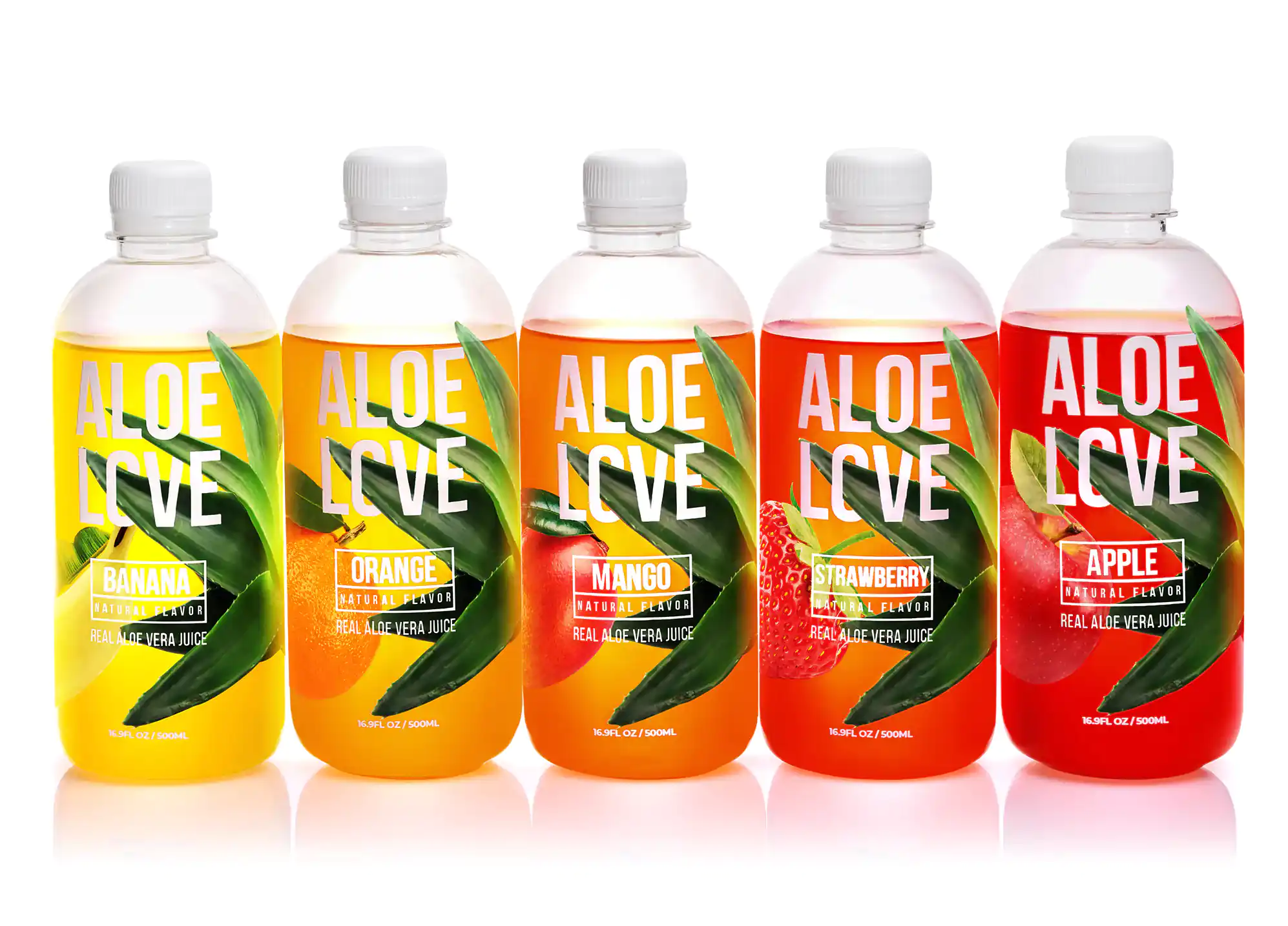
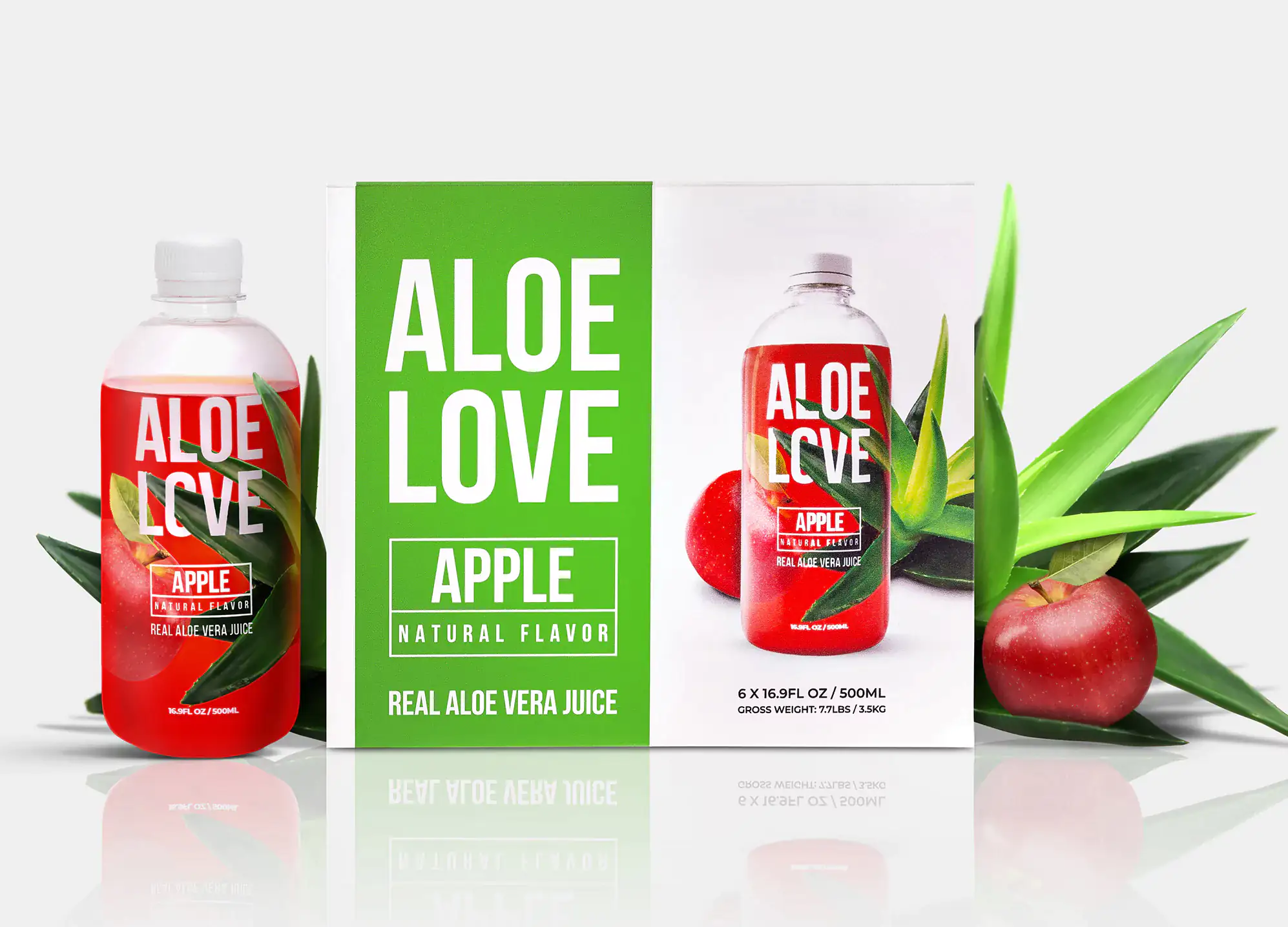
One company whose style guide we helped put together is Aloe Love. Aloe Love is a supplier of naturally flavored juices. In the saturated food industry, they needed a catchy and consistent branding package that’ll ‘spread the love’ of their fruity collection of different flavors to a new demographic.
After several conversations (via Zoom), a creative brief, and project development notes were reviewed and we concluded that the new Aloe Love logo needed to work on a variety of packaging and print formats, along with online platforms. We considered the best ways to create this universally applicable logo. Eventually, we did.
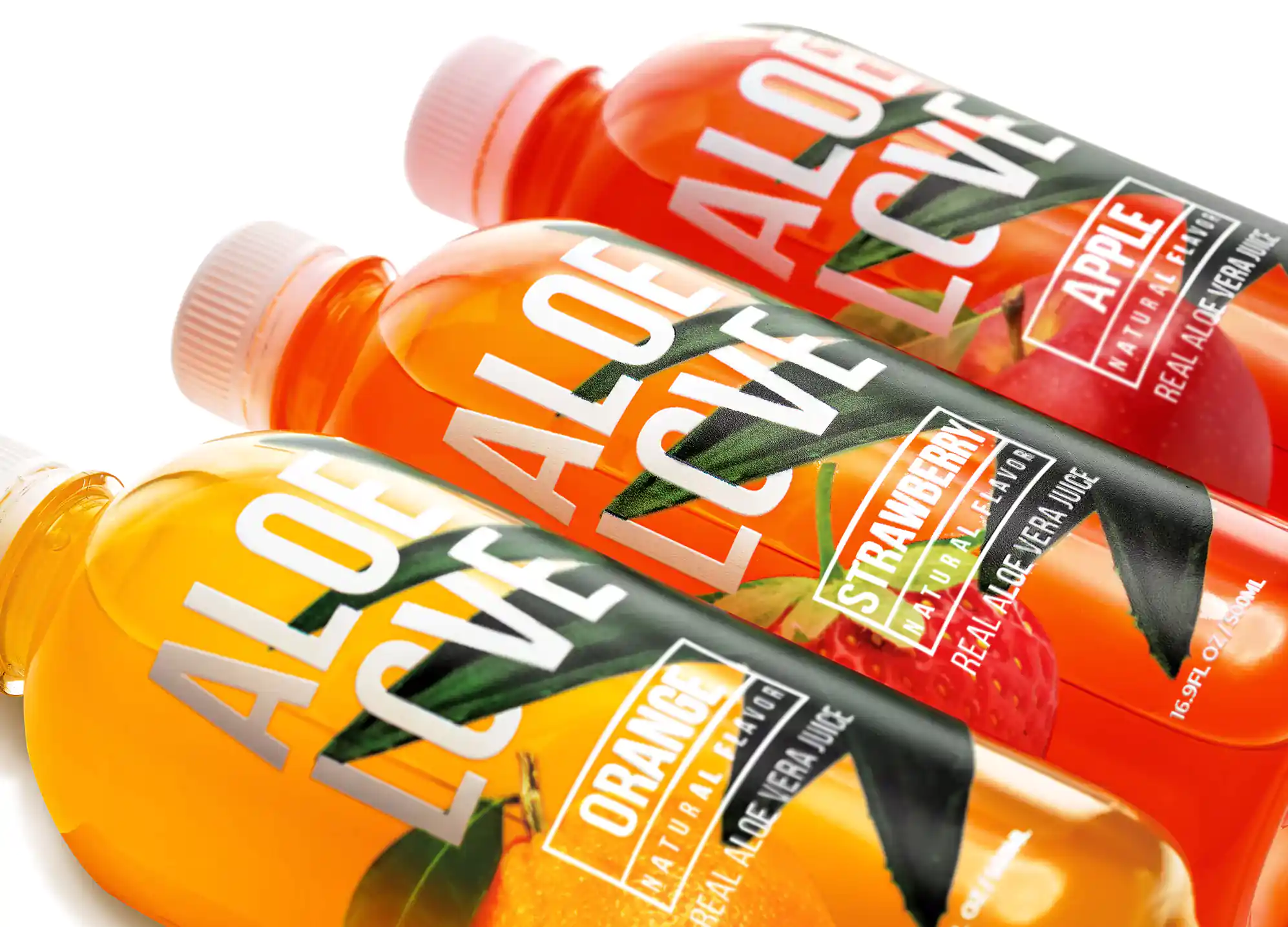
It took several brainstorming sessions involving our expert team of marketers and designers. Moving on, we leveraged feedback from their marketing team and industry research to put together a flexibly crisp yet cohesive packaging where the fruit dictates the theme (e.g., strawberry pops with red!).
With the high-level of creativity on show, we were able to come up with a fresh, compelling package of juice flavors that pop on the cover just as much as it does on customers tastebuds!
And when we were done, we also worked with a product photographer to showcase Aloe Love online.
Our award-winning agency was able to drive value in these three areas: commercially, functionally, and from a creative perspective, for their packages.
Proof of this can be seen in how after a few months post-launch, Aloe Love’s marketing department saw their purchase intent rise by a whopping 45.3% with current and new customers. This win has informed their latest move as they look to roll out even more SKUs (store keeping units) with flexible packaging.
What to expect in a standard branding package?
When you approach a branding agency, naturally you may already have expectations about the style of packaging you want for your business and you hope the agency would be more than capable to deliver. Or, like most of our clients who are C-suite executives, you may be entirely new to the field.
Whichever the case, you probably lack the necessary know-how to be able to determine if what a branding agency is offering is up to the standard you want your business to demonstrate. So, here are some tips on what you should always look out for in any good branding package!
As part of the service rendered in the innovation of a cool, or bold new logo, a standard brand identity package should contain:
• 3-5 design templates from which the client can choose. Afterward, the selected design would be crafted and refined to fit the client’s taste.
• A primary custom logo with which your business will be recognized.
• Variations of the custom logo. These are secondary logo designs such as stacked, vertical, or horizontal applications, which may take several forms depending on the primary logo. Other simplified marks like icon marks, wordmarks, and letter marks are also included in the package.
• A simple set of instructions guiding the logo application, popularly called ‘logo one-pager guide’. This guidebook gives instructions about the appropriate icon and trademark version for your brand, together with primary and secondary versions, sizing, color and background applications, unacceptable usages, and any necessary legal requirements for using the logo. A brief look at NASA’s logo and design guidelines gives a clear picture of these elements.
The multiple logo ideas and icon variations Slack was provided with before they selected a concept to work solely with is a shiny example. And now we are all witnesses to the special attention the Slack logo has drawn to the company both physically and online. Today, Slack has become the darling of the tech industry with a valuation of over $27 billion.
You should expect a similar professional touch in your dealings with any branding agency. Correct! As soon as you choose a particular logo, your chosen design agency should create a primary logo your company will be identified with, and also provide your company with a logo one-pager guide.
… If they don’t, then they’re probably not worth your time — and money.
Benefits of a good branding package
Here are some of the benefits you stand to gain when you invest in a quality branding package exercise:
You’re Unique. Distinctive. Different.
If you’ve not noticed, there are one too many businesses in operation. But the good news is — whether you’re a small or large-scale business, a good branding package will help you stand out from your competitors. When you have secured a standard logo design or appealing visual identity, you can rest easy knowing your business broken the ice!
An award-winning agency, we have uniquely executed 300+ projects with proven results — both in the short term, a unique branding powered by catchy, consistent design and — and the long term — an exponential increase in brand equity, and sales.
More Brand Credibility
Customers are more likely to patronize name businesses because consistent packaging attaches a measure of credibility to the product or service on sale. Thus, more people will choose your brand because they trust you’re professional and well put together.
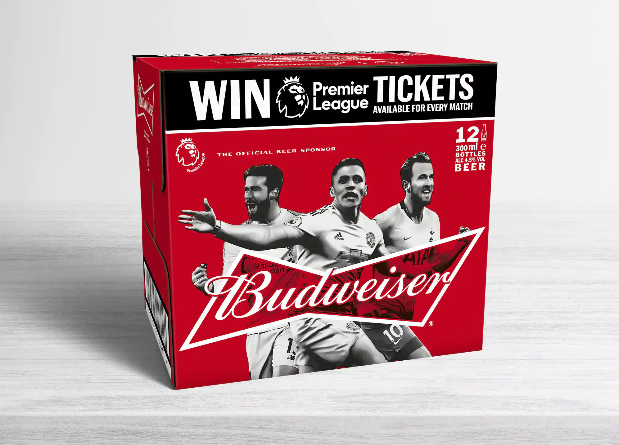
Think about how Budweiser’s constant brand packaging campaigns based on the latest media and sports trends keep the brand at the top of the beer market yearly.
Image source: https://www.iceland.co.uk/p/budweiser-lager-beer-bottles---premier-league-edition-12-x-300ml/68035.html
You could take a cue from this, implementing consistency across your brand packaging and marketing campaigns to preserve your brand’s influence within social discourse.
Command Higher Pricing
With all that packaging on display, your pricing can now truly reflect the top-tier positioning of your brand.
Like it or not, customers ‘judge a book by its cover’ when trying to get the best deals. So, without professionally done brand packaging, buyer’s confidence reduces and your high pricing is met with resistance.
You become more professional once your business undergoes branding, and so you acquire the right to charge like a professional. Basically, your bottom line gets higher once you begin to acquire more profit if your brand identity is second to none — which explains why luxury brands like Gucci can confidently charge six figures for their high-quality products without the threat of a backlash, or a drop in sales.
Secure Customer loyalty
Ever heard someone go, “oh, I only wear Fashion Nova?” Here’s why — they’ve sampled their products and now they feel a sense of loyalty towards the brand. They see the monochrome design of Fashion Nova’s logo on a product and immediately associate the product with the brand’s luxurious identity.
Frankly, at face value, the one thing which differentiates one clothing brand from the next is the logo. And that’s why brand packaging is an absolute necessity.
A Consistent theme
With your brand style guide, making decisions about your marketing becomes a walk in the park!
You don’t have to debate with the graphics designer about fonts or colors. Your brand style guide provides all the needed facts about your brand’s visual identity and helps you to maintain a consistent front in the eyes of the public.
In line with AT&T’s logo design, their website and ads always reflect the blue color as a dominant color scheme for whichever digital footprint or presence the brand takes on. Let’s visit another of our unique completed projects and the results we helped them achieve.
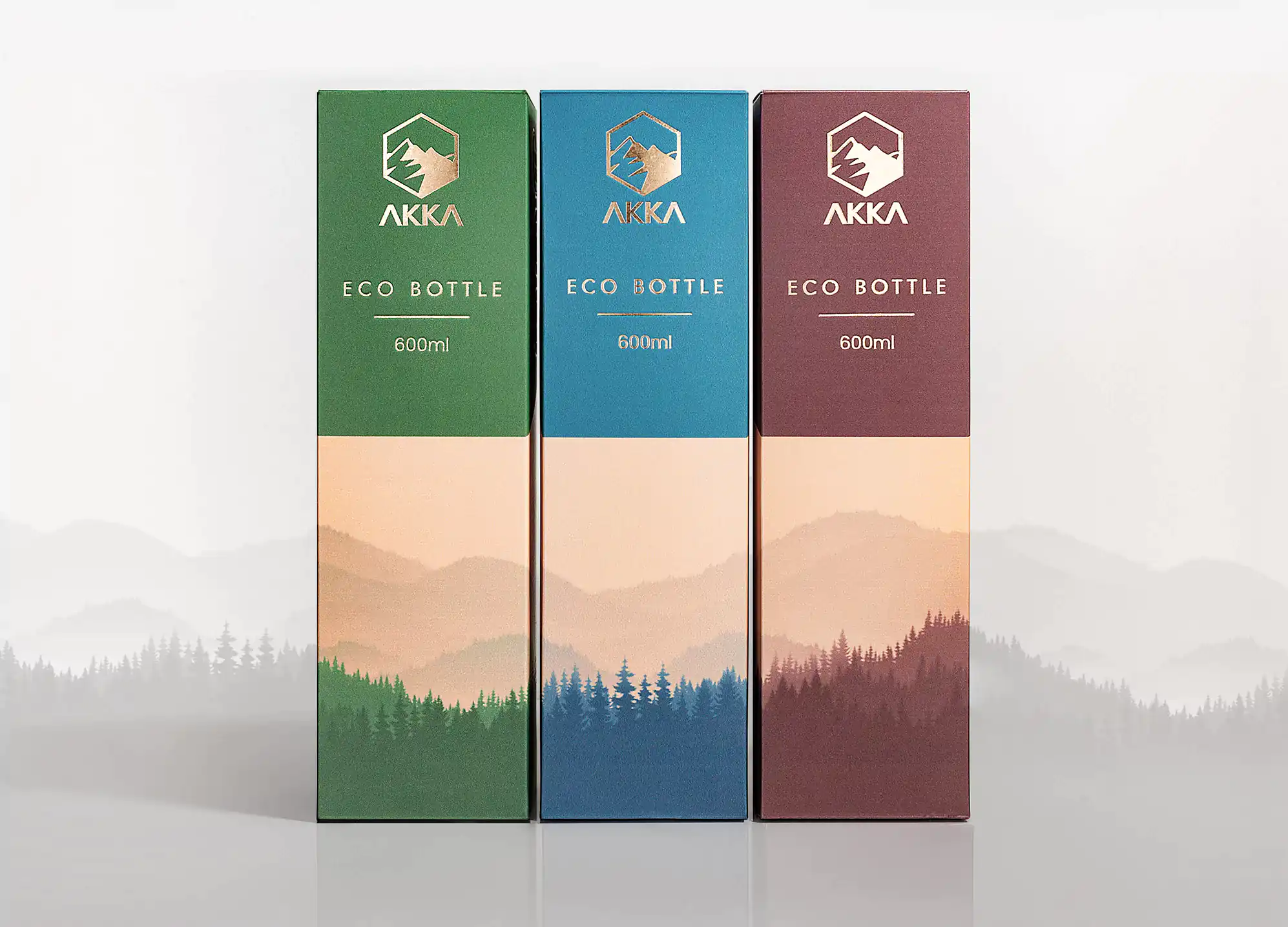
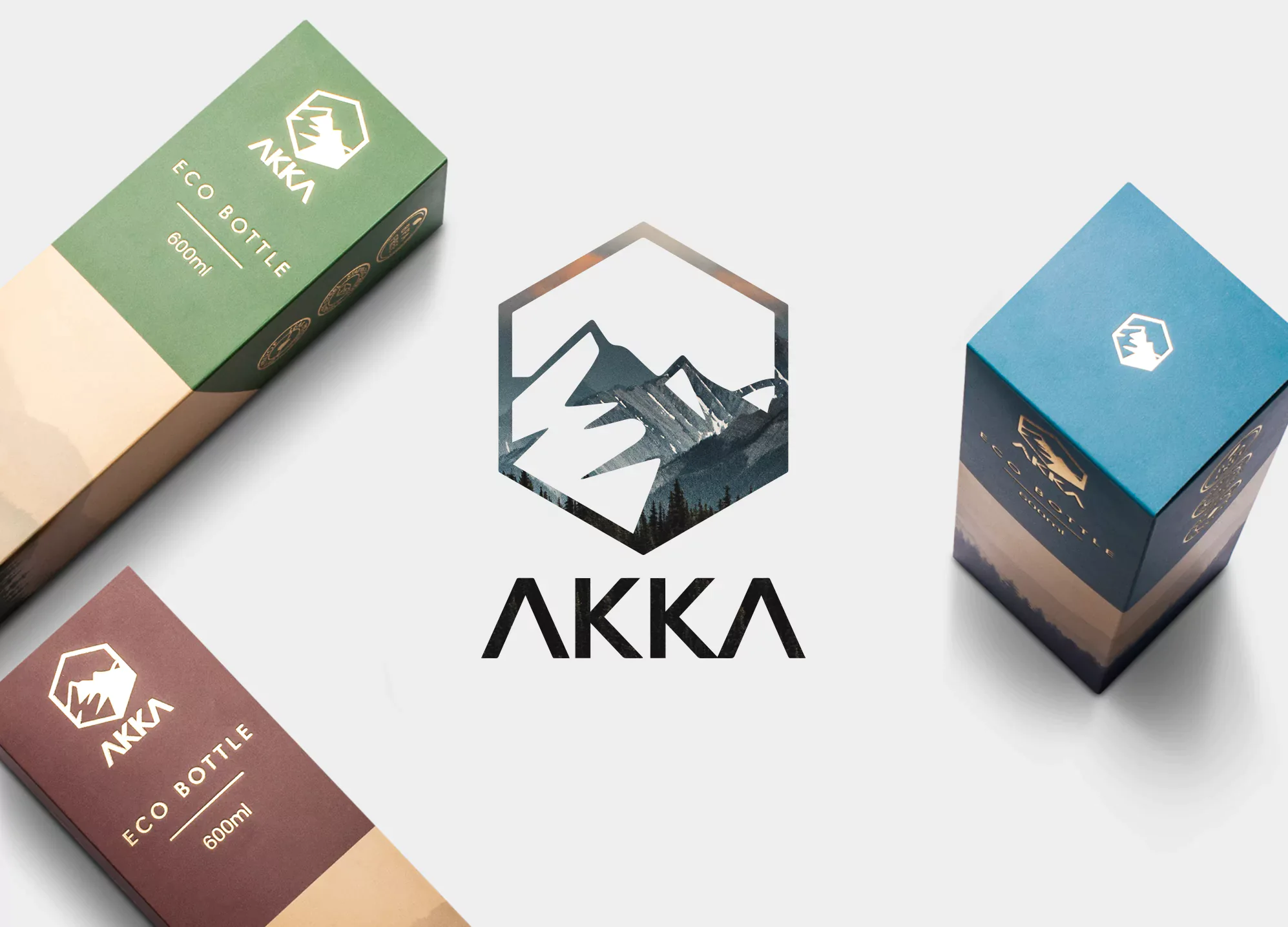
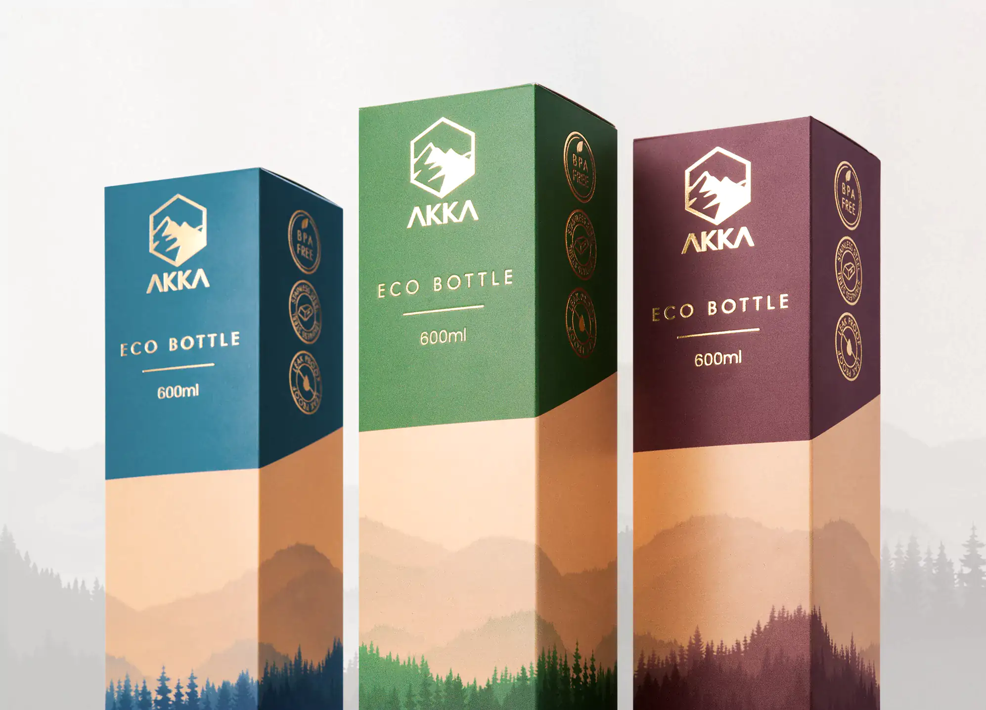
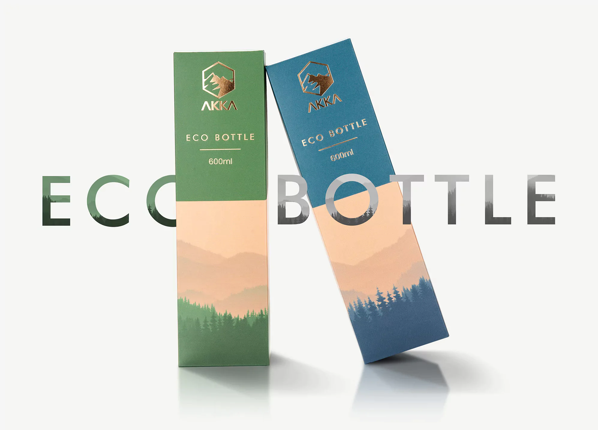
Akka had just launched their company and looked to mark their debut with a line of premium products (Eco Bottles) when they requested a brand packaging that will signal their position as an industry leader. For us, that included figuring a way to curate branded assets in a manner that continues their brand consistency and customer experience across these lines of products.
Initially, their internal marketing department tried implementing this branding package exercise by themselves. However, they soon found that the unusually ultra-technical detail involving fragile touchpoints meant they required professional help from an external team with deep commercial understanding and a background in product design.
Following a general brainstorming of our expert team (marketers and designers), the options were presented and a mountain theme was chosen to lay the foundation for what was a universally appealing branding package for carriers and customers. We also harnessed a high level of creativity within the team, so the logo harmoniously fits the technical & corporate spheres of Akka’s company culture.
Bonus point? Our product designers sprung up a unique stamping process using a special press to create deep and textured packaging prints. We love how the gold embossment looks on the bottle packages! The packaging offers a clean design and is sustainably produced. This helped launch Akka’s new visual identity.
These efforts brought the brand alive as they promptly ensured a unified consumer experience without blowing up the budget. Today, Akka is set up for a uniform, efficient, and cost-effective brand application that will sustain them for years. The on-budget and on-delivery outcome of the project also made sure they are well placed to reach new heights in their industry.
How much does a branding package cost?
The cost of a branding package varies according to the needs of your business. But the pricing usually ranges from $2,000 – $75,000, depending on the turnaround time you desire, the company or designers you’ve hired, and how much work needs to be done.
Typically, branding agencies offer specific packages depending on the kind of branding services you desire for your business. Some packages include special add-ons like email templates and letterheads, in addition to the traditional logo design and style guide combos.
On the whole, the branding elements included in the branding package determine the cost. Branding is a big deal for any business, whether small-scale or large-scale. And it could be tricky if done without proper guidance.
So, if you’re looking to bring your business from digital dungeon into the spotlight through branding, consider hiring a professional branding agency that can give you a cost-effective branding package.
We have 300+ successful branding projects with the vast majority of them being branded packages. Whether it’s a brand launch or full-scale rebranding, we leverage deep commercial understanding to create branding kits for clients. These comprehensive packages, designed with customers in mind, also include all the must-have elements to increase recall.
Wrap Up
In another survey from IPSOS, about 72 of American consumers hinted that the packaging’s design had a lot to do with whether they chose to buy the product or not.
You want an identity that distinguishes your business from the sea of sameness in your industry. To be fair, it’s not as easy as randomly picking a color palette or hiring an individual freelancer who’ll go on to create muddled designs that cannot sustain your business lond-term due to a lack of strategy.
Decisions made when getting a branding package is not one to be rushed, or done without expert guidance. And if a complete level-up is what you’ve got on your mind, then you must seek assistance from the experts!
The Stan Branding team includes a full stack of marketers and award-winning designers that are willing, and ready to mastermind branding packages that refine your brand’s visual identity in a uniform manner across all nodes of brand interaction.
Need a helping hand? Looking to get branding packages you’ll be truly glad you invested in? If this is you, don’t miss the opportunity to get your free project pre-development consultations from our CEO.
