Brand Values
Empowering – Akka empowers people to take charge of their waste footprint and explore the wonders of the outdoors.
Enjoyment – Akka supplies sleek products so more people can enjoy the minimal waste trend without sacrificing style.
Nature – Akka is dedicated to preserving natural spaces and appreciating the beauty in the world outside of the cities and towns.
Exploration – Akka encourages people to explore, whether it’s seeing what’s down the street, out in a natural zone, or into the next innovation.
Brand Differentiation
Akka launched its first product, the eco bottle, before waste reduction became a mainstream idea. However, the company used this to differentiate itself further over the years and attract buyers who valued long-term solutions.
Brand Voice
Akka uses a friendly voice similar to what is heard when avid hikers discuss their favorite trails. This voice and demeanor help the brand connect with active urbanites who are its most frequent customer. This connection fosters trust before people even know what the company sells.
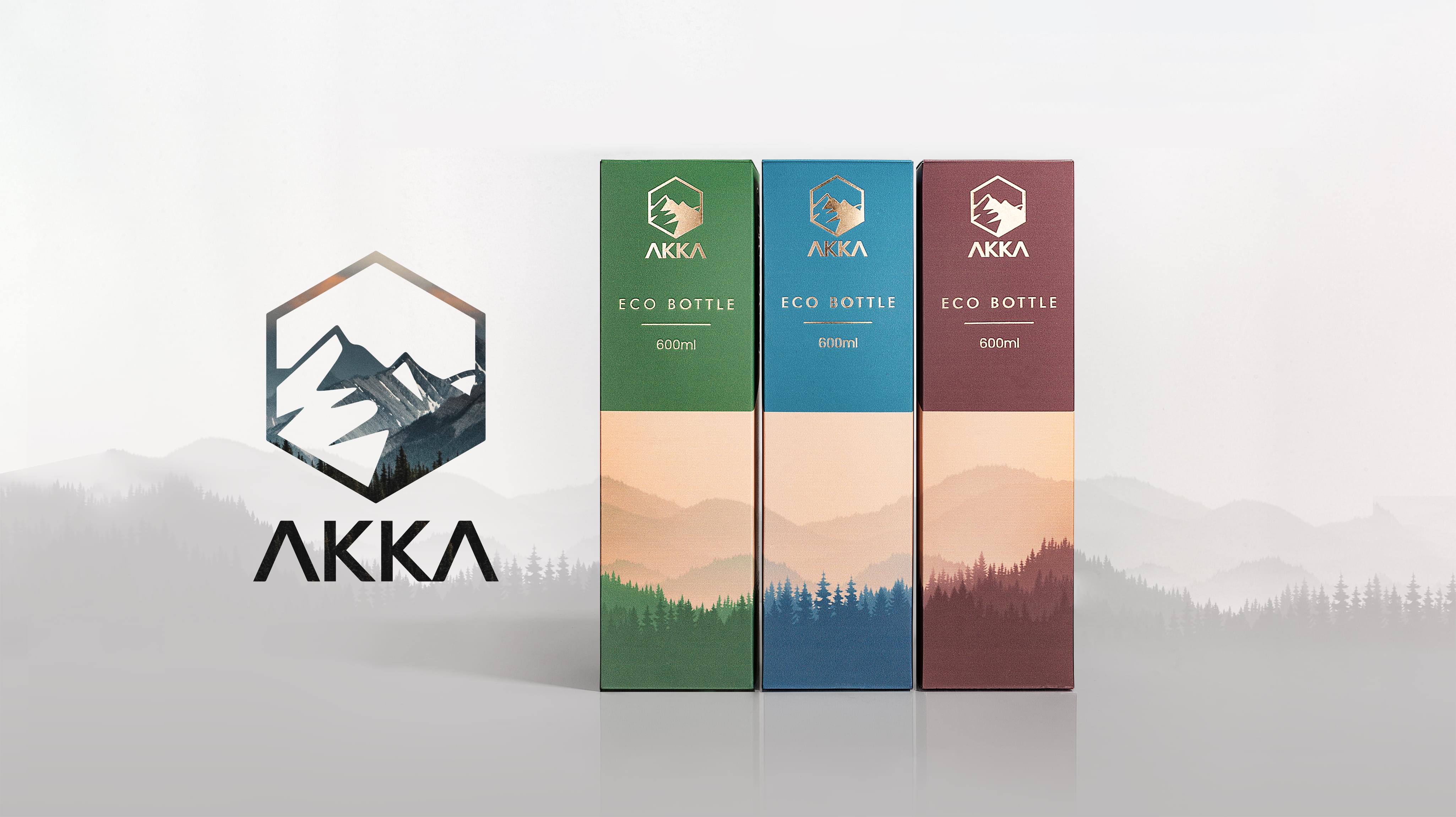
Brand Identity
Akka uses an up-and-coming identity to foster more relationships with potential customers. While it uses some elements that evoke wisdom, like the mountains on the packaging, many of the pieces speak to a masculine, younger identity.
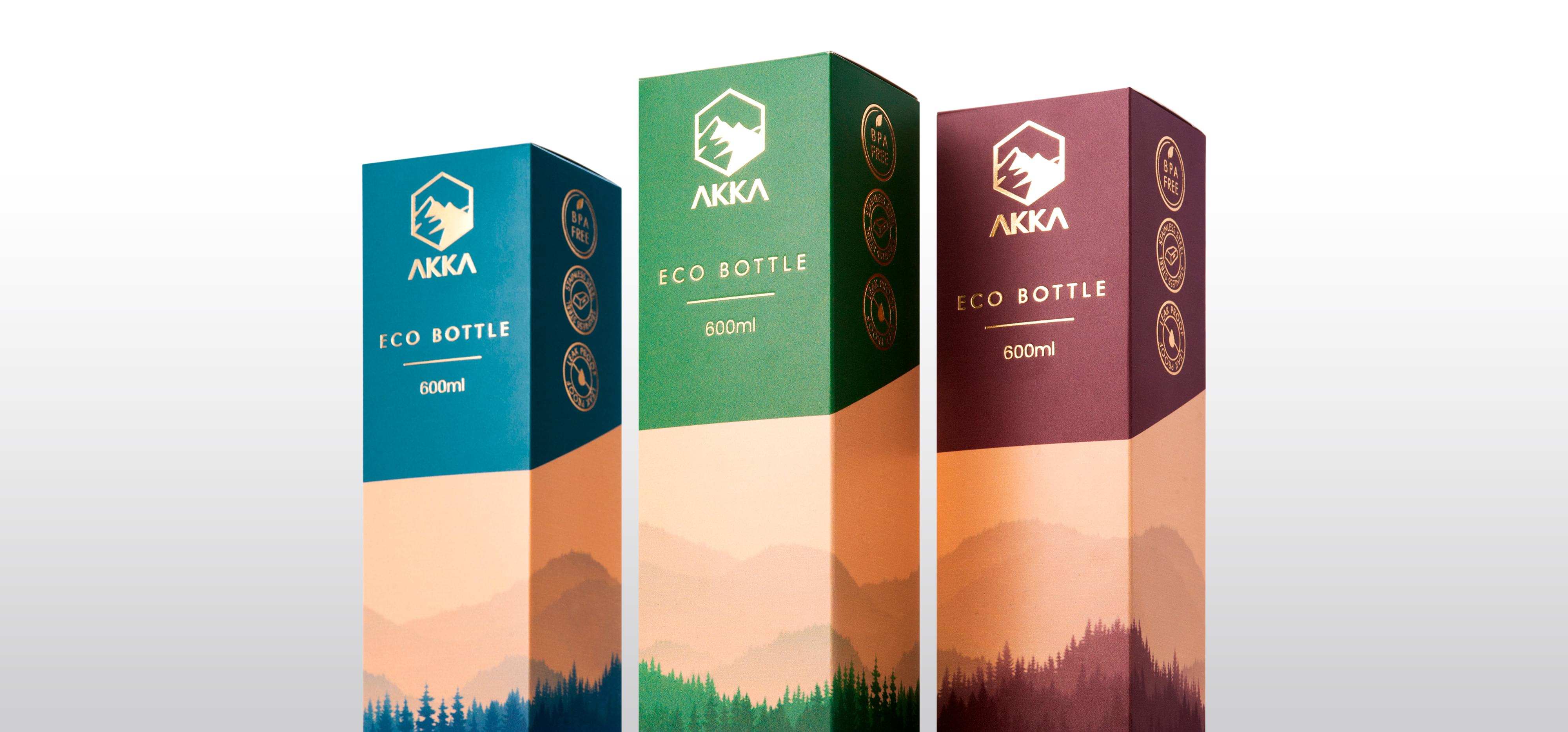
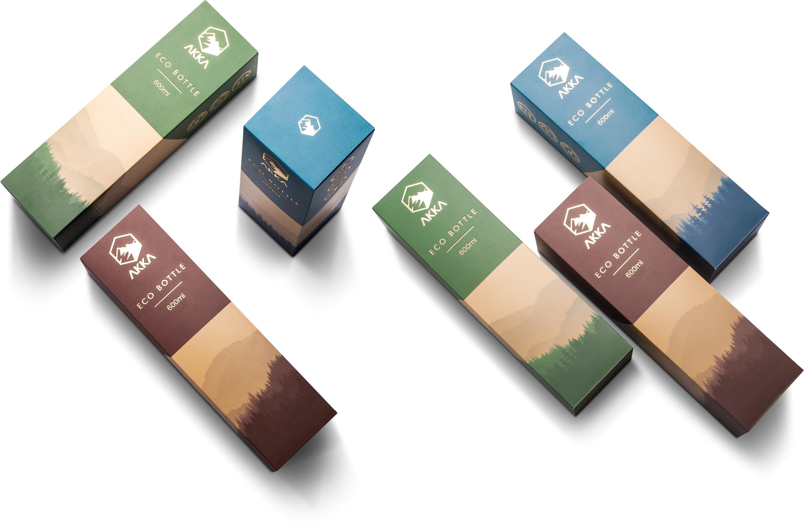
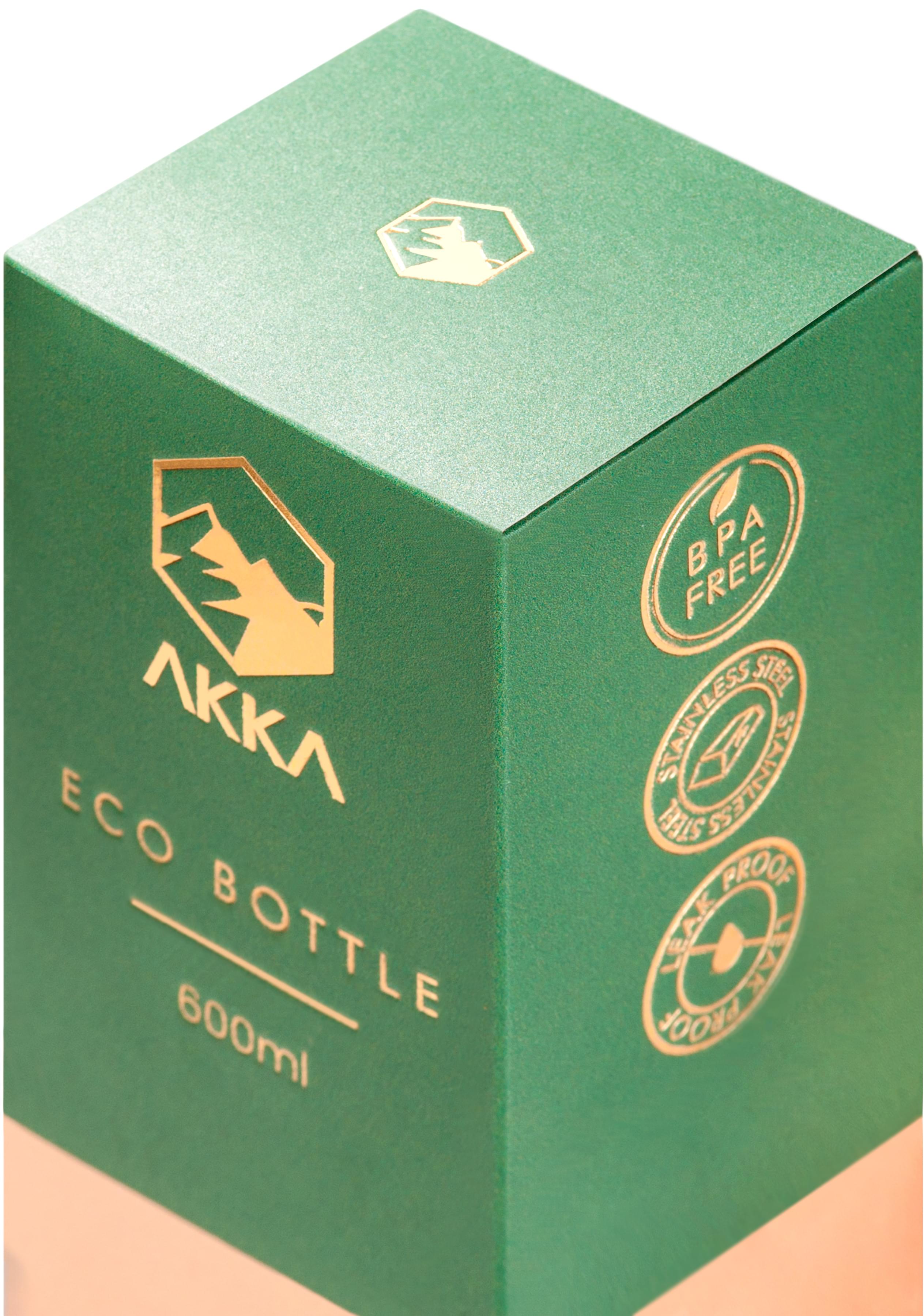
Packaging Elements
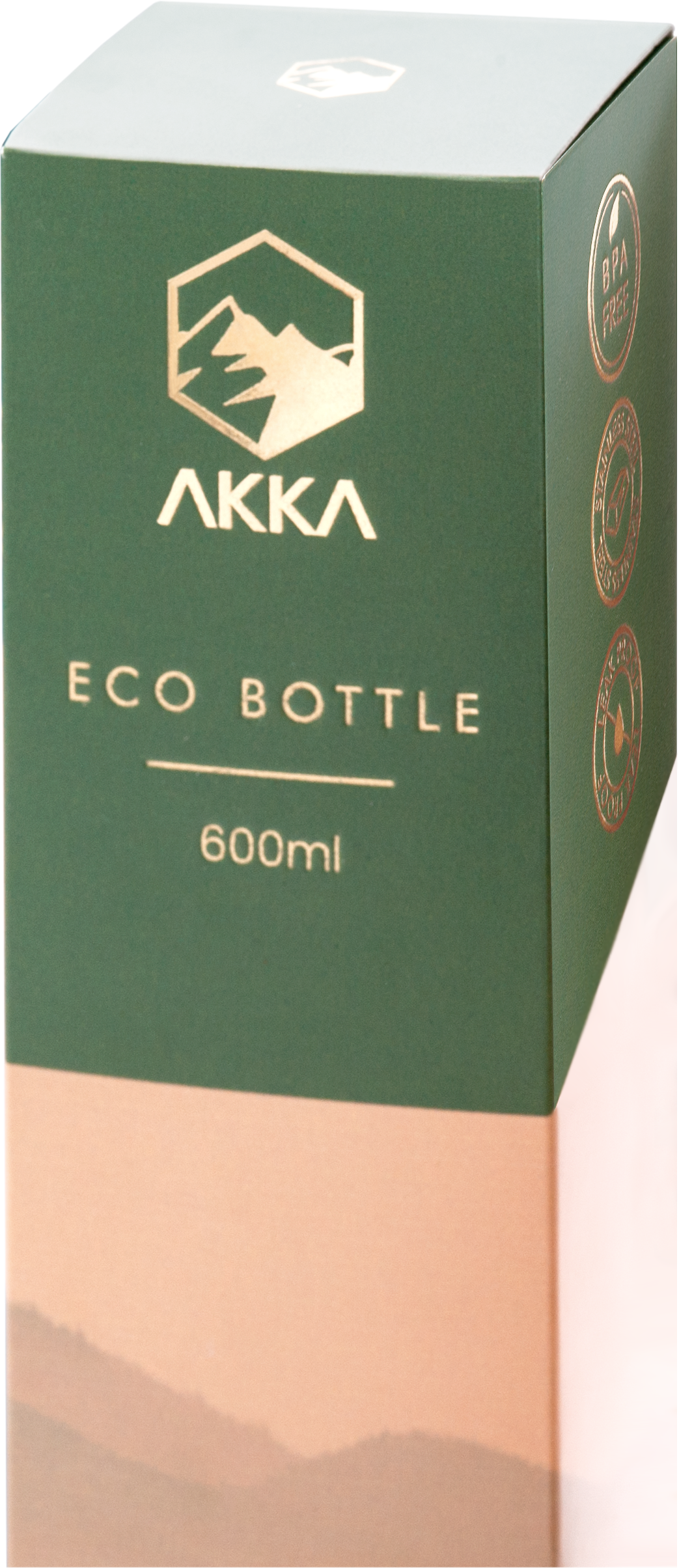
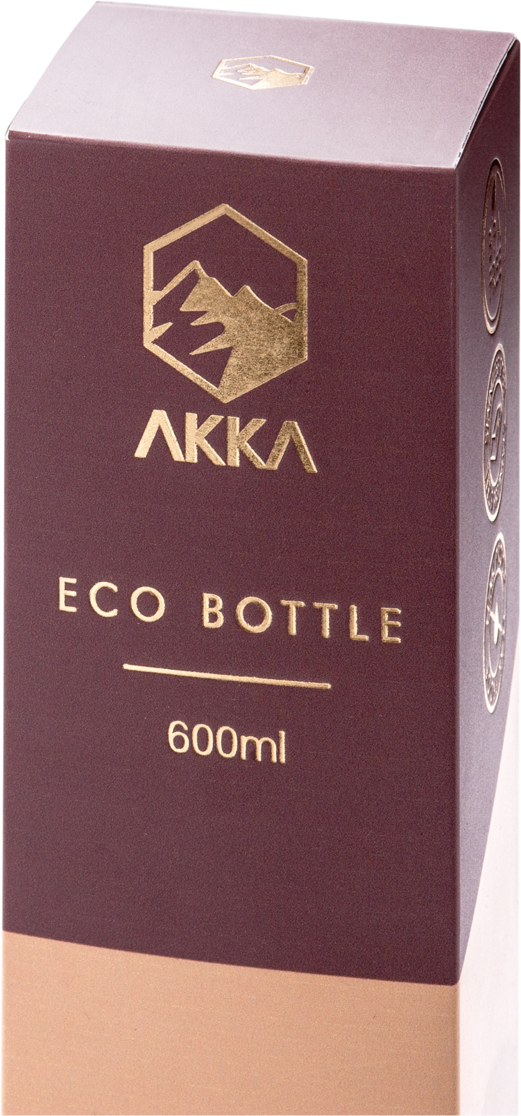
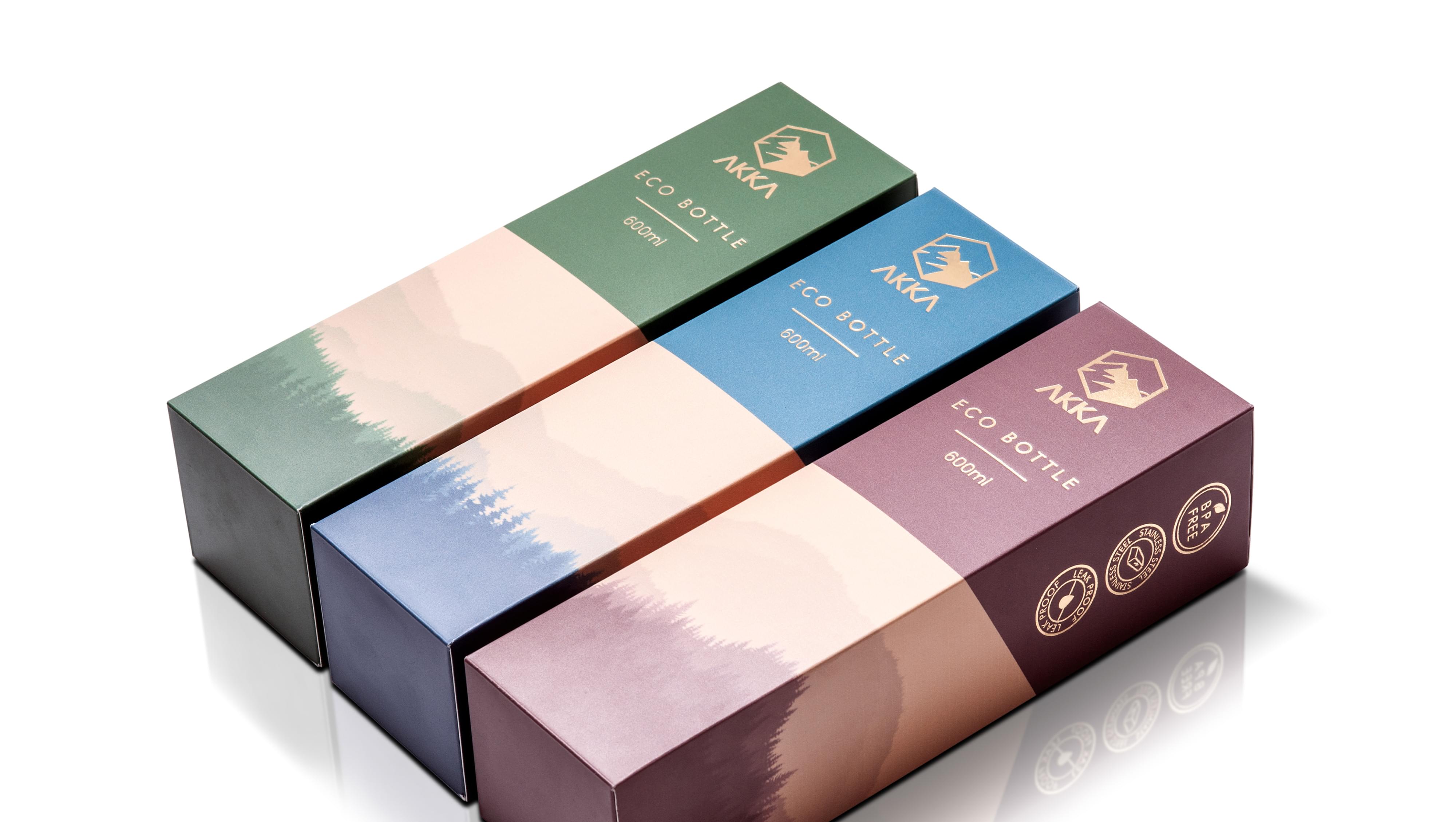
Colors
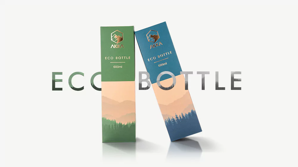
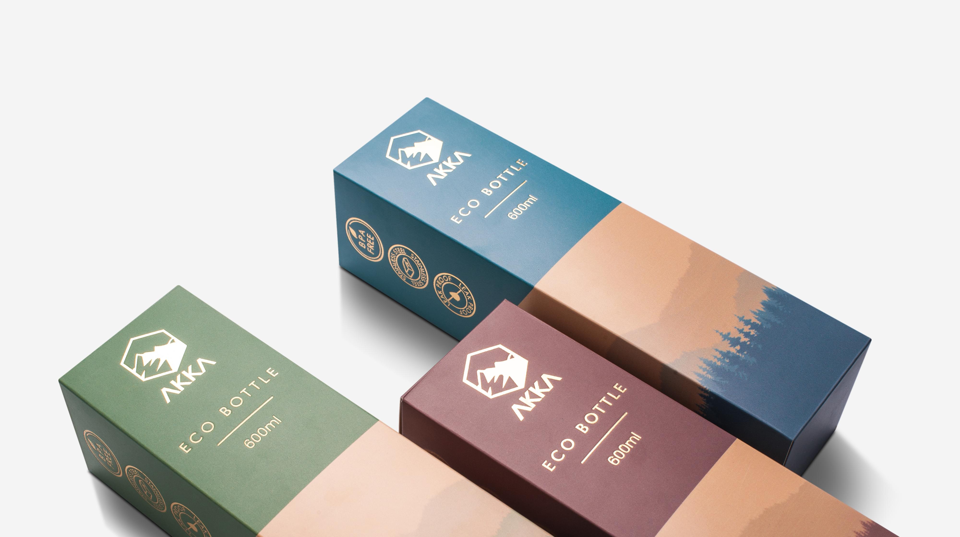
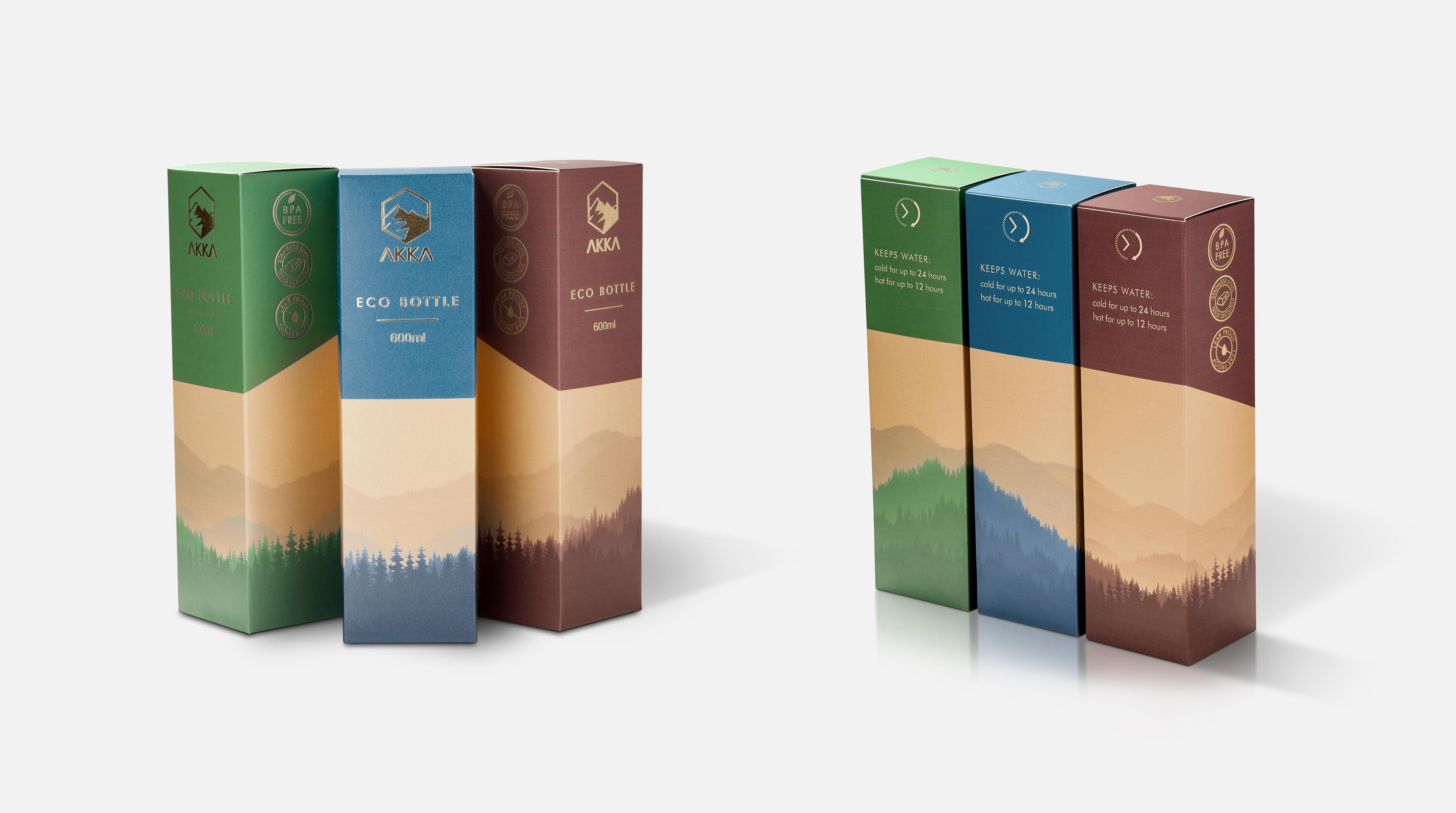
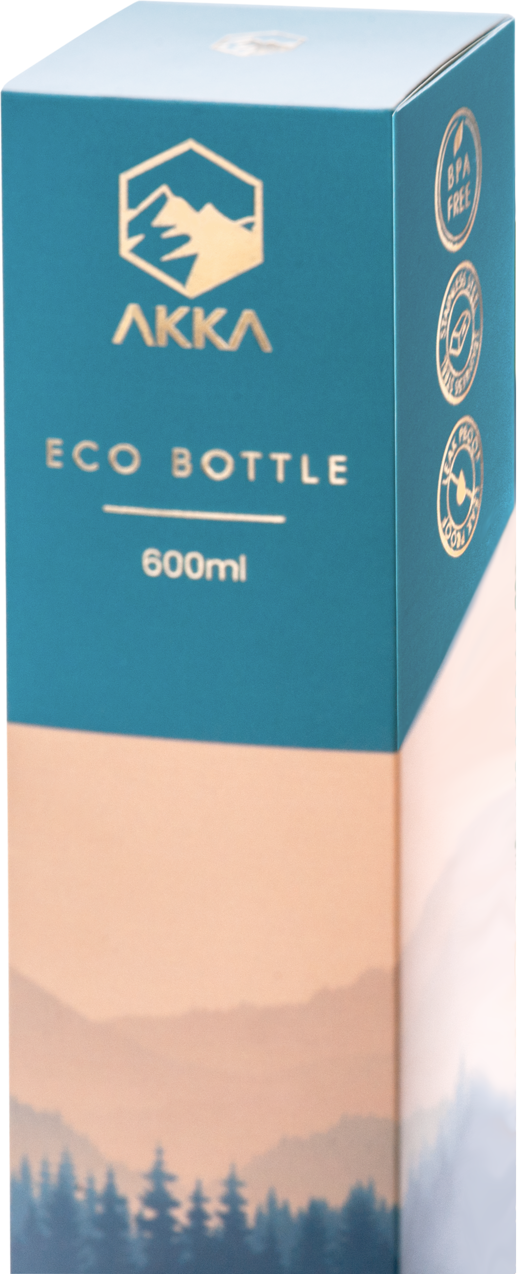
Akka’s brand packaging uses rich, subdued colors that evoke nature. The reds, blues, greens, and gold all fit well with the company’s nature theme while still imparting a high-quality feel for the brand.
Visuals
Akka uses mountains for most of its visuals to evoke standing the test of time and exploration. These two feelings are crucial for the company’s overall brand and provide options for future packaging designs.
Typography
Akka uses minimalist sans serif fonts to allow the visuals precedence. While the logo has a few flourishes, the packaging font is a solid sans serif that pairs well with the mountain imagery.
Format
Akka uses a very minimalist format for its packaging. This format choice give the company more agency as it expands its product lines beyond the eco bottle that started it all.
Brand Targeting
Akka targets the active urban population with at least a little bit of disposable income. Typically, the company’s messaging resonates with more men than women, but all recipients are at least a little eco-conscious.
Brand Positioning
Akka positions itself as an accessible alternative to make a little change in their daily life. The company focuses on appearing in outdoor stores and places where people pick up general supplies to project this position as part of its efforts beyond the packaging.