
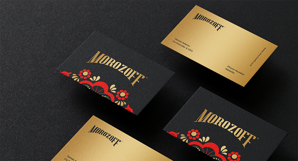
Brand Mission
Morozoff provides a taste of home for Russians, whether it was their grandmother’s kitchen where they immigrated or they left Russia last year.
Brand Story
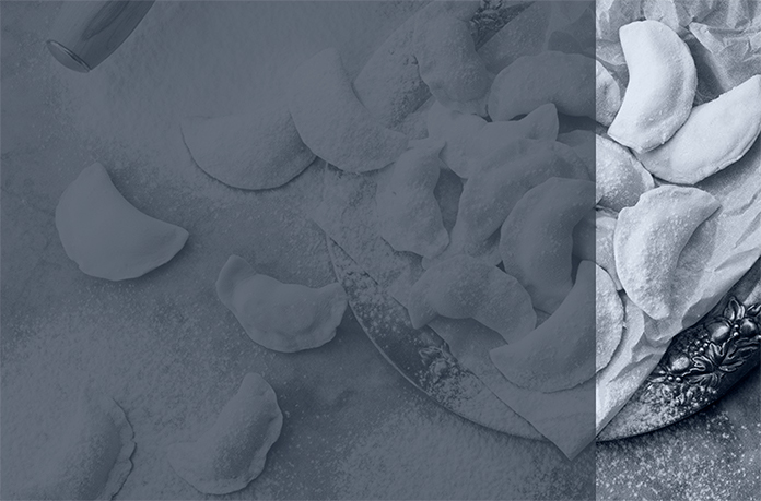
Morozoff began when the founder discovered a lack of authentic Russian cuisine available in the USA. After frustrating attempts to cook her own and finding her grandmother’s recipes made too much, she decided to expand into the frozen food business to help others in a similar position find a taste of home.
Brand Values
Authenticity – Morozoff uses authentic recipes handed down through families for generations to create the perfect bite.
Family – Morozoff knows that food is part of every family’s traditions and enjoys supporting families in making connections.
Tradition – Tradition creates great food, and Morozoff respects the traditions that go into every meal.
Respect – Respect is the basis of any relationship, and Morozoff implements respect at every stage of its operations.
Brand Differentiation
Morozoff produces authentic Russian dishes for the freezer section. As this is not a crowded niche in its native market, this sets the brand apart in the freezer and consumers’ eyes. The differentiation made it an immediate hit once the products were released.
Brand Voice
Morozoff uses a serious brand voice that displays significant knowledge of traditional ethnic Russian culture and food. This voice is a natural choice for the brand since it matches the culture of the food and is well understood by the community.
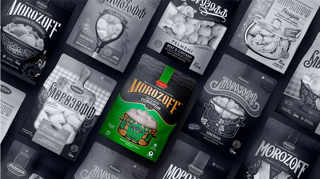
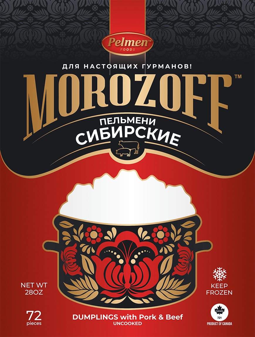
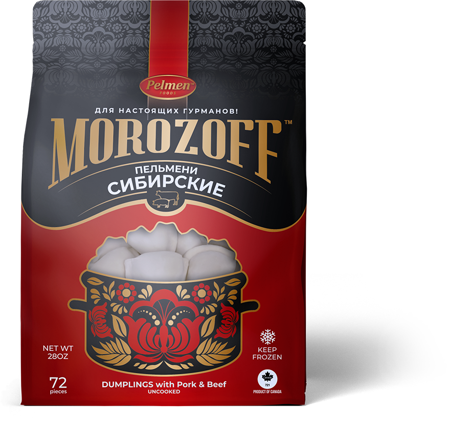
Packaging Elements
Colors
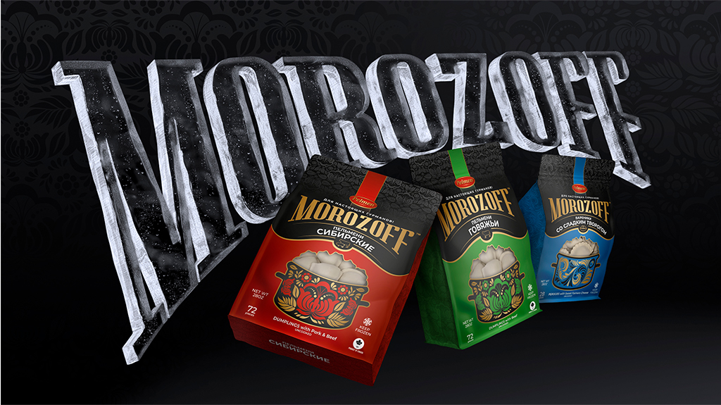
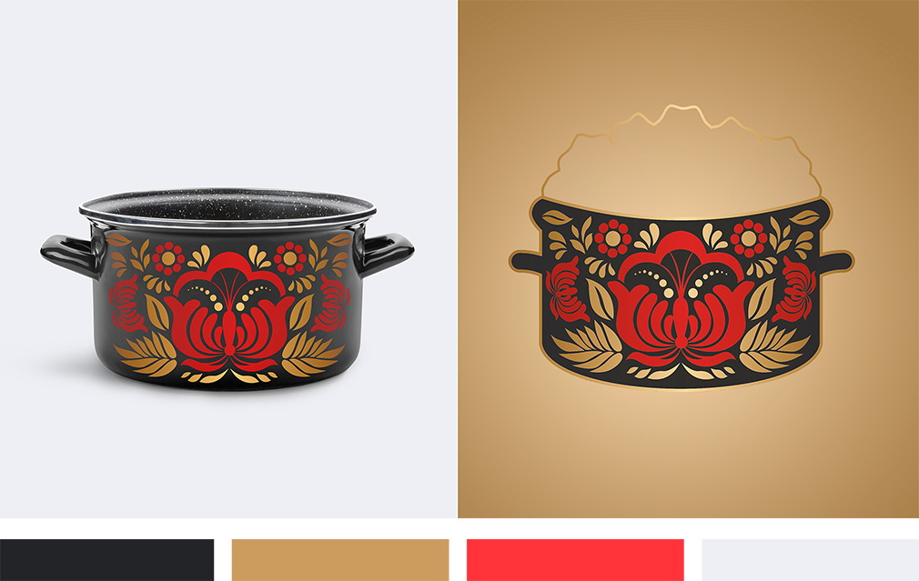
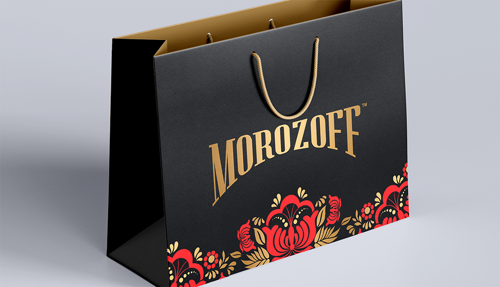
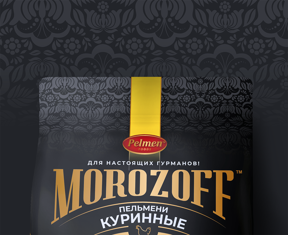
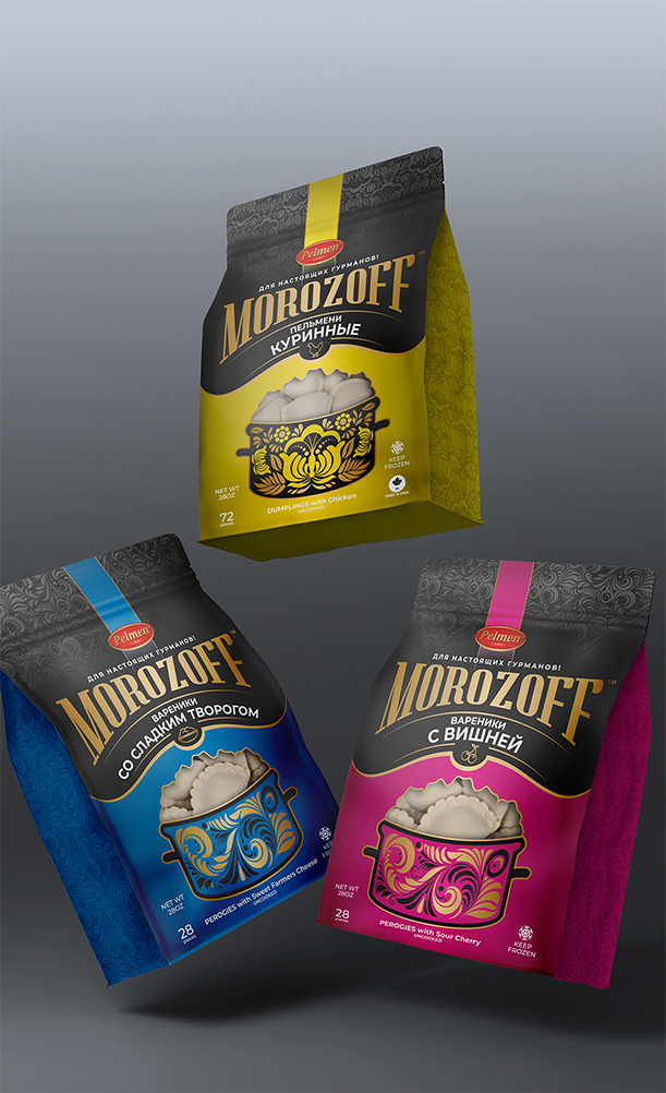
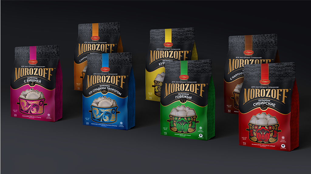
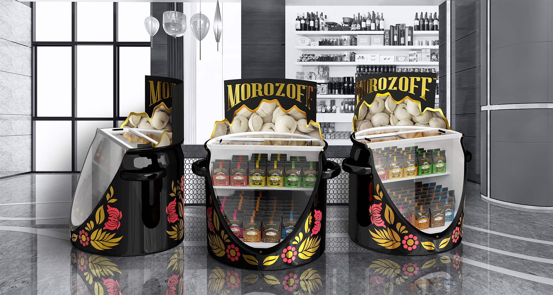
Morozoff uses rich, well-saturated colors common in Russian art as part of its palette. These choices help consumers tell the various flavors apart while still providing a consistent look.
Visuals
Morozoff chose a traditional-looking pot as the anchor for its visuals. The decorated pot changes color and design with the packaging changes for different flavors but remains the same size.
Typography
Morozoff uses a bold serif font for its logo combined with a sans serif font for the rest of the text. This combination creates contrast in the packaging and ensures that all labeling is clear per regulations.
Format
Morozoff uses both English and Russian labeling for an authentic feel to the packaging. The language combined with the product window helps consumers make their choices.
Brand Targeting
Morozoff targets ethnic Russians and those who have spent time in Russia. The brand focuses on those who have experienced the same type of food at some point in their lives rather than trying to draw new individuals in the USA into the wonders of Russian comfort foods.
Brand Positioning
Morozoff aims to remain affordable for most of the population. The company is specifically positioned in markets most likely to attract people who crave a taste of home rather than taking a broad approach many frozen food companies enact.