Brand Mission
Aloe Love aims to disrupt the beverage industry with freshly formulated aloe juice beverages that quench thirst and deliver health benefits.
Brand Values
Health – Aloe Love beverages can be part of a healthy diet, and the company seeks to encourage everyone on their journey towards their health goals.
Clarity – Aloe Love believes that clarity across operations, from ingredient sourcing to marketing direction, can change the world.
Mindfulness – Aloe Love practices mindfulness around the products it produces and throughout the company’s presence to deliver the most benefit possible.
Humor – Aloe Love believes in the benefits of humor and strives to implement those benefits for customers throughout its public presence.
Brand Differentiation
Aloe Love sells beverages made with aloe juice, which is not a common option in its native market. This ingredient choice serves to differentiate the brand along with its public voices that use humor rather than the fun that many beverage brands choose.
Brand Voice
Aloe Love uses a witty, humorous brand voice to convey its messages. This choice, combined with the knowledge and activity the brand conveys, helps it appeal to the most common subset of purchasers from the grocery store chains stocking the beverage.
Brand Identity
Aloe Love uses bright colors and contrast throughout its brand identity. However, the company aims for clarity wherever it shows up, leading to a minimalist-inspired approach to visual elements so that the brand voice personality is the driving factor in the brand identity.
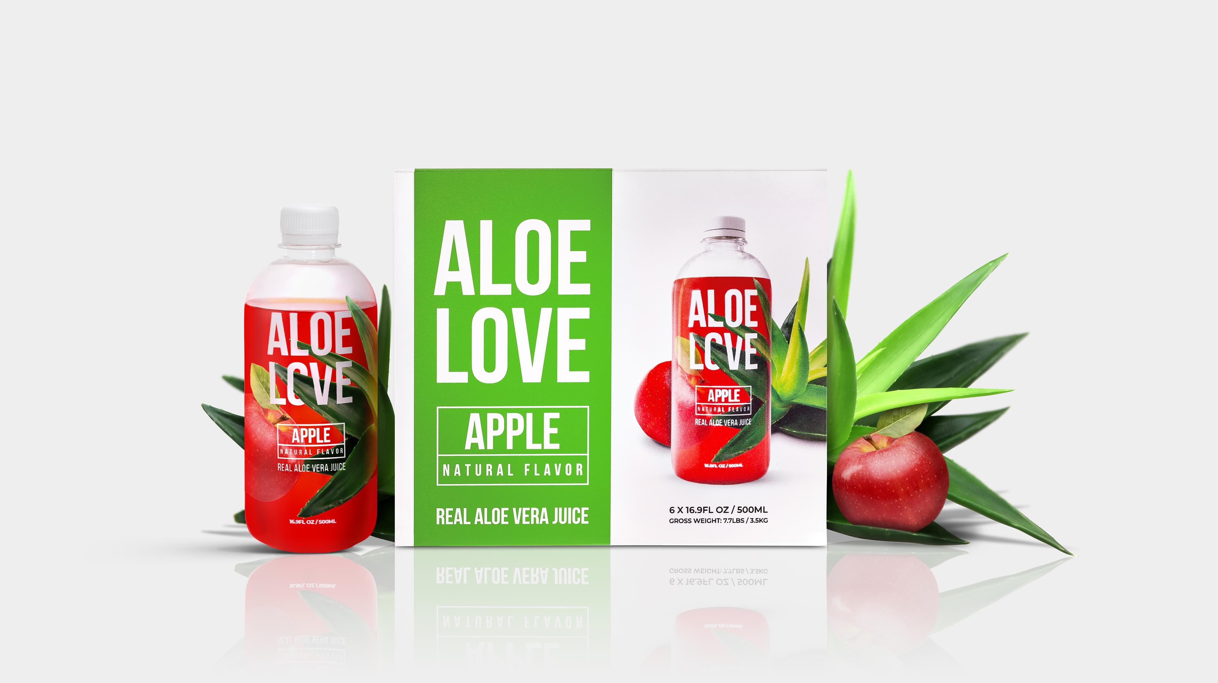
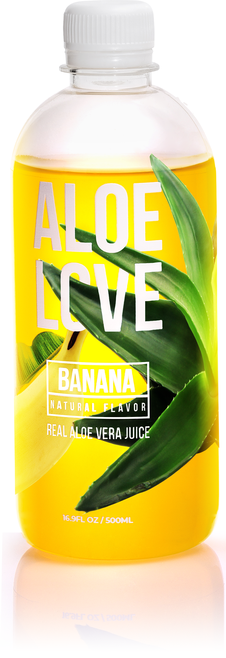
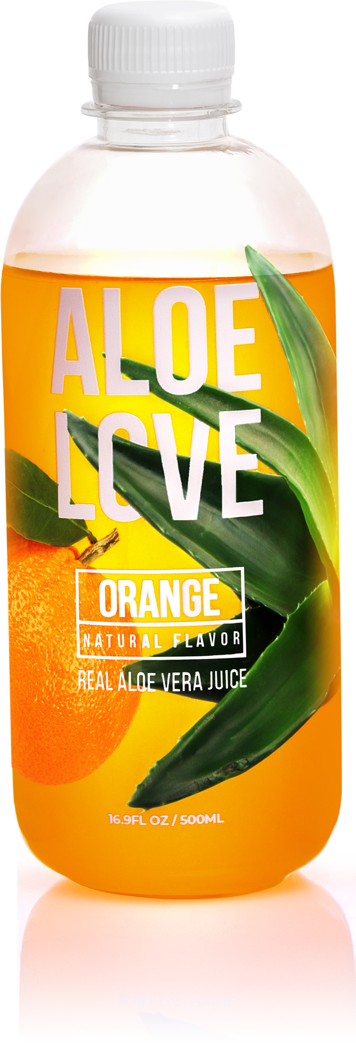
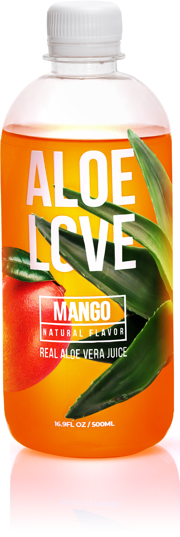
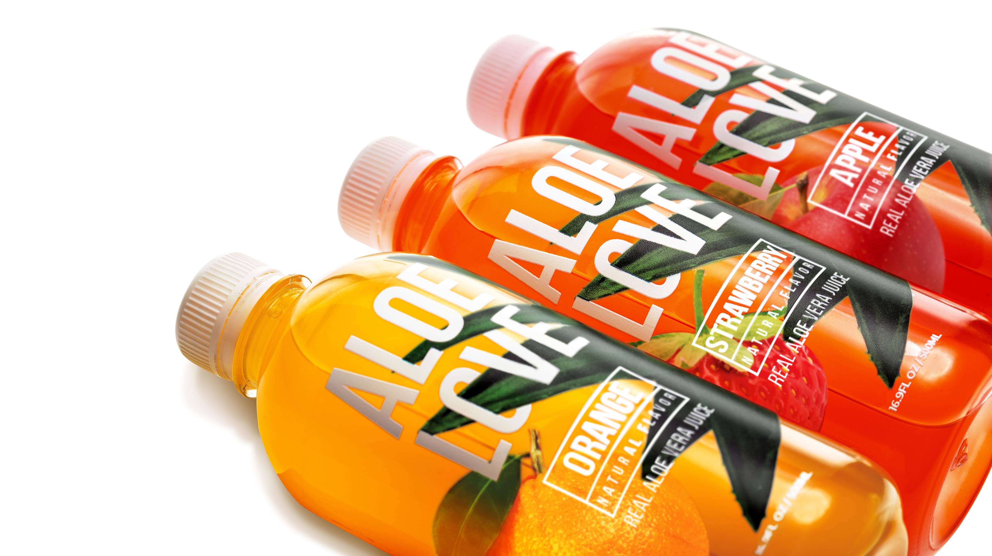
Packaging Elements
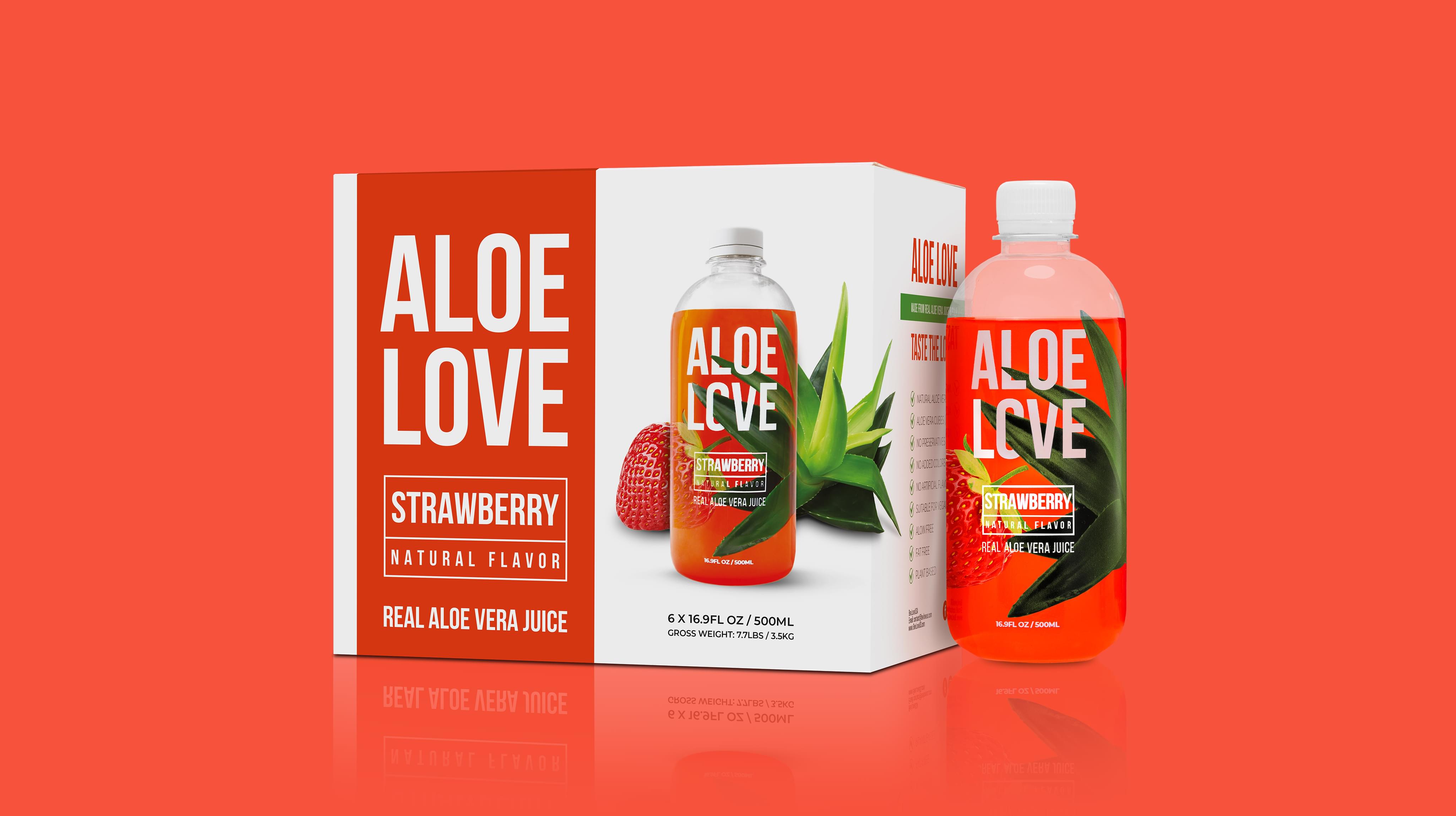
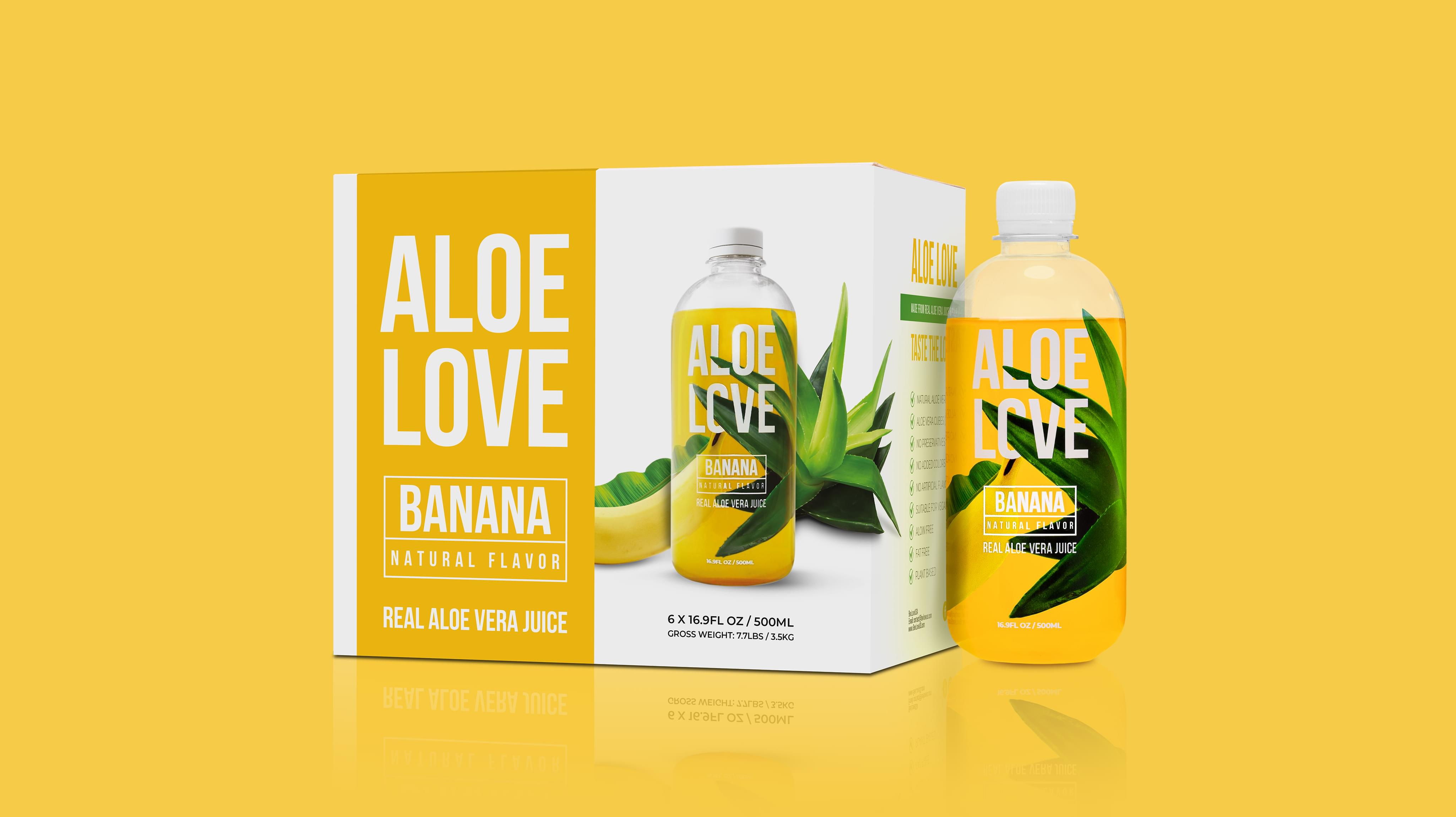
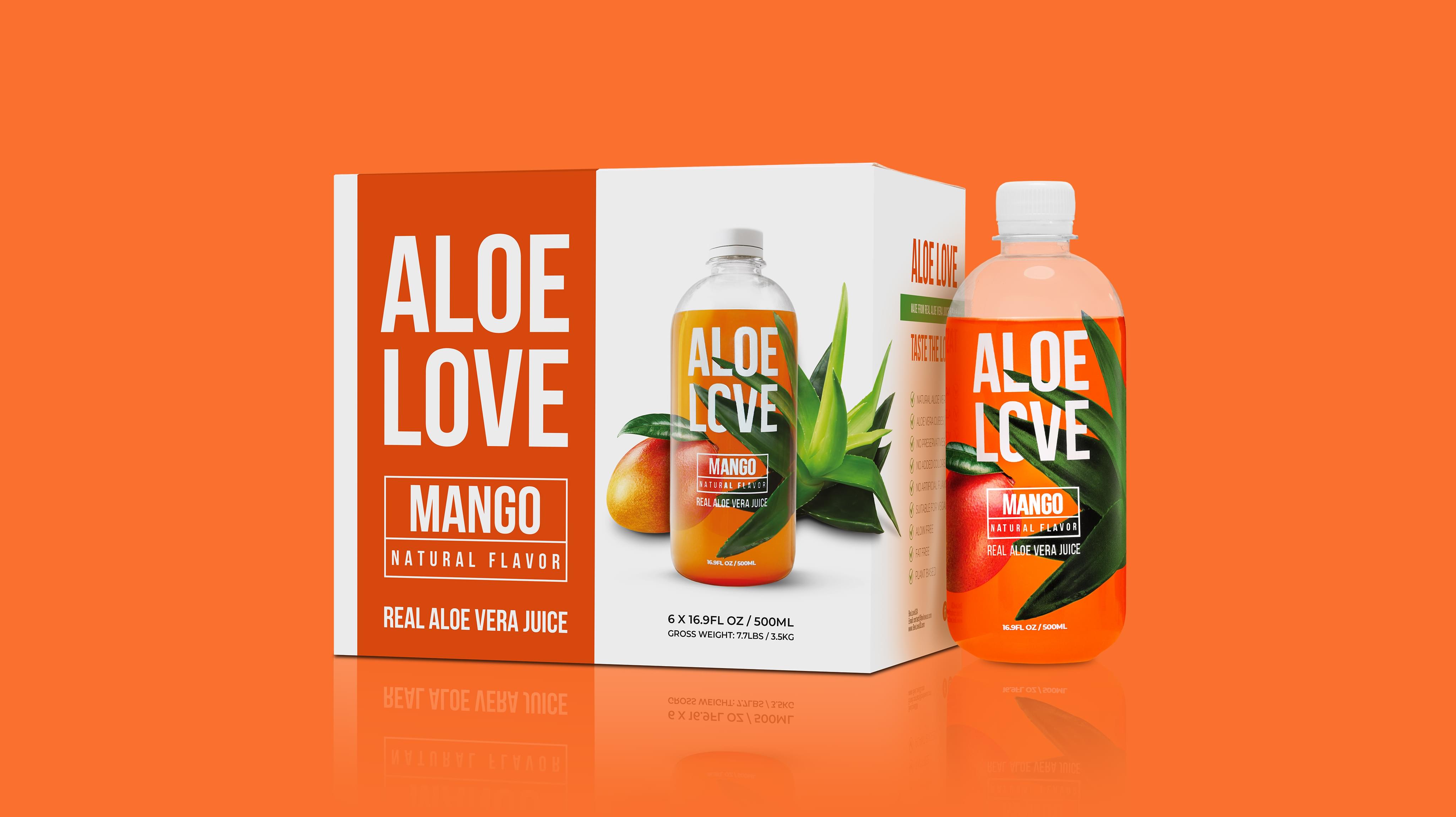
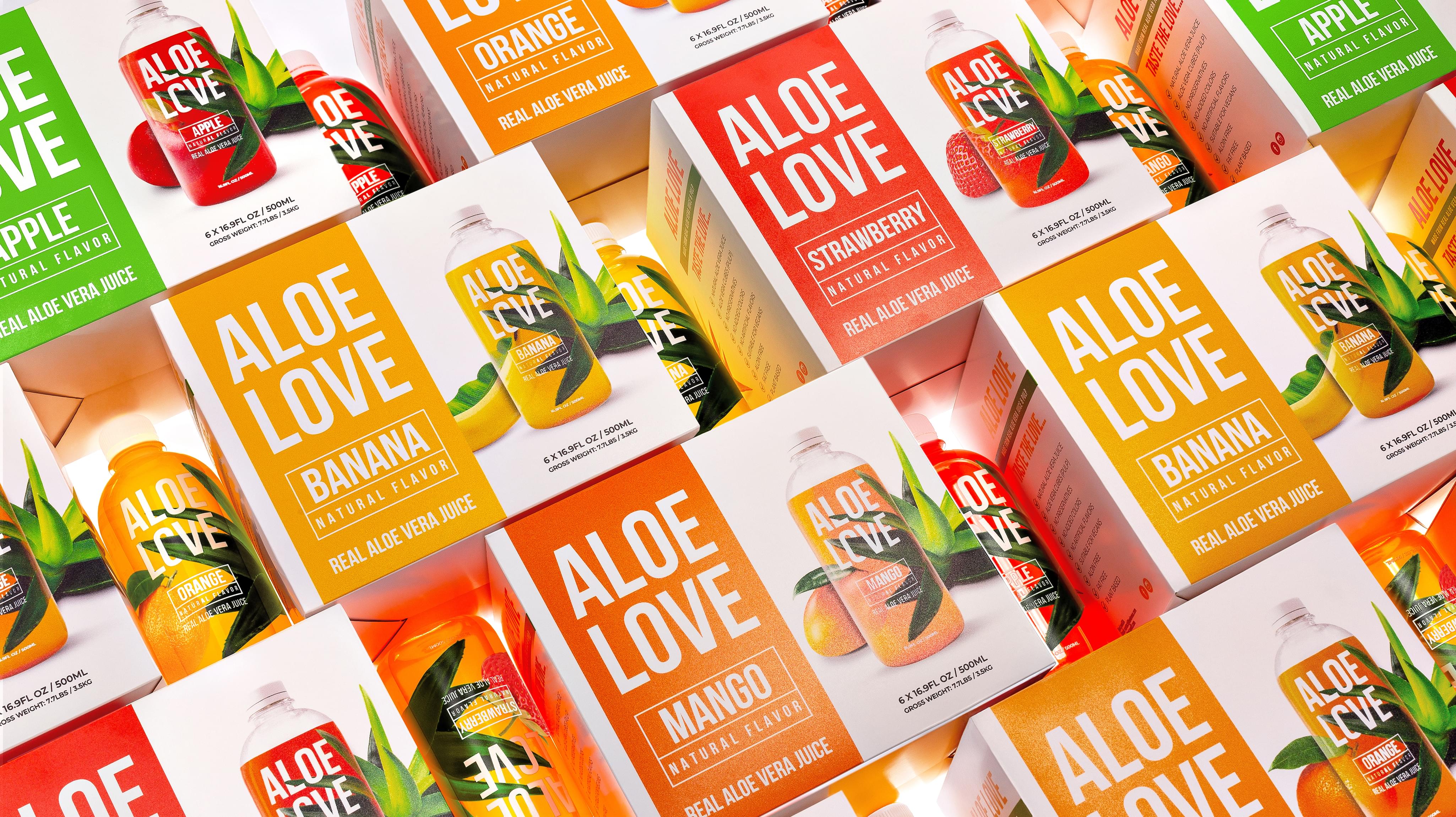
Colors
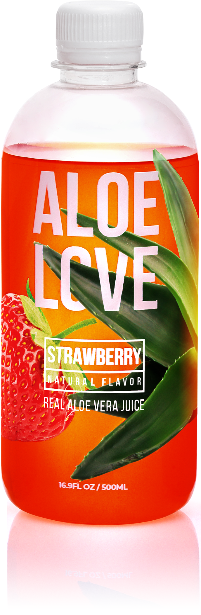
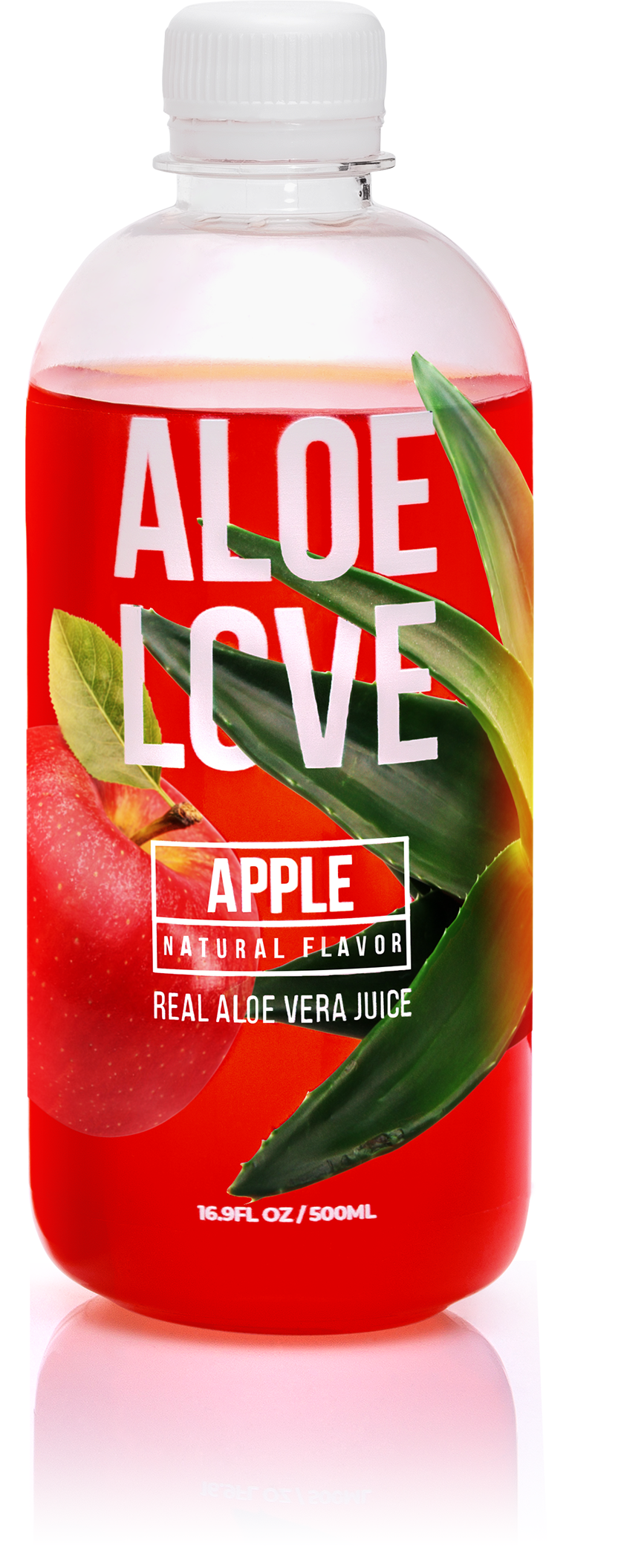
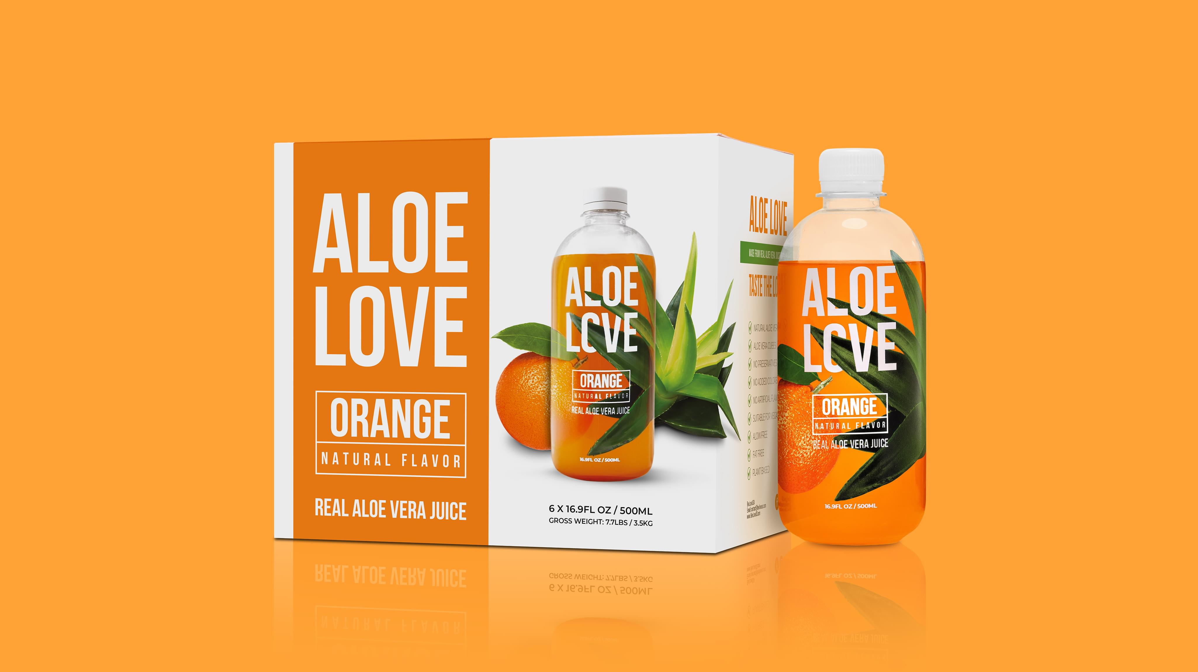
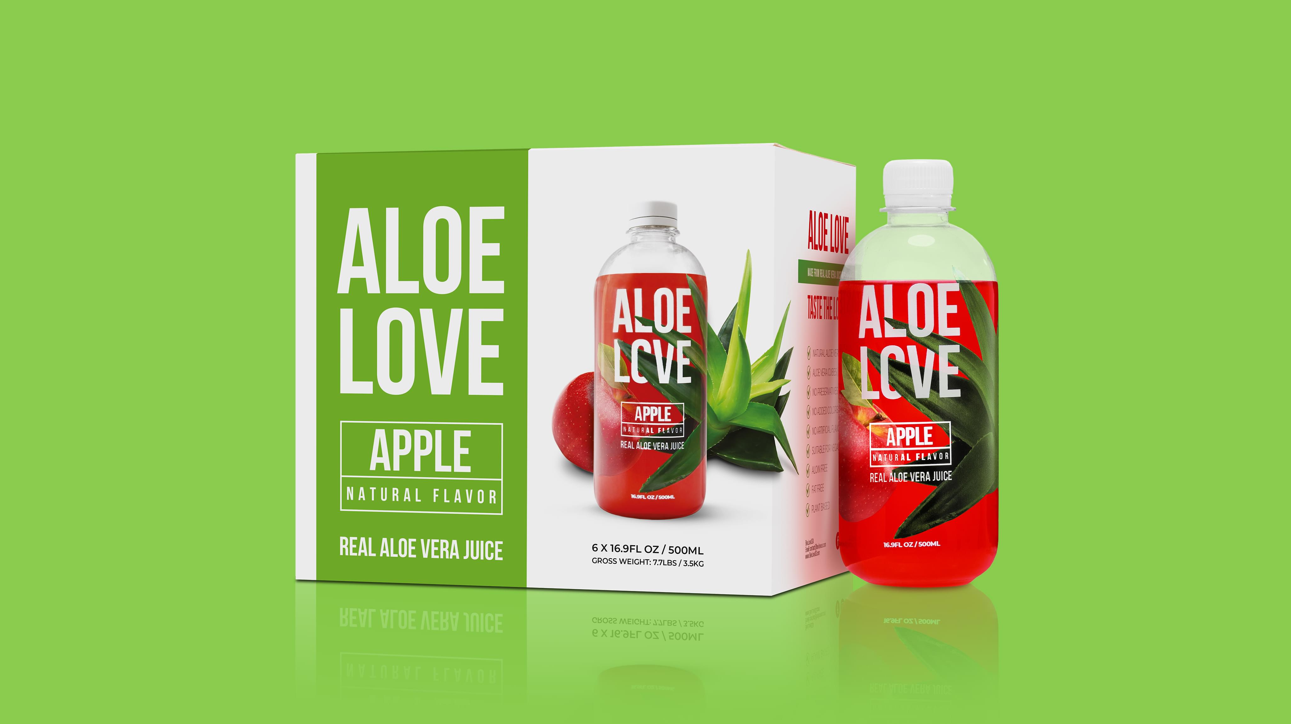
Aloe Love uses vibrant colors in the packaging design that match the flavor of the specific beverage. This decision ensures consumers recognize the flavor they pick up each time.
Visuals
Aloe Love centers around aloe juice, so the plant was a natural choice of visual. Additionally, each package pictures an image that represents the flavor, like an apple for apple flavored.
Typography
Aloe Love uses minimalist sans serif fonts in its packaging design for clarity. The decision ensures the packaging has the best chance of being recognized in any medium.
Format
Aloe Love uses a dual part format on its packaging to give itself agency over customization for flavors. Each flavor has large color patches alongside a custom bottle image for recognition.
Brand Targeting
Aloe Love primarily targets grocery purchasers, who tend to be middle-aged and female, though not overwhelmingly so. Aloe Love appeals to the need for healthy hydration that does more than water, which is attractive to this subset of consumers who often shop for families.
Brand Positioning
Aloe Love is an accessible beverage. While the price is more than a standard six-pack of soda, Aloe Love is still priced so that consumers do not need to adjust their budgets radically. This decision, combined with the unique brand identity, makes Aloe Love an approachable brand.