


Learn how to increase your site conversion rate and sales using icon branding. We will equip you with world-class branding strategies to create the best icon set for your brand.
Do you know that 88% of online buyers stated that they would not patronize a brand after going through a bad user experience? The marketing data makes sense as it is natural to judge a brand based on the site outlook.
From our 8+ years experience of branding over 150 top seller products, we have seen firsthand how the icons used on a company’s website can make or mar their lead generation campaign. The better the user experience, the higher the lead conversion rate.
Are you wondering how glyphs affect your site conversion rate? An icon set or glyph set is to your site users what the store assistant is to your real-world customers. It guides users throughout their journey with your business. As users proceed from your homepage to your about section, the brilliantly placed icons will help them navigate better. As research shows, Icons that are uniquely designed for your organization and consistent with your brand aesthetics tend to perform better than the cheap off-the-shelf ones.
Keeping up with consumers’ expectations is hard without professional help. Stan Branding has been offering professional icon branding services to more than 340 partners since its inception in 2014. Our award-winning agency has been cosigned by established publications from Forbes to Clutch magazine. In case you need a professional diagnose why your site users are not connecting with your brand or you can’t wrap your mind around the concept of icon branding, you can get a free pre-development of your project from our CEO, Stan Kurkula.
After investing much energy and Benjis into logo branding, It is tempting to think you are ready to launch your brand. Of course, anyone would think…Why wait any longer? Completing nearly more than 500 unique projects, we can say that successful brands have glyphs that are as memorable as their brand logos. Who does not know the “Facebook like” icon, Twitter retweet icon, or Amazon cart glyph?
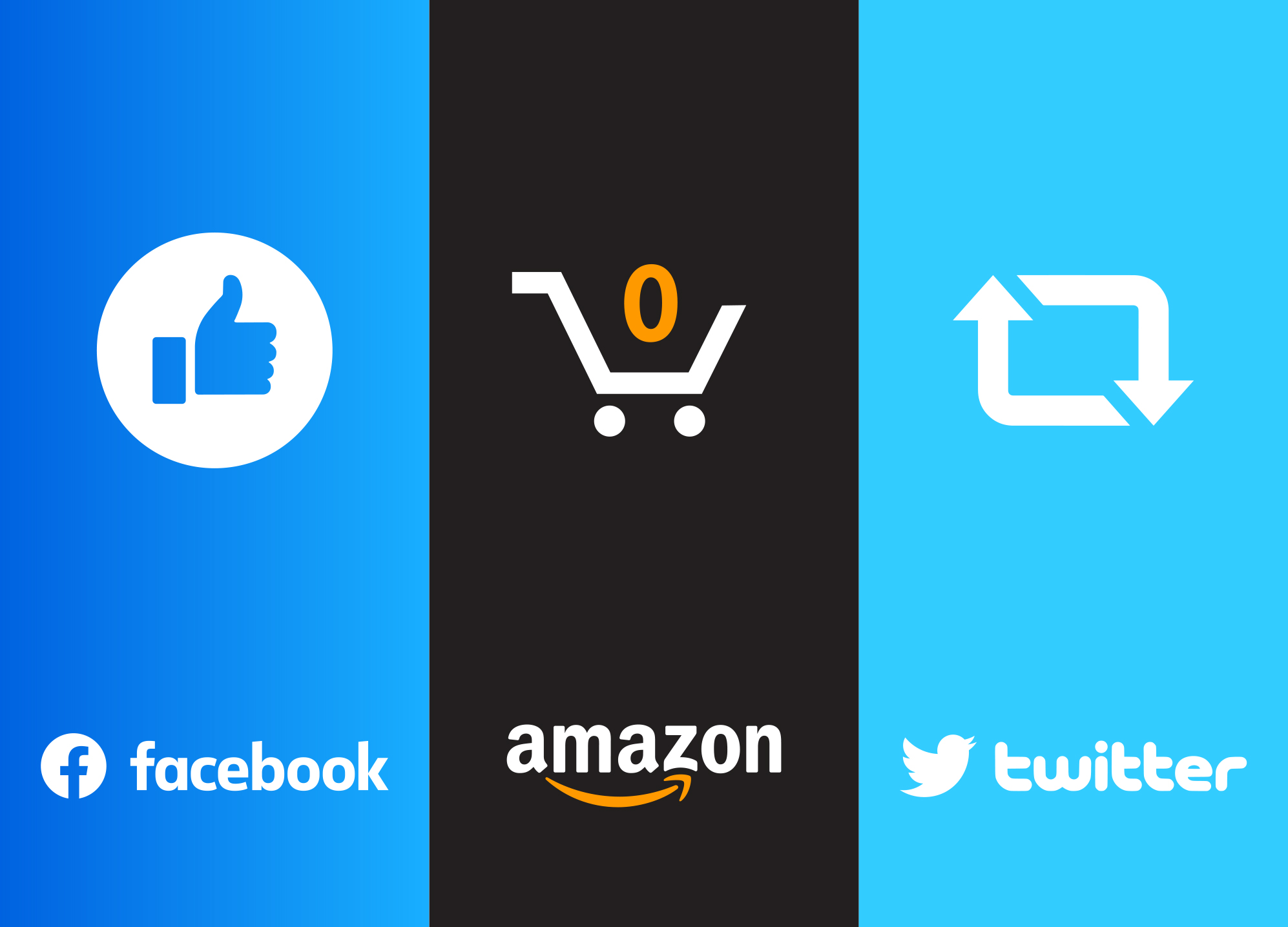
Image source: https://www.facebook.com/, https://www.amazon.com/, https://twitter.com/
Icon vs Logo
To an untrained eye, icons might be confused for logos. Citing examples from our past projects, we will explain the differences between icon branding and logo branding and how you can make them yourself. There is an endless list of things that look similar but have totally different roles – like margarine and butter, sea and ocean, turtle and tortoise, shrimp and prawn, alligator, and crocodile, and of course, icon and logo. In this section, we will solve, for once, the growing debate among designers over the similarities or differences between digital representations.
What is a Logo?
The logo is a perfect representation of a company’s identity or core values for instance the swoosh logo of the Nike brand represents motion and speed – according to Phil Knight (founder of Nike). It can also be defined as the face of a brand or a unique visual representation that sets a particular company apart in the market. In the words of Stephen A. Greyser, it is the “living and vibrant symbol of a firm”.
No two companies have the same logo. A company can license its trademarked logo out to another business with explicitly stated rules governing its use, but under the law, only one company can own a logo.
Every branding project requires a unique approach and by working with more than 850 happy clients, we have employed different types of logos, namely wordmark, letterform, pictorial mark, mascot, abstract logo, emblem logos, monograms, among many others. These types of logos differ by the inclusion or omission of text, typeface, fonts, and dimension of graphics.
What is an Icon?
An icon aka glyph, pictorial representation, emblem, or small-sized digital image is a minute graphical representation that helps an app or site user identify a particular software function, action, or analogy. It is a minimalist approach to UI design that replaces texts with symbols or small images. For instance, the hamburger button, which has no connection to the real-life hamburger, is universally used to toggle a site menu. Also, the home pictorial representation, which looks like a house, is used to navigate to a site’s homepage.
You don’t always know what icons fit a particular project until you try out various prototypes. During our brainstorming sessions, our team of designers leave no stones unturned and utilize different types of UI icons namely, reference, resemblance, flat, arbitrary, semi-flat, and skeuomorphic icons. Like the logos, icons are divided into different groups based on the varying dimensions, symbolism, direct or indirect connection to function, and arbitrariness.
![]()
Why Businesses Need Branded Icons
Branded Icons bring users closer to the brand while helping them navigate your site. It is the middle child between exclusivity and universality.
While emblems are primarily used in communicating ideas and actions to site users, branded glyphs can also be used in infographics, packaging, presentations, media kits, pricing guides, landing pages, online forms, and many more. The application of an icon is endless. But the goal of icon branding remains the same – they boost your lead conversion rate. Sometimes, icons evolve into standalone brand identities that are useful outside the borders of the World Wide Web like signage, flyers, and customized t-shirts. For instance, people mistake the iTunes glyph for its logo because they have gotten used to it, giving the once-anonymous icon a life of its own.
The iTunes brand icon has gone through 8 evolutions in the past 21 years. Like a phoenix rising from the ashes, it is a remake of Apple’s former logo. The pictorial representation communicates its essence which is infinite quality music through the musical note symbol placed in a circle. Three colors were brilliantly utilized while making the iTunes icon, namely steel pink, medium orchid, and light deep pink. The color combination indicates happiness and joy – two qualities many people seek from music. Like Apple, your brand can also become well-known for its excellent icon sets while becoming an essential part of your audience lives. You see, people are always looking for communities to join and new brands to share with their loved ones. However, this primal desire is only activated with great design, solid identity, and brand story. Believe me, no one wants to share wack marketing designs. At Stan Branding, we have discovered that the common cause of lack of growth in many brands is they all have bad or average designs that do not bond with users. Can you imagine paying thousands of dollars for such lukewarm designs? We have created a free project development consultation for brand owners who are stuck in between uninspiring brand touchpoints and the need for more leads, from our CEO, Stan Kurkula.
Below are the reasons every brand needs a branded glyph set.
Enhance user experience
Usability and findability are two of the many factors that enhance the user experience on your site. Branded glyph designs help users discover the items they are looking for on your site, bringing them closer to the relevant information that drove them there. Without bombarding your site with wordy instructions, users would know where to click when they are on your website.
Ranked as one of the UX websites with the best icon branding in the last decade, Nurture digital is definitely the epitome of what a 21st-century website should look like.
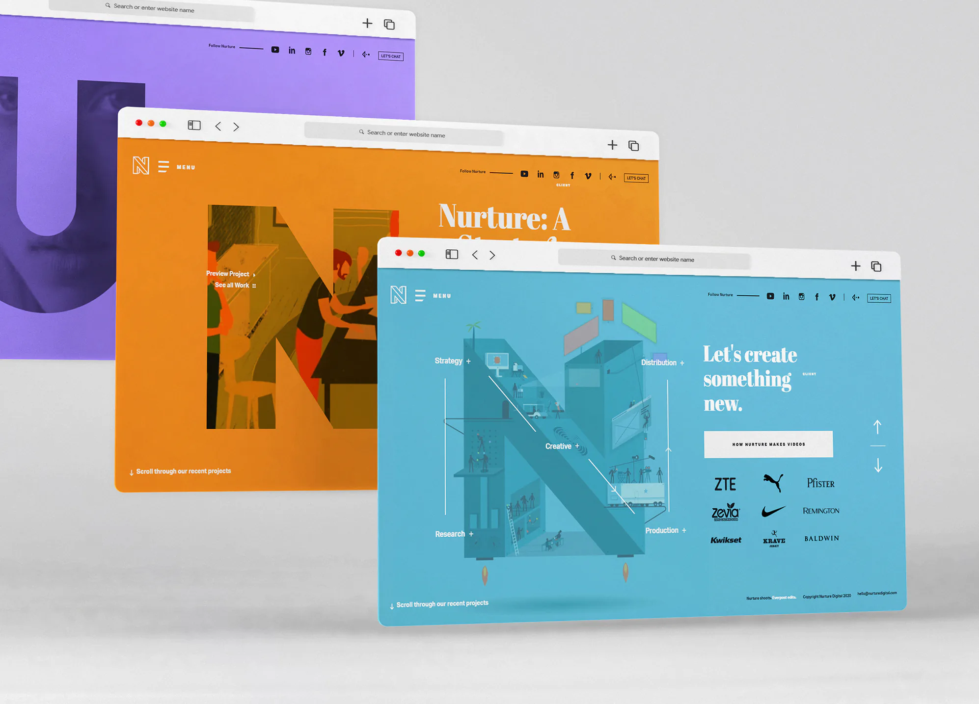
Image source: https://nurturedigital.com/
The website was designed with a cool minimalist approach. On its first page, the designers made the best use of glyphs in spreading the gospel about their creative process and popular partners. Instead of using archaic “next” or “back” navigation buttons, they employed two arrows.
Simplify complex concepts
The key to effective communication is simplicity. When words fail to explain complex concepts, icons speak. Concepts that require a thousand boring words to explain can be explained successfully using interesting pictorial representation.
Icons are effective in educating your prospects about your services, getting them to act fast, and proving your professional skills. Two of the websites with the best icon branding, as far as using small-sized images to explain complex concepts is concerned, are the Orangina website and the Nine Hours Hotel website.
The Nine Hours Hotel is an extreme example of how pictorial representations branding can be used to communicate effectively even in the absence of text. The Nine Hours Hotel identity is built on minimalism at its finest, hence the reason for its devotion to the use of glyphs. When visiting the hotel, customers are directed to their rooms via the emblems on the floors, walls, and doors. Its strict commitment to icon branding is displayed online and offline.
Unlike the Nine Hours Hotel, Orangina is not so heavy on iconography but its colorful and minimalistic approach to breaking down its process is noteworthy. The site directs consumers on the best way to enjoy their juice products. Even though the site features texts, the presence of the icons further simplifies and gives the message a richer feel.
In a computer-savvy world, users can tell a wack icon set from a professional one. We do not recommend leaning towards off-the-shelf design packages; since such can reduce the quality and uniqueness of your site. If you want to play the long game in your industry, it is best you hire award-winning designers to create visually appealing designs that speak to the identity of your brand. Stan Branding is a one-stop-shop for icon design, logo design, marketing design, brand development, and packaging services. Our expert team creates pictorial representations that are applicable on websites, apps, presentations, user guides, online forms, and packaging materials. Over the past year, our designers have received more than 15 awards for creative and unique design solutions and 7 awards for deep commercial understanding of the market. If you have questions that you would like to ask our experts, you can use the “free project pre-development” service, where the CEO of our agency will share his experience and give you some tips on how to become #1 in your industry.
Makes your site content come alive
Infographics contain icons, charts, and texts. However, without icons, infographics would be boring and unrelatable. In a research conducted by PNAS (Proceedings of the National Academy of Sciences of the United States of America), it was discovered that pictures were recollected by the human brain faster than words. The researchers got to this conclusion with the aid of positron emission tomography, a brain-mapping procedure effective in detecting the brain’s response to words and digital emblems.
Completing nearly 100 unique projects, we can say icons, unlike texts, are universal and need no translation. To communicate with your international clientele via texts, you need to translate into quite a lot of foreign languages – a costly and strenuous process. When done right, icons can help you get the right message to a diverse group of audience. Due to its DIY nature, Canva ensures that its website exploits the use of icons in helping small business owners create graphics easily. The different types of artworks attainable on the website such as social media posts and videos are illustrated using icons.
How to conceptualize icons
Creating professional icons requires years of research, practice, and a deep commercial understanding of what gets your audience excited. In this guide, we will walk you through the DIY steps involved in the conceptualization of glyphs.
Brainstorm
As research shows, getting the first idea out regardless of its crudeness is key to the branding process. The fear of getting it wrong can trump your creative flow, hence we recommend you start with a few crude ideas and refine them as you proceed. When brainstorming, you need to think about the purpose of the icon and the audience. For those who already have brand colors, you don’t have to overthink what color to use since you can borrow from your brand color sets or find colors that complement them. For instance, Facebook brand colors are blue, white, gray, and black. When you take a quick peek at their glyphs, you will discover that they simply recycled their brand colors and in some cases adopted complementary ones. The ‘Facebook like’ emblem is made of blue, the message pictorial representation is made of white and blue, and the ‘upload photo’ icon consists of white and gray.
Let your dictionary guide you
You may be thinking out loud, “how does a dictionary help me with icon branding?”
You will discover the reason in a minute. Keep reading!
In storytelling, writers replace regular words with stronger nouns and verbs to make character actions and environment more colorful in the reader’s mind. Also, writers tend to avoid overused words and clichés. Why? This is because overused words or regular clichés deprive a creative work of depth. Instead of, “the paper fell off the table”, we can replace the word, fell, with drifted, specify the type of paper used and give it a bit more context. The new sentence would read, “The A4 paper drifted off the table in response to a gentle toss from the cold breeze. It’s beginning to rain.” The same technique can be applied to icon branding.
For instance, in 2020, YouTube introduced a new icon for users to upload and watch short videos, and rather than use cliché words like ‘story’ or ‘status’, the company ingeniously named this new feature ‘shorts.’ Thanks to this display of creative icon branding, YouTube has been able to secure sky-high revenue, giving other video apps like Tiktok a run for their money.
If you intend to spark a feeling or thought in the mind of your reader, write down the idea and search for synonyms of the same word that are concrete nouns. If you want to depict wealth, you can search the dictionary for concrete representations of wealth such as cash and coins. In our many years of experience in branding, we have discovered that the best way to keep fueling your sales funnel is to get consumers hooked with small-sized images that solve their problems. Don’t use cryptic icons; use clear ones that allude to the items they are longing for. That way, they will know right off the bat that you (or your business) are the real deal.
Pick the right icon style for your brand
You should consider the different types of styles available to get the right picture of what you’re looking for. Your icon can be isometric, skeuomorphic, or flat. Isometric pictorial representations present a drawing from a birds eye view, giving users a three dimensional feel of an object using just two dimensions. For instance, Apple used isometric glyphs in its on-site campaign for its iMac24. Also, check out the popular brands using these styles for more inspiration. Skeuomorphic designs retain the attributes of the original objects. Good examples of skeuomorphic designs are those used in android apps such as notes, clock, videos, messages, photos, etc. Unlike 2D icons, flat glyphs have smooth and crisp edges. They do not have shadows or gradients. One company that is fond of using Microsoft. The major part of your Windows OS user interface is built with flat web design.
It is noteworthy to add that you need to stick with whatever style you choose throughout the creation process. If you choose 3D, every small-sized image on your icon set will be 3D. The same is true for all other icon branding styles. Don’t complicate the style as simplicity and clarity are the two qualities shared by the best designs.
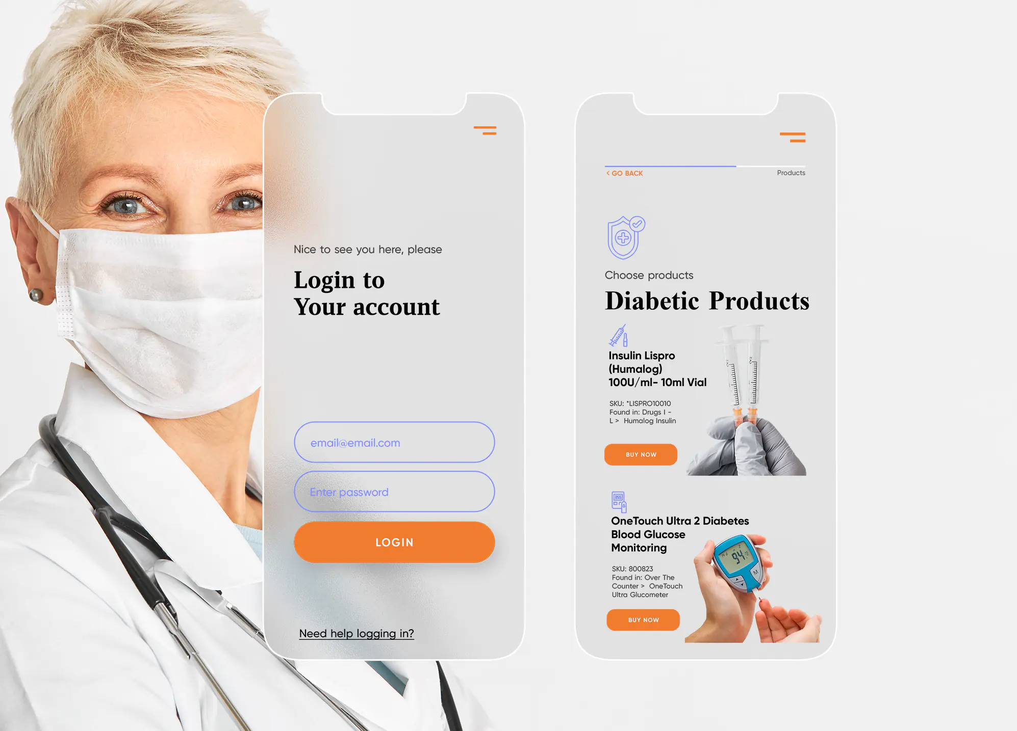
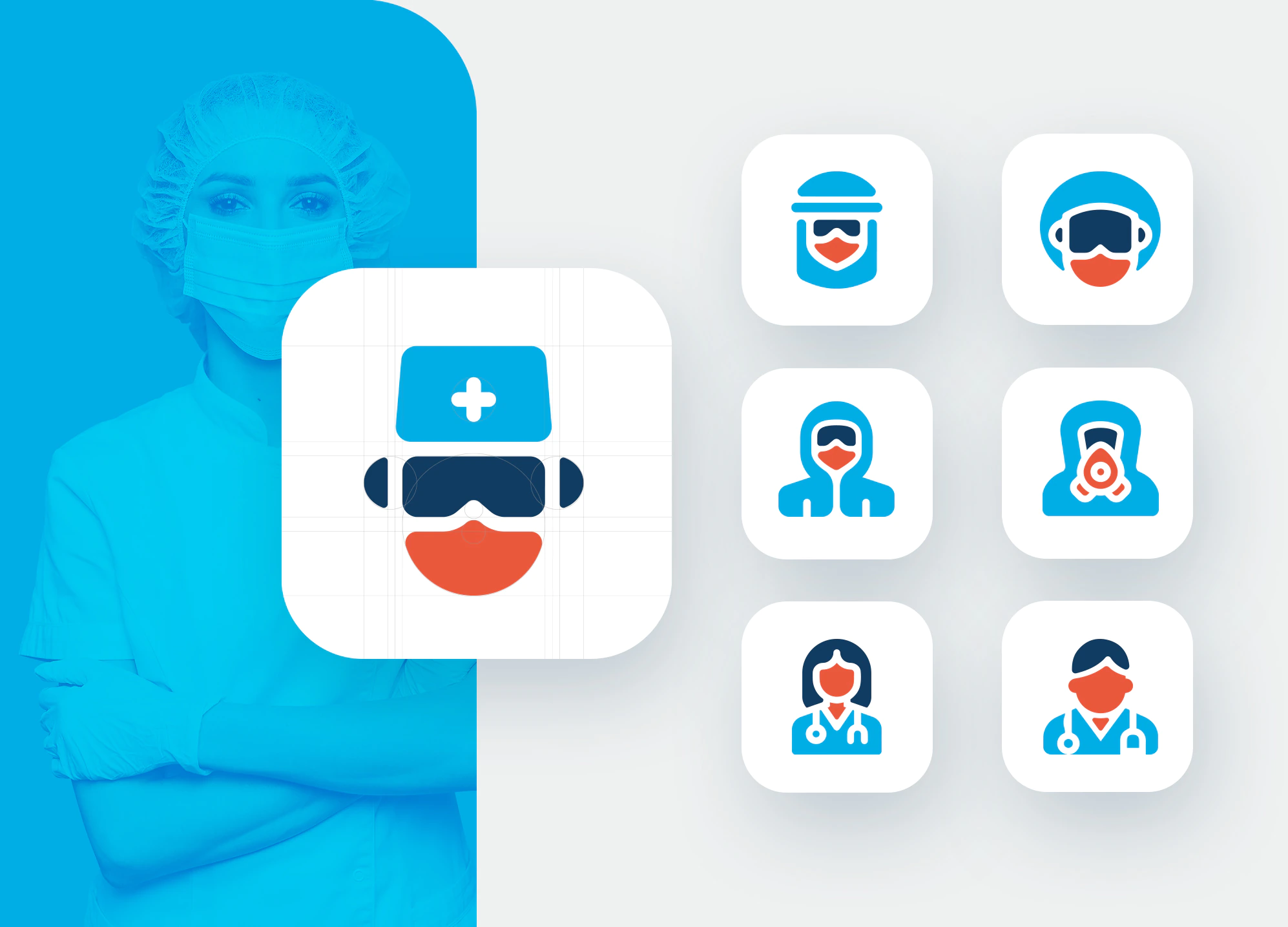
The usage of custom small-sized images on your website and physical branded materials defeats the sole purpose of icon branding. Some business owners realize this truth late and spend twice the amount they would have spent if they had the information earlier. A good example is DME, a medical supply firm based in Chesterfield, Virginia.
Our award-winning agency was contacted by the CEO of DME (Durable Medical Equipment). Isabella was referred by an old client who has had great success after we helped them rebrand. We were tasked by the company to come up with a winning design for their site. One of the many challenges the site had was that the pictorial representations lack clarity and sense of purpose.
Stan Branding’s leading team of designers built DME’s icon set from scratch using orange as a dominant color. The orange color conveys the friendly and vital nature of the DME brand. After general brainstorming of our expert team (marketers and designers), we decided to create icons that mirror the likeness of their products and services. With the aid of light-weighted lines, our designers created winning designs that are consistent with the site design and represent the delicateness of their products.

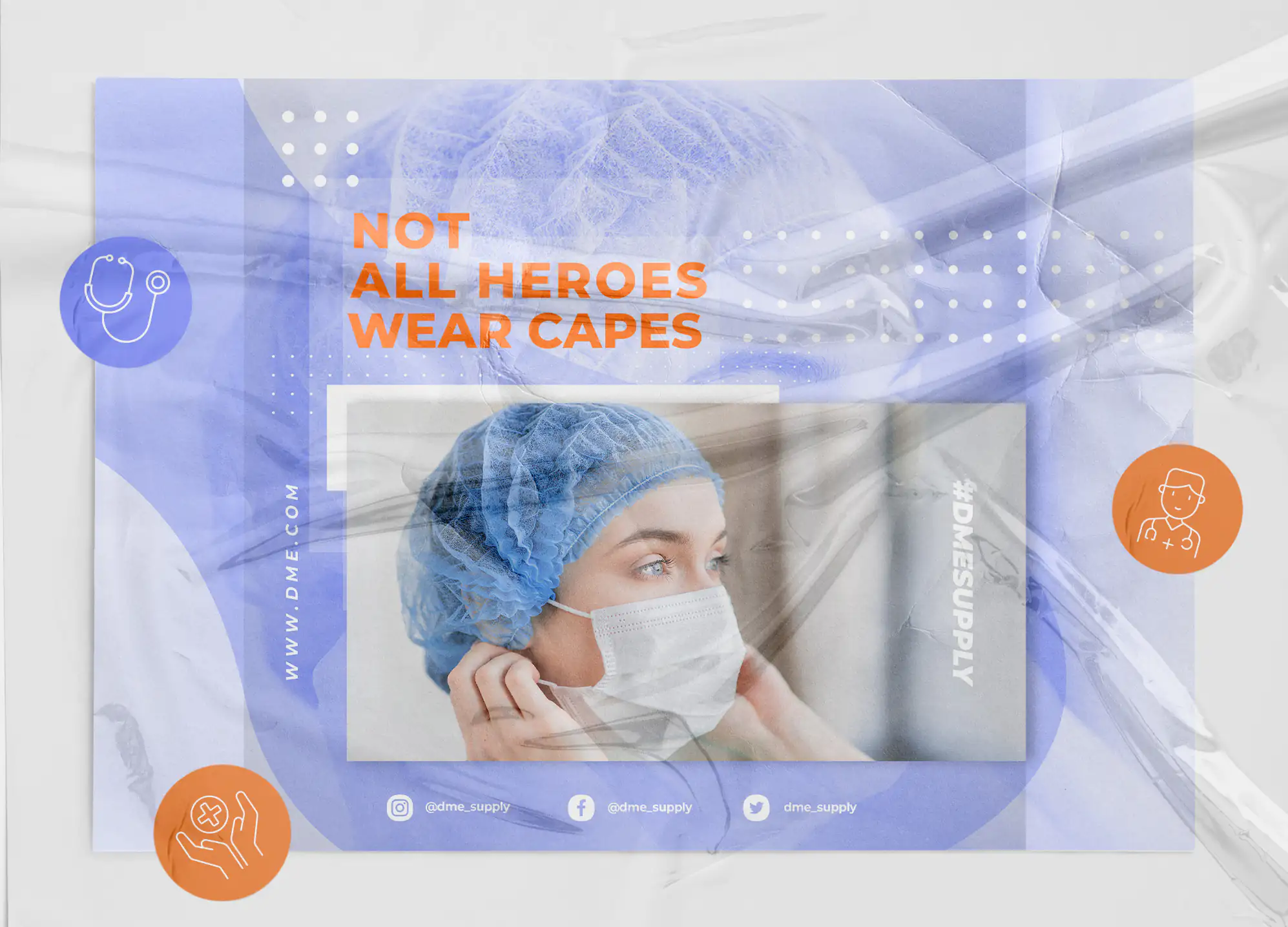

We approached the DME site design with a high-level of creativity while maintaining a clear template across the design set. Thanks to our many years of experience in branding, we understand that an icon design needs to be simple and minimalistic in order to retain its details when its size is altered.
To deliver a unique completed project on time and budget, we used our patented branding tools, preview pixel mode and grids to fine tune the designs.
The DME site was featured on Wikihow on the 10 sites with the best icon designs. Three months after the DME site was relaunched, their product sales via their website went up by 33%. The company was ranked according to a The Telegraph research as the second-biggest producer of medical equipment in Chesterfield in December 2021.
Pen down a detailed plan
Take the crude ideas we talked about earlier and polish them until a detailed design plan forms. Your design plan is an advanced form of your initial crude ideas. Ensure the color palette, size, shape, and style are clearly stated before initiating the full-fledged icon branding process. Having bagged 12 awards for our service to 340 partners, our success secret is that we plan ahead of every project and we carry our clients along when making important decisions on behalf of their business.
Start designing
Once your plan is ready, you can start designing. There are many graphic editing programs you can employ in icon branding such as Adobe InDesign, Corel Draw, Adobe Photoshop, Microsoft, Canva, Adobe Illustrator, etc. The best program for you depends on your skill level. Canva is great for beginners while professionals can use Adobe products. Our expert team of designers uses the most advanced design tools like AutoCAD, Adobe Photoshop, and Adobe Illustrator to arrive at the best design outcomes.
Check for possible plagiarism
Nothing is new under the sun. It is possible to unintentionally make a logo similar to an established logo even if you have not come across the logo before. There are several companies that have similar logos such as Airbnb and Azuma drive-drive-in, Starbucks and Starpreya, Ubuntu and Human Rights First, Gucci and Chanel, and many more. To prevent your brand from being sued, it is essential you search the web to ensure no brand has the same icon as yours. If you discover a brand glyph that’s similar to yours, it is best you tweak it and make some changes in properties to make your identity more distinct.
Creating a befitting glyph set can be very difficult for someone with no experience in icon branding. Don’t let your lack of design skills stop you from competing at the highest level in your niche. One client named Lucas approached us in the fourth quarter of last year with a problem that is not alien to most small businesses, lack of site conversion despite spending thousands of dollars on social media ads.
Lucas owns a disposable medical supplies brand by the name of Qcare. Although he thought the root of his health brand was his marketing techniques, we discovered a different problem when our creative team ran an in-house diagnostic test on his site. The underlying cause of their inability to generate leads was the dysfunctional site. The Qcare site used cheap icons with mismatching colors that are unrelated to the brand’s message.
The primary brand colors are blue, green, and orange while the secondary brand colors are dark blue and gray. We settled for three distinct fonts, namely Codec warm, Gotham, and Nunito.
Out of the above-mentioned brand colors, the primary color set we decided to use for the icon design is green. Why green? Green represents life, growth, safety, and hope. Qcare, as a brand that preaches protection, especially in a time when the world is still plagued by the covid-19 virus, it is important for the color to be solid and bold to symbolize protection.
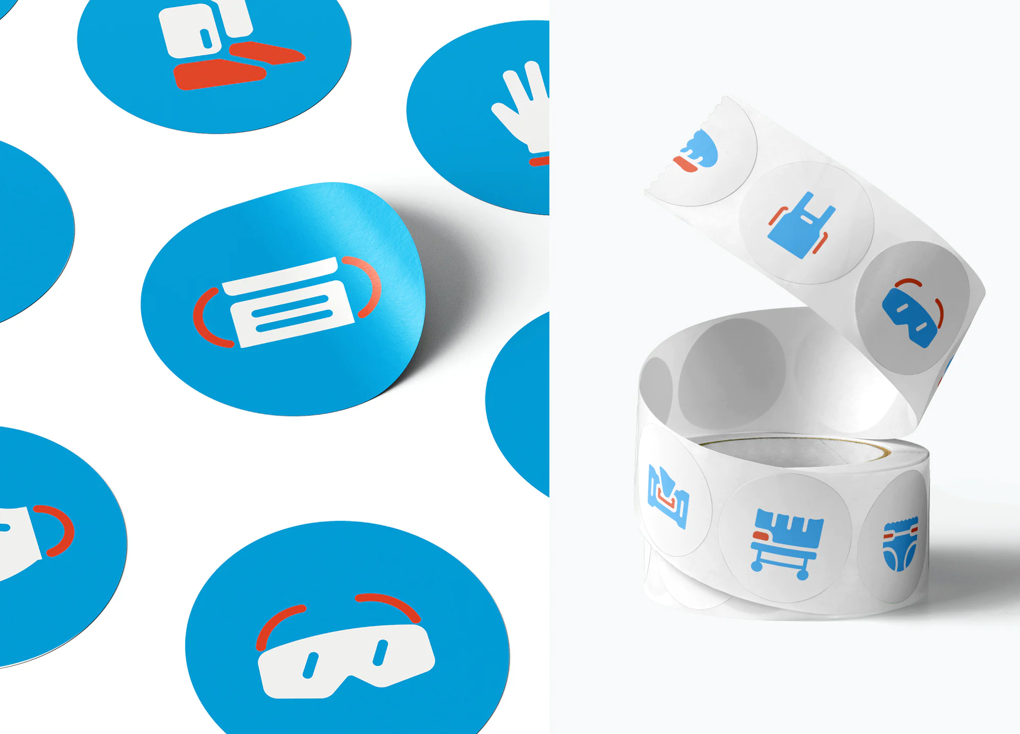
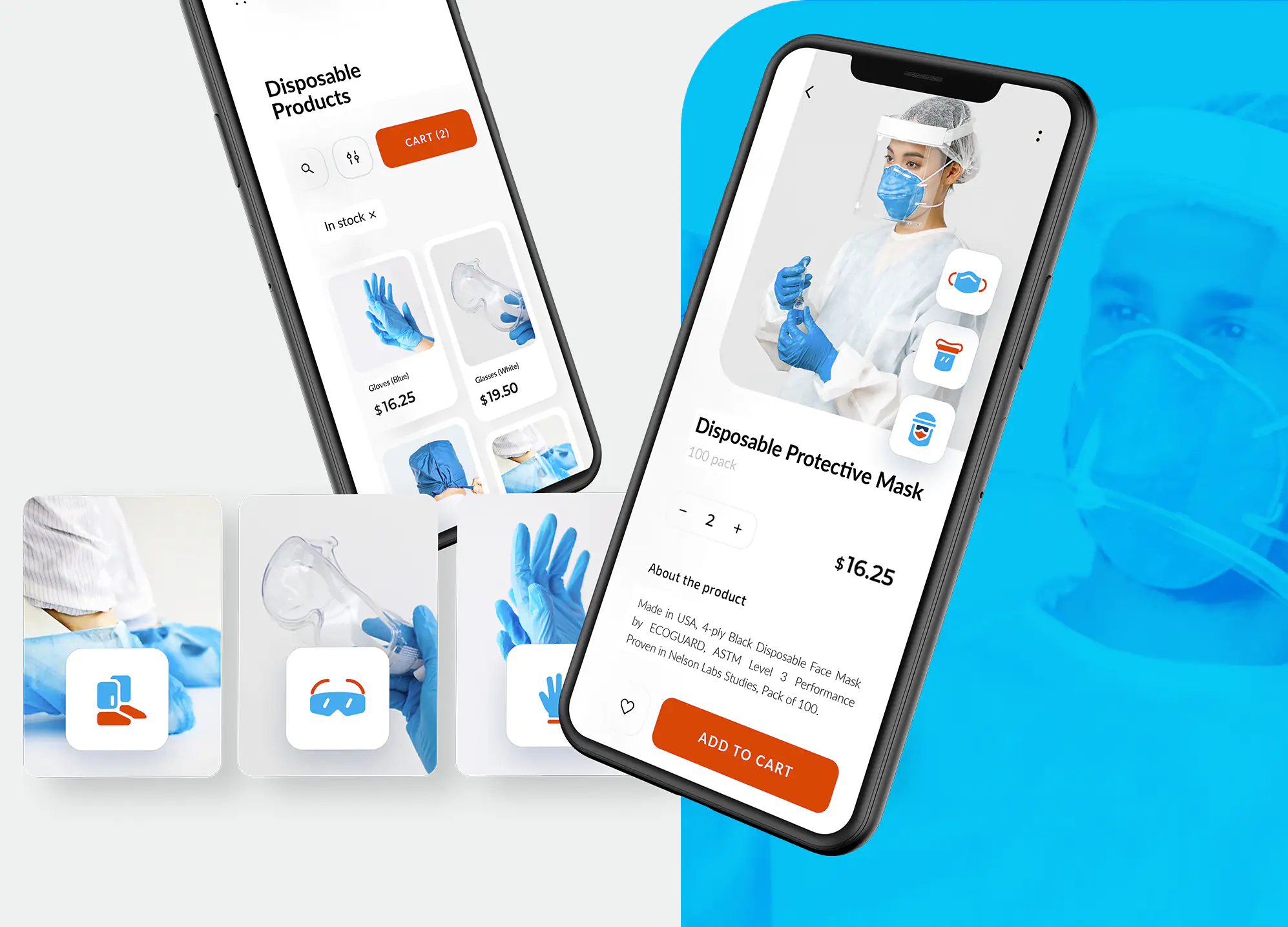

Our expert team went the extra mile to over-deliver quality sets of icons even though the project was on a budget. We delivered designs for disposable medical products, usage of products, web illustrations, and social media pictorial representations. We ensured the properties of the icons were consistent with the core values of the Qcare. Since we were tasked to totally refurbish the site, our team of designers created a unique brand guide, and web development design.
Roughly three months after our creative agency renovated the website, Lucas called to thank the whole team for our input as his site conversion rate went up by roughly 40%. A poorly designed website only tarnishes the brand image. We have a question for you. When visitors leave your website, how do you want them to feel – confident or disappointed? If you chose the former, then it’s high time to contact branding experts for site designs that convert. The award-winning Stan Branding agency has listed over 150 top seller products in different industries and our impact in the US market has been recognized by established media companies like Forbes and Clutch.
How to choose an Icon for Brand
More often than not, clients don’t know what to look out for when presented with a design delivery. In this section, we’ll discuss the questions to ask a graphic designer and the factors that should guide your decision when given diverse options.
Are the icons in tune with my niche?
Icons are universal, but they can be tweaked for different reasons, one being the niche of the client. The human body structure is the same but we all dress and have our slight physical differences. In the same vein, they can look casual, professional, religious, or sporty.
A good example of a website that uses formal icons is LinkedIn. For a brand website that helps professionals communicate around the globe, its navigation controls must be clear, simple and precise. Hence, the LinkedIn website is heavy on the use of universal, social and professional icons. Some vector glyph designs on LinkedIn are aided with texts (for example the event, write article, video, and photo icons) but the majority of icons there are without complementary words. Few of the professional ones include the job icon which is represented with a briefcase vector image a day, the services marketplace icon which consists of an ‘i’ symbol and checkmark, and finally, the learning pictorial representations (which resembles the YouTube glyph but with a different color).
At Stan Branding, we do not recommend using custom icons all in the name of “cutting costs” because two out of three custom designs barely fit the client’s field. Formal glyphs look bizarre on a sportswear website and vice versa.
Our design team has a proven track record across 18 industries and a deep commercial understanding of the role of niche-suiting branded icons in the success of a brand. We have no doubt that the best way to bond with your first time site users is to help them navigate your site using designs that meet your industry standards.
Is the message clear?
Clarity of message cannot be overlooked when it comes to icon branding. The best way to know if you’ve got the right pictorial representation is to show them to a non-team member and get their first impressions. If they get it at first glance, then your designs are effective. Remember, icons should not require a higher-than-usual IQ to be understood. It’s not math.
Getting traffic is a privilege you don’t want to waste and your aim should be to convert as many site visitors as you can. To up your conversion rates, you need to make your site glyphs as clear as possible. One brand that understands the need for clarity when it comes to site icons is Shopify. They aid site users with ‘branded but universal’ icons and they do not leave these icons unaccompanied with clear descriptions. You may use only images in making your icons but make sure they are recognised globally.
Are the icons consistent with my brand image?
The whole aim of taking a step further to brand your glyphs instead of settling for less is to build a design set that is not just consistent with your brand image but also rings a bell in the mind of your audience. The color/colors used must fit perfectly with your brand colors. The thickness or faintness must reflect your core values.
Are we different enough?
A good designer must know when to be different and when not to be. The ability to balance universality and uniqueness is what differentiates OG designers and newbies.
What is an icon in branding?
Branded icons are used to paint a complete and appealing picture of a brand in the mind of readers. A design set is an extension of your brand image that enhances the user experience on your website and app. In addition, they serve as a guide to customers when using your products or on signposts to raise awareness on societal and organizational matters.
Final Thoughts
Regardless of what industry you are based in, your users must leave your site feeling connected and impacted.
If you are struggling to communicate your products and services to your customers via your website, book a free project pre-development consultation with our CEO at Stan Branding. We have an expert team of competent graphic designers, digital ad optimizers, branding professionals, and print graphic specialists on standby. In just 8 years of operation, we have received 18 awards of excellence from Forbes, Clutch, Good Firms, The Manifest Agency, and GD USA to mention a few.