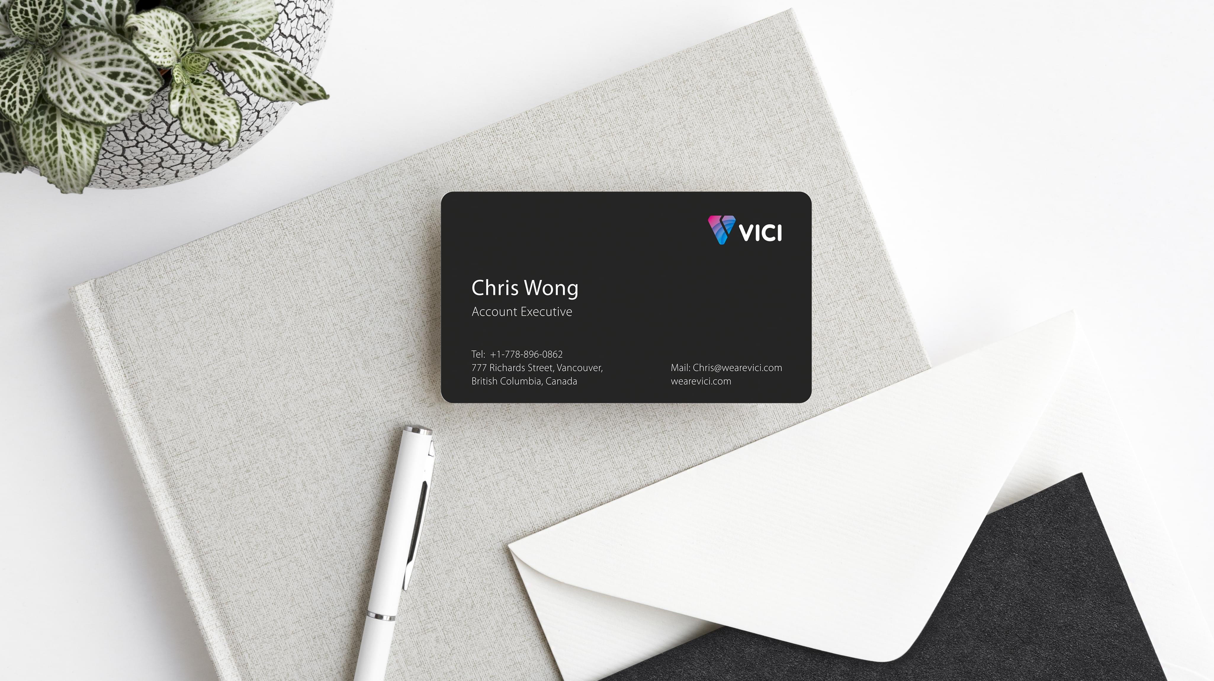
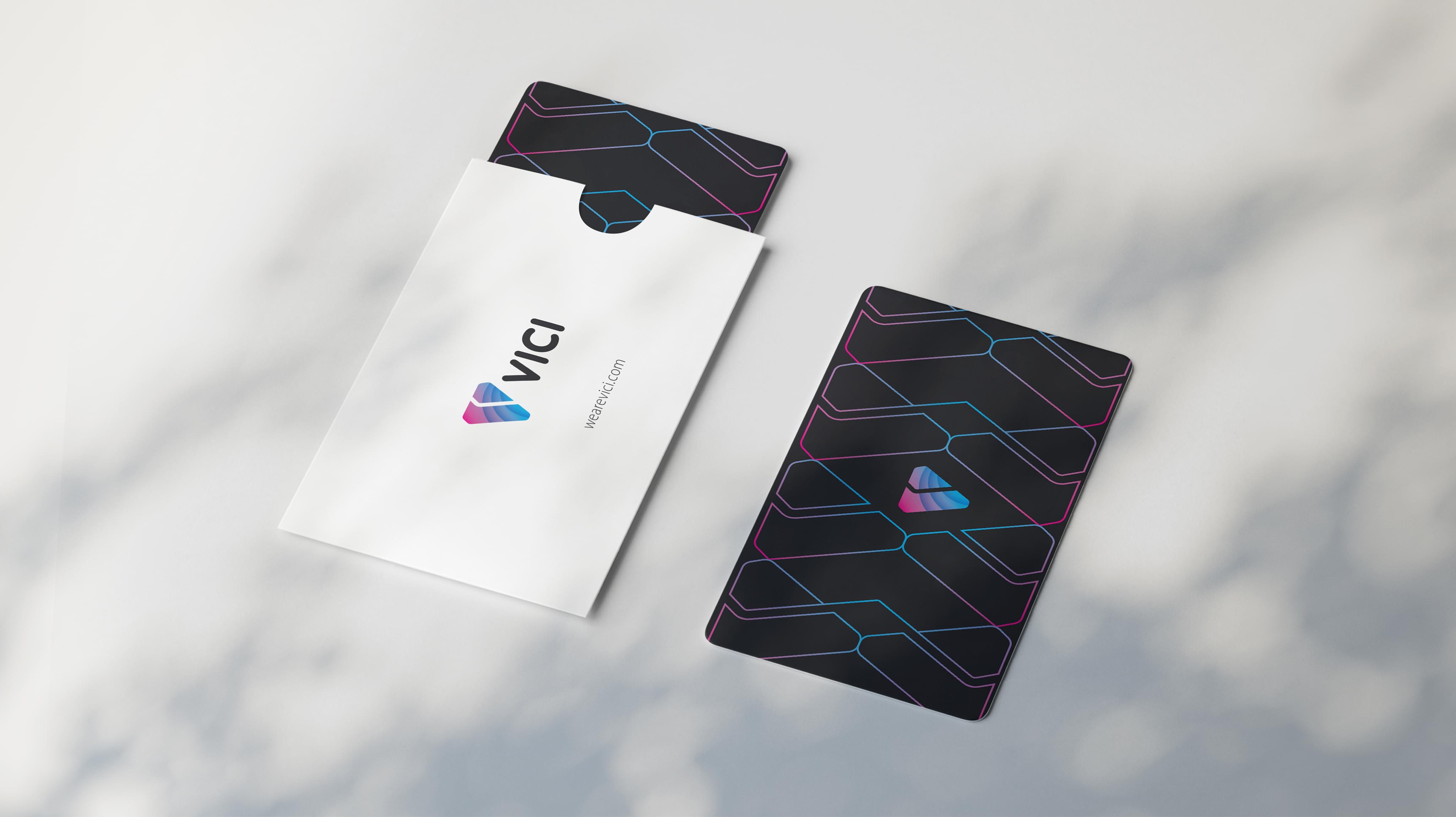
Vici ordered a new series of custom business card designs for the company’s employees. Vici is a women’s brand focused on the chic market. Stan Agency was brought in after the company’s last two business card redesign attempts did not meet standards. We eagerly accepted the challenge of creating a one of a kind business card design.
Challenge Components
- Saturated market
- Incorporating the clothing market
- Making everything memorable
The Universal Challenge with Business Card Design
Professional business card designs are inherently difficult to create. We needed to find a way to incorporate all of the relevant contact information in a readable fashion. However, that cannot negate the need for business cards to be eye-catching and unique. Finding the balance here while keeping everything professional needs a designer.
Industry Research
The first stop on this custom order was the industry itself. Fashion is known for innovation, even amongst the classic styles. This distinction provided more latitude than some other industries we have designed business cards for. Additionally, we found we could draw inspiration from interior design business cards since the two sectors are linked.
Audience Research
Our next step was looking into the audience that receives the business cards, which were two distinct groups. Shoppers could receive the cards if they were in-store, or the cards could go to fashion industry contacts. That made the business care design tricky since the goals of the two groups are different.
Research as a Custom Business Card Design Firm
We also examined the business card industry, which has started innovating in the last couple of years. Design a business card sites offer a DIY option, as well as the most popular features that make business cards unique like gloss and paperweight. We looked for the new features on the cutting edge of business card design for possible inclusion.
Bonus Challenge
The added challenge with this business card design project was incorporating the fashion industry. This industry has many different representations, but it ultimately comes down to the essentials. We needed to distill that essence and seamlessly integrate it into our overall business card design.
Brand Symbology
Vici is a chic brand, and that translates to the company’s branding. Overall, the style is relatively simple. However, Vici tends to favor pastels and lighter colors overall. Combined with the triangle shape of the logo, this indicated femininity without overtly specifying, which shows a great deal of subtlety that we needed to incorporate.
Additionally, the Vici brand name served as inspiration. When translated from Latin, Vici means conquered or victory. We found that concept inspiring, especially coming from a clothing brand that is working to conquer the industry. We included the idea as an abstract concept in the final design.
Design Inspiration
Our design inspiration began in Vici’s products. Many of the options come in straightforward colors with practical pairings. This indicated that the business card design needed to do the same. Since the whole brand centered on simple chic, that also meant that we could bring in an unknown element or two without losing the brand.
Element Decisions
This project design needed to appear simple at first glance, which removed many possible elements. The eliminations left us at abstract or minimalist as possible design styles, neither of which were big on flashy elements. Nevertheless, the design team in their offices was able to create outstanding business card design concepts with these few elements.
Narrowing Down the Final Options
Our professional design team produced several awesome looking business card designs, and narrowing it to the final design was challenging. We began by comparing the concepts to Vici’s brand guidelines. Then we moved into comparing the business cards themselves for eye-catching properties that were sure to make them memorable.


