- Company:SWISSGate
- Location:Germany
- Service:Thank you & Gift card design, Invitation
-
5.0
 100+ Reviews

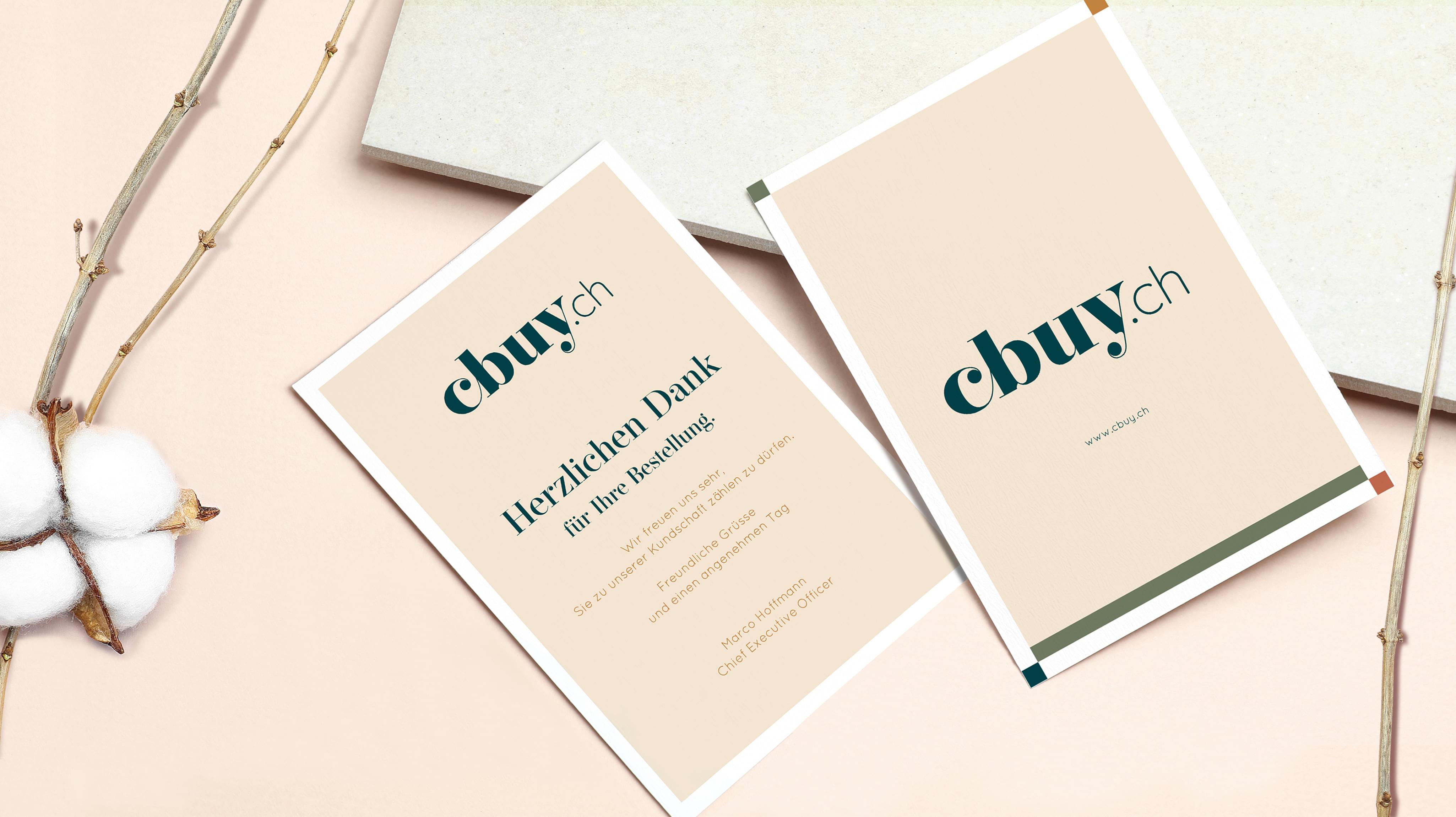
Challenge
Cbuy presented Stan Agency with a unique custom order. The company needed a new gift card design for its thank you cards. The previous model was showing its age and no longer suited the intended purpose. Stan Agency assigned our top-rated design team to this custom thank you cards project and got to work.
Result
After the full design process, the result was the simple thank you card design that Cbuy was looking for. The company began a print run and distribution soon after the card was delivered. From there, the gift card design made it across Switzerland and beyond. Cbuy sent an email letting us know that the design popularity was pleasantly surprising for the company.