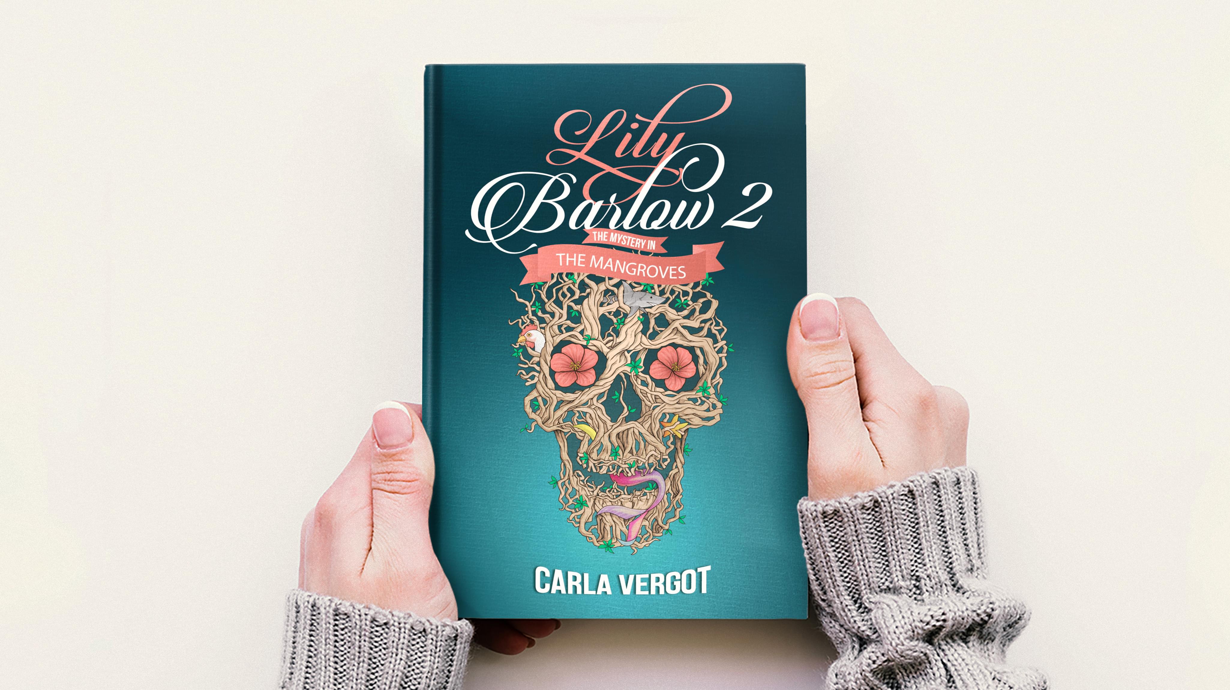
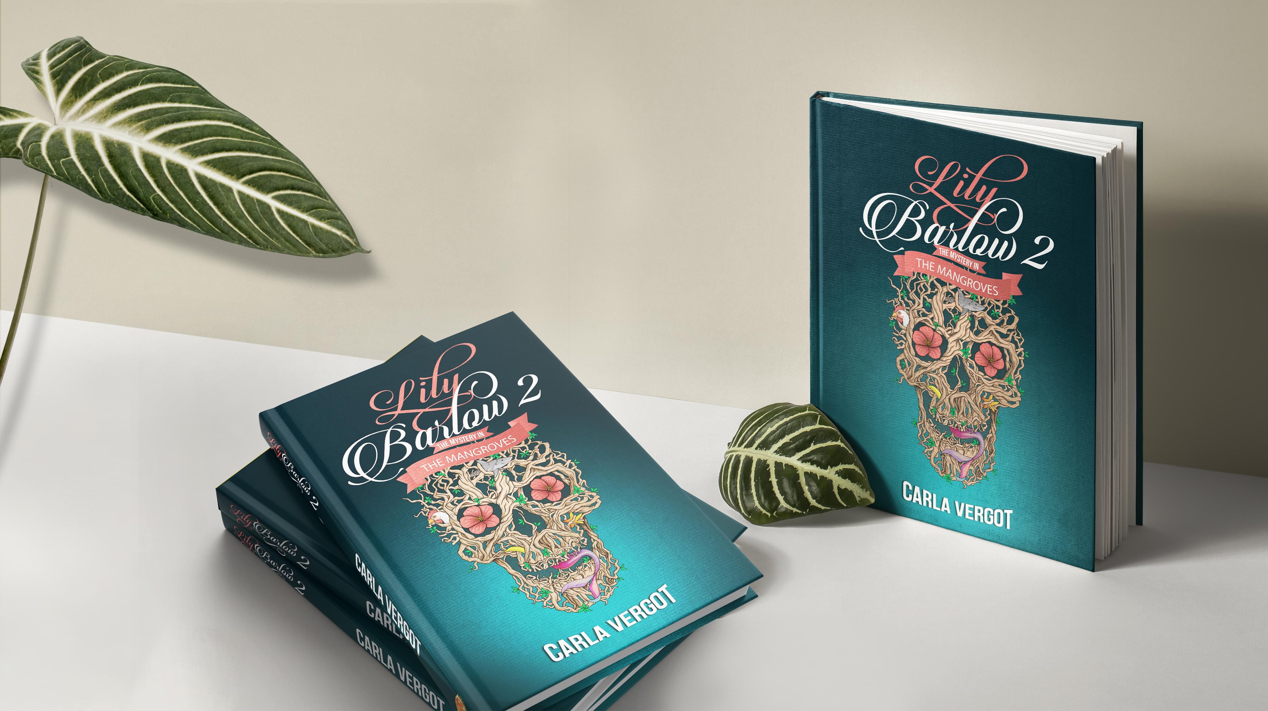
We decided to design books cover for Carla Vergot that were as feminine as they were bold. The overall cover design is simple, with the primary focus on the singular skull graphic and the scrawling title text. A primarily female audience was targeted, reflected in the delicate font, color scheme, and choice of graphics.
However, the creative book cover design balanced that softness with dark gradient tones and the unavoidable image of a skull directly in the center of the design.
Both tropical and mysterious, the colors used to accentuate the book cover design capture immediate attention. The stunning bold blue tone begins behind the skull before fading to black, almost like the colors of a deep ocean as light slowly gives way to the unknown darkness lurking below. At the same time, those dark hues are contrasted by the colorful flowers entwined within the skull, as well as the soft coral color of the script. This innovative pairing reflects the story of the novel itself — delicate yet mysterious, designed to be enjoyed by largely female readers.
The decision to create a book design cover using primarily only a skull also speaks to this concept of dual softness and morbidity. The skull is aggressive in how it grabs attention, a dark image made beautiful and alive. It is filled with living things, both plants and animals, that highlight the dark yet inspiring themes of Carla Vergot’s novel. Aside from the image of the skull, there is almost nothing else included on the design books cover. This deliberate decision is intended to highlight the thrill and suspense of the story, plainly and simply. Rather than distract readers with a large array of graphics, designs, and colors, our book cover design focused specifically on the most important elements of the narrative.
The font included in the professional book cover design adds soft notes to the over-wise dark themes depicted in the visual elements of the book cover. The font itself is overtly feminine, a cursive script that feels evocative of the script used when writing a personal letter. The colors also add some lightness to the book cover design. The white and peach-toned font jump out against the blackening turquoise background. The location of the font is centered as well, grabbing immediate attention from viewers.
Our challenge was to develop a creative book cover design that was both innovative and accurate to the contents of the novel. Our final creation directly appeals to the female target audience in a manner that is unique and intriguing, urging potential customers to pick up the book and discover for themselves the mysteries held within the pages.


