- Company:Hanu Company
- Location:Germany
- Service:Leaflet design
-
5.0
100+ Reviews
Challenge
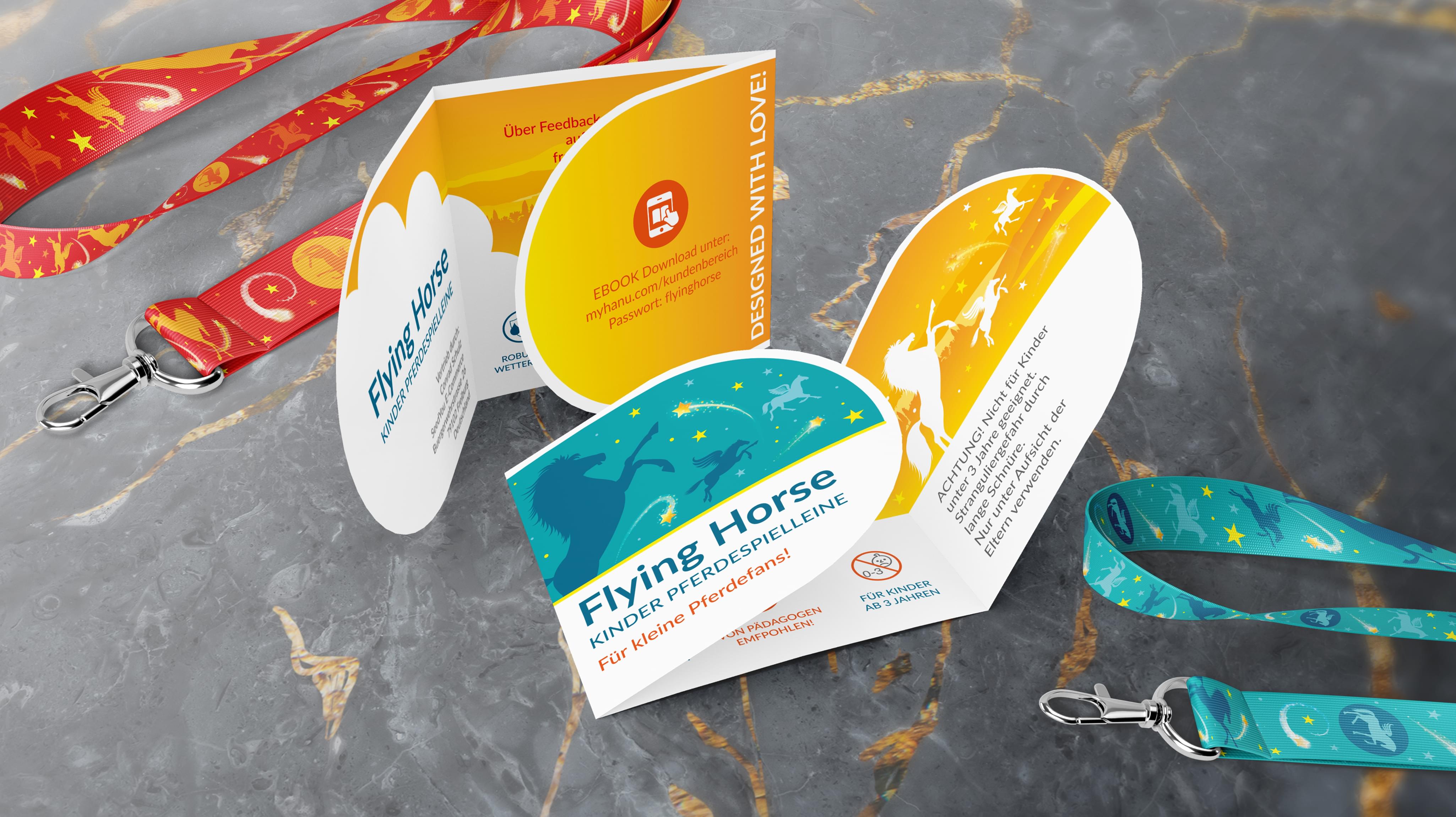
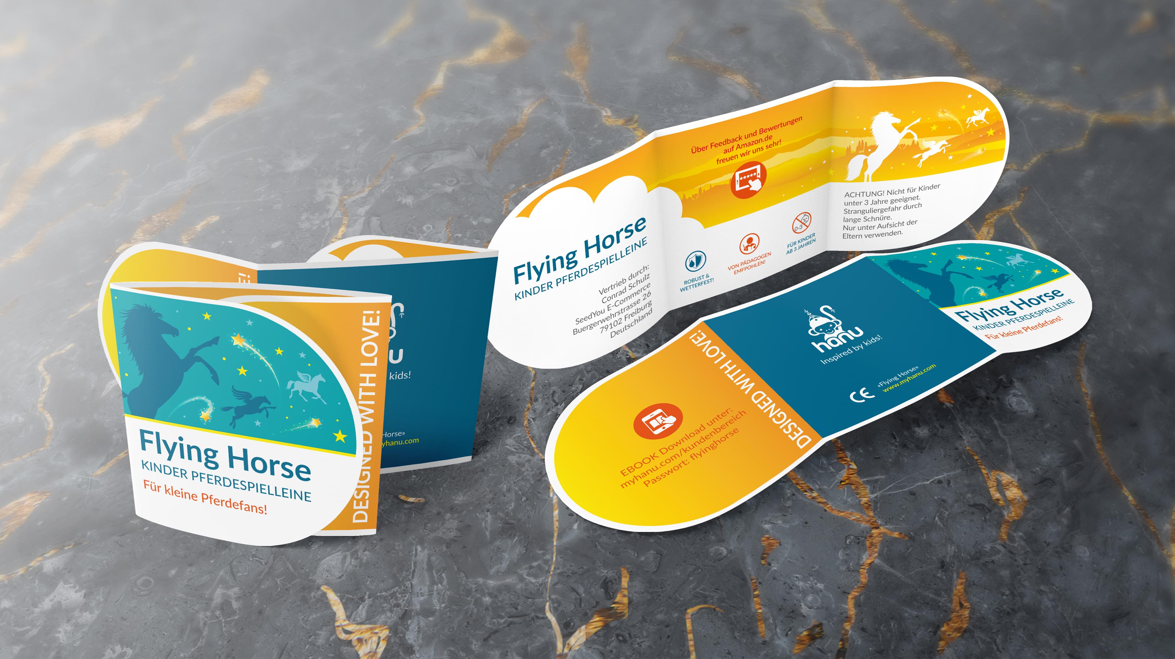
Flying Horse presented a unique challenge to Stan Agency with its custom order. The company needed a new leaflet design to inform customers about its product. The leaflet needed to be attractive as well since it would end up in busy common areas. Stan Agency accepted this custom order and began work right away.
Challenge Components
Challenge Components
- Saturated market
- Creating a highly informative yet small document
- Attracting attention
Industry Research
Since Flying Horse intended the leaflet to end up in waiting rooms and similar venues, we examined the history and current practices for that industry. This lead to some intriguing discoveries, including how much people think graphic leaflet design costs.Audience Research
Companies leave leaflets in offices and other relevant common areas. This meant that we were considering an audience that would pick up the piece if it was eye-catching, and they were bored in the surroundings. This tended to skew towards older demographic groups, which we found in our research.Research as a Custom Leaflet Design Firm
Leaflet design is a complex balance, so we examined pieces from some of Flying Horse’s competitors. Each of the pieces tended towards including a significant amount of information. However, it led to crowding. In some, it was even difficult to determine the background of the leaflet design.Bonus Challenge
The challenge with this custom order is incorporating the product information successfully into a leaflet design. Leaflet design should be informative. However, it’s easy to include too much information as Flying Horse’s competitors did. Finding the right balance required multiple design rounds for our team.Design Inspiration
The design inspiration for this custom order was mostly practical in nature. While we knew we needed some amazing elements, we also knew the information was the most crucial consideration. From there, the team located various imagery that worked with Flying Horse overall and conceptualized how to incorporate it.Element Decisions
The big element was the informational text and how to divide it so it was not quite as overwhelming. The team experimented with several paragraph styles and lengths to find an arrangement that flowed correctly. That way, the text would work without costing the entire leaflet designNarrowing Down the Final Options
The Stan Agency leaflet design team produced several amazing concepts. Our professionals began the meeting by comparing how well the ideas fit within the Flying Horse brand. Then we moved on to how well the necessary details fit in each leaflet design concept. That was enough to complete the process.Result
Flying Horse was able to place the leaflet design in print quickly since the company had a printer lined up beforehand. The leaflet was then distributed, along with special promotion codes, so Flying Horse could track its effectiveness. Flying Horse let us know that our leaflet design passed the A/B test and was helping drive reliable sales figures.
The Deliverable
The Final Package:- One complete custom leaflet design
- Separate package design elements for reuse

Like what you see?
schedule a call

