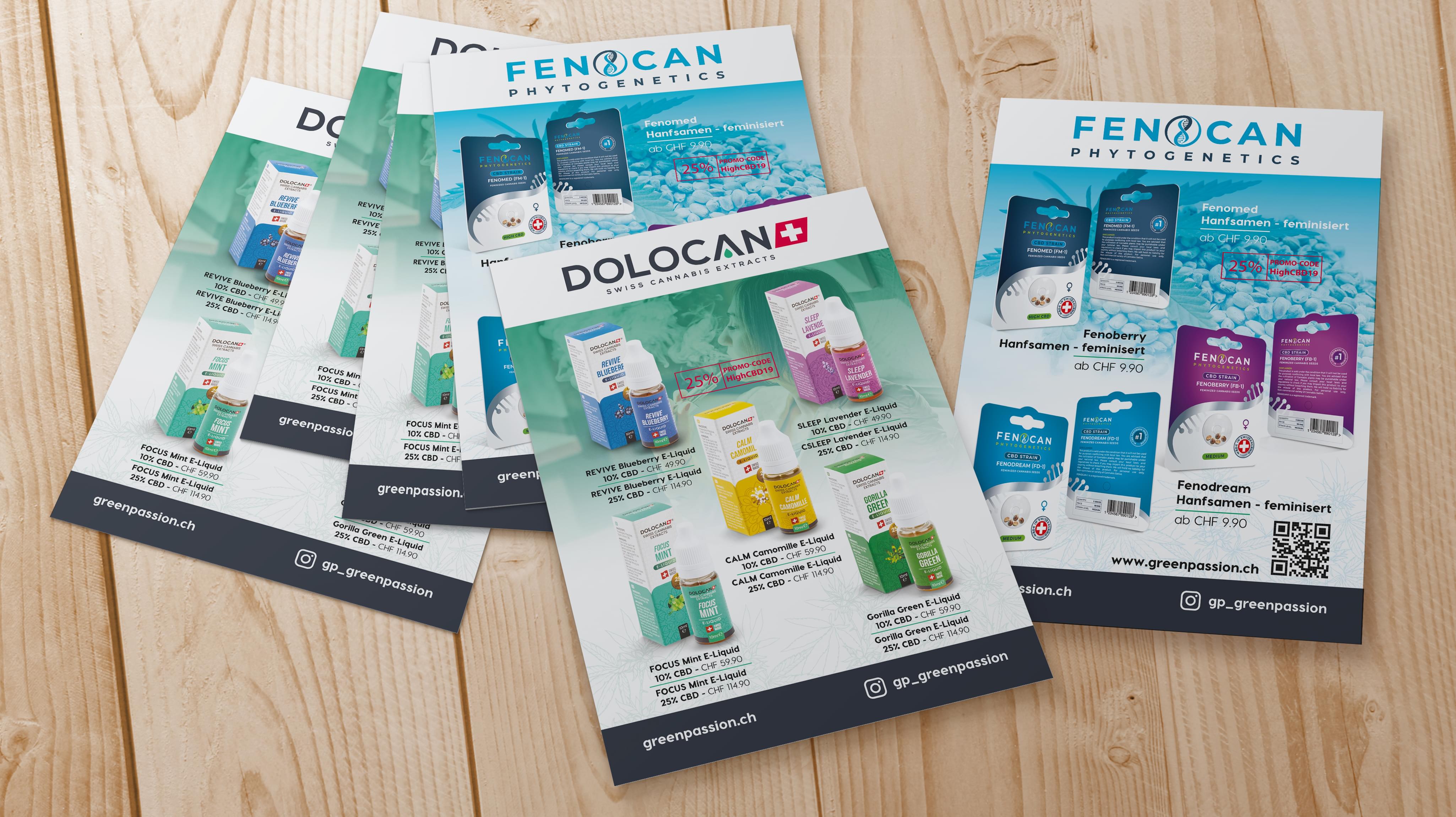
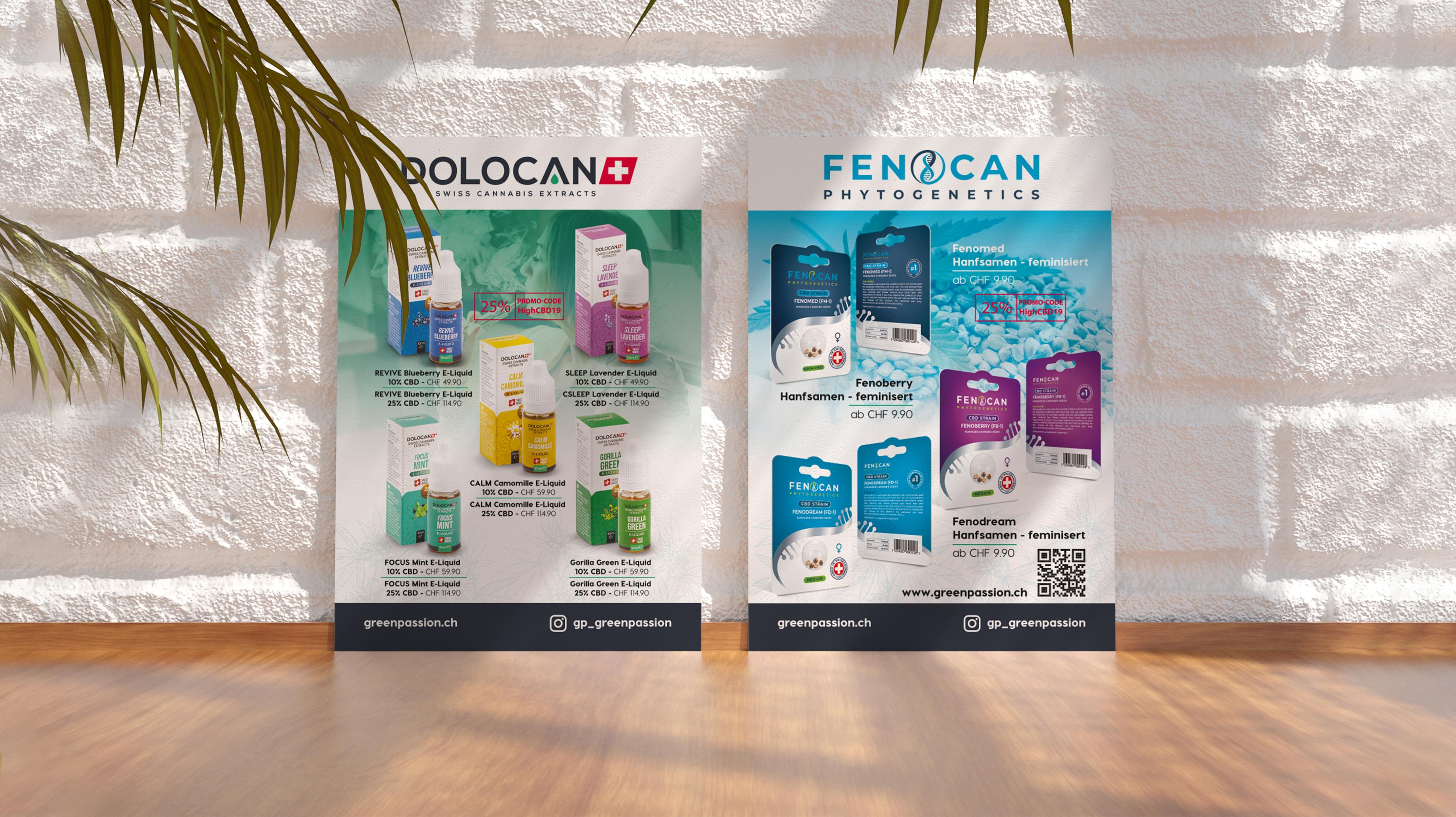
Dolocan brought an exciting pair of projects to Stan Agency for new flyer designs. Dolocan sells Swiss cannabis extracts and phytogenetic compounds. Both products can be tricky to market effectively, so adding custom flyer designs to the company’s marketing arsenal is a good option. Stan Agency accepted the challenge.
Challenge Components
- Saturated market
- Cannabis preconceptions
- Differing uses by different demographics
Industry Research
Cannabis industry marketing is tricky since each county has a unique legislative history with the plant. We examined the industry in several countries. This examination included Switzerland, where the product originated, and the USA with its new markets. We found a growing sector where consumers are searching for products pure enough to work for their problems.
Audience Research
Cannabis is not necessarily favored in one group over another. However, the reason people use cannabis changes as they age. For example, in the USA, those under 35 perceive cannabis as anxiety control while those older than 35 turn to it for pain relief. This distinction meant designing a flyer needed to consider the divide and actual target client more closely.
Flyer Research as a Custom Design Firm
We also needed to examine the flyer design industry where it intersected with cannabis. Since the field is newer, there are some incredibly innovative flyer designs on the market. We took samples, examined them for common elements, and then chose to look in a new direction.
Bonus Challenge
Cannabis is a controversial plant, and we needed to address that carefully in our flyer design process. Consumers tend towards having firmly held beliefs on cannabis, regardless of whether those beliefs are fact or fiction. We needed to provide a controversy-free flyer design to appeal to the largest number of people possible.
Design Inspiration
We knew we needed neat and clean flyer designs. We began by looking at calming design inspiration since that’s one of the big extract benefits. We also looked at the intended use settings and ingredients. This inspiration provided the basis for most of the initial flyer design concepts.
Element Decisions
We knew we needed calm and professional. This consideration informed the eventual color choices. Then we examined how to incorporate the product itself. The team decided ended up deciding including the packaging would work. From there, it was a matter of choosing how to represent the product. We knew those elements needed to fit the calm and professional motif.
Narrowing Down the Final Options
The flyer design team came up with several quality concepts for this project. The group first narrowed them down by how well they presented the professional image. Then we moved into brand considerations, such as color scheme. Finally, we placed the flyer designs in front of test groups for feedback.


