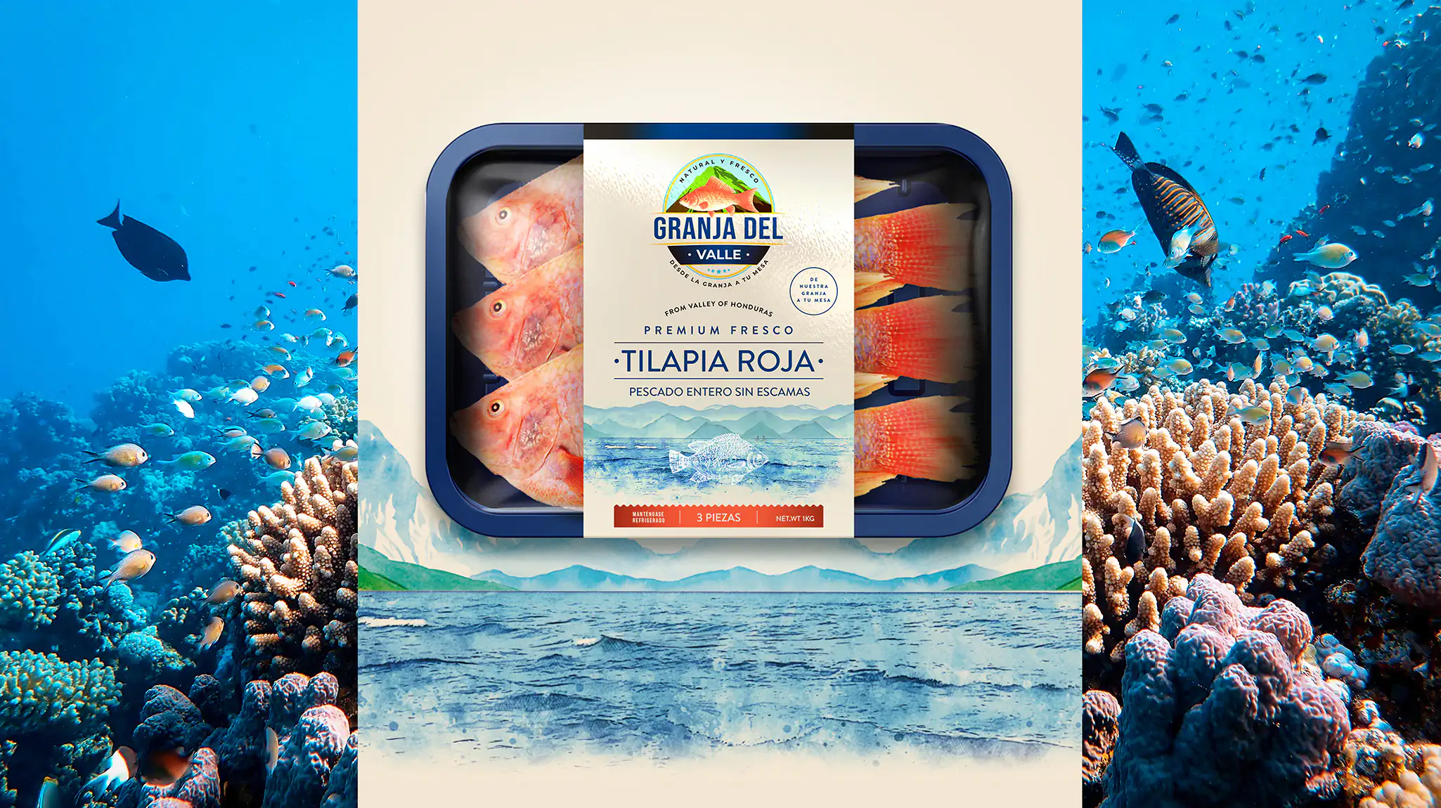
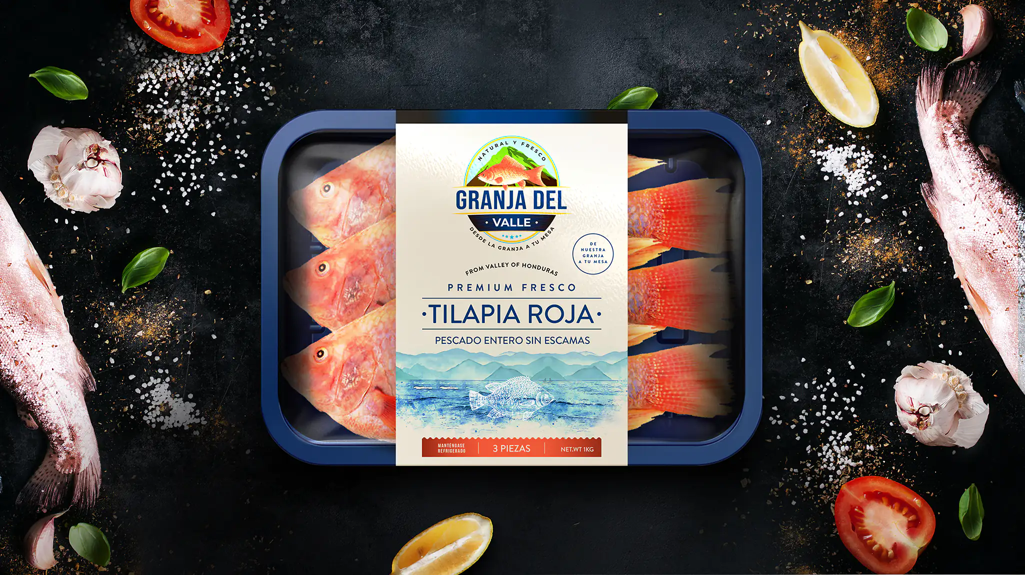
Every detail of the label sticker design showcases the refreshing taste of Granja Del Valles’s fish. Blue tones mimic the very water that the fish was taken from, while the calming graphics of waves further cement that connection on a potential customer. It is as if the fish leaped straight from the shores into the packaging. Essential product information is conveyed clearly and concisely in the form of eye-catching font and bold graphics.
Simplicity and minimalism
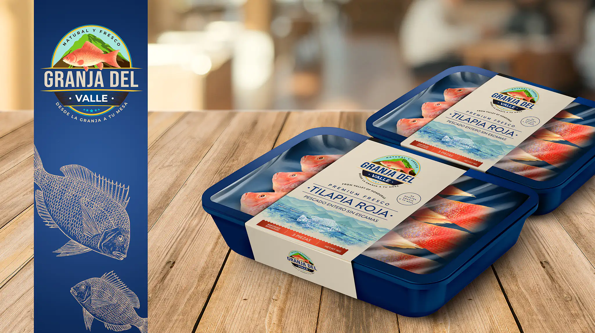
Simplicity and minimalism were key to best showcasing the product within the packaging. Rather than overwhelm potential consumers with an excess of graphics and information, the key details were highlighted. The quality of the product was considered the most essential aspect to convey to shoppers browsing through the aisles of their local supermarkets. Our innovative design was approachable yet of obvious high-quality, showing that superior ingredients could be purchased on an everyday budget.
The color scheme
The color scheme we created for Granja Del Valles’s label sticker design deliberately complimented the color of the fish in creative and innovative ways. Therefore, not only does the primarily blue tones create an ocean-like image, the dark hues directly contrast the bright red of the tilapias’ skin, making the product appear more attractive to a consumer. The beige, neutral accent colors provided balance to the color palette and also served as a convenient backdrop to display crucial product information.
Finalization
When we design label stickers, we factor current trends and global inspiration into our designs for clients — and Granja Del Valles’s label sticker design was no different. In order to create a highly effective, professional product with the ability to attract customers searching for affordable, high-quality fish products, we utilized every visual element possible.