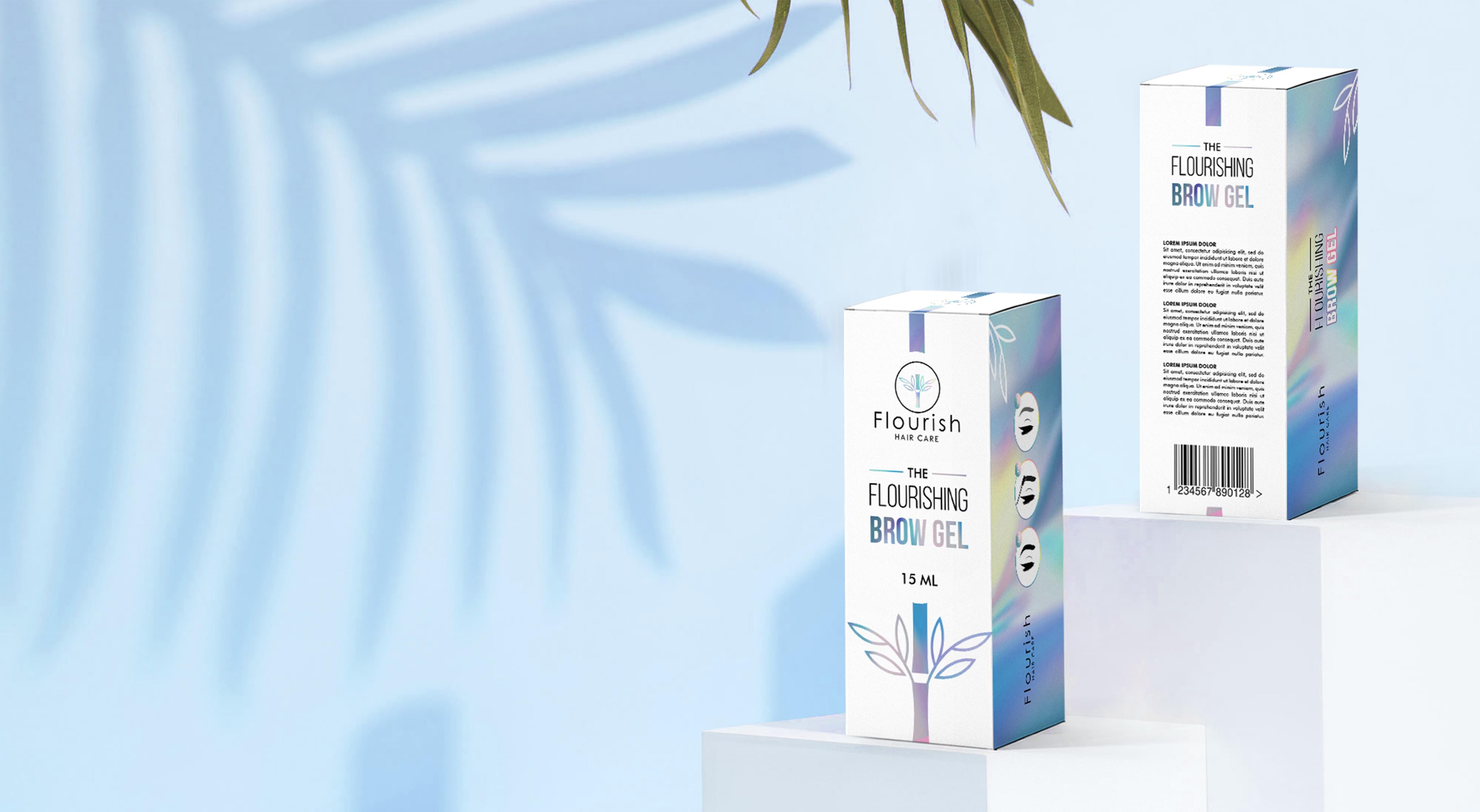
FLOURISH Packaging
FLOURISH

FEMININE PACKAGING DESIGN

  • Company:Flourish Hair Care Co.
  • Location:USA, NJ
  • Service:Packaging design
  • Category:Cosmetics & Beauty
  • 5.0 Review FLOURISH Packaging 100+ Reviews

Challenge

Flourish recently developed an eyebrow gel, and the company needed a package to inspire consumers. Flourish chose Stan Agency to take on this unique order and create a standout feminine packaging design. We took on the project with gusto and set our top-rated design team towards building an awesome package for the product.
Challenge Components
  • Saturated market
  • Confusion over what eyebrow gel is
  • Uniquely identifying the product

Research as a Custom Packaging Design Firm

The project began with research into the eyebrow gel market. Flourish produced an organic product, so we were able to narrow our research further. Then we looked into feminine packaging designs since that is Flourish’s target market. After examining all these trends, we began developing design concepts.

Bonus Challenge

The challenge for Flourish’s project was uniquely identifying the product so consumers could choose it off the shop shelves. Eyebrow gel packaging tends to use some standard motifs, such as cartoon brows. Creating a feminine package design that did not use these motifs, was still recognizable as eyebrow gel, and met brand guidelines was a challenge.

Design Inspiration

Instead of focusing on the brows, we decided to focus on the gel aspect. Though gel is difficult to represent on feminine packaging, our design team worked with the concept. We also pulled in elements of Flourish’s branding and minimalism in general. These elements allowed us to create several eye-catching options.

Narrowing Down the Final Options

Our design team brought several feminine packaging ideas to life. While each was creative, we needed to narrow the ideas down. We began by comparing the designs against existing market packaging. Then we examined which concepts best evoked the product without outright specifying what it was.

Result

The resulting design was met with resounding approval. Flourish put the feminine package design into use, and pre-orders exceeded expectations. When the product became available in stores, Flourish mentioned that the company saw steady sales figures at a level that exceeded the company projections.
The Deliverable

The Final Package:
  • One complete custom package design
  • Separate package design elements for reuse
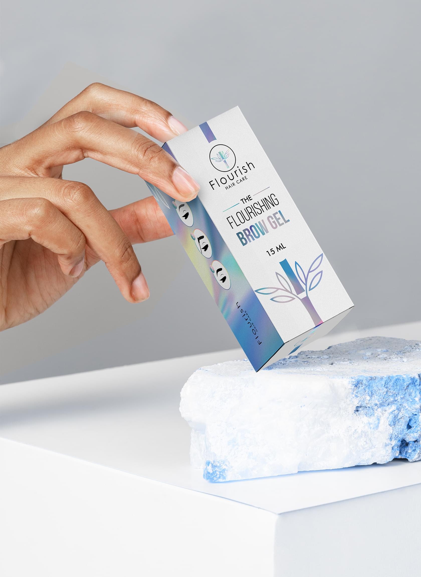
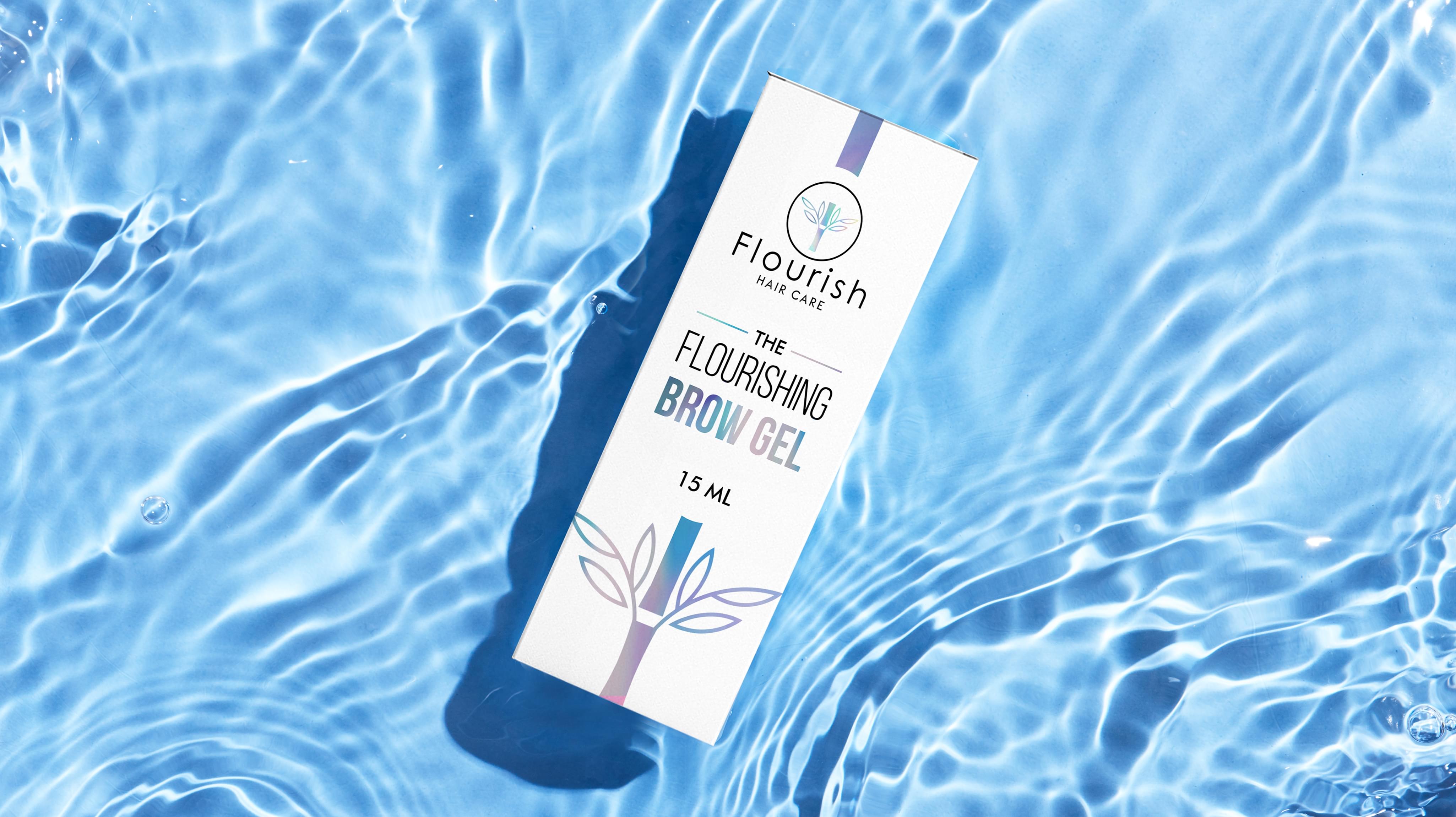
For the final feminine package design, we began from a white base. Then we used a watercolor mix with each element to convey the gel. We used an abstract brush motif as well for recognition. Overall, we look forward to seeing how Flourish’s eyebrow gel packaging helps it achieve market success.

The Box Over the Image

Every product deserves a unique package, and eyebrow gel is no different. At Stan Agency, we were able to use branding and abstraction to create the ultimate unique eyebrow gel package.
FLOURISH Packaging
FLOURISH Packaging
FLOURISH Packaging
FLOURISH Packaging
Our design team brought several feminine packaging ideas to life. While each was creative, we needed to narrow the ideas down. We began by comparing the designs against existing market packaging.
Scroll