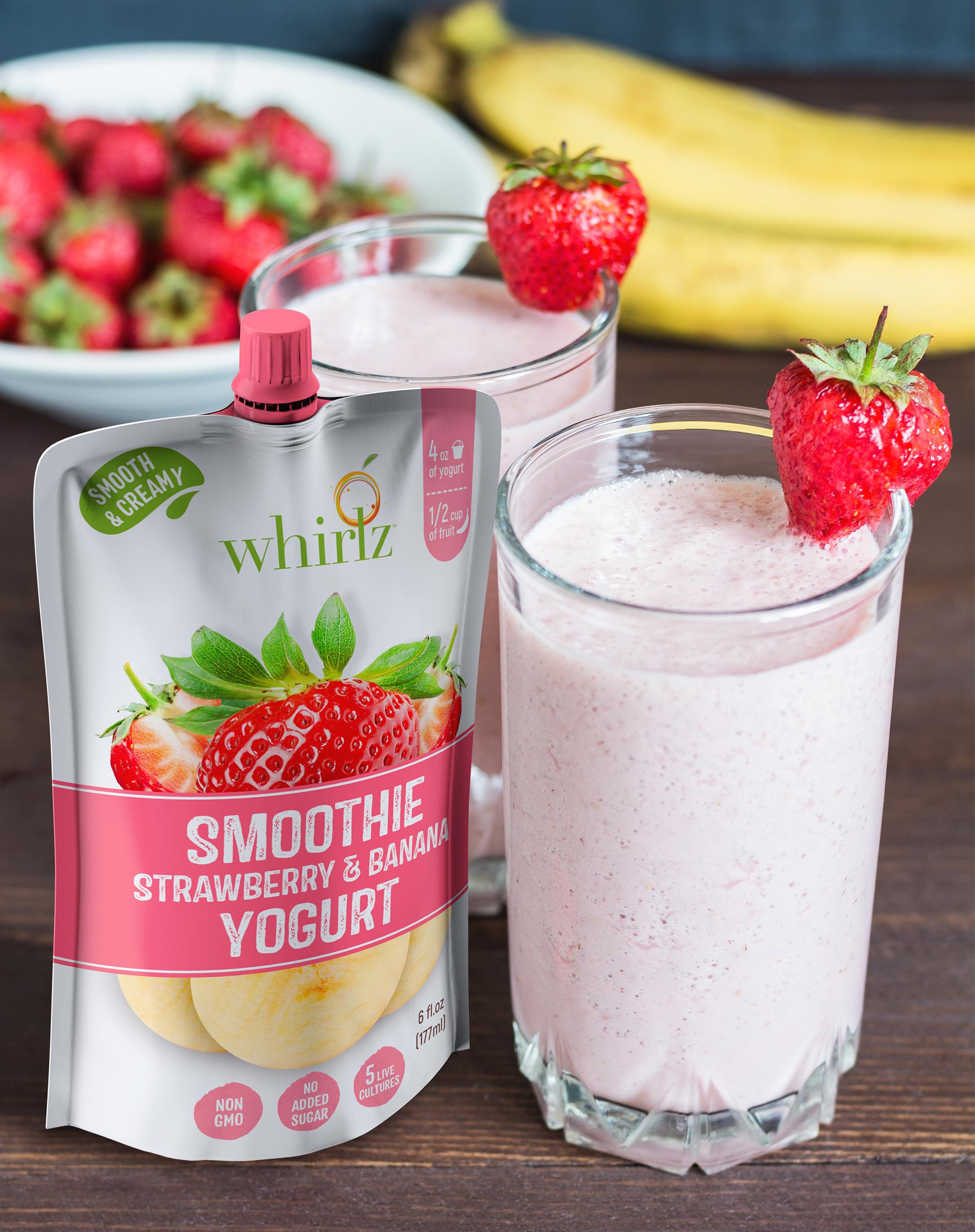
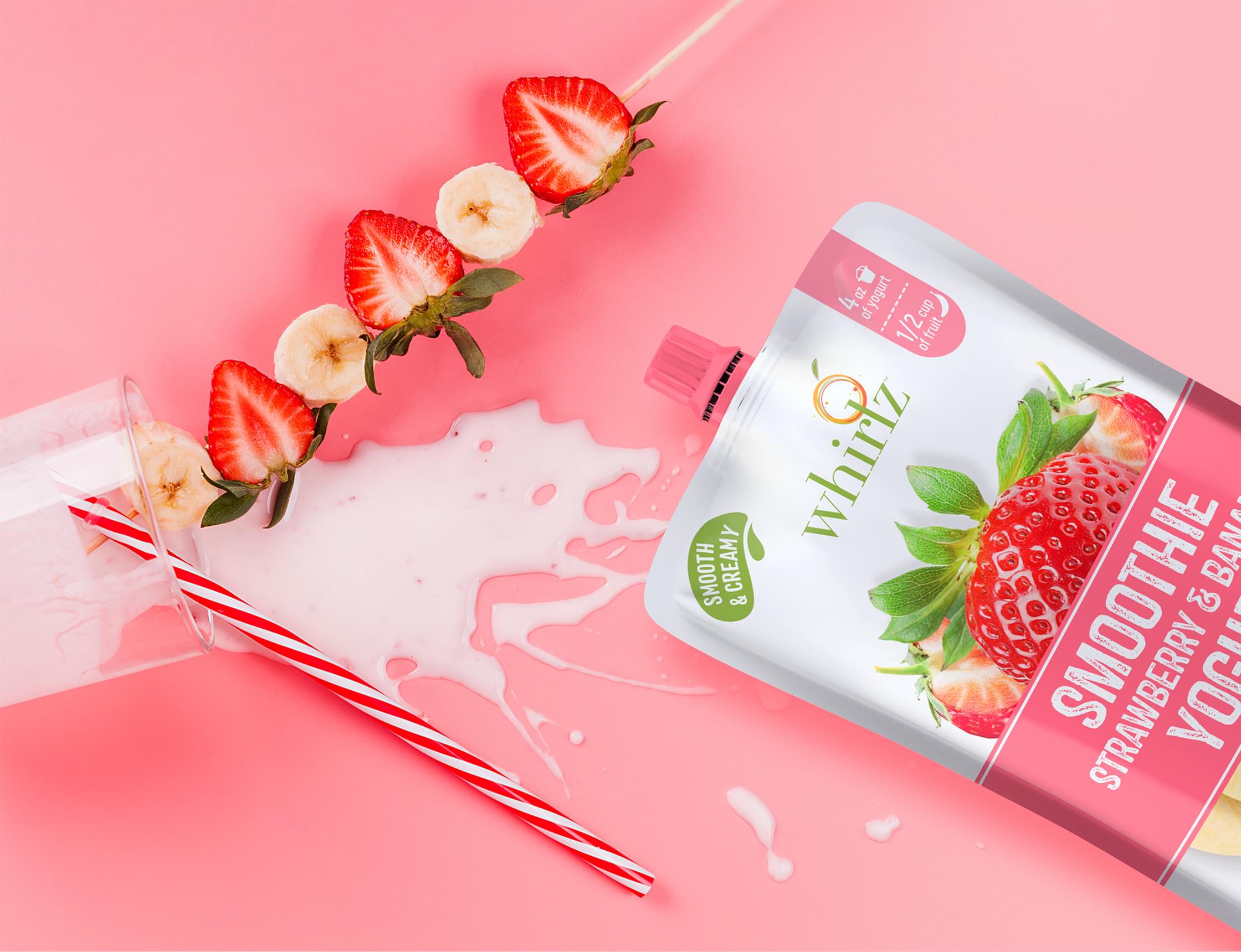
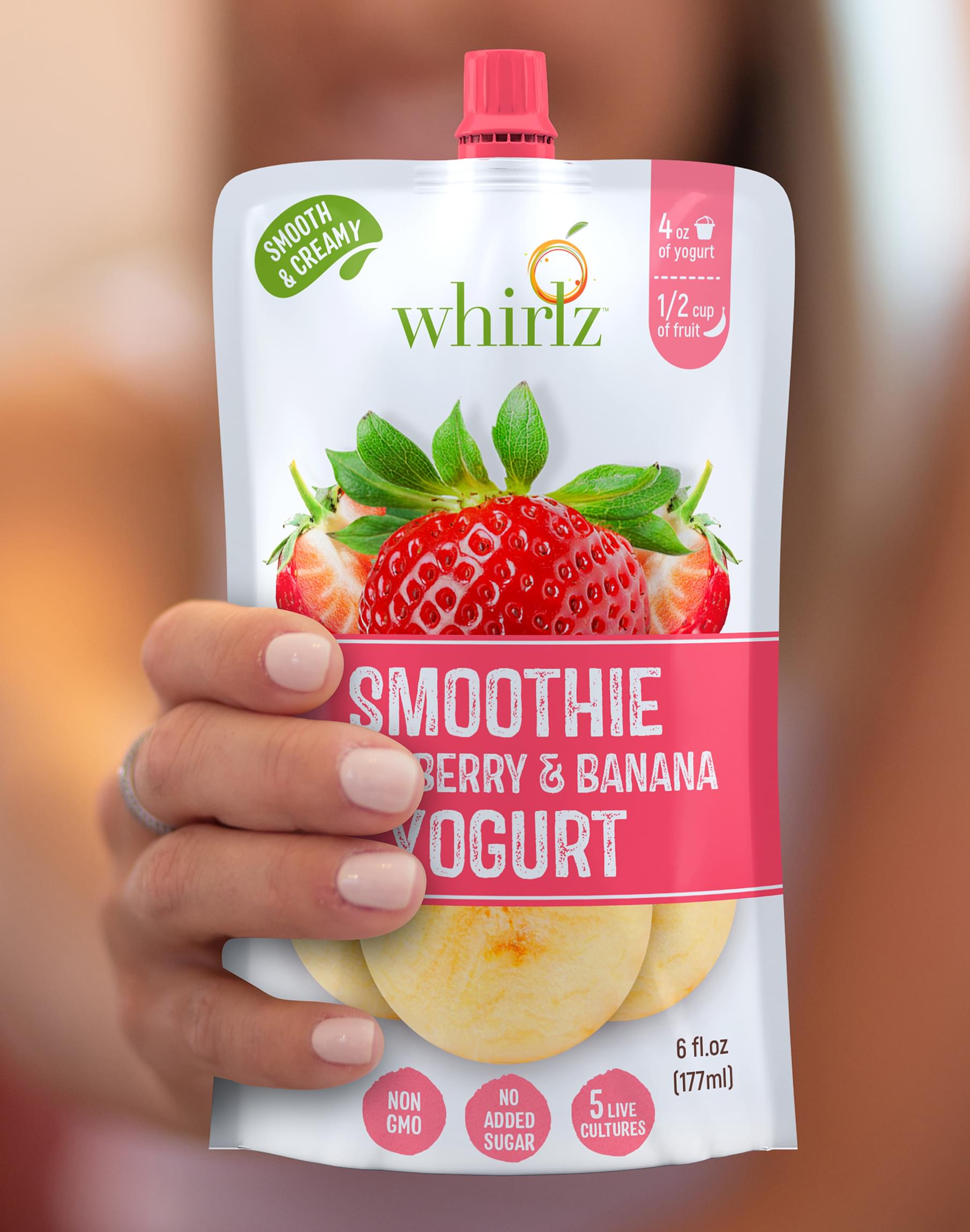
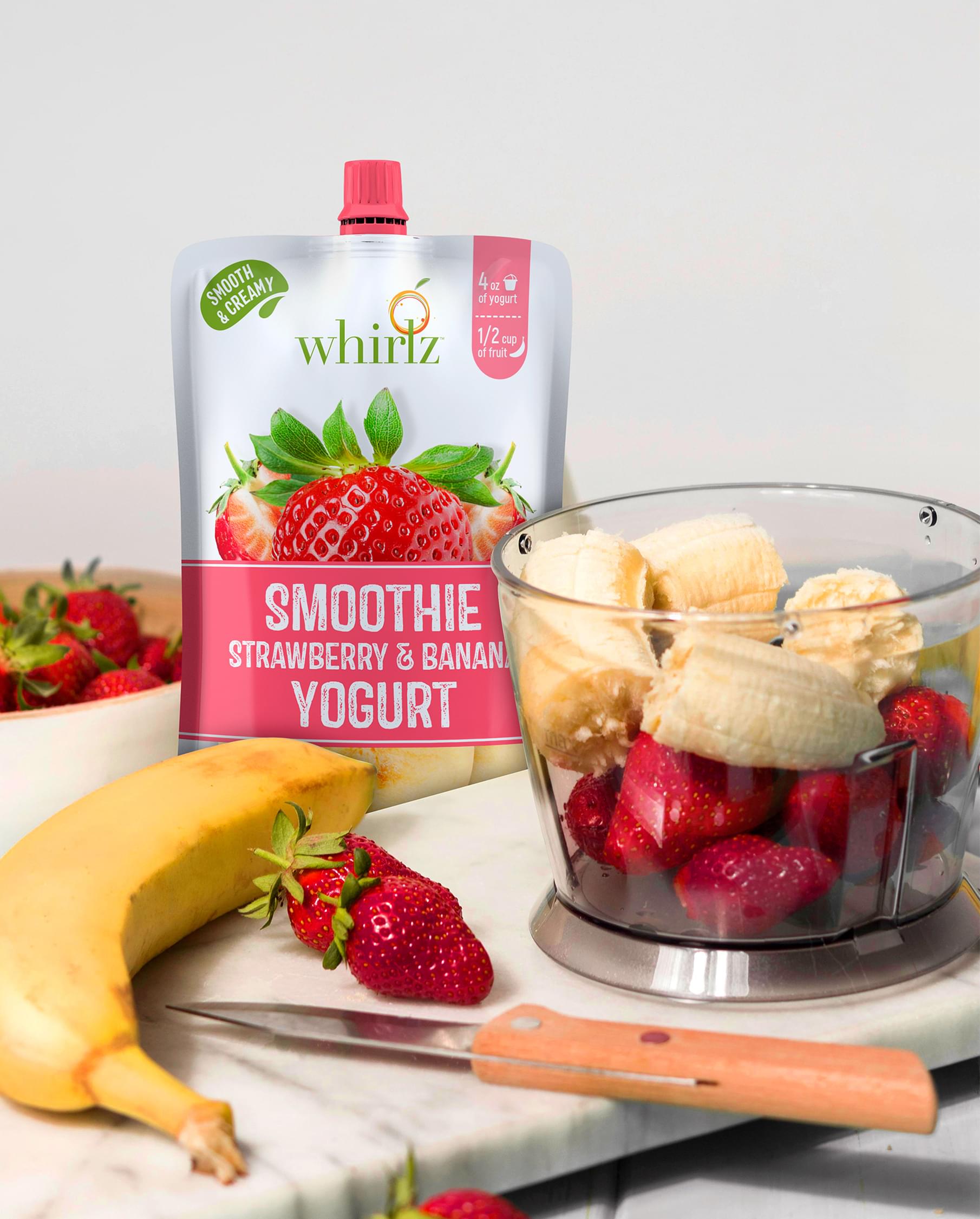
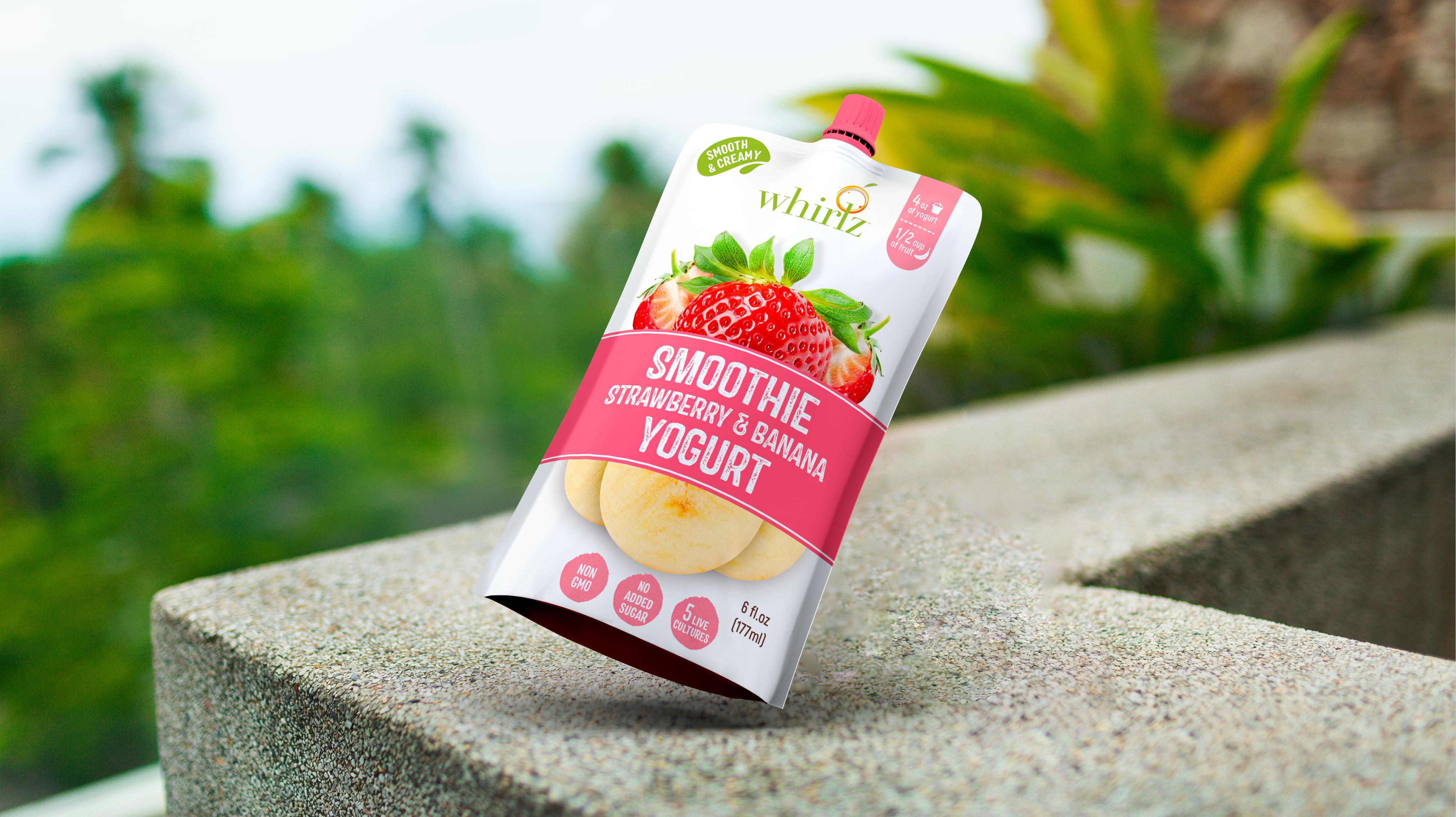
The drink company Whirlz presented Stan Agency with a unique beverage label design project. The company was launching a line of smoothies in a pouch. Each needed an amazing beverage label design, and we accepted the challenge.
Challenge Components
- Saturated market
- Simple design
- Consumer health wariness
Research as a Custom Beverage Label Design Firm
Our first beverage label design step involved examining the broader smoothie pouch market trends. Then we pulled several USA direct competitors and reviewed their beverage label designs. We discovered that beverage label designs tended to go illustrative or minimalist.
Bonus Challenge
The added challenge to this beverage label design was the market. There are several well-established smoothie companies. This competition makes beverage label design more critical. We needed something that stood out on the shelves.
Design Inspiration
The Whirlz brand inspired most of the colors. Meanwhile, we examined successful beverage label designs and smoothie packaging. This helped us decide what consumers looked for on beverage label designs. That inspired many of the creative element decisions.
Narrowing Down the Final Options
The professional designers produced several beverage label design concepts. We tested the ideas using a side by side comparison. Then we brought in a focus group. This group helped us narrow down which beverage label design stood out to consumers.
