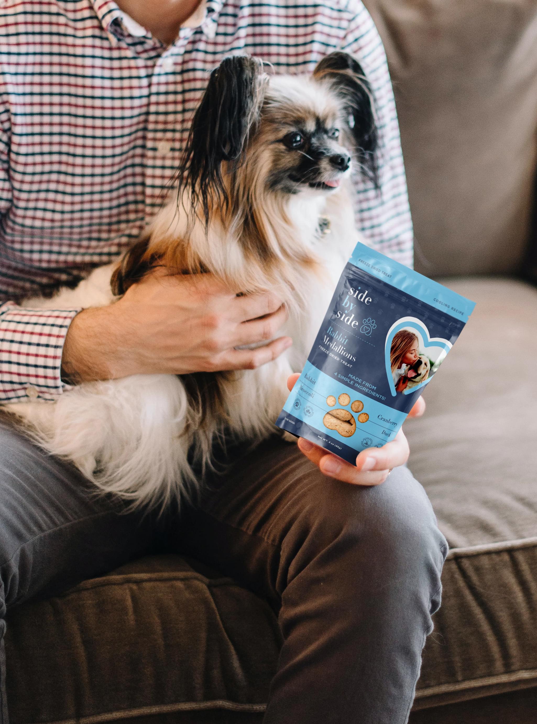
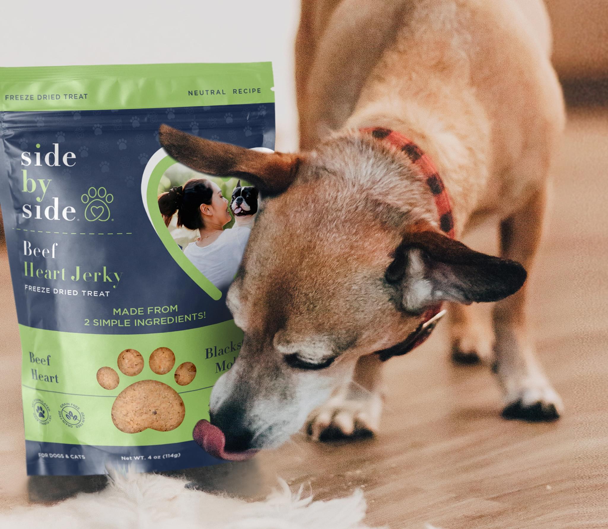
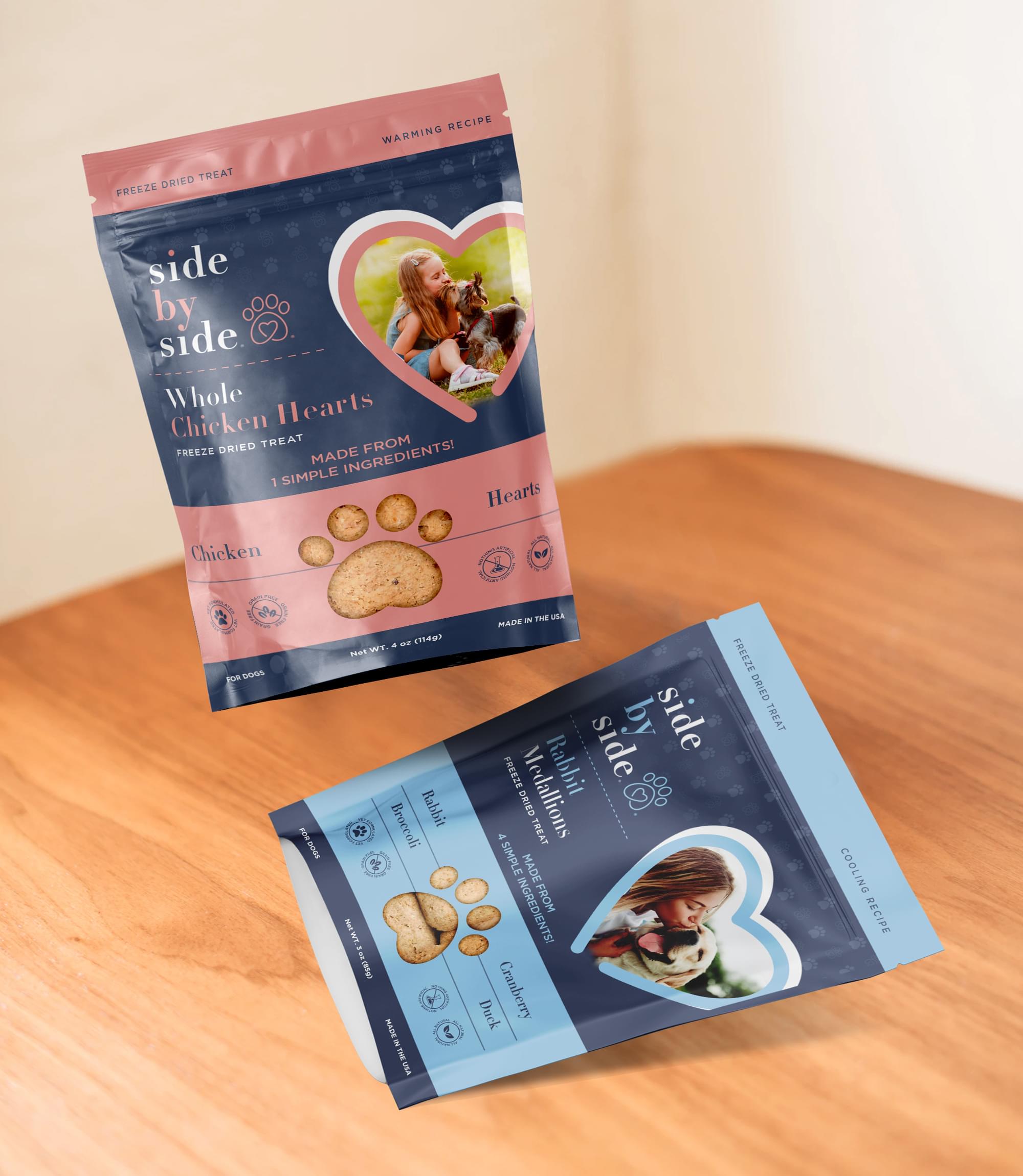
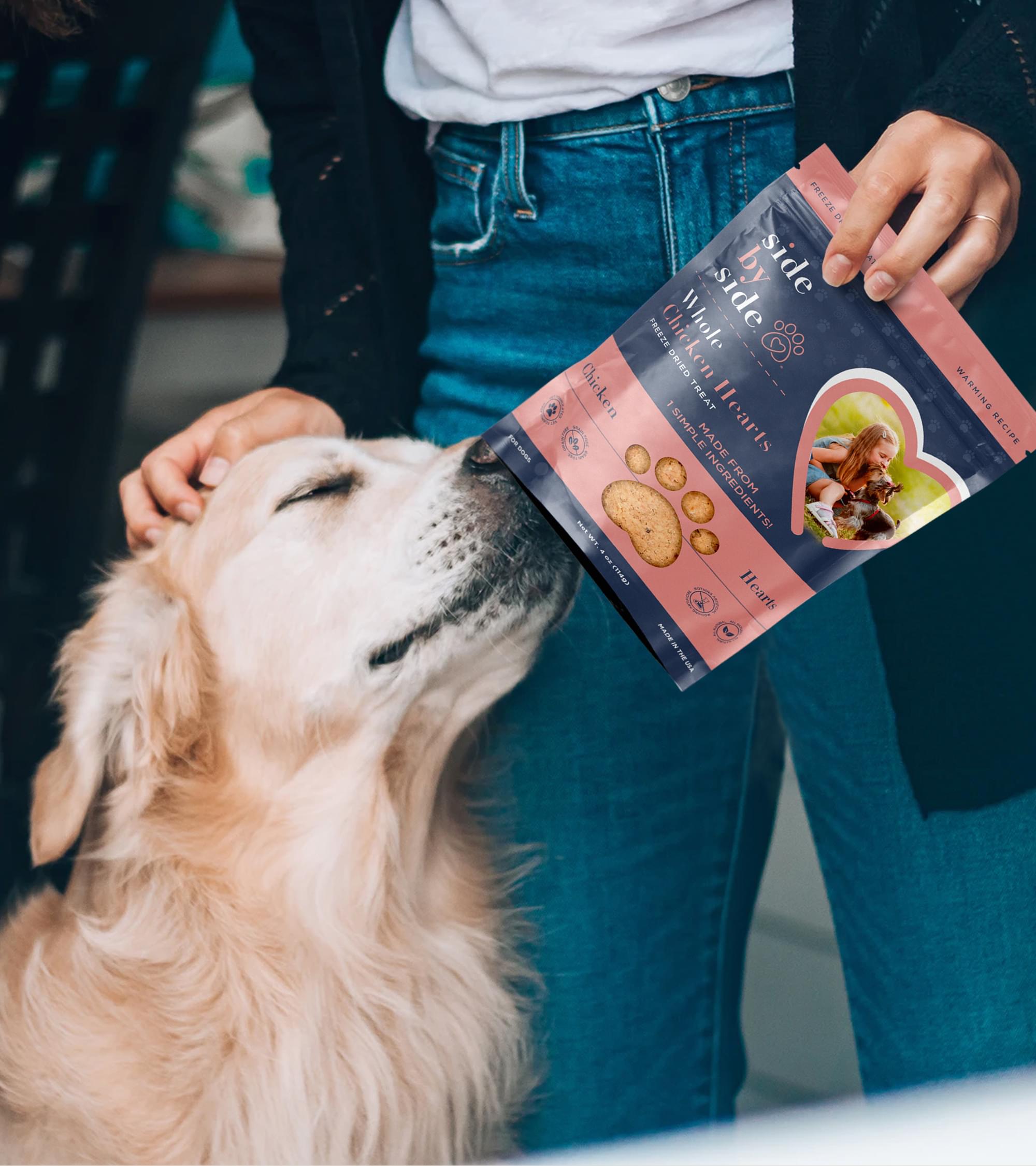
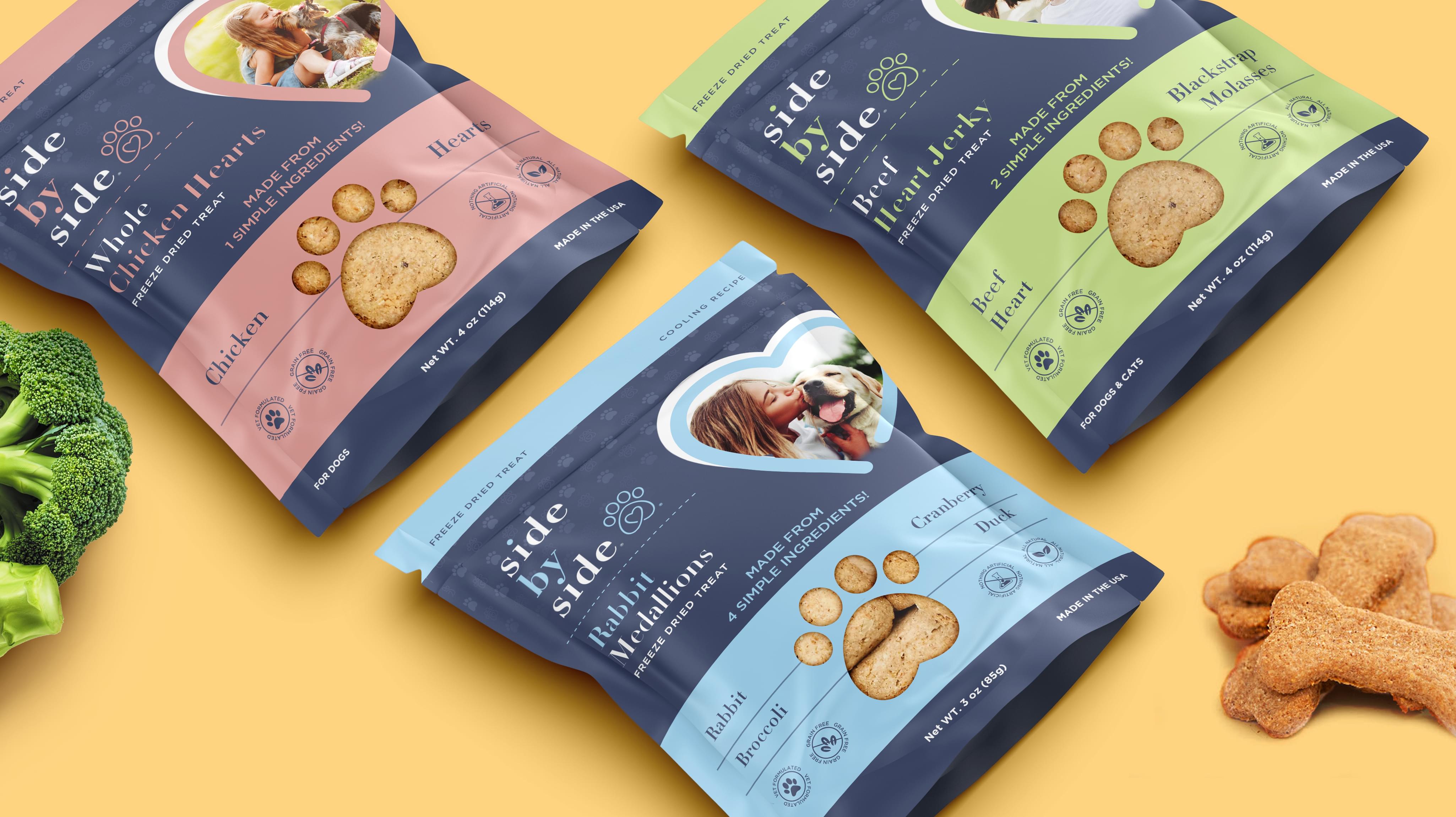
Side by Side presented an intriguing pouch packaging design order. The company creates pet food. It needed a new pouch packaging design for its rabbit medallions option, with the possibility of redesigning the whole line. We accepted the project eagerly.
Challenge Components
- Saturated market
- Dog specific elements
- Dog owner protectiveness
Audience Research
We began by examining which dog owners were likely to choose Side by Side. We discovered that the demographics tended towards women with only one dog. We incorporated that when selecting elements for our pouch packaging design.
Research as a Custom Pouch Packaging Design Firm
We also examined the pet food industry. Dog food comes in a wide variety of examples, so we narrowed it to boutique dog food products. This competitor research greatly informed our pouch packaging design.
Bonus Challenge
The added challenge with the pouch packaging design project involved the saturated market. Companies create dog food often and frequently rebrand. This issue makes standing out on a shelf difficult. Often, competitors in the USA resort to outlandish schemes simply for business. That made our pouch packaging design more vital.
Design Inspiration
The pouch packaging design color inspiration was the Side by Side branding. We wanted a sophisticated design that suited the brand as well. The pouch packaging design offered a unique canvas.
Element Decisions
Pawprints were the obvious choice for a dog food pouch packaging design. However, we wanted original concepts. We also wanted elements that conveyed care. We let the team decide on placement and abstraction level.
Narrowing Down the Final Options
The Stan Agency team returned several amazing pouch packaging design concepts. We began by comparing the packaging to the Side by Side branding. Then we combined two of the best pouch packaging design ideas to create an awesome completed design.
