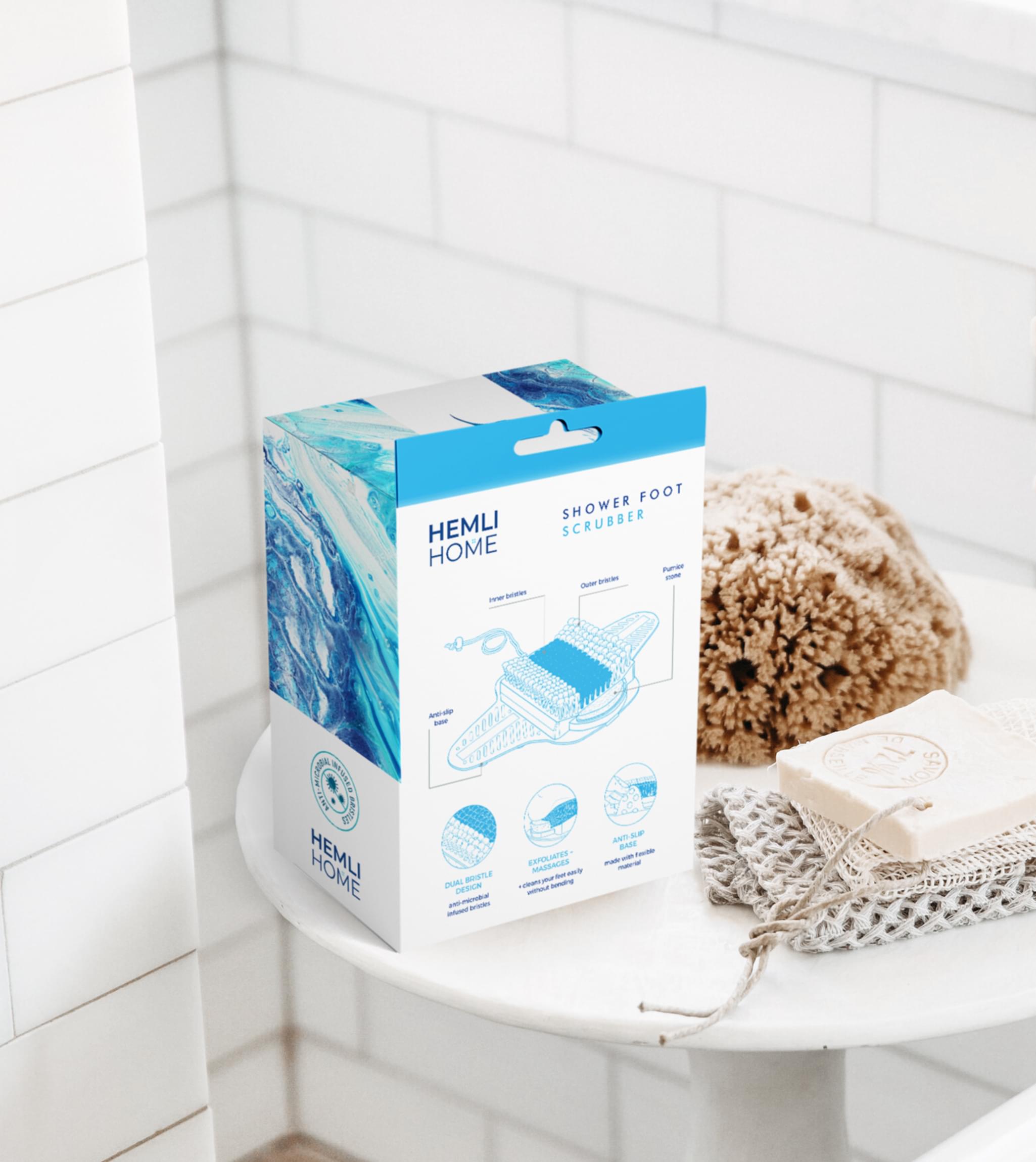
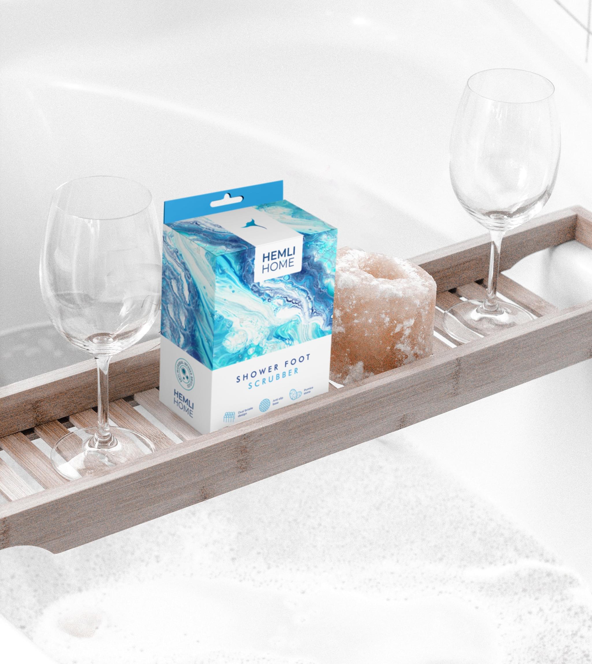
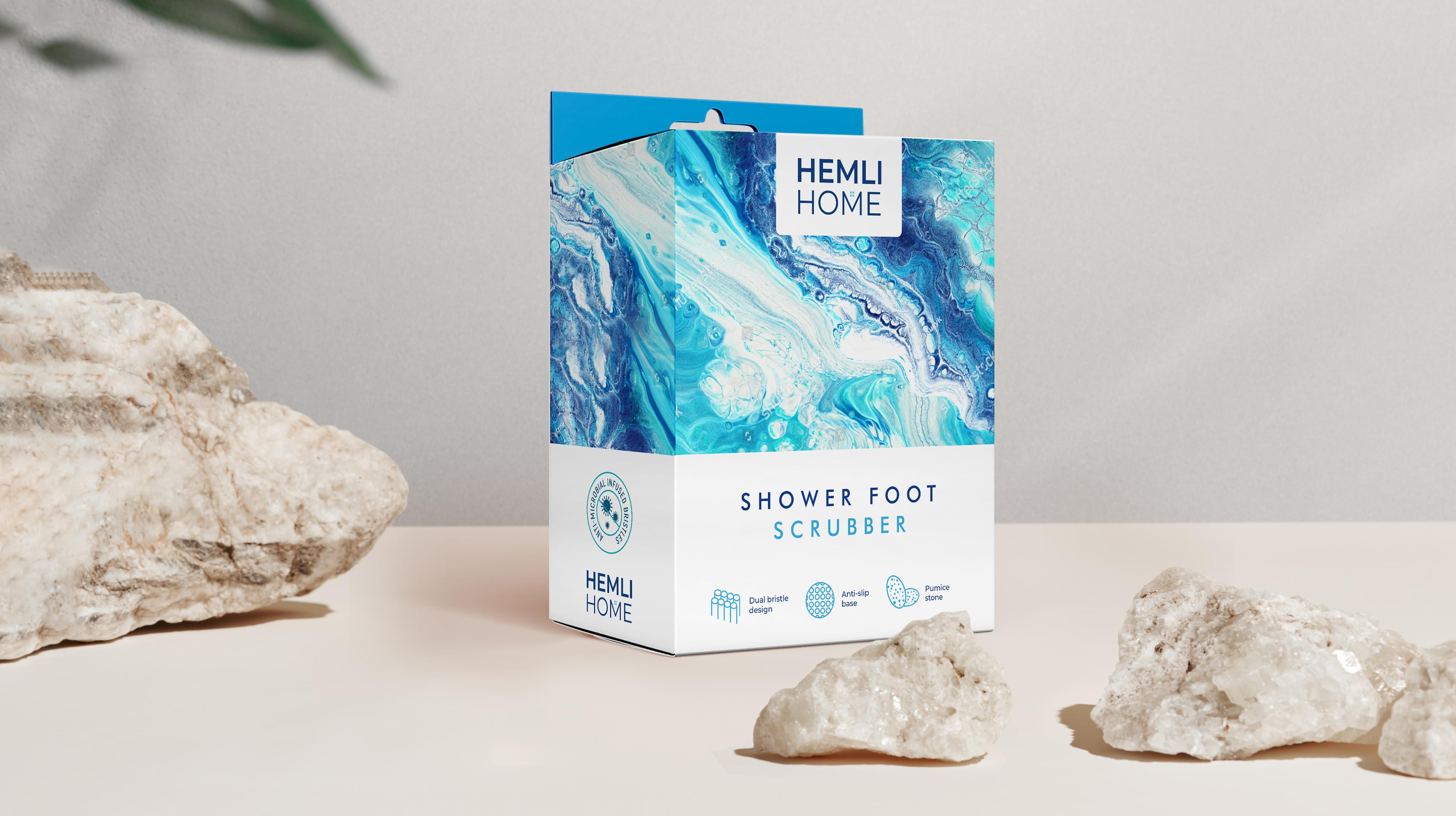
Hemli Home presented Stan Agency to create an innovative, modern packaging design for its foot scrubbing product. Personal hygiene is a competitive field, so Hemli Home wanted its product to stand out. We were happy to oblige, and our top marketing team researched extensively before creating an awesome design.
Challenge Components
- Niche market
- Developing new ways to convey the product
- Well established competition
Research as a Modern Packaging Design Firm
At Stan Agency, research is always our first step. We examined Hemli Home’s competitors, including both their package design and their sales data. From there, we investigated foot care in general, since that is the secondary product market. We looked for trends in each area along with the designs we wanted to avoid.
Bonus Challenge
The tricky part of Hemli Home’s order was figuring out a way to represent the foot scrubber on modern packaging that had not already been done. Many companies had already used the product forward approach, so standing out doing that would be difficult. We need to create a modern packaging design without copying the crowd.
Design Inspiration
We took most of our design inspiration from the area where the foot scrubber would be used, the shower. Most showers have straightforward and practical designs, but they also offer a retreat from life. We decided to channel that into our packaging design. That way, the whole package would look unique.
Narrowing Down the Final Options
The packaging design team came back with several advanced concepts. We began by checking that the designs did not invoke something else, such as the ocean. Then we considered which ideas represented the product and Hemli Home’s established brand best. That led to the water forward modern packaging design in use today.


