SAN LIANG FUN Packaging
SAN LIANG FUN

JAPANESE PACKAGING DESIGN

  • Company:RECO Insight
  • Location:Asia
  • Service:Packaging design
  • Category:Food & Drink
  • 5.0 Review SAN LIANG FUN Packaging 100+ Reviews

Challenge

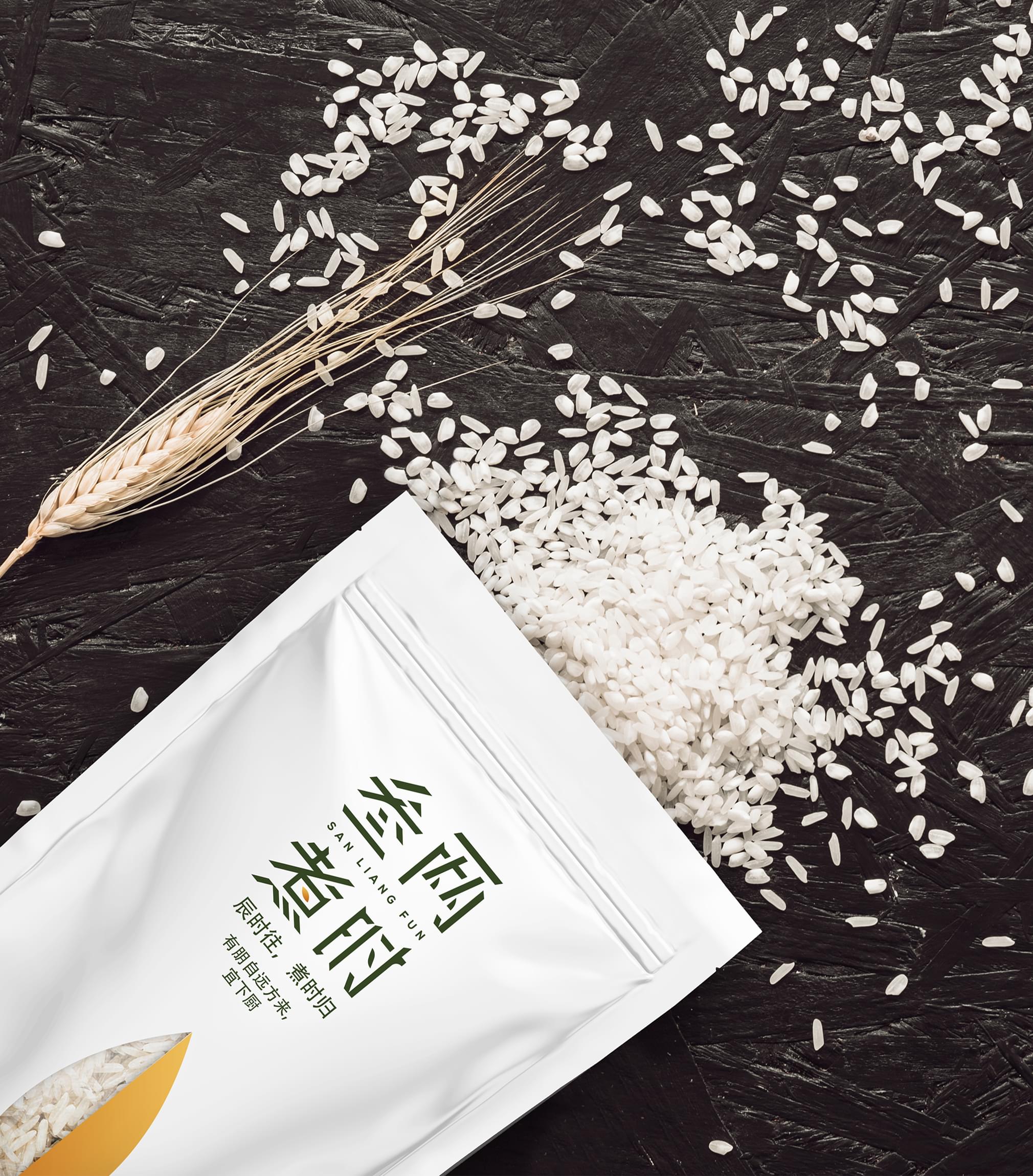
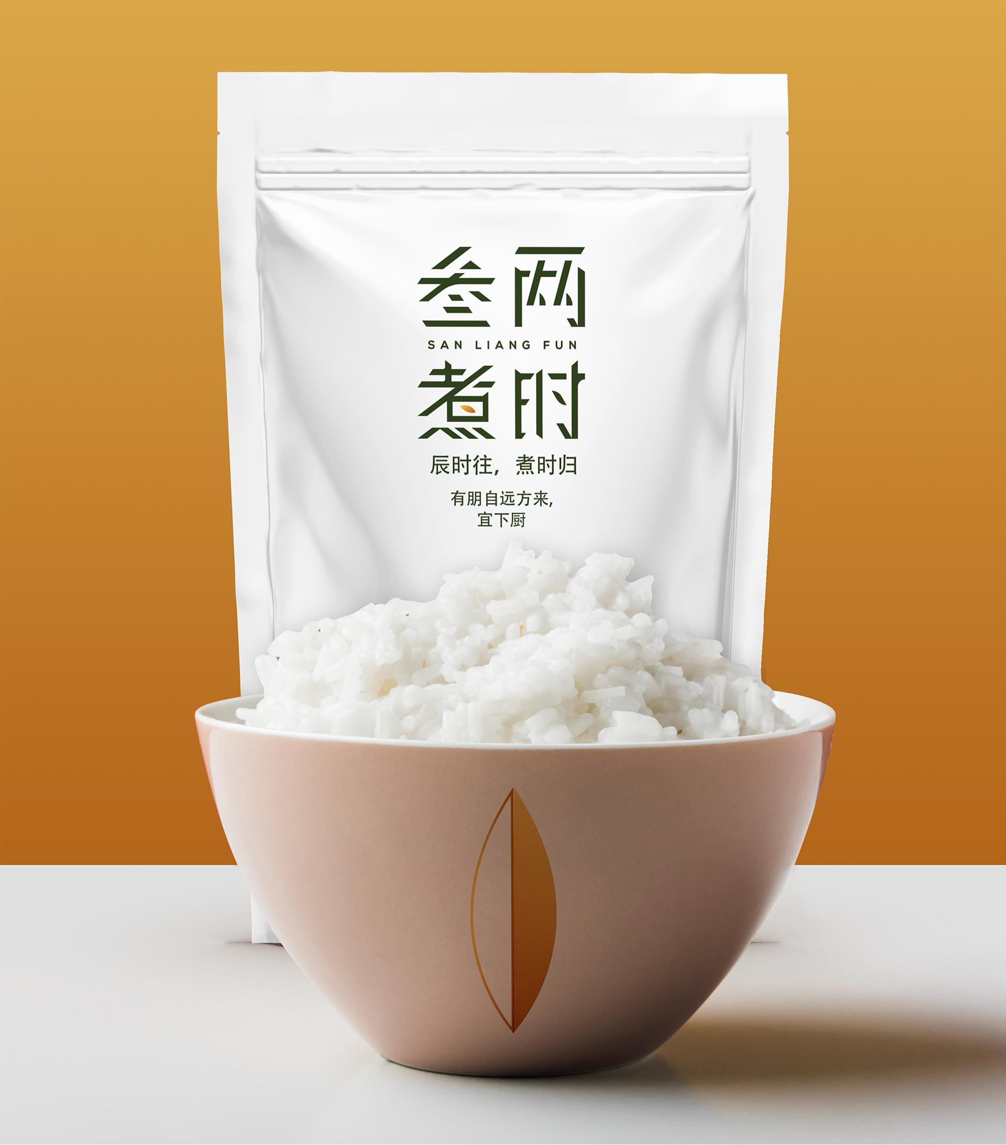
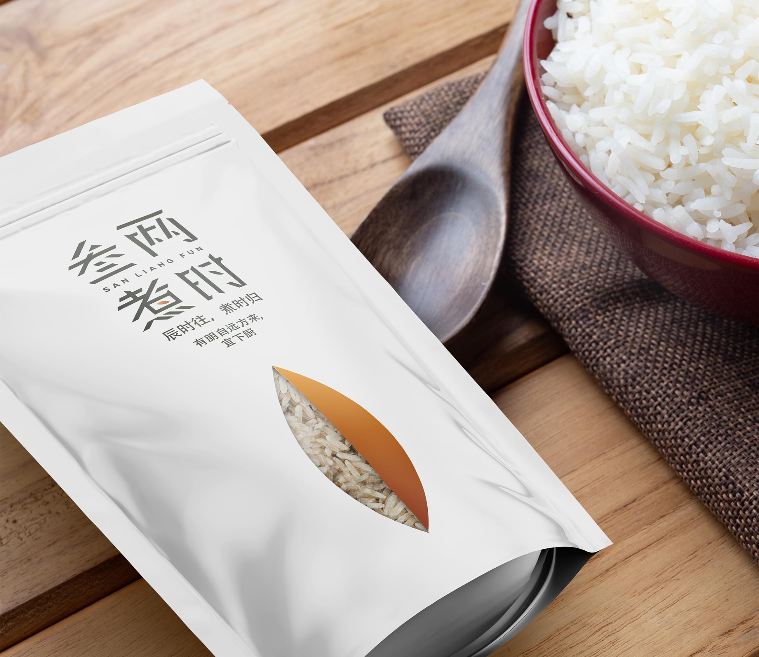
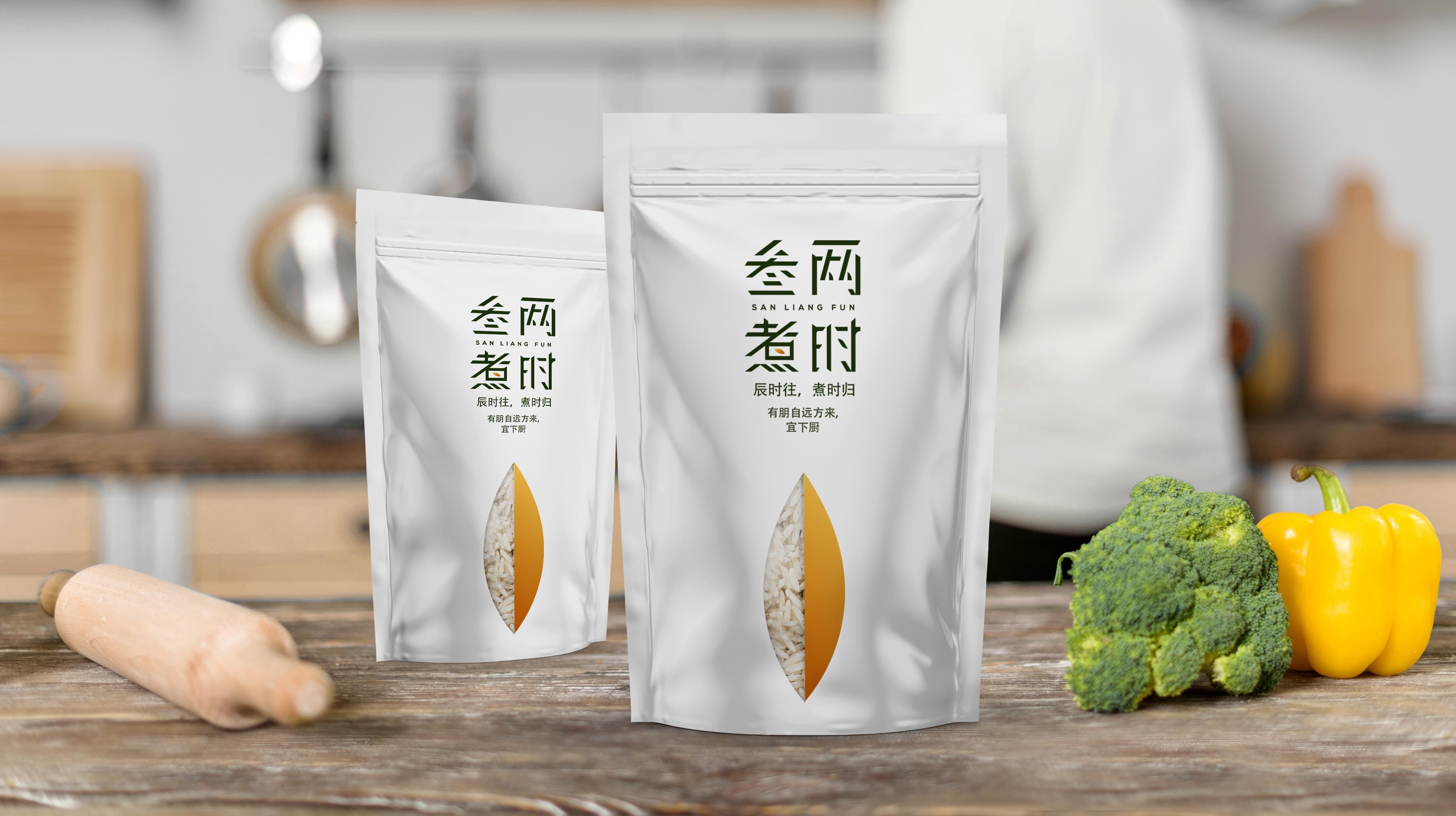
San Liang Fun presented Stan Agency with an intriguing Japanese packaging design problem. The company sells rice to urban dwellers and needed a package entirely in Japanese. We accepted the challenge and began working towards a suitable solution.

Challenge Components
  • Saturated market
  • Appealing to an urban audience
  • Foreign language and labeling

Audience Research

Our first step was researching the people who buy from San Liang Fun. Since the Japanese market trends differ wildly from the USA, it required extensive consideration. We needed a Japanese packaging design that was modern and joyful.

Research as a Custom Packaging Design Firm

We also examined the relevant market trends. Then we pulled Japanese packaging design samples from direct competitors. It revealed existing Japanese rice packaging design tended towards functional or image-driven.

Bonus Challenge

The added challenge for us was the foreign language. We needed a professional translation for this project. Fortunately, we had worked with a translation company before to achieve amazing Japanese packaging design.

Design Inspiration

The primary Japanese packaging design inspiration involved the minimalism trend. It began there, so it made sense it would appeal to an urban population. We also used the shape and color of the rice.

Element Decisions

Minimalism made the Japanese packaging design element decisions more vital. We chose the grain of rice and product name as the primary elements. The amazing design team did the rest of the work choosing colors and layout.

Narrowing Down the Final Options

The design team produced several outstanding Japanese packaging design concepts. We compared the packaging design team results to the brand. Then we decided which ideas best suited the overall minimalist concept.

Result

The San Liang Fun representative liked the Japanese rice packaging design. The company quickly produced the packaging and got it on the shelves. We recently heard how practical the company finds the packaging design now that it has been on the market.

The Deliverable

The Final Package:
  • One complete custom Japanese packaging design
  • Separate package design elements for reuse
The completed Japanese packaging design featured a minimalist approach. We kept to a black and white theme. We also incorporated a half accent color and product window. This allowed us to showcase the quality rice. We look forward to working with San Liang Fun again.
SAN LIANG FUN Packaging
Scroll