Brand story
Yanano began with a single product, cassava flour, and expanded into other pantry staples while creating a sustainable supply chain. The company continues to satisfy customers and recently expanded into micro greens.

Yanano delivers premium quality pantry staples and fresh greens that help people achieve healthier lives. The company aims to become a household name for people who want a healthier life without sacrificing taste.
Yanano began with a single product, cassava flour, and expanded into other pantry staples while creating a sustainable supply chain. The company continues to satisfy customers and recently expanded into micro greens.
Yanano products carry various certifications in addition to its line being unique products on their own. For example, cassava flour is not common in western markets, yet Yanano not only carries it but guarantees the product is fair trade.
This additional care and certifications separate Yanano just as much as its brand messaging. With limited options for healthy products from the region, the steps Yanano has taken with each product raise the whole brand.
Yanano uses a refined brand voice as part of its operations. The idea is to match customer expectations about the quality of the products, which Yanano ensures is quite high through its sustainable supply chain.
Yanano mixes content in its brand voice so that everything is elevated a little higher. Even though the company uses practical product applications and how it’s made content, the posts are always high-quality and cleaned up.
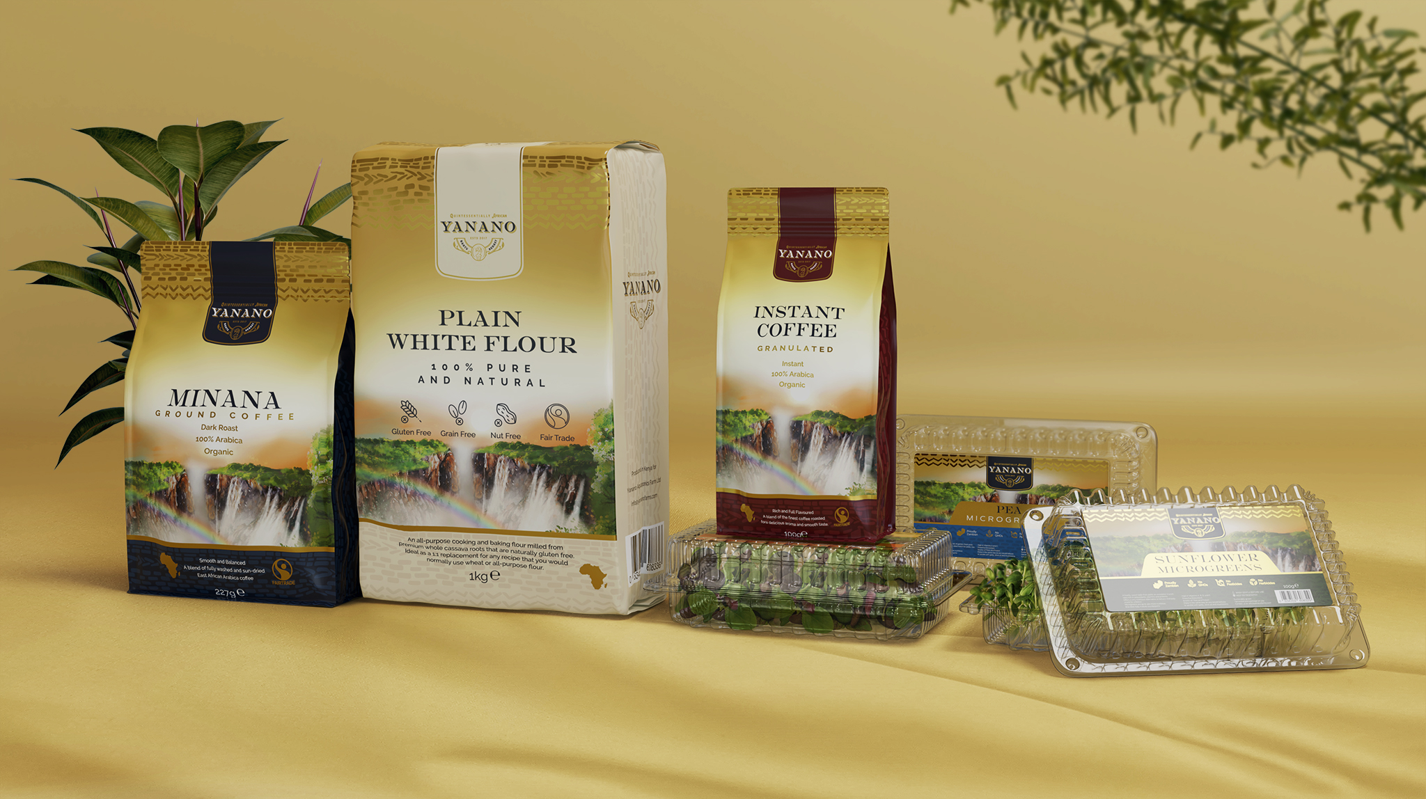
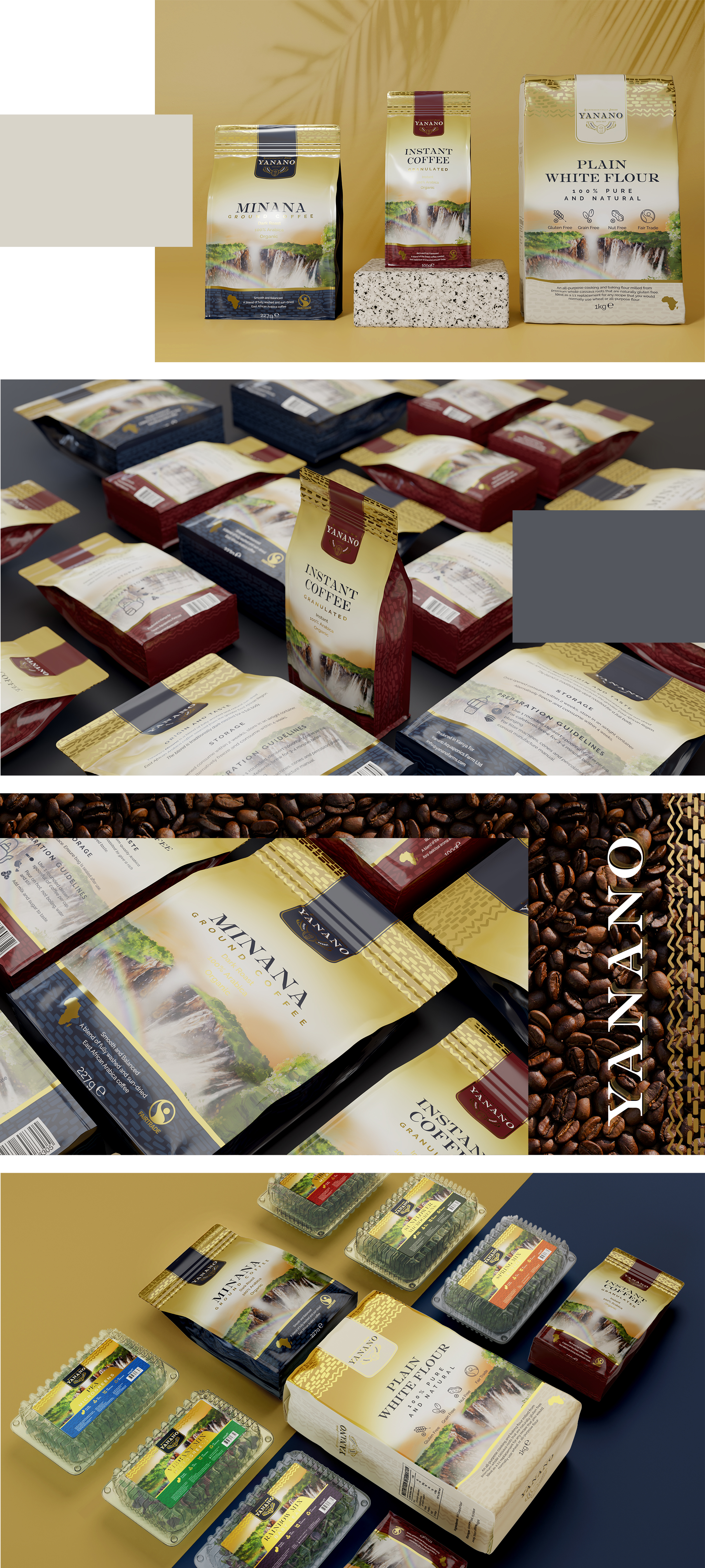
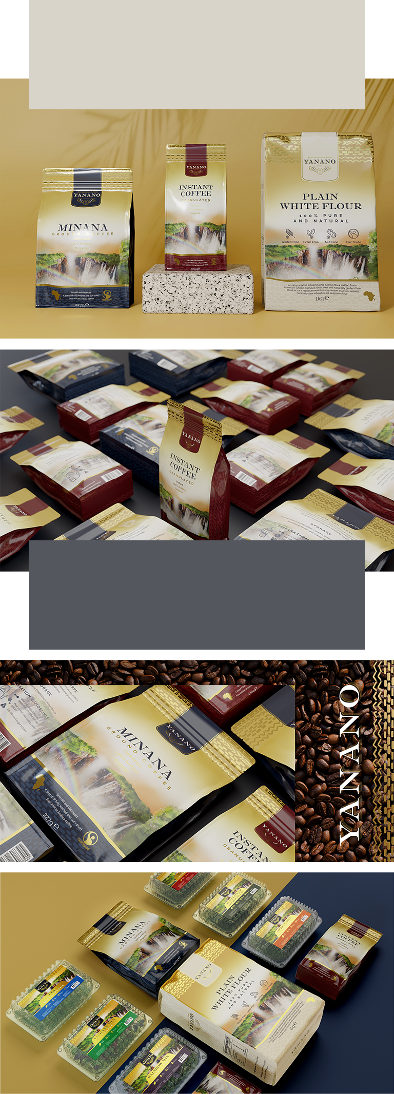
Yanano uses rich colors to convey the brand on its packaging, including a cream on every package. The company also employs distinct colors to help people instantly recognize which product they see, which came into the agency packaging design process for the microgreens.
Yanano uses a peaceful waterfall scene on all of its packagings in addition to its logo. This slightly wild image conveys peace, tranquility, and harmony related to the product, which speaks to the fair trade nature of each option.
The sans serif used on the Yanano packaging design was selected for its clarity to readers. In addition, this choice blends well with the clear labeling requirements many food safety organizations require, creating a seamless look.
Yanano follows the conventional format for its packaging design. This choice ensures that the products are readily recognizable in stores. It also allows for a more luxurious look since customers can readily visually compare.
Yanano targets individuals with disposable income rather than acting as a widely available brand for staples. These people do not mind the extra expense associated with the addition of high-quality products in their kitchens.
Yanano also targets a segment of the health market. The company creates access to alternative products as well as microgreens, both of which are high-demand items that fit numerous trends. By including this market, Yanano ensures it is a preferred option.
Yanano is positioned on the edge of the luxury space where not everyone can afford to access its products. While pantry staples tend not to be luxury items, Yanano ensures it produces products of the highest quality.
Yanano is also positioned as a specialty brand. From the coffee to the cassava to the fresh microgreens, everything Yanano produces is not familiar within the target stores. This specialty positioning also helps the company maintain its brand.