Brand Differentiation
Montagna differentiates itself on the quality and uniqueness of its products. The company achieves this quality by respecting the history of kefir, reaching back thousands of years, alongside using the newest market innovations.
Brand Voice
Montagna speaks from a fun, authoritative space. This brand voice educates on kefir, gut health, and general wellness. The fun nature of the voice makes the brand feel accessible and unique in the crowd of available dairy products.
Montagna uses this voice across all of its platforms, including its packaging. Pairing the fun voice with active images and people consuming the product helps convey the message that kefir products are part of a balanced and healthy life.
Packaging Elements
Colors
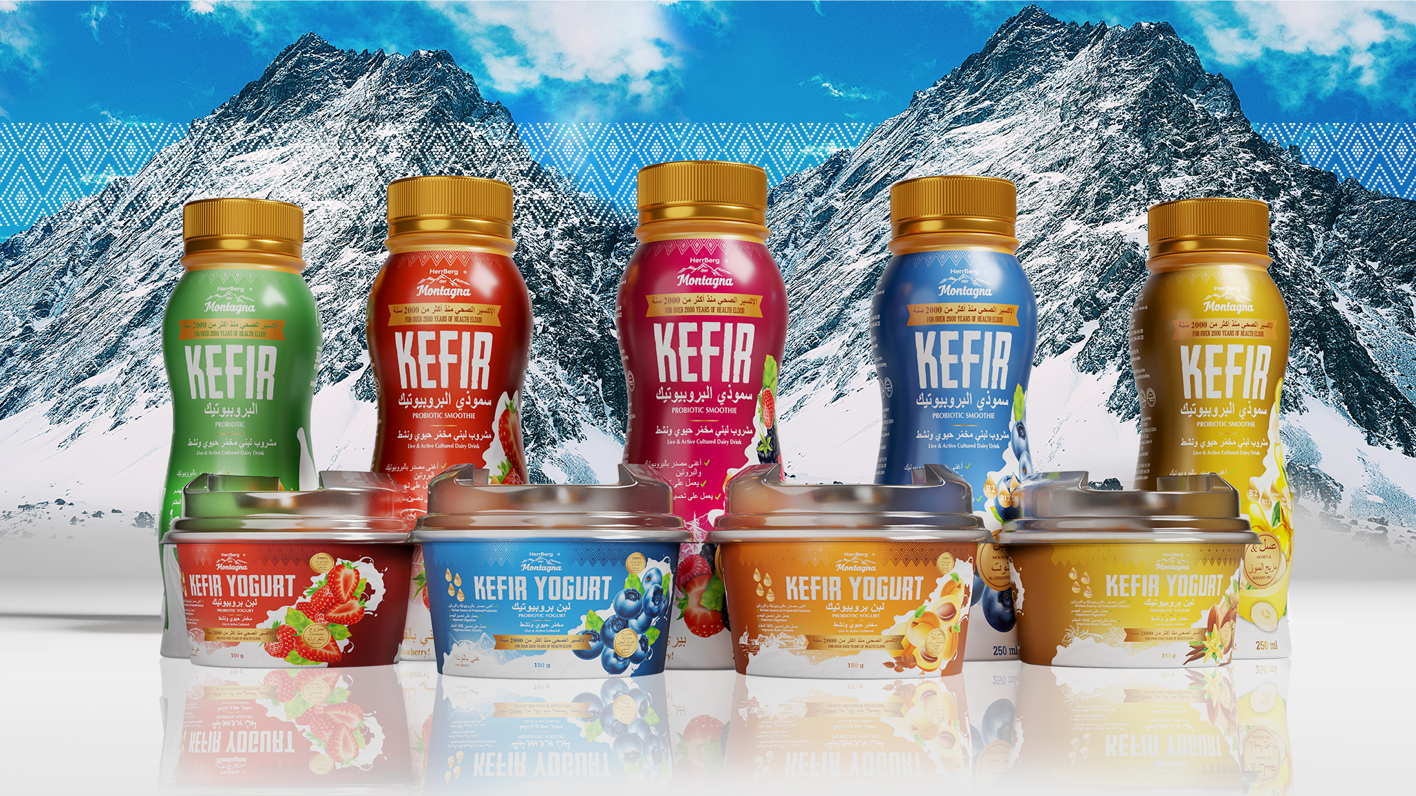
Like many items in stores, Montagna uses distinct colors to relay the flavors of each product. These colors match between the kefir drink and the kefir yogurt flavors rather than being universal.
Visuals
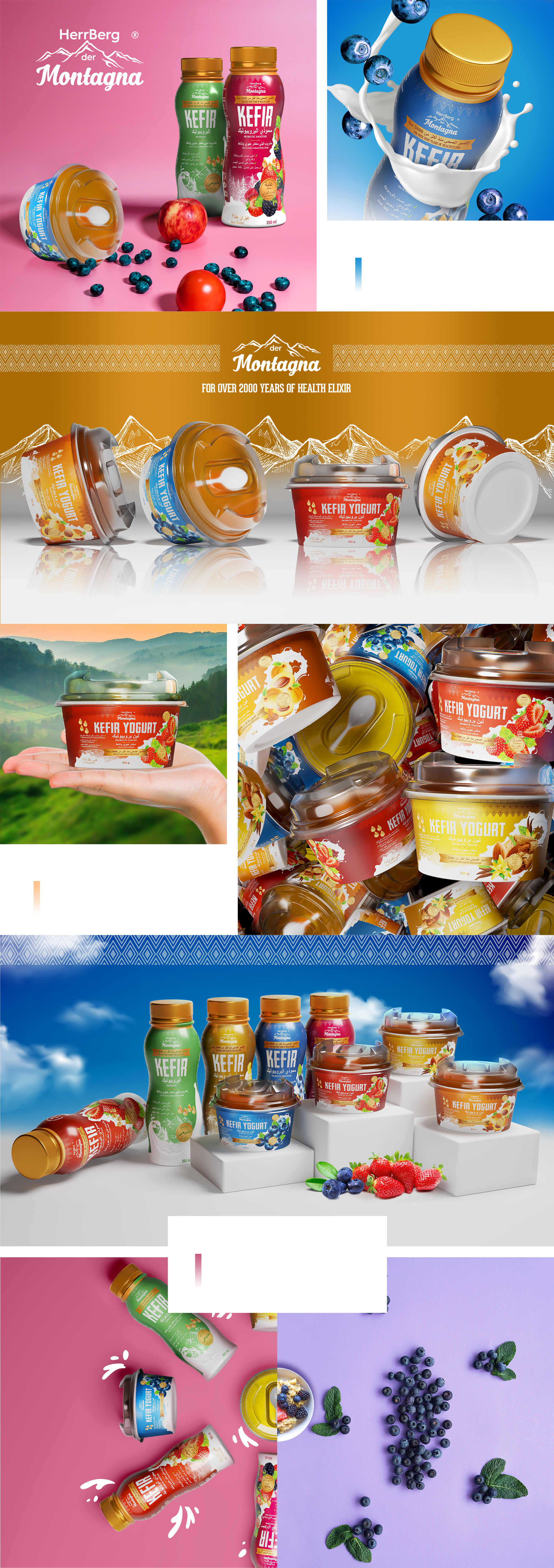
Montagna uses images of the origin of the flavor for each kefir, making them easy to recognizable when viewed on the shelf. The company uses a consistent image that looks like poured kefir to accent packages.
Typography
Montagna uses a consistent script throughout its packaging design. This choice helps the product appear consistent and will make it easier to transition to English if the company moves out of the Arabic-speaking market.
Format
Overall, the Montagna uses a minimalist-inspired look on its packaging. Most of the packaging is a solid color with a single visual apart from the company’s logo. This simplified look allows the company more agency to expand its product lines.
Brand Targeting
Montagna generally targets women as they make the purchasing decisions in most households. While consumers may be more evenly balanced, appealing to married women offers a more consistent base.
Montagna has a secondary market in the health sector. By targeting people interested in fitness, Montagna appeals to their sense of taking care of the body so it can perform the way they intend. This fact makes kefir a good post-workout snack.
Brand Positioning
Montagna is positioned as an affordable choice on the grocery store shelves. Due to the nature of kefir, it is not priced comparable to conventional milk or yogurt, but it is on the lower end of specialty products. Combined with the unique marketing approach, the kefir company is positioned for maximum awareness.


