Brand
story
Anigma was started by a small group tired of always having to replace their peripherals, whether they worked or gamed on them. The team started finding better solutions to increase the quality of each device.


Anigma provides exceptional computer peripherals throughout its market so more people can use technology seamlessly. These accessories change how people view their computers and what's possible overall.
Lorem ipsum dolor sit amet, con-sectetur adipiscing elit. Quisque ultrices ipsum urna. Sed eget turpis est. Fusce facilisis dapibus maximus. Proin et lectus tempor, efficitur tortor vel, pretium nisl. Donec facilisis sapien in massa accumsan scelerisque.
Anigma was started by a small group tired of always having to replace their peripherals, whether they worked or gamed on them. The team started finding better solutions to increase the quality of each device.
Anigma operates with an eye on innovation, adaptation, effectiveness, and support. These values help the company achieve the next great things in computer peripherals while ensuring customers feel like part of the team.
Anigma distinguishes itself on the market through quality and marketing strategy. The company maintains a mysterious air throughout its branding, making it fun for consumers to interact with. Then they get the top-of-the-line peripherals and rarely swap brands again.
Anigma uses a mysterious brand voice that’s incredibly knowledgeable about technology. This mix helps it relate to people who are serious about their computers, whether they game hard or need to be for work.
Anigma uses a variety of action shots, technical information, and tech industry news to exercise its brand voice to the general public. This strategy offers a broad appeal within an increasingly diverse market segment.
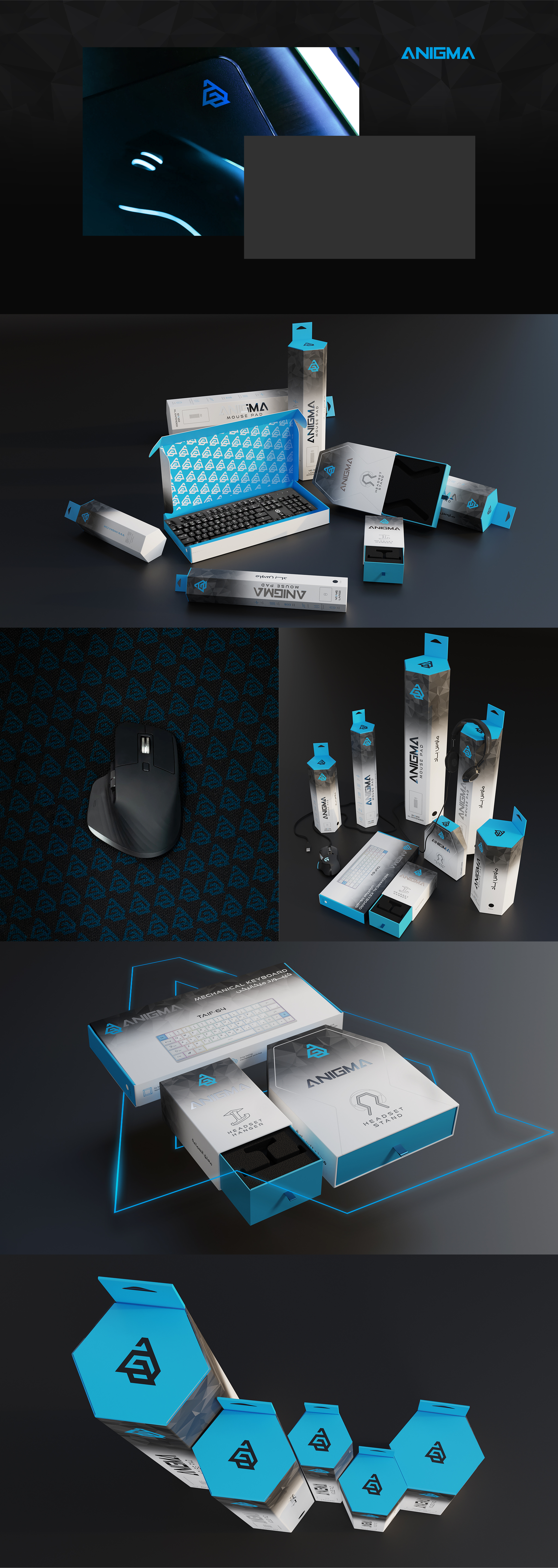
Anigma uses a vibrant blue to contrast with the more traditional black and white the tech industry often uses. Additionally, the agency turned the black and white into a unique gradient with blue accents for a dramatic look.
The primary visual is the Anigma logo, a unique twist on the company’s full name. There are also smaller visuals on the sides of the packaging that indicate the contents, which are fully colored.
Anigma uses a futuristic version of a standard sans font. This specialty font speaks to the innovation of the company and its commitment to creating the future of peripherals for every situation.
Anigma’s unique packaging designs featured hexagons and other geometric shapes, which really spoke to its tech appeal. The brand truly wanted to represent the possibilities inside each box while minimizing packaging waste.
Anigma targets heavy tech users for all of its products, from keyboards to mice. This demographic often has disposable income and has previously experimented with various popular peripheral brands.
Anigma recognizes that this demographic is often male, but not exclusively. Therefore, Anigma takes specific steps to target women as well so that its products can be universally appealing to those who need better peripherals.
Anigma is a mid-range tech company as far as pricing goes. The company does not try to compete with the cheapest options but does not believe good peripherals should cost a significant amount either.
Anigma also positions itself as a friendly expert. By doing so, the company reaches the broadest base possible, who then understand the company’s value even before they buy their first Anigma product. This strategy helps the company maintain its solid brand position.