Brand Differentiation
All Better differentiates itself through quality products and an imaginative take on marketing. The company may supply lotion, but from its marketing campaigns, people can see how it changes the lives of ordinary people.
Brand Voice
All Better uses a fun, energetic brand voice that speaks with humor and modern slang. This brand voice is uniquely suited to the forward-thinking brand and helps address potential customers who have tried every solution for skin problems in the book.
All Better uses this brand voice to create a fun presence that people enjoy interacting with. Featuring series like all the different locations to use lotion and the funniest lotion fails, All Better helps people connect with the community.
Packaging Elements
Colors
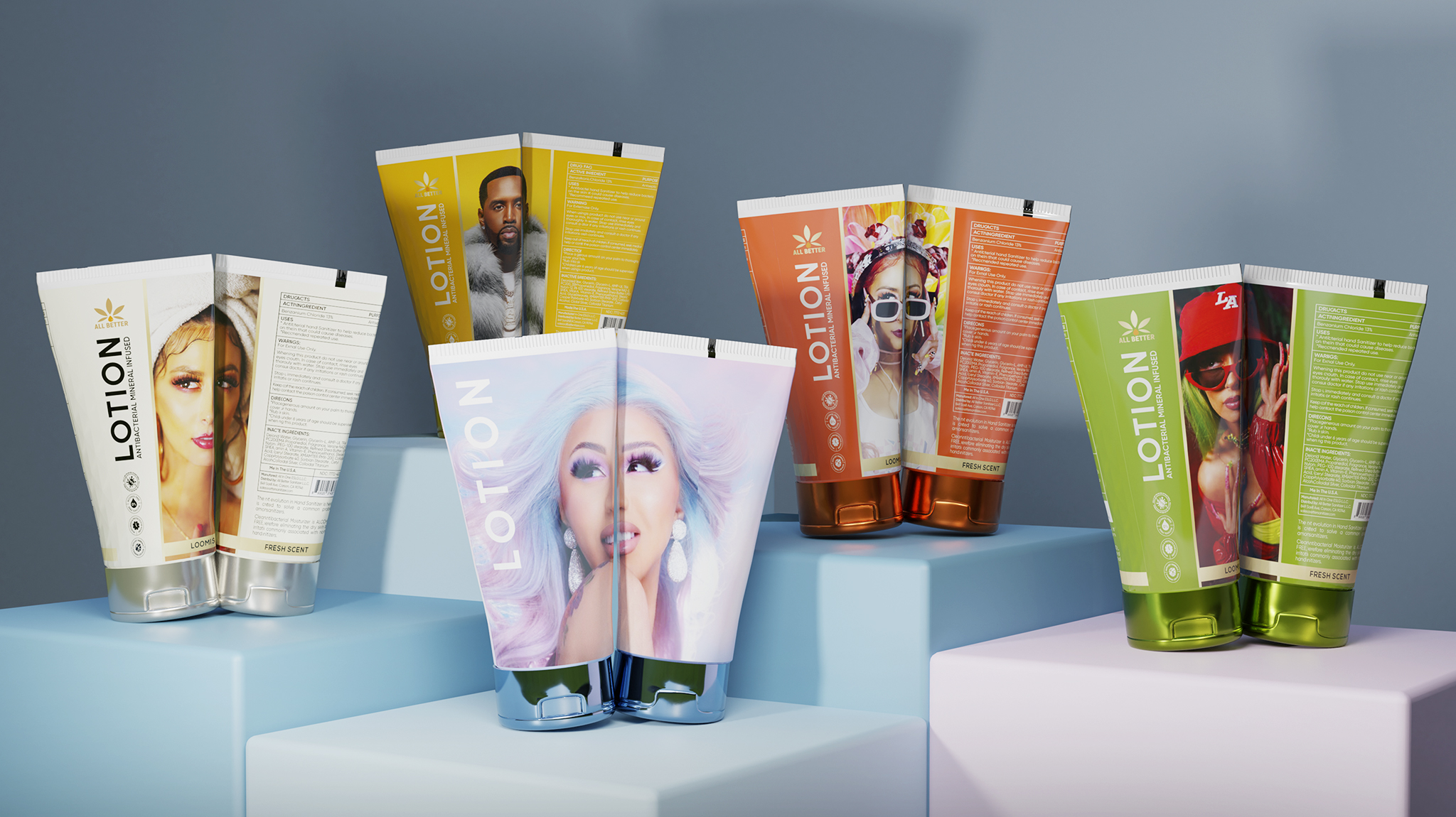
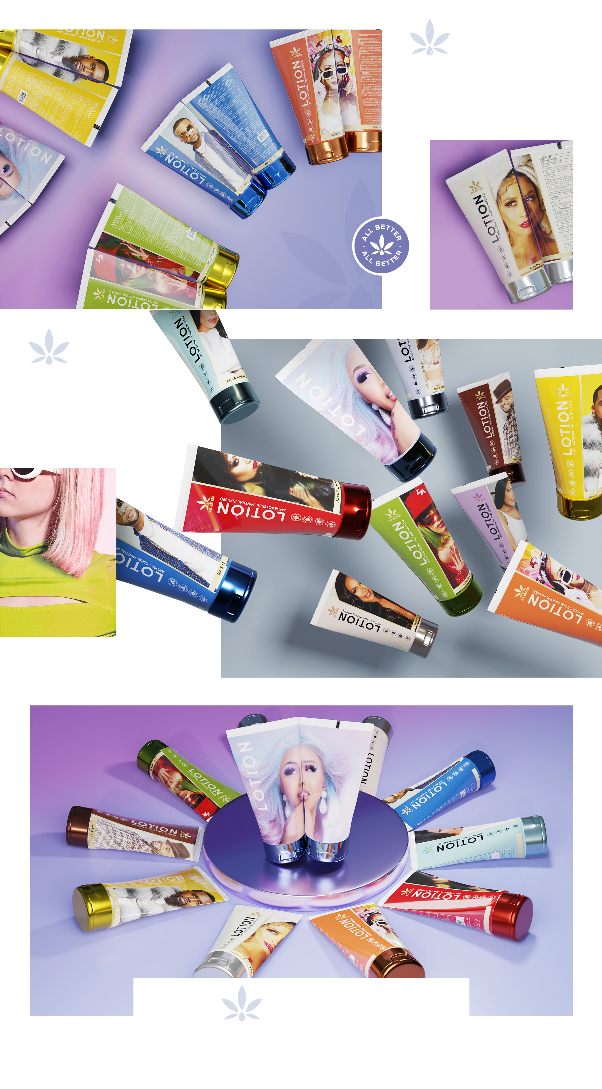
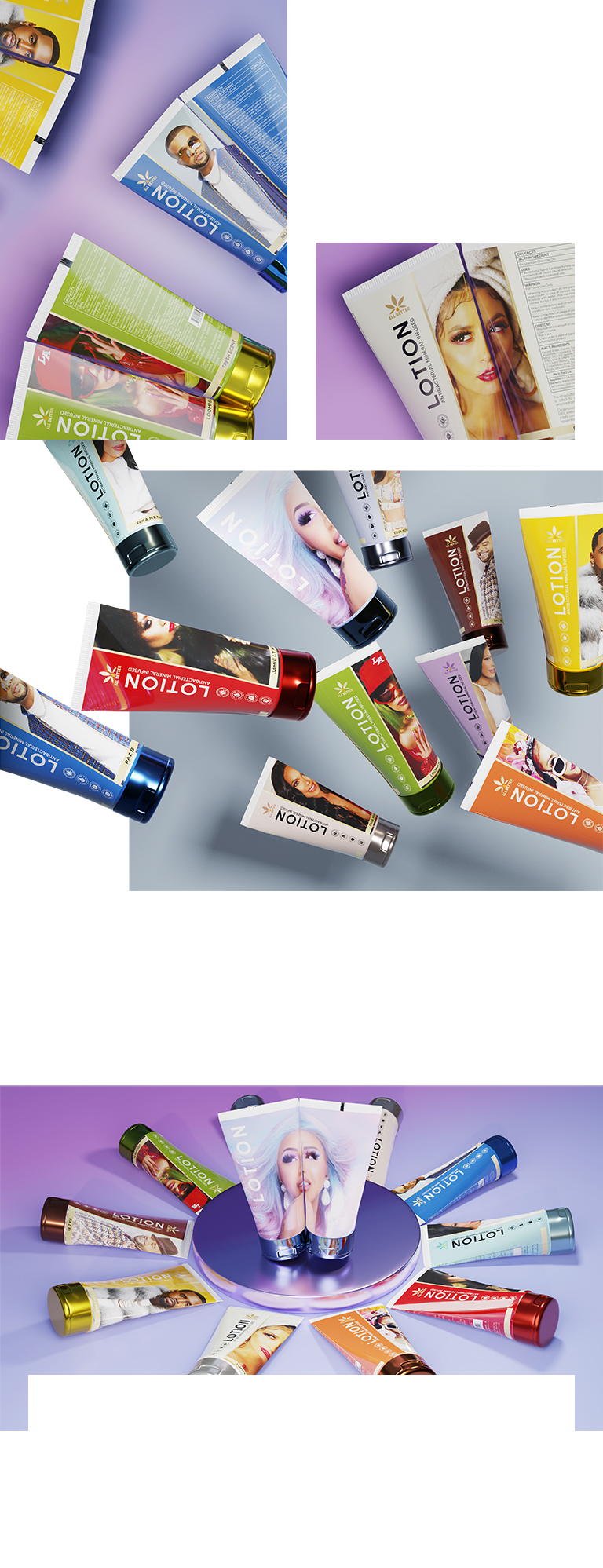
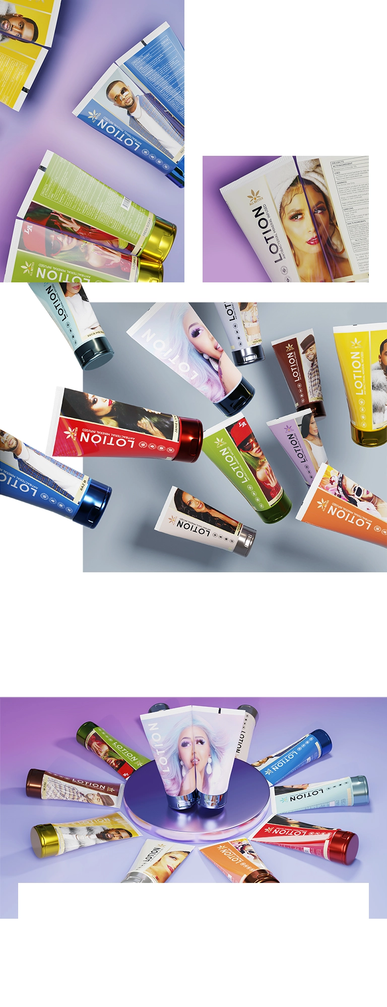
All Better uses a wide variety of colors. These colors tend to be bright and eye-catching rather than following a specific palette that typically limits brand design. This out-of-the-box approach makes All Better stand out on shelves and in online stores.
Visuals
Each bottle of All Better features a different person. These figures were chosen to represent the brand’s vibrancy, daring, and imagination since many break stereotypes. Each photo is done as a wraparound on the bottle.
Typography
All Better uses a classic sans serif look for easy readability. This font choice balances the more bold look of the visuals and ensures consistency across product packages. Plus, it allows the company agency to adjust the way a more elaborate font may not.
Format
The format is relatively straightforward. Half of each lotion tube features vibrant color, and the other half is the matching photo, which wraps around the tube. This half feature intrigues potential customers into picking up tubes to learn more.
Brand Targeting
All Better targets younger consumers who may not fit the traditional lotion demographic. This targeting ensures that the company can serve everyone, which fits the company’s overall mission to make a lotion that works on every skin.
While All Better targets women more than men, the company offers various options to address various needs. This unique set of options also helps the brand reach the target demographics.
Brand Positioning
All Better positions itself in the middle of the price scale for lotions. The brand offers a daring, young, and fun option for consumers who may not otherwise be interested in lotions, which helps the company attract a larger customer base.