PRO BRIGHT Packaging
PRO BRIGHT

TOOTHPASTE PACKAGING DESIGN

Challenge

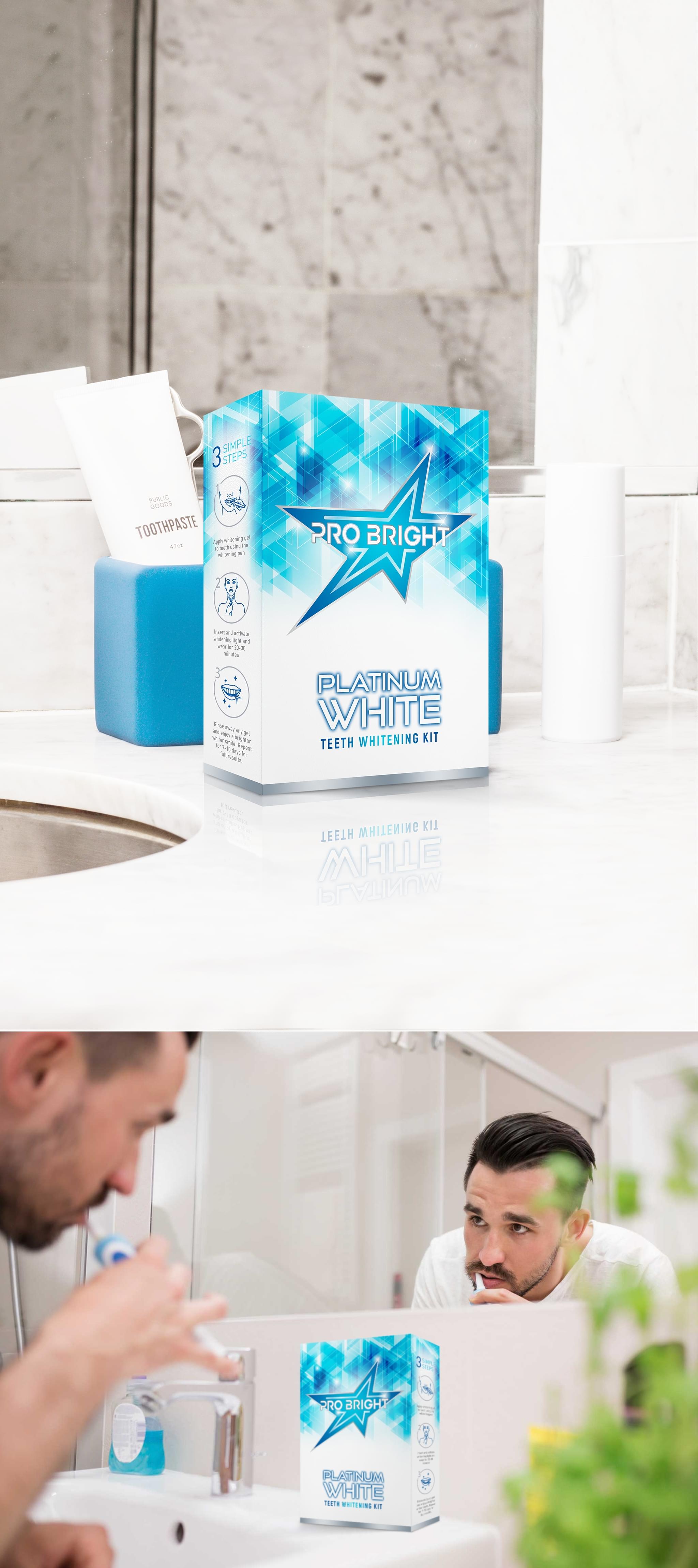
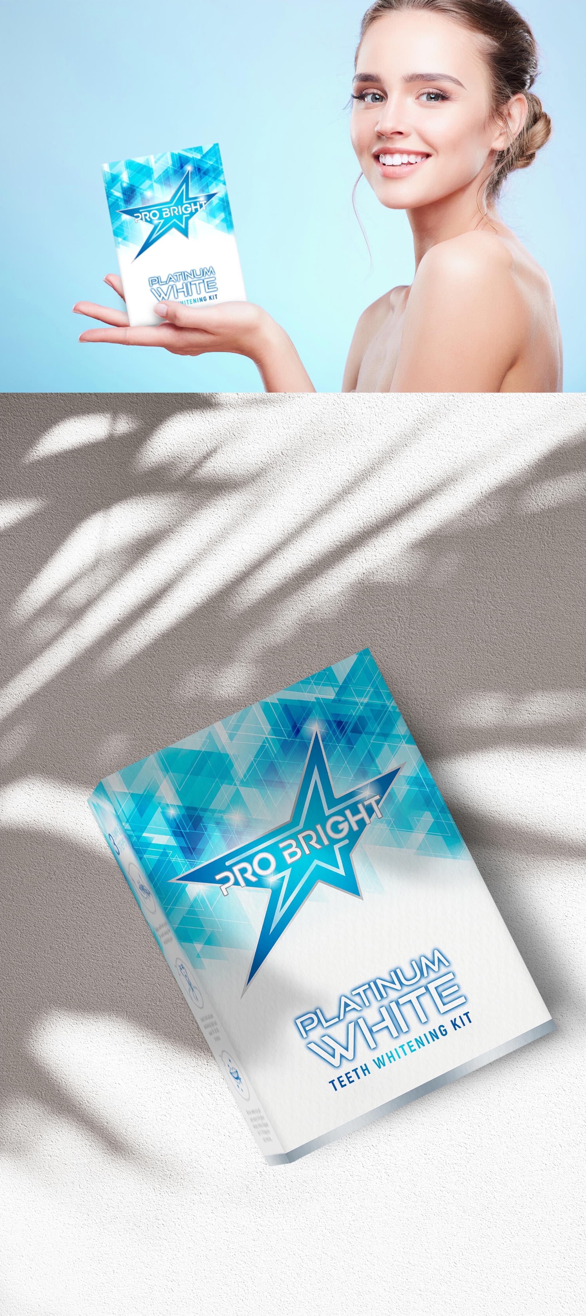
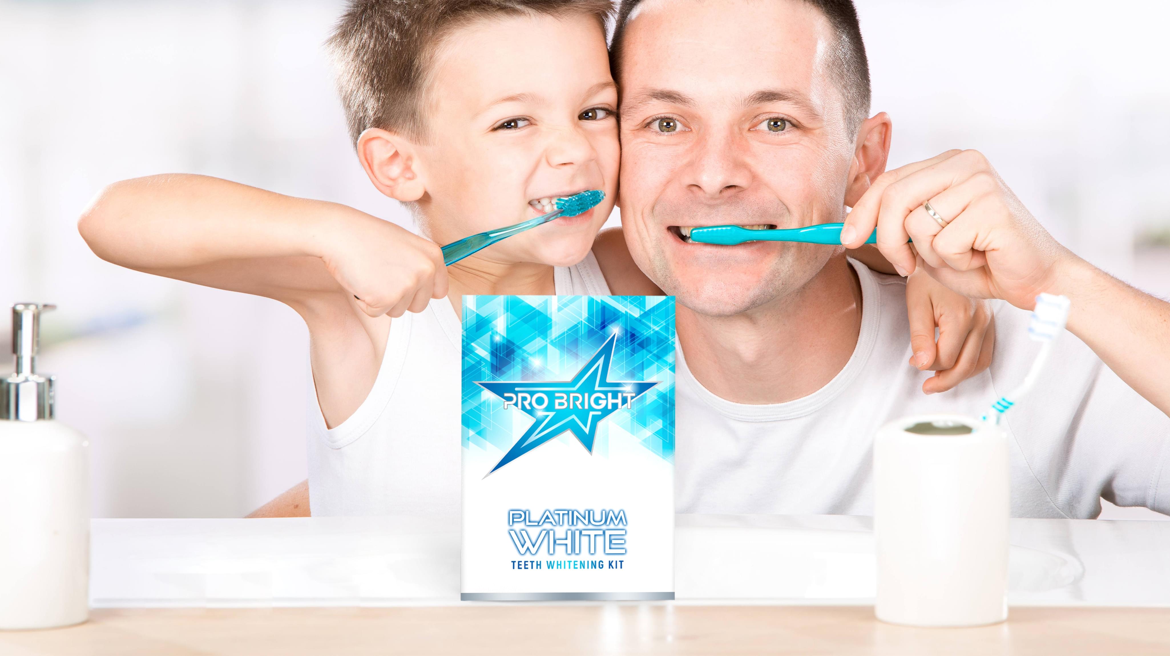
Pro Bright Toothpaste brought a unique challenge to us at Stan Agency for its new toothpaste packaging design. The toothpaste was not only toothpaste, and the whole tooth whitening kit needed a packaging design. The company wanted its product to stand out while still considering the industry standards.
Challenge Components
  • Saturated market
  • Conveying the safety of the product
  • Market demands for sustainability

Research as a Custom Packaging Design Firm

This order required intense research, especially since markets like the USA have labeling requirements on toothpaste. We needed to incorporate those requirements with an innovative toothpaste packaging design that stood out on the shelf. Competitor research revealed how every other company was trying to stand out as well.

Bonus Challenge

The biggest challenge with Pro Bright’s toothpaste packaging design was conveying the safety of the product to consumers while still meeting legal labeling requirements. Depending on the market, whitening kits may or may not be typical and well-liked. We wanted to ensure that our package design conveyed safety while still being eye-catching.

Design Inspiration

In addition to competitors, our design inspiration also came from the cleaning market. This market conveys bright, sanitary, and safe routinely, making it the perfect place to draw some inspiration. The team then went to work on creative concepts using a mix of both sets of research and the necessary legal guidelines.

Narrowing Down the Final Options

The design team brought several innovative design concepts for this toothpaste packaging design project. The group first eliminated ideas that were too far outside of the market norm. Then we worked to find the most innovative approach that drew our eyes in. The resulting toothpaste package design is both elegant and appealing.

Result

Pro Bright began deploying the new toothpaste packaging design immediately, and customers seemed to love it. As the new whitening kit packaging entered circulation, the company marketed the re-branding effort. They then reported an uptick in sales, especially as they were able to enter new markets.

The Deliverable

The Final Package:
  • One complete custom tube design
  • One creative box design
  • Separate package design elements for reuse
The final toothpaste packaging design used a mix of blue and white to convey the sparkling cleanliness the product produces. Additionally, the innovative toothpaste package draws the eye in since it uses a patterned gradient. We look forward to working with Pro Bright again as the company expands its product offerings.
PRO BRIGHT Packaging
Scroll