MOMO Packaging
MOMO

DRY FRUIT PACKAGING DESIGN

Challenge

Moving into a Crowded Market

The global protein bar market growth is strong, meaning there are opportunities for new companies to enter the space and find long-term success. Unfortunately, the crowded market also means that new brands must either drastically undercut their competitors’ price or craft a unique, professional image that helps them stand out.

Building a Quality Brand Image from Scratch

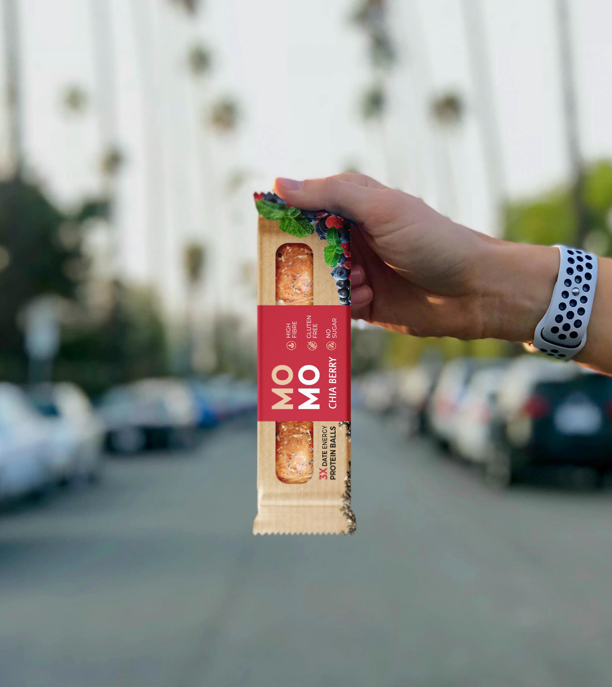
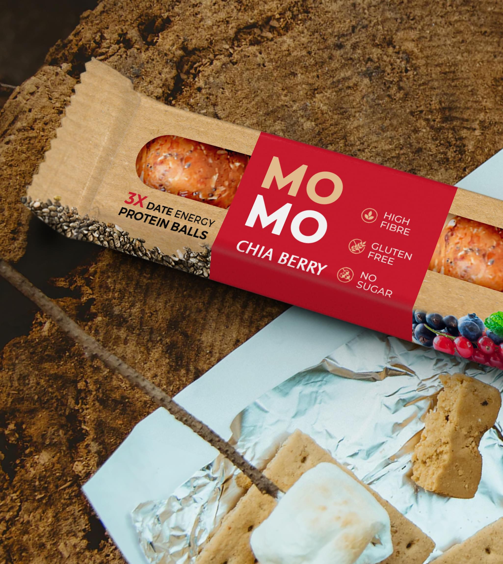
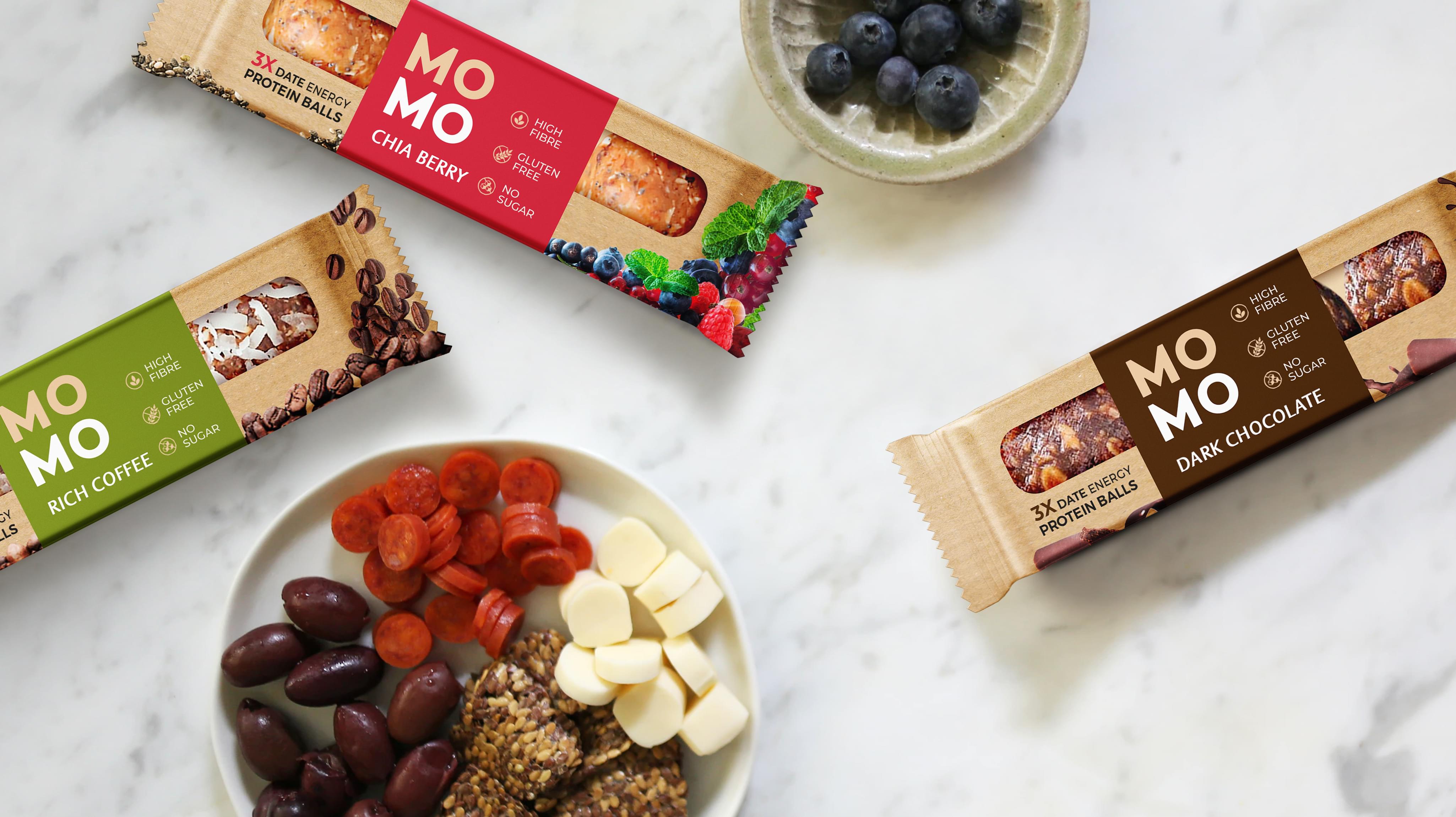
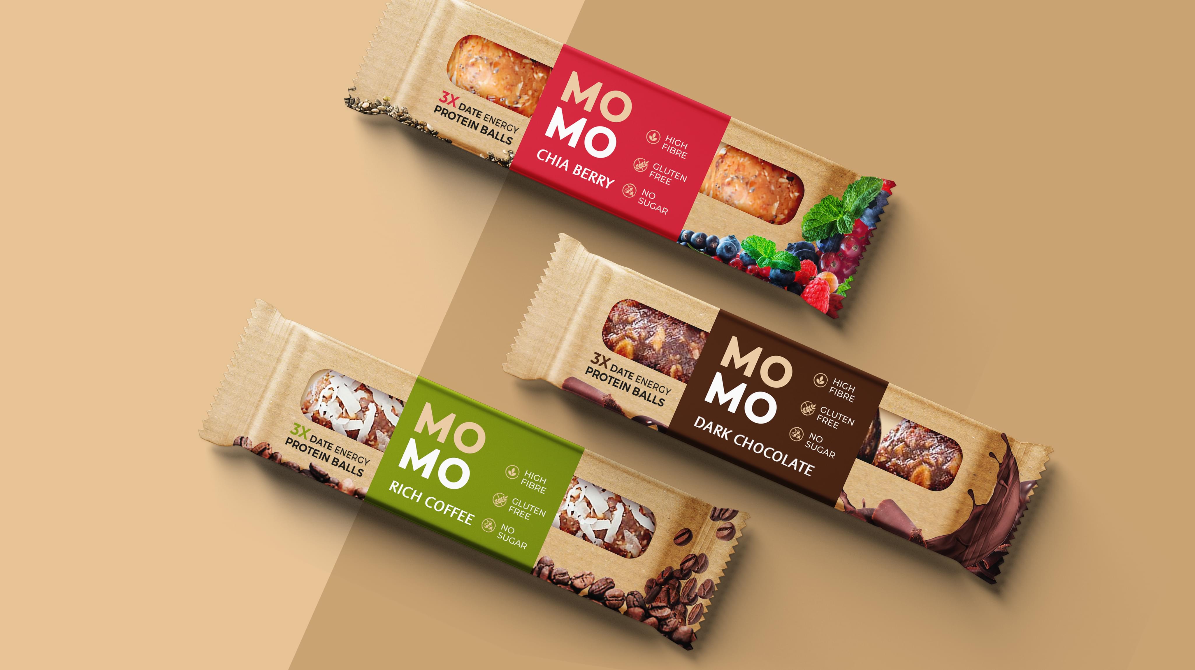
When Momo decided to enter the protein bar market, they contacted Stan Agency with a clear goal for their order: Develop a creative dry fruit packaging design concept that showcases their product in a way that draws consumers in and leads to sales.

Only an innovative approach to dry fruit packaging design could differentiate their energy bars enough to lure prospective buyers away from more familiar brands. So, that’s what we created.

Result

Discovering a New Approach

Before setting our designers to work, we conducted in-depth market research on the protein and energy bar niche. We examined the dry fruit packaging design of Momo’s closest competitors, analyzing every aspect, including color, typography, imagery, material quality, and convenience.
After reviewing the competition, several points stood out. Almost of them features images of the protein bars rather than allowing the actual product to be seen. Many of them included cluttered text that distracted more than informed. And a number of the fry food packaging designs appeared dated.

Considering how to approach this project, several things stood out in our minds. We wanted to create custom packaging that…
  • Utilized advanced packaging methods and materials, ensuring each package was environmentally friendly and in line with Momo’s core values.
  • Allowed the actual product to serve as an inspiration to consumers.
  • Implemented design ideas that communicated a modern, high-quality vibe.

Crafting a Package Design that Sells

Using these principles, we created a brief for Momo that included several amazing packaging examples. Eventually, we settled on the one seen above.

How we did it…
  • A thin, plastic window features prominently on the front of the protein ball, allowing consumers to clearly see the delicious product they’re buying.
  • Bold colors and images were chosen which draw attention.
  • The plain, brown paper wrapper communicates Momo’s commitment to environmental friendliness and recycling.
  • High fibre, gluten free, and no sugar seals adorn the label, immediately offering important information to consumers who are increasingly concerned about the ingredients in their food.
The final dry fruit packaging design was an immediate hit that connected with consumers in a big way. Not only was Momo able to enter the saturated protein bar market, they were able to do successfully – and with a bright future ahead.
MOMO Packaging
MOMO Packaging
MOMO Packaging
Scroll