Pure Grove Packaging
PURE GROVE

PLASTIC PACKAGING DESIGNS

  • Company:Pure Grove Co.
  • Location:Australian
  • Service:Packaging design
  • Category:Food & Drink
  • 5.0 Review Pure Grove Packaging 100+ Reviews

Challenge

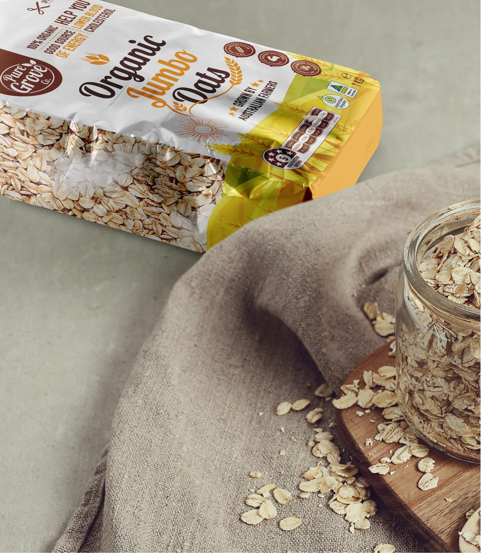
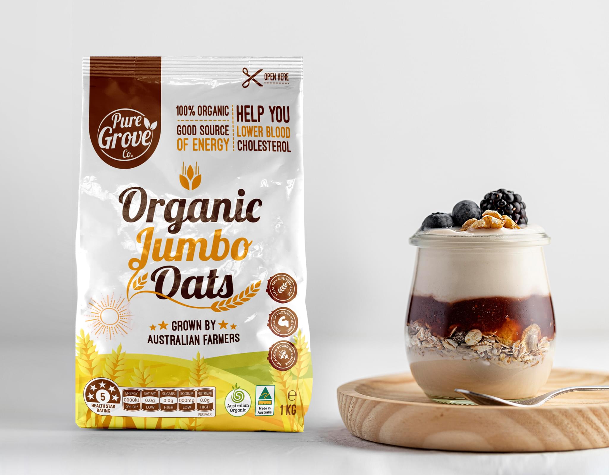
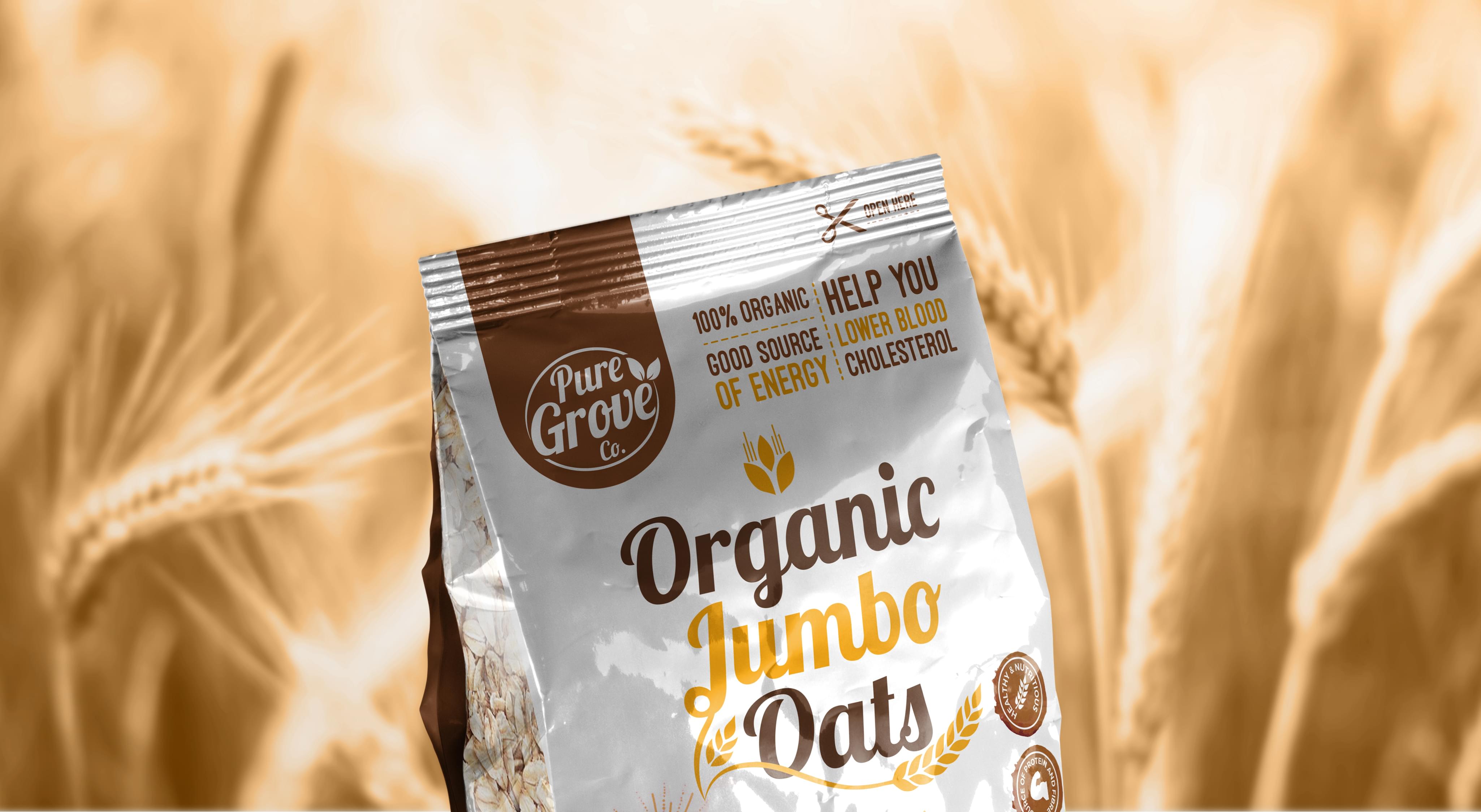
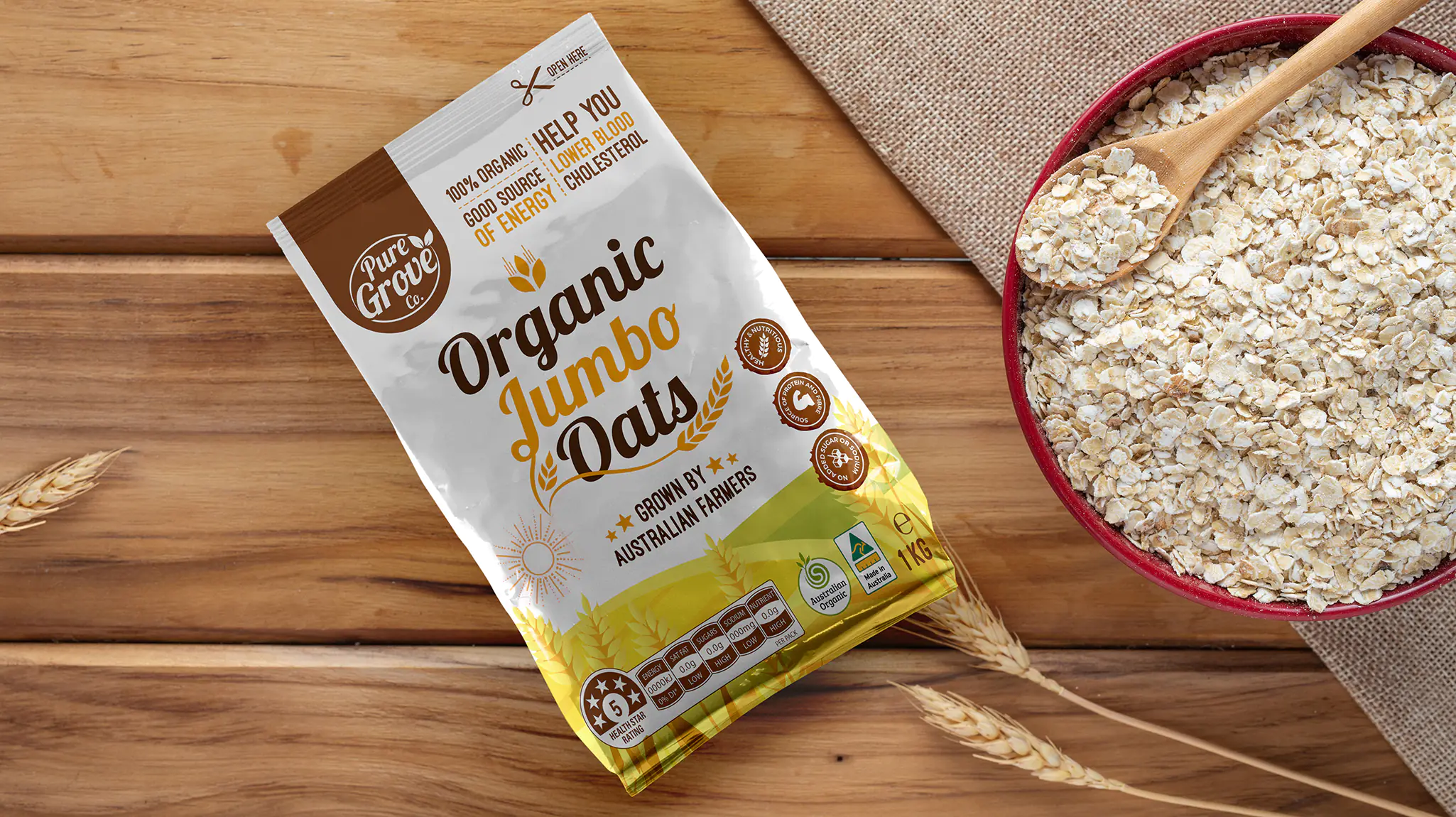
Organic food is increasingly more relevant for — and preferred by — customers in markets all around the world. The source and quality of an ingredient not only tells a story about the product itself but also ensures consumers of the healthy properties of the food. Pure Grove required an innovative and eye-catching plastic packaging design for its Organic Jumbo oats product that reached a larger target base than those limited only to health food stores; instead, the Pure Grove product required a design that showed how accessible the product was to customers of all backgrounds.

Additional options

For Pure Groove, it was necessary that we created a custom-made design that effortlessly showcased the wholesome, organic nature of the product to consumers.

Result

Organic food often has the connotation of being expensive and inaccessible to the average shopper operating on a grocery budget. Rather than be branded as a specialty health food item, Pure Groove required a plastic packaging design that was welcoming to shoppers of all different types. The combination of warm colors, cheerful graphics, and bold font ensures that potential customers immediately recognize the healthy quality of the organic oat product without being driven away by a perceived high price.

Knowledge to achieve the goal

Every design decision for Pure Groove’s plastic packaging design was intended to attract shoppers of all backgrounds. The organic oatmeal packaging has mass appeal, intended to catch the eye of shoppers yet fit in with the style of other supermarket goods. Our knowledge of current food packaging market trends influenced the style for Pure Groove, yet did not dictate the entirety of the design. Rather, the plastic packaging design employs both traditional design elements and creative visual twists.

Coloring

The healthy properties of the organic oat product are expertly conveyed through the earthy color palette and usage of graphics. The warm yellow, orange, and brown hues evoke images of a healthy golden field growing beneath the sun. The graphics are simple and easy to understand even through a quick glimpse, easily showcasing essential information to busy shoppers rushing through the aisles. The font is placed centrally on the plastic packaging design, boldly highlighting the healthy and organic nature of the product.

Finalization

Overall the plastic packaging design for Pure Groove’s organic oats expertly showcases the two most essential parts of the product itself: the healthy origin of the ingredients and the accessibility of the product to shoppers of all backgrounds.
Pure Grove Packaging
Scroll