NUT2SWEET Packaging
NUT2SWEET

SNACK BAR PACKAGING DESIGN

  • Company:Nut2Sweet
  • Location:USA, Texas
  • Service:Packaging design
  • Category:Food & Drink
  • 5.0 Review NUT2SWEET Packaging 100+ Reviews

Challenge

Building Momentum Behind a New Energy Bar Option

The energy snack bar market in the USA is a multi-billion-dollar industry that’s expected to grow for the foreseeable future, according to current trends. So, opportunities are rife, but not without challenges.

The sheer number of companies releasing new energy snack bars every year, each trying to get a piece of the growing market, is staggering. And any new business entering the market has to appeal to consumers who have a favorite energy bar brand and flavor. Their only real options are to lower their price below the competition or use amazing design ideas to grab their attention and draw them in to a sale.

When Organic Wise contacted Stan Agency, they informed us of their strategy and asked for custom powder packaging design that would be practical for shipping and customer use, while communicating their core belief in natural and organic food sources.

Our Mission: Craft an Innovative Snack Bar Packaging Design & Larger Brand

When Nut2Sweet contacted Stan Agency about developing a unique and creative snack bar packaging design that would separate it from the competition, we understood the challenges…
  • We needed to differentiate Nut2Sweet’s energy snack bars from a myriad of alternative snack options.
  • Nut2Sweet lacked a history, meaning it was trying to break into the market for the first time. So, the packaging needed to be even more eye-catching and engaging.
  • This packaging wouldn’t just be Nut2Sweet’s snack bar packing design, it would be the foundation for their broader brand image, making it particularly important.

Result

Analyzing the Competition

When we get a new project, the first thing we always do is conduct advanced, professional market research. This allows us to fully understand the current market landscape so we can develop strategies that meet the competition where they are. For this order, we analyzed the energy bar market and its leading products, looking at their packaging design, imagery, typography, cost, and more.

In addition to market research, we dug into Nut2Sweet’s core values and brand vision for further inspiration. They’re a company that values quality, all-natural ingredients and that targets fitness-minded men and women.

Crafting a Custom Package Design that Sells

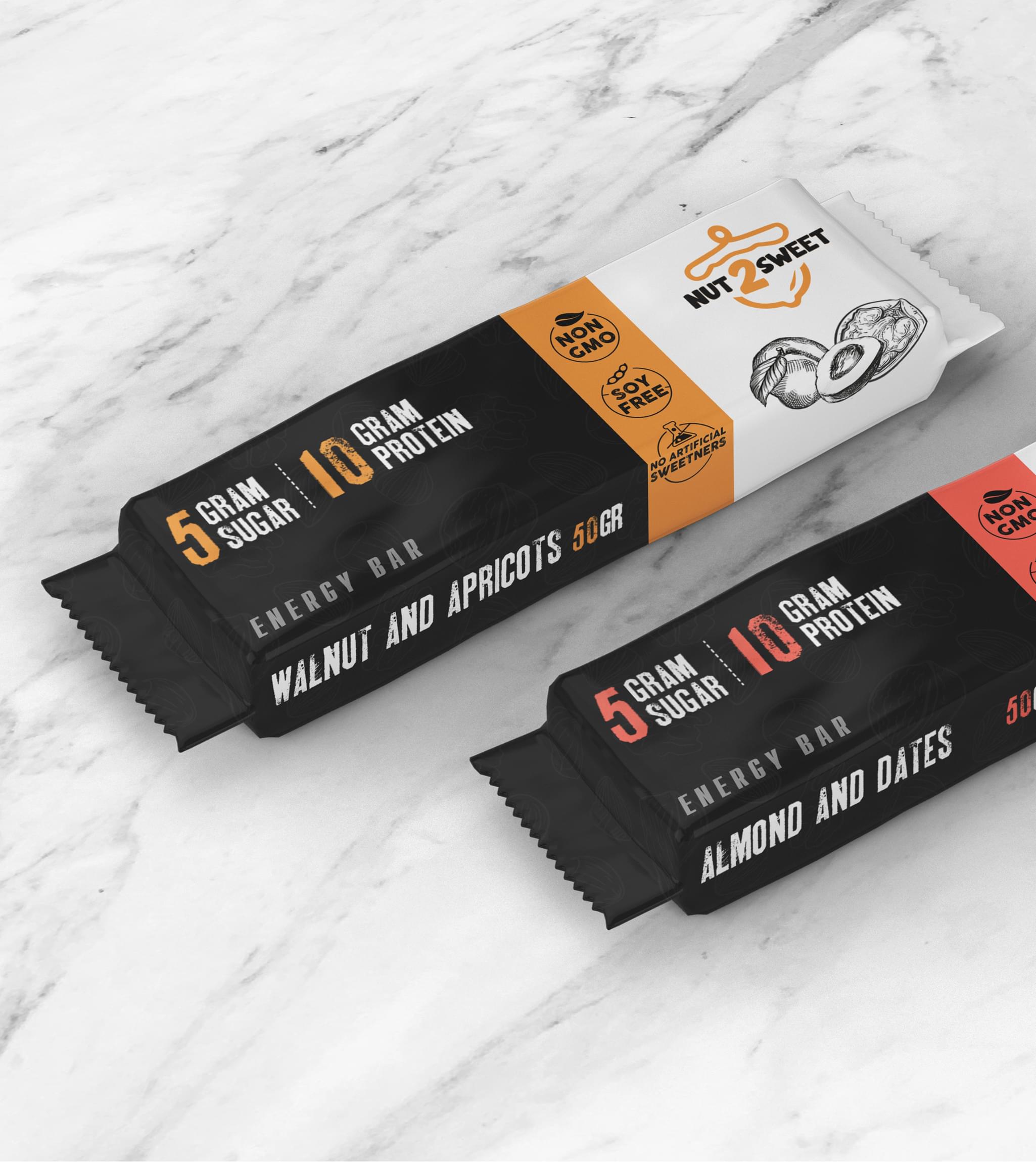
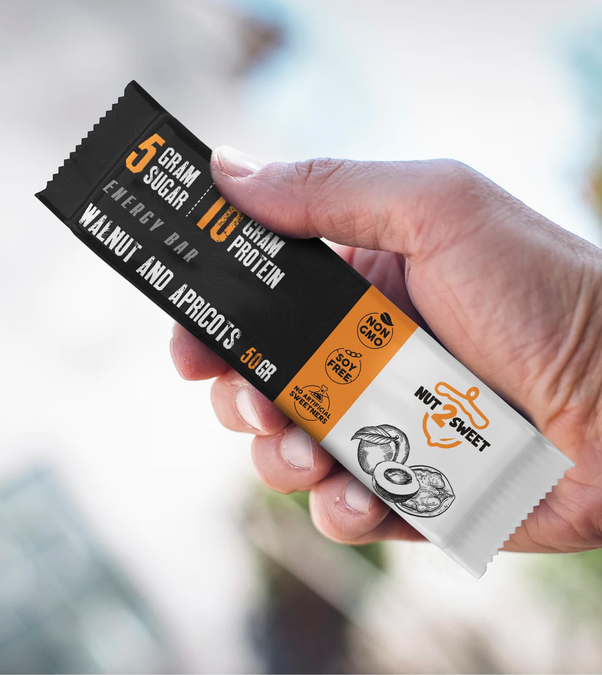
After putting together a brief with a variety of quality concepts and snack bar packaging design options, Nut2Sweet eventually settled on the option pictured above.
How we did it…
  • Bold colors were chosen, including black, grey, red, and orange. Not only do they grab the attention of consumers, they communicate confidence and appeal to the kind of forward-thinking consumers that make up Nut2Sweet’s target market.
  • The sugar and protein content feature prominently since these are factors targeted consumers prioritize.
  • The design utilizes the design principle of the rule of thirds, allowing the logo plenty of space in the far right third of the snack bar packaging design’s front. This creates a pleasing aesthetic that consumers will remember.
  • The fonts used are bold and communicate strength – exactly what Nut2Sweet’s consumers rely on.
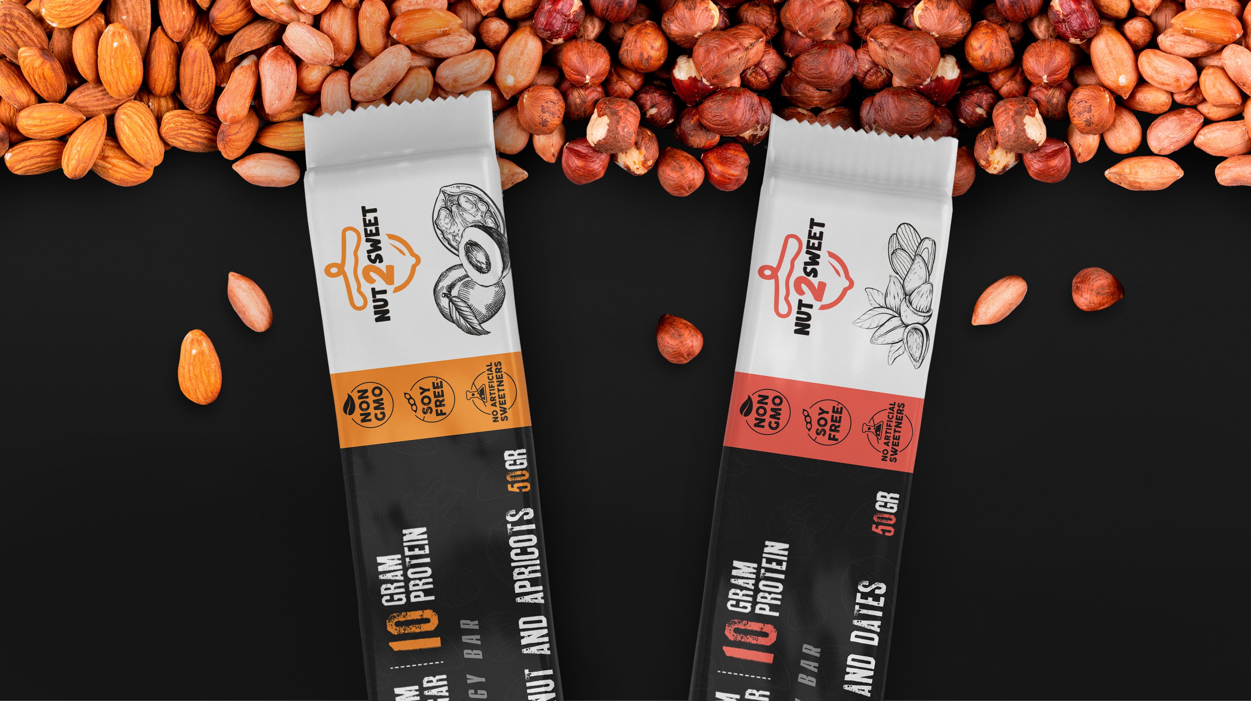
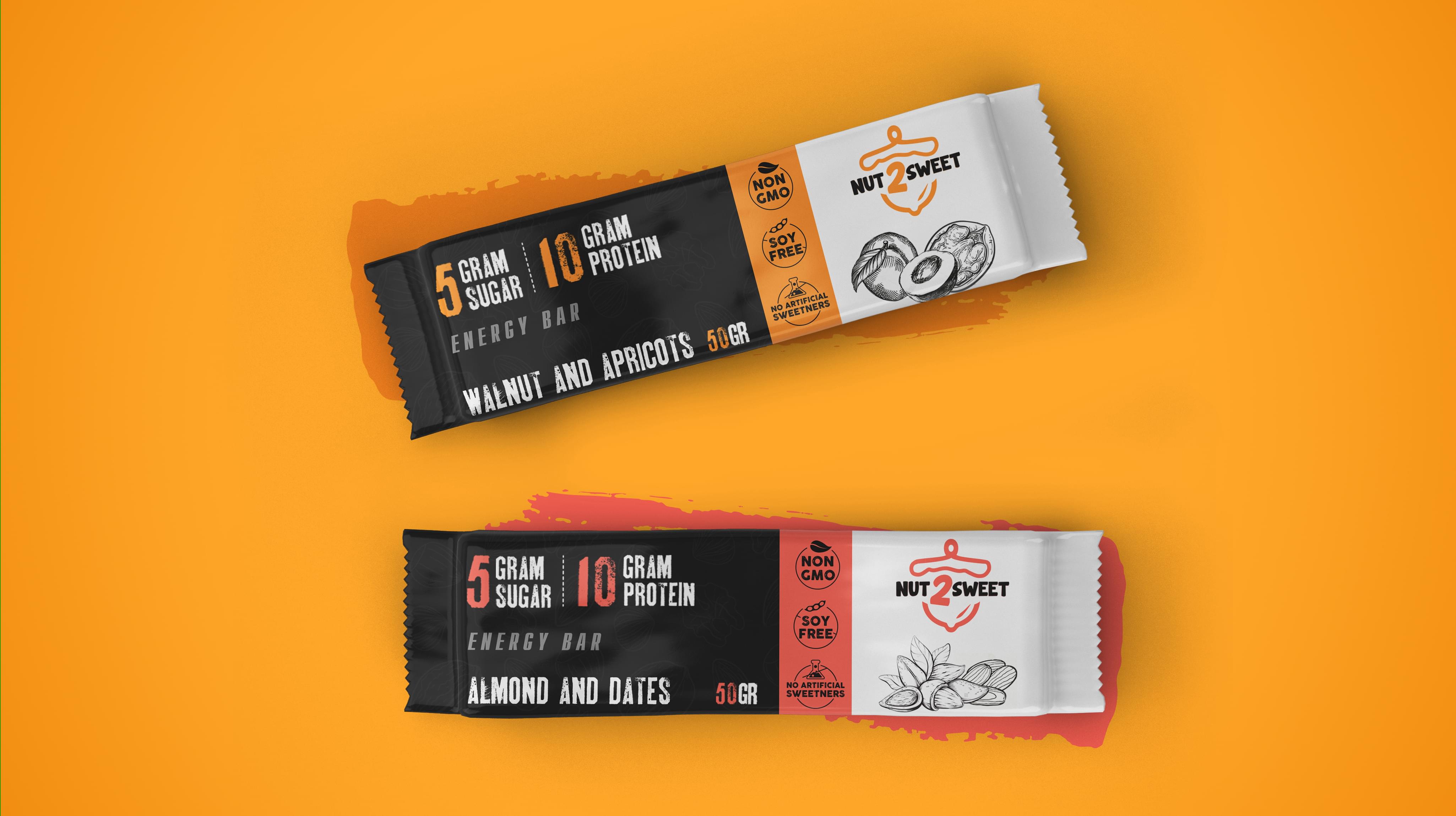
With this snack bar packaging design, Nut2Sweet has been able to break into this crowded market and achieve several major sales goals. They have seen consistent growth in both varieties and are currently looking at expanding the line further.
NUT2SWEET Packaging
NUT2SWEET Packaging
NUT2SWEET Packaging
Scroll