Analyzing the Competition
Our process began with an advanced market analysis that clarified the target market and examined rival products, including their price point and use of color, design, and typography. We noted the common design threads within product packaging marketed in the Middle East, including their lack of strong, bold colors.
Crafting a Package Design that Sells
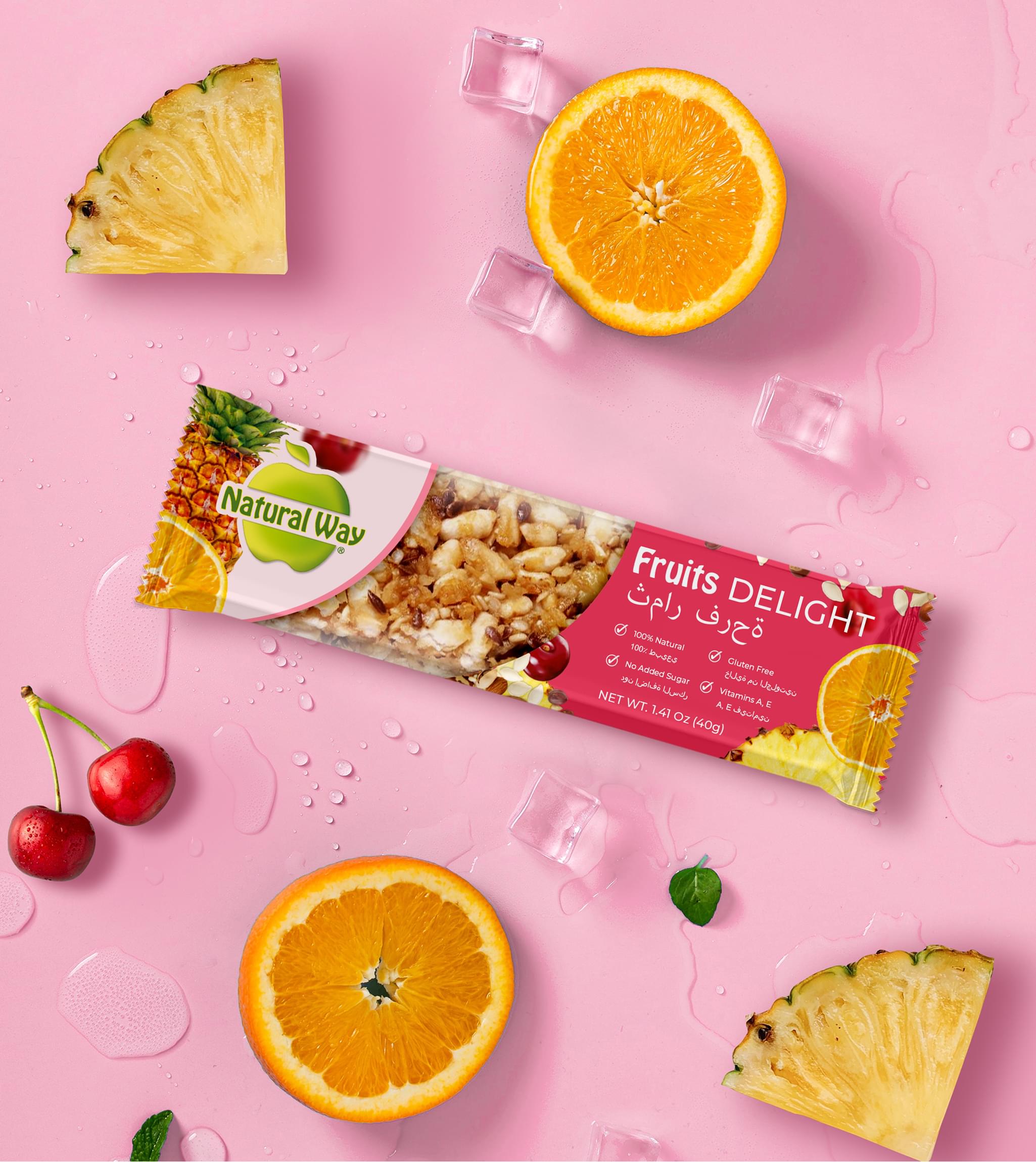
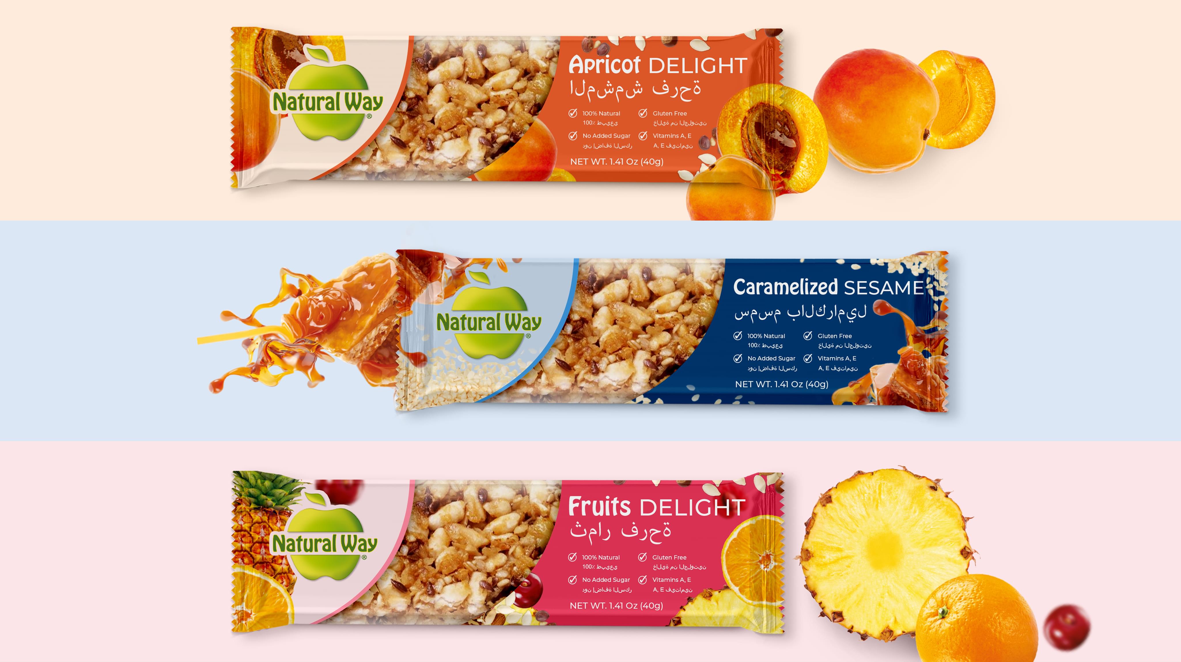
We used the information we gained during market research, along with Natural Way’s unique brand identity, to come up with a nut packaging design that met all of their goals. Our brief included several potential examples, ranging from modern and professional to slightly edgy. Eventually, Natural Way chose the design featured above.
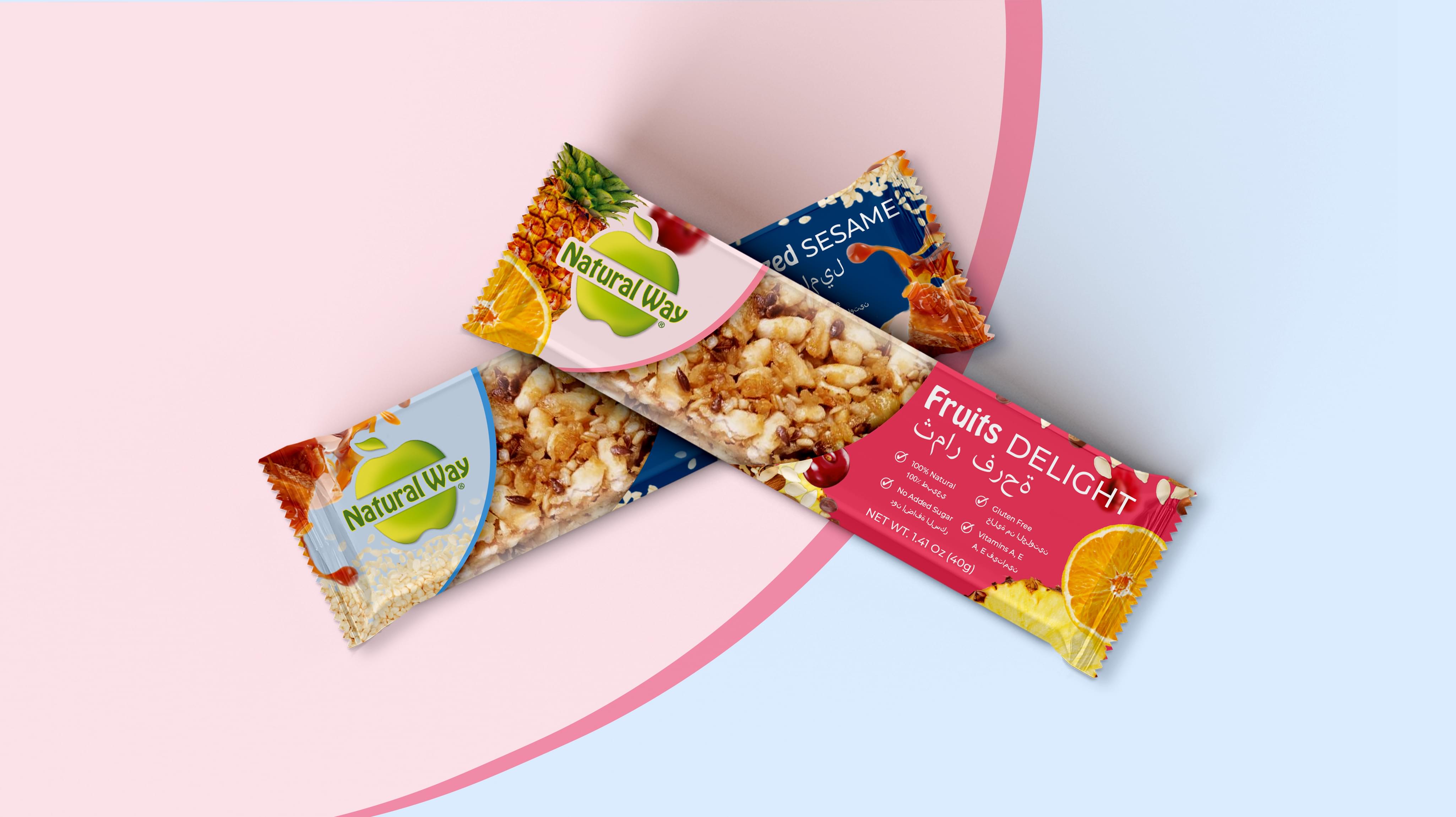
It showcases the product in a variety of ways, uses bilingual text, and fits the Middle Eastern market perfectly, looking amazing without appearing garish.
How we did it…
- The product is showcased in a variety of ways, including through the clear window in the center of the package and via images of included ingredients that adorn the rest of it.
- Since the product was marketed toward consumers in the Middle East, bilingual text (English and Arabic) was used. This ensured maximum market reach.
- Unobtrusive yet attractive colors were chosen that draw the eye without causing a strong reaction through color scheme alone.
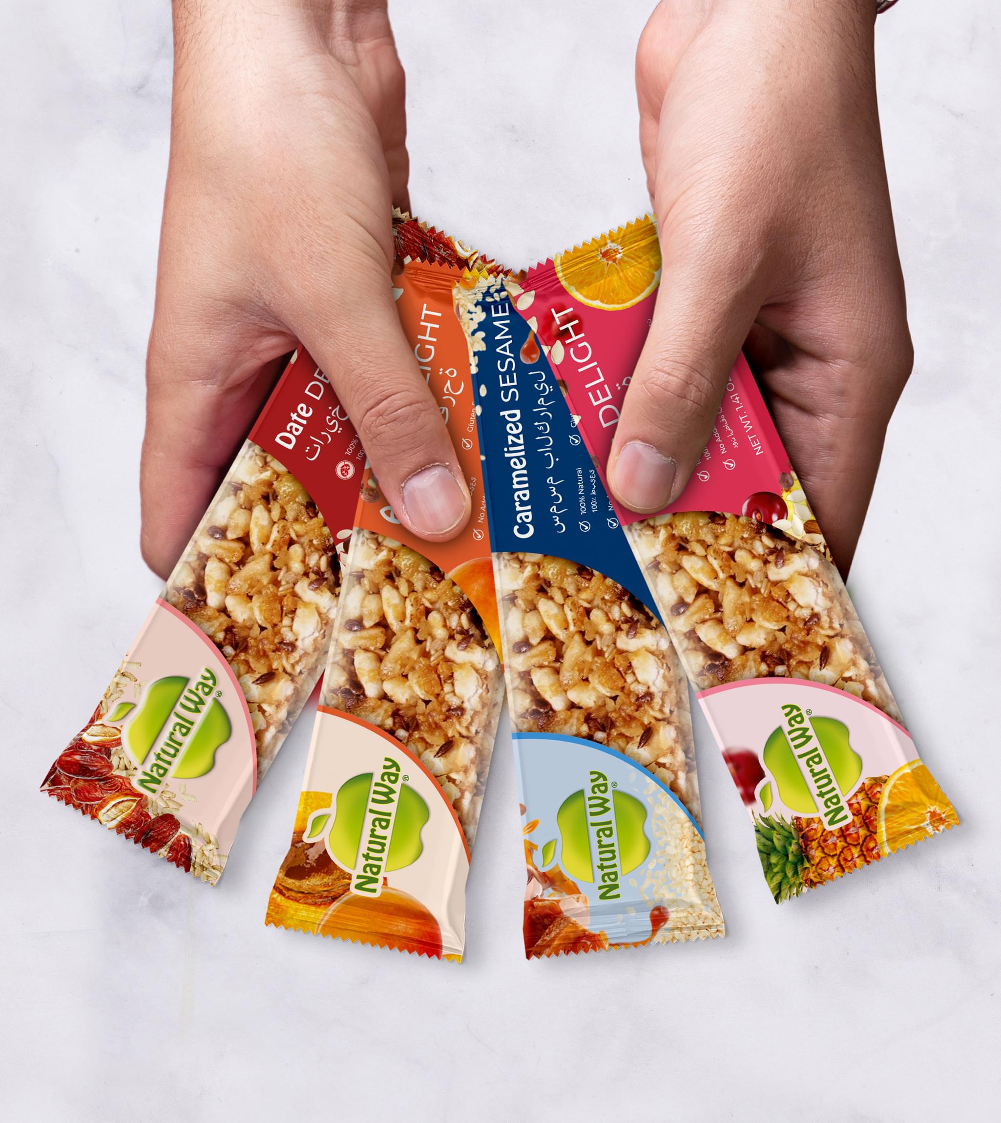
- A design was used that could easily be tailored for any snack bar product by altering the images, colors, and text. We crafted two varieties, based on Natural Way’s fruit and sesame snack bars.
Natural Way was able to enter the Middle Eastern snack bar market and make serious headway against a growing competition. Sales have continued to increase, and they are looking to add more flavors to their line. When they do, customizing this nut package design will be a simple task.


