MOMO Pro Packaging
MOMO

TOFFEE PACKAGING DESIGN

Challenge

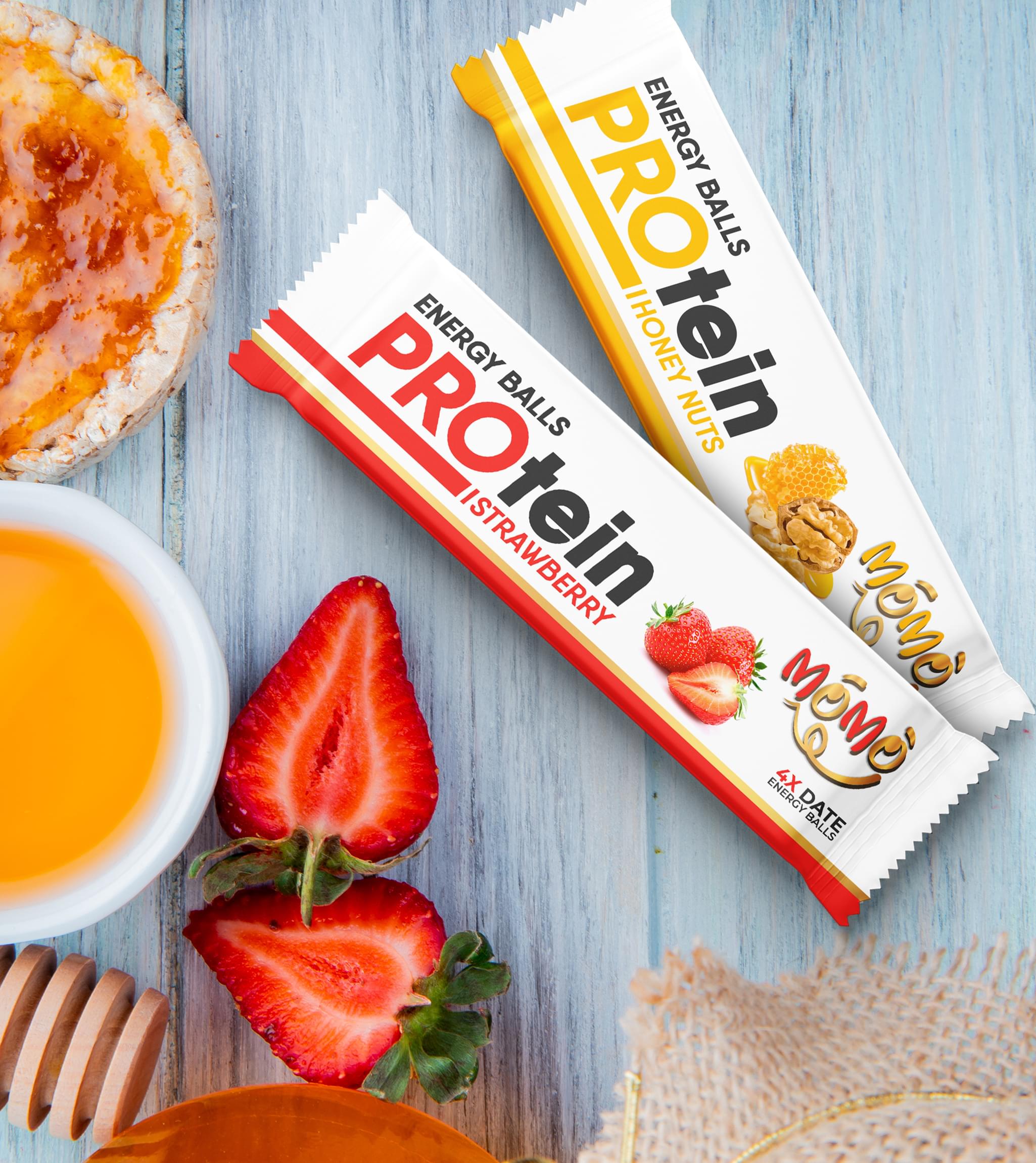
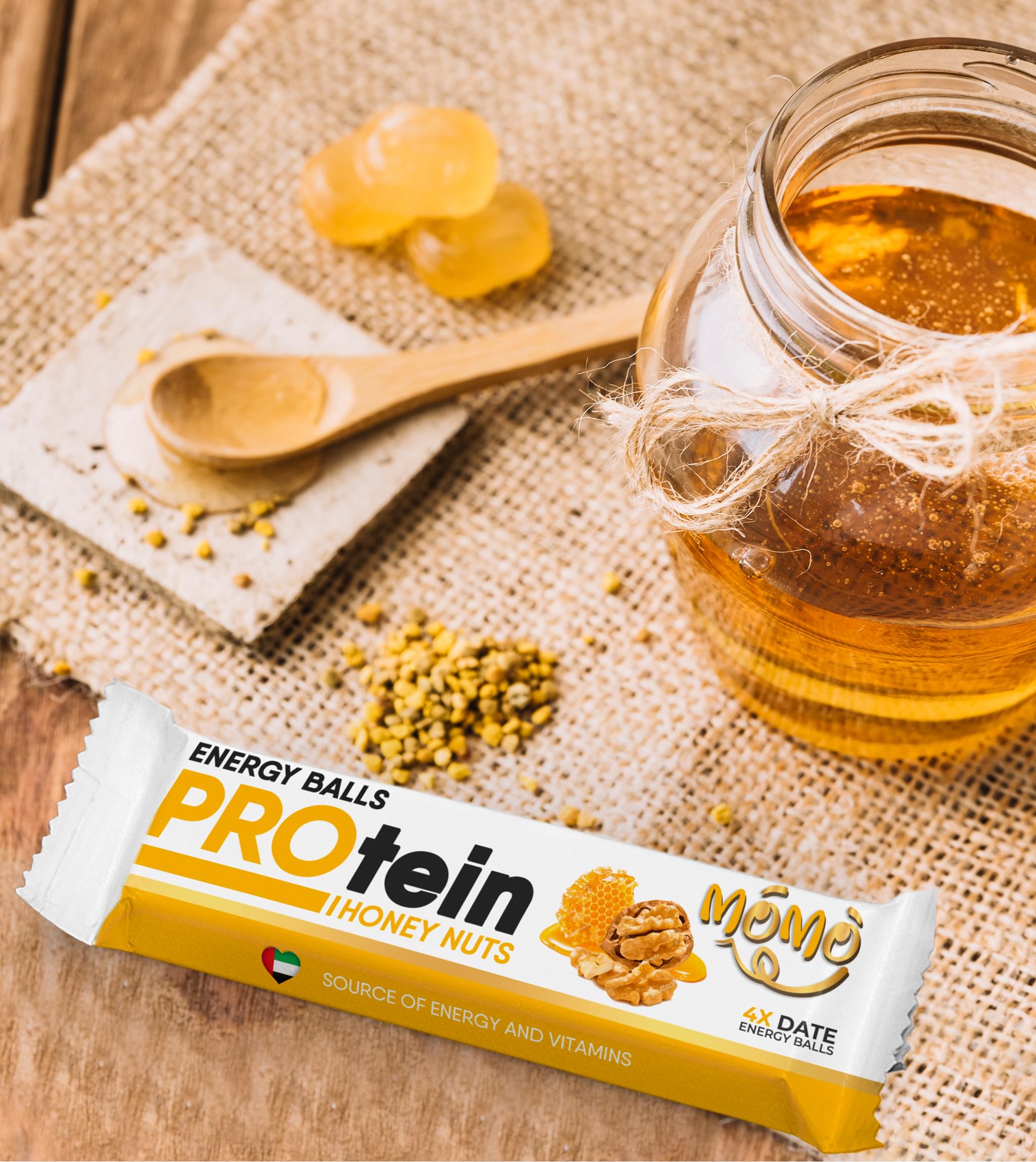
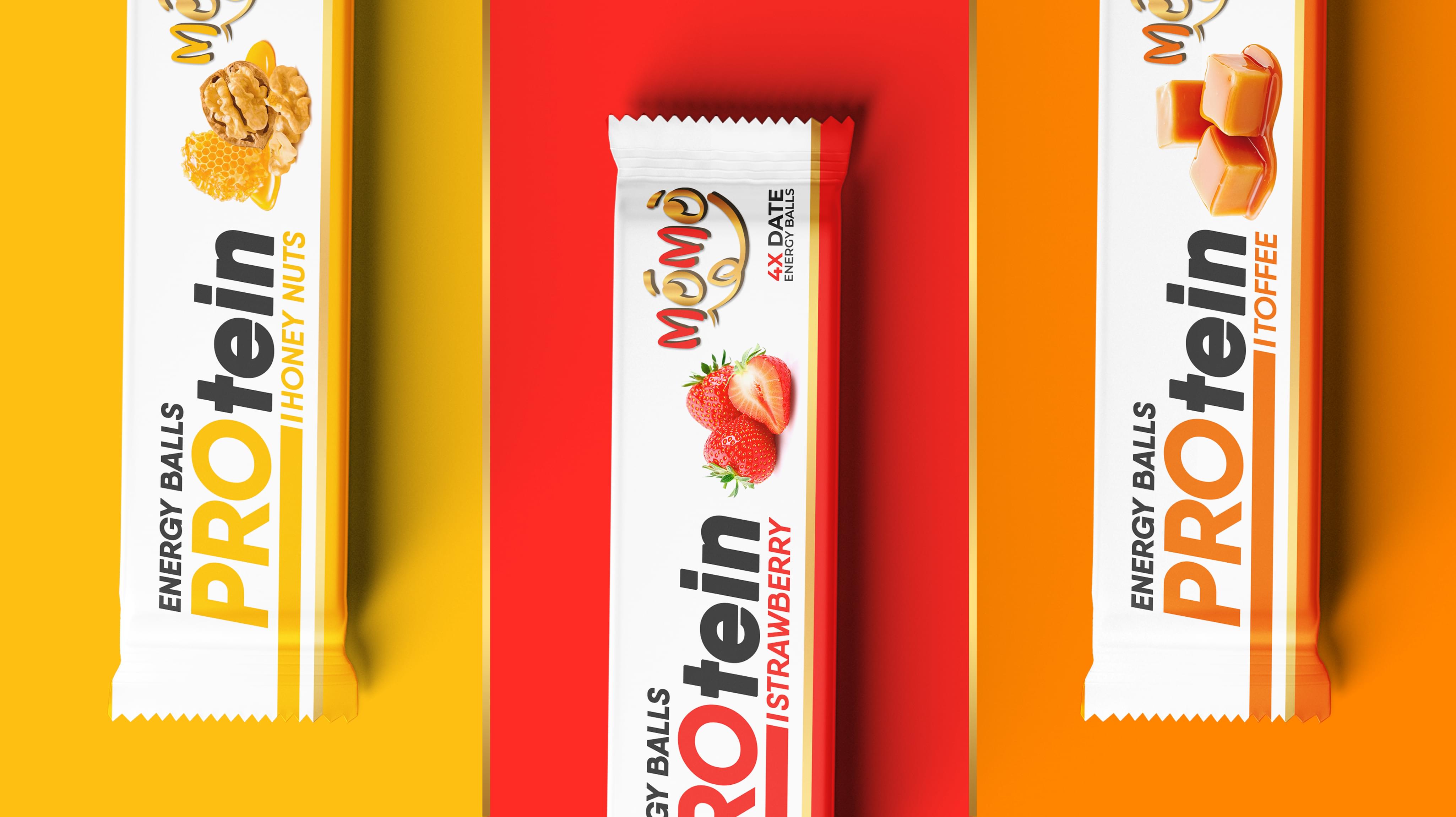
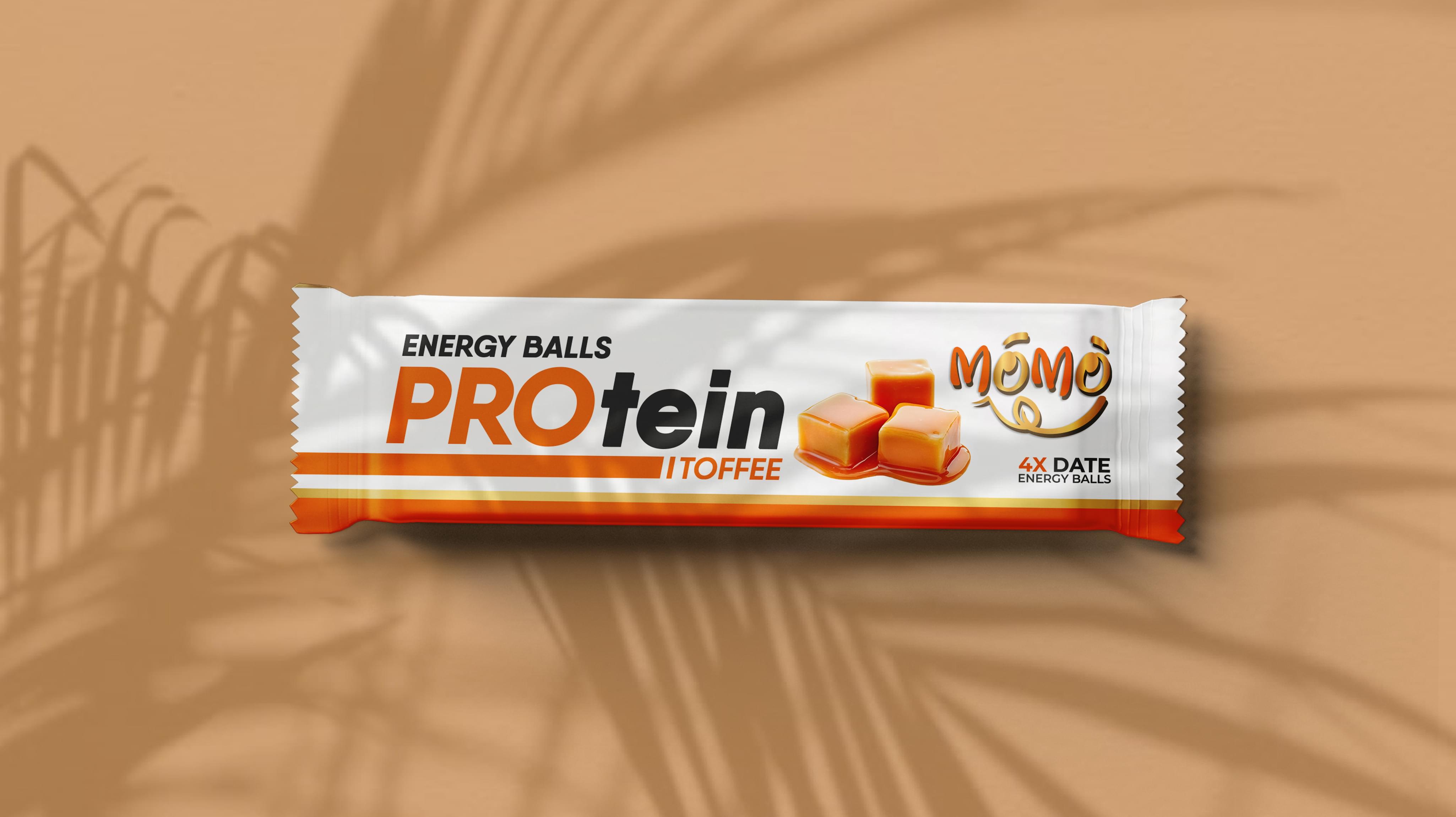
Momo chose Stan Agency for a unique order. The company wanted to release multiple protein balls flavors soon, including a toffee flavor, it needed packaging design completed quickly. The company intended for the new products to use distinct packages. Stan Agency took the challenge.
Challenge Components
  • Saturated market
  • Protein balls are rarely tasty
  • Consumer wariness

Research as a Custom Packaging Design Firm

Items like toffee protein balls packaging design require research. The protein balls industry in the USA was our starting point. From there, we examined direct competitor packaging for market-specific trends. This information helped us formulate a noteworthy toffee packaging design.

Bonus Challenge

We needed to consider the over-saturated protein balls industry. Our toffee balls packaging design needed to address the visibility problem. We also needed to recognize that while sweet flavors are standard, consumers rarely believe the balls taste good. This causes them to avoid new products.

Design Inspiration

We wanted a simple yet effective packaging design for the toffee balls. The team decided on minimalism, which allowed us to work without element distraction. Inspiration also struck for how to differentiate the flavors while we were discussing the idea board.

Narrowing Down the Final Options

The packaging design team returned several advanced concepts for the toffee. We began by evaluating the designs against brand criteria. Then we examined the eye-catching qualities and how easy it would be to tell the flavors apart once we added the other two options.

Result

The Momo team loved the toffee packaging design and how we created the other two flavor packages. The company easily located a packaging production company. The printing finished ahead of schedule. Momo let Stan Agency know how successful the launch was.

The Deliverable

The Final Package:
  • Three complete custom packaging designs
  • Separate package design elements for reuse
The final toffee packaging design included a large color block and colored text. The simple layout emphasized the text. When we added the other two flavors, we changed the relevant colors. We look forward to working with Momo again as the company expands the product lines.
MOMO Pro Packaging
MOMO Pro Packaging
MOMO Pro Packaging
Scroll