- Company:Umami Food Studio
- Location:South Africa
- Service:Branding, label design
- Category:Food & Drink
-
5.0
 100+ Reviews
Challenge
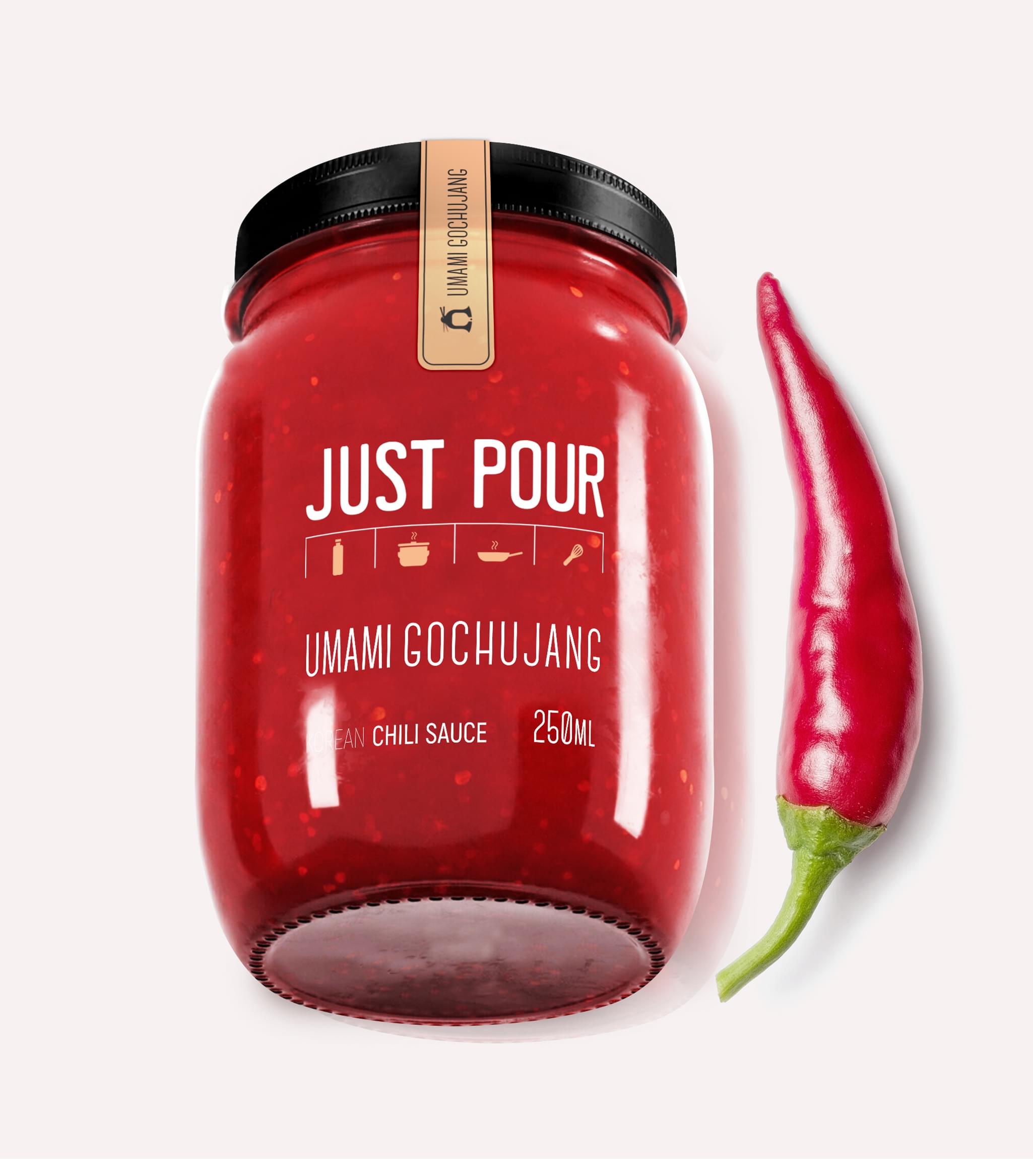
Our challenge was to create distinctive hot sauce
label designs that highlighted the individual flavor profiles of each unique type of
Just Pour’s sauce. In cooking, sauce acts as a complement to the other ingredients,
building upon the flavor but never overwhelming the overall taste. High-quality sauces
let the flavor speak for itself. With that in mind, we utilized the same concept in our
sauce label design.
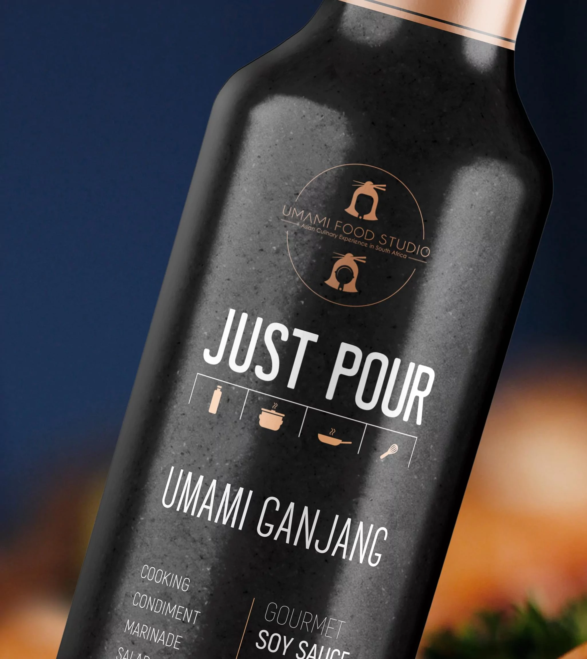
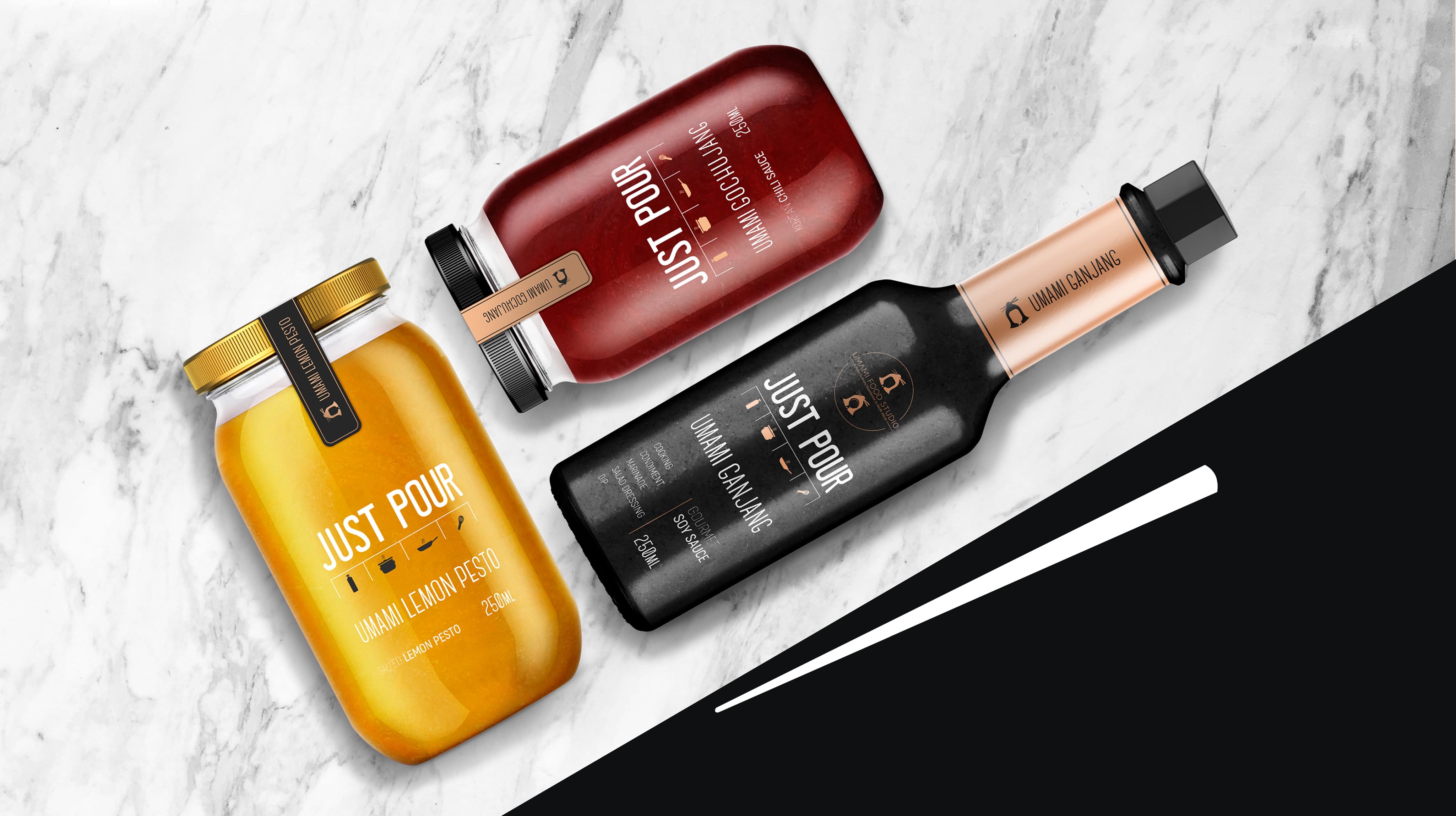
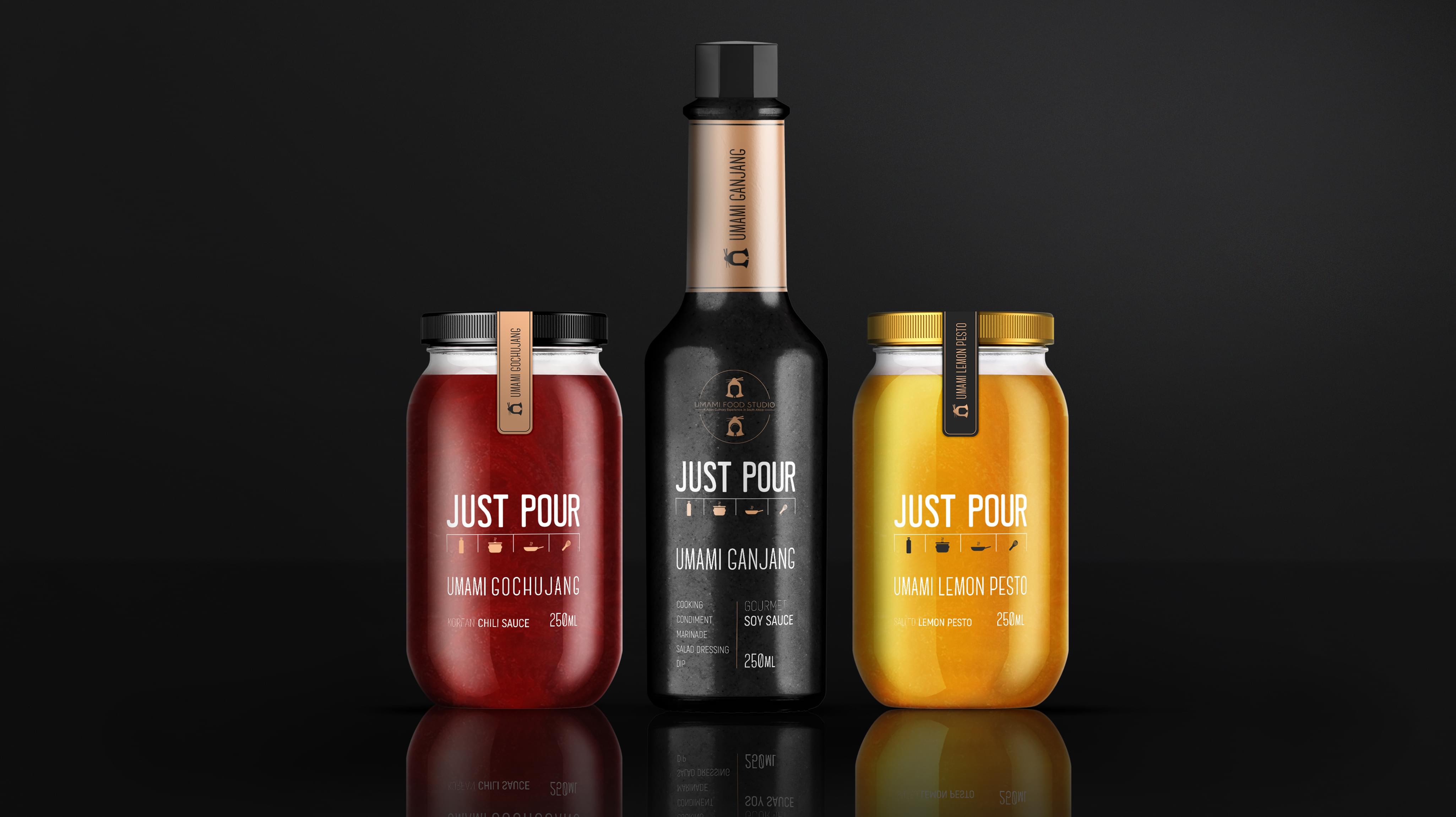
Result
Our intent was to create sauce label design that
was bold and eye-catching without becoming overwhelming. The inspiration in the hot
sauce label design had to be innovative and distinctly different from competing
companies’ sauce label design. Rather than rely on previous hot sauce labels currently
trending, we sought to develop a unique design that spoke to the depth of taste in Just
Pour’s sauces. As a brand, Just Pour needed a hot sauce label designs that would target
customers in supermarkets searching for high-quality cooking products to use in their
meals. Our designs sought to reflect that demand.