HYCURA Packaging
HYCURA

INDUSTRIAL PACKAGE DESIGN

  • Company:Hycura
  • Location:USA, Texas
  • Service:Packaging design
  • Category:Cleaning & Maintenance
  • 5.0 Review HYCURA Packaging 100+ Reviews

Challenge

Septic Tank Treatment: The Product No One Wants

There’s nothing sexy about septic tank treatment. It’s not even a product the average consumer thinks about – until they need it. And when that unfortunate moment arrives, they’ll walk into their local big box store, glance at the shelves, and grab the first product they see with ‘Industrial Strength Septic Tank Treatment’ scrawled across the front. They won’t care what brand it is.
That was Hycura’s problem. They were selling a product that USA consumers only bought because they had to. And their industrial package design was as bland and boring as their product. There wasn’t an ounce of inspiration or any creative ideas to be found. It was like Joe Friday designed the package – “Just the facts, ma’am.”

Making Septic Tank Treatment Stand Out

When consumers saw Hycura’s uninspiring package next to their competitors – and noted that the prices were the same – they grabbed whichever was closest. Half the time, it was the competition. Hycura wanted Stan Agency to design industrial packaging that would stand out on the shelf. They were looking for an innovative concept that didn’t look like stereotypical ‘septic tank treatment.’ Instead, they wanted an amazing custom package design that would catch consumers’ eyes and inspire confidence.
Result

Discovering a New Approach

Before thinking about colors, design elements, or typography, we did in-depth market research on the trends and companies in the septic tank treatment niche. One of the first things we noted was the complete lack of quality industrial package design. Everything looked as if it hadn’t had an update since the mid-90s. So, when we began developing Hycura’s brief and developing packaging examples, we knew we wanted to take a distinctively modern approach to their custom package design.

Analyzing the Competition

So many of Hycura’s competitors had cluttered packaging, littered with too many words and images. In particular, photographs of toilets and drains were often prominent. But consumers didn’t want to be reminded of their problem. They just wanted a solution

Crafting a Package Design that Sells

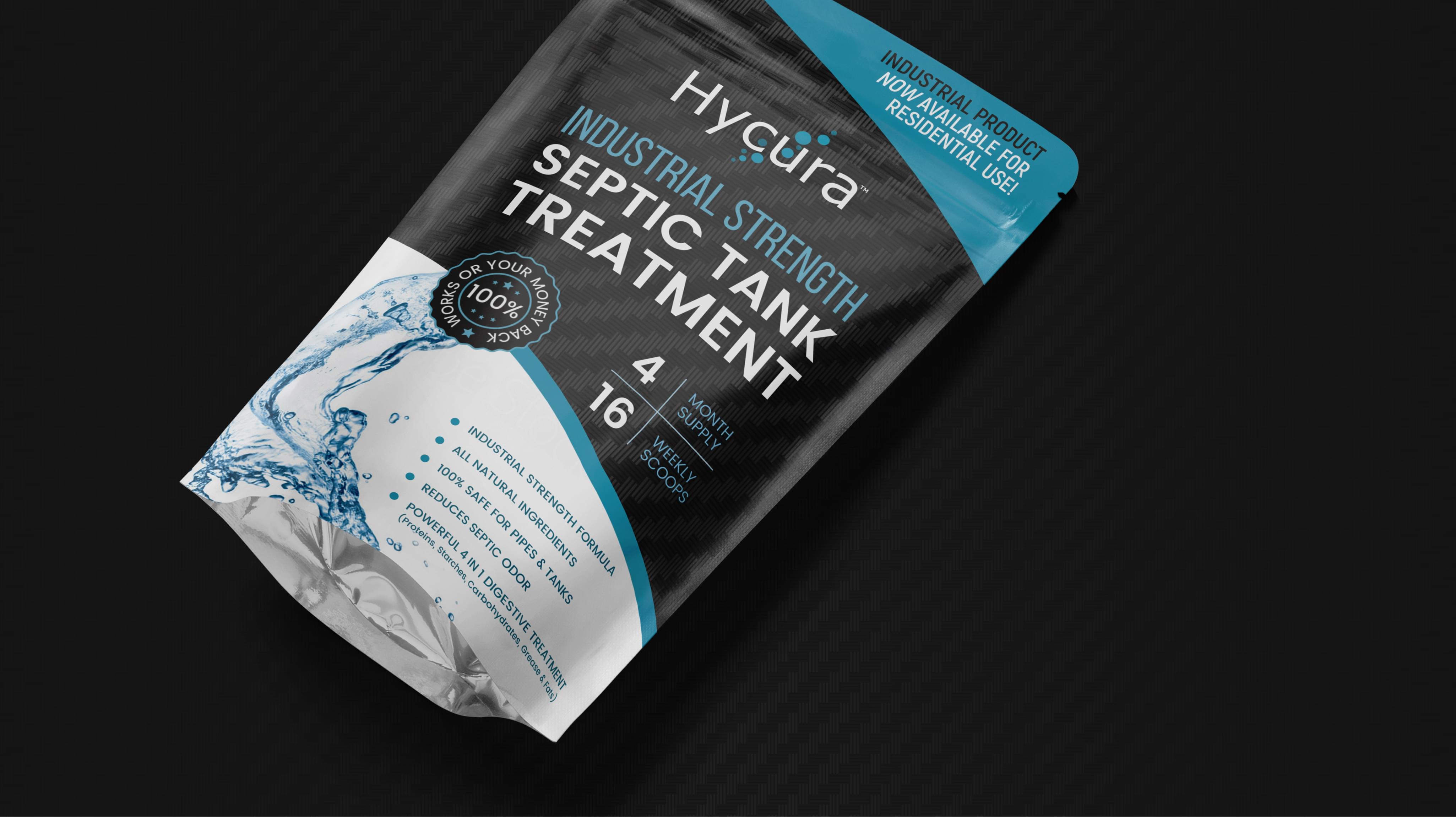
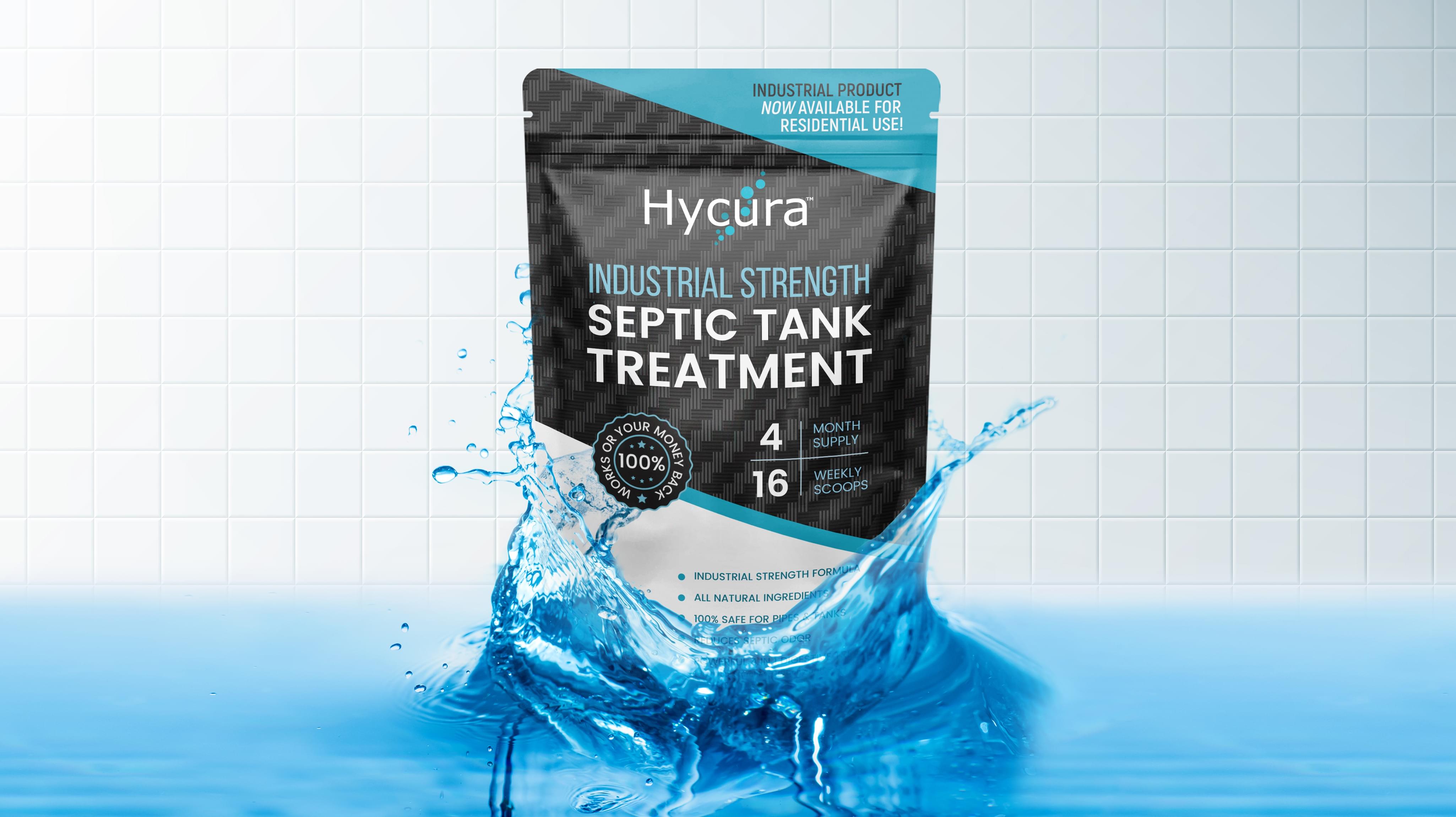
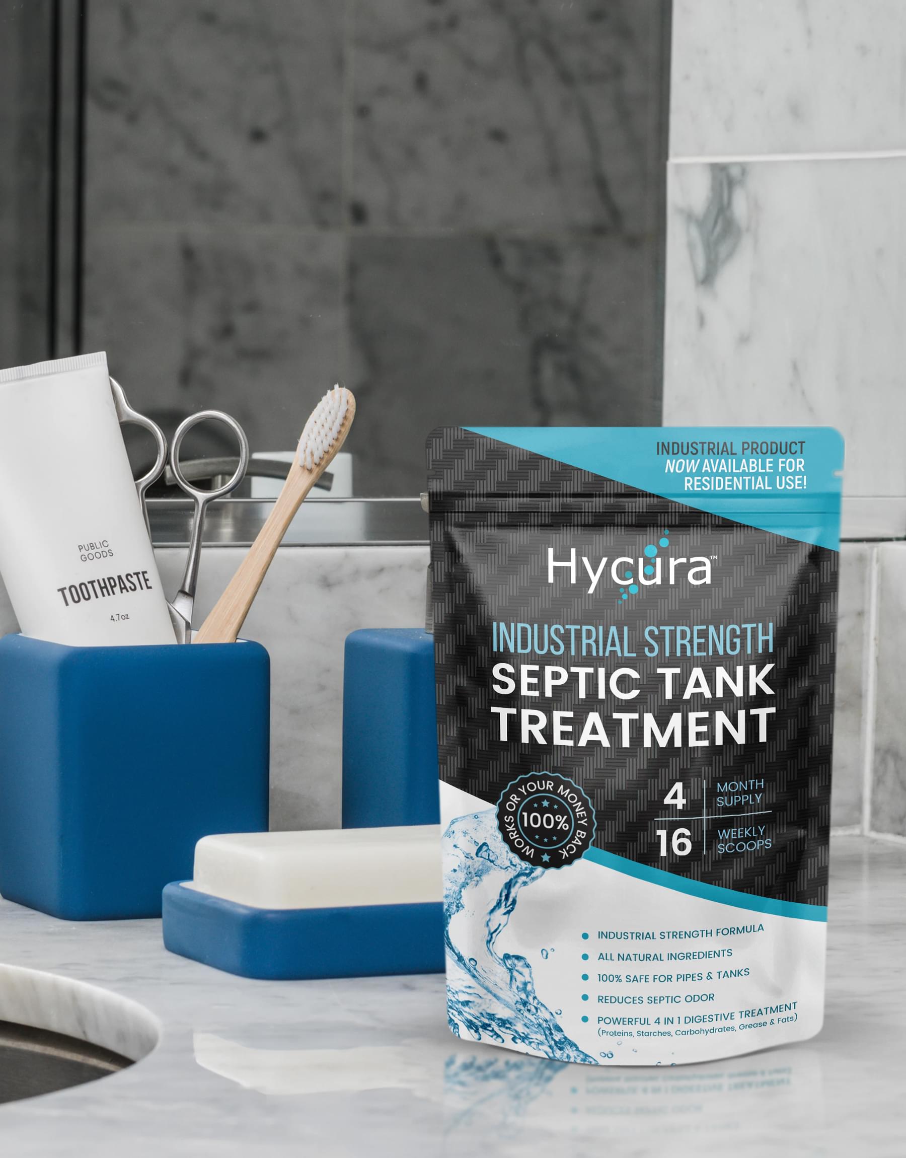
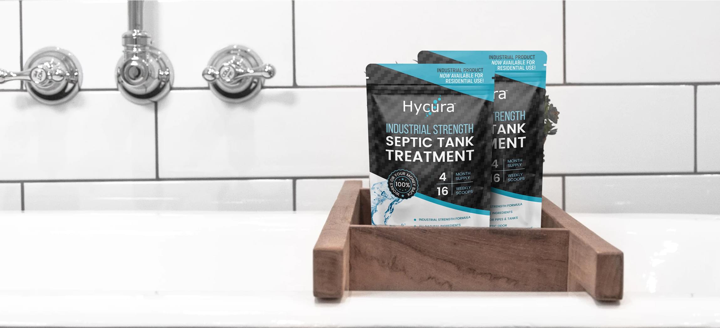
So, we created a quality minimalist industrial design that looked professional and sleek while still communicating the important features of Hycura’s product. How we made it happen…
  • Sans serif fonts were used for all text, subtly communicating cleanliness and reliability.
  • Colors were used that reinforced the same themes, including aqua, gray, black, and white.
  • ‘Septic Tank Treatment’ featured prominently in white lettering against a black background, drawing consumer attention before they noticed competitors.
  • Additional, value-adding features are described across the rest of the space, leaving plenty of empty room so it retained a professional look.
  • A 100% money back guarantee seal is prominently displayed, further hooking browsers.
Once Hycura’s Industrial Strength Septic Tank Treatment hit the shelves, consumers quickly took notice, even being willing to pay a higher cost than the competition because of the confidence that this new custom package design inspired.
HYCURA Packaging
HYCURA Packaging
HYCURA Packaging
HYCURA Packaging Consumers quickly took notice, even being willing to pay a higher cost than the competition because of the confidence that this new custom package design inspired.
Scroll