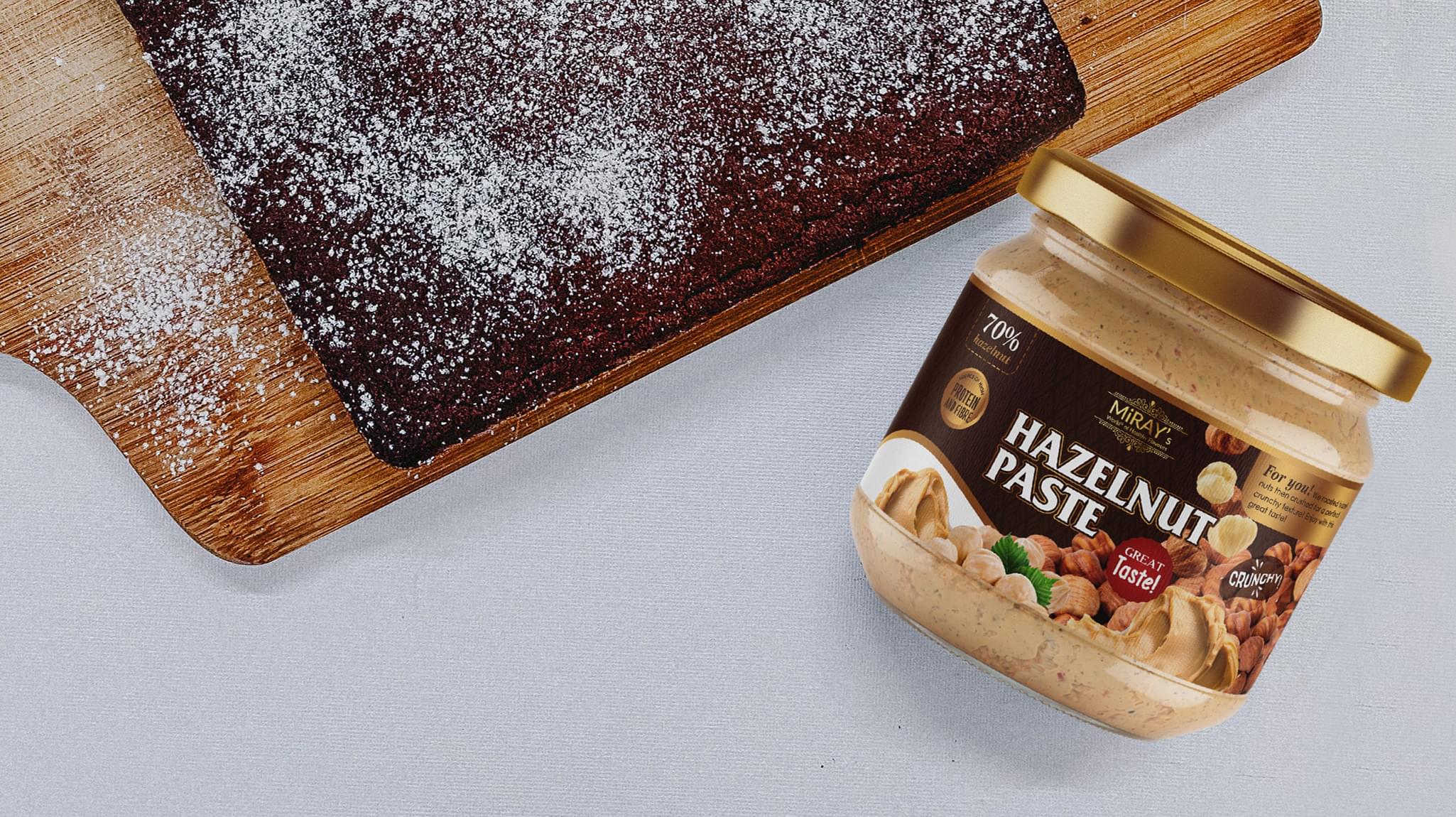
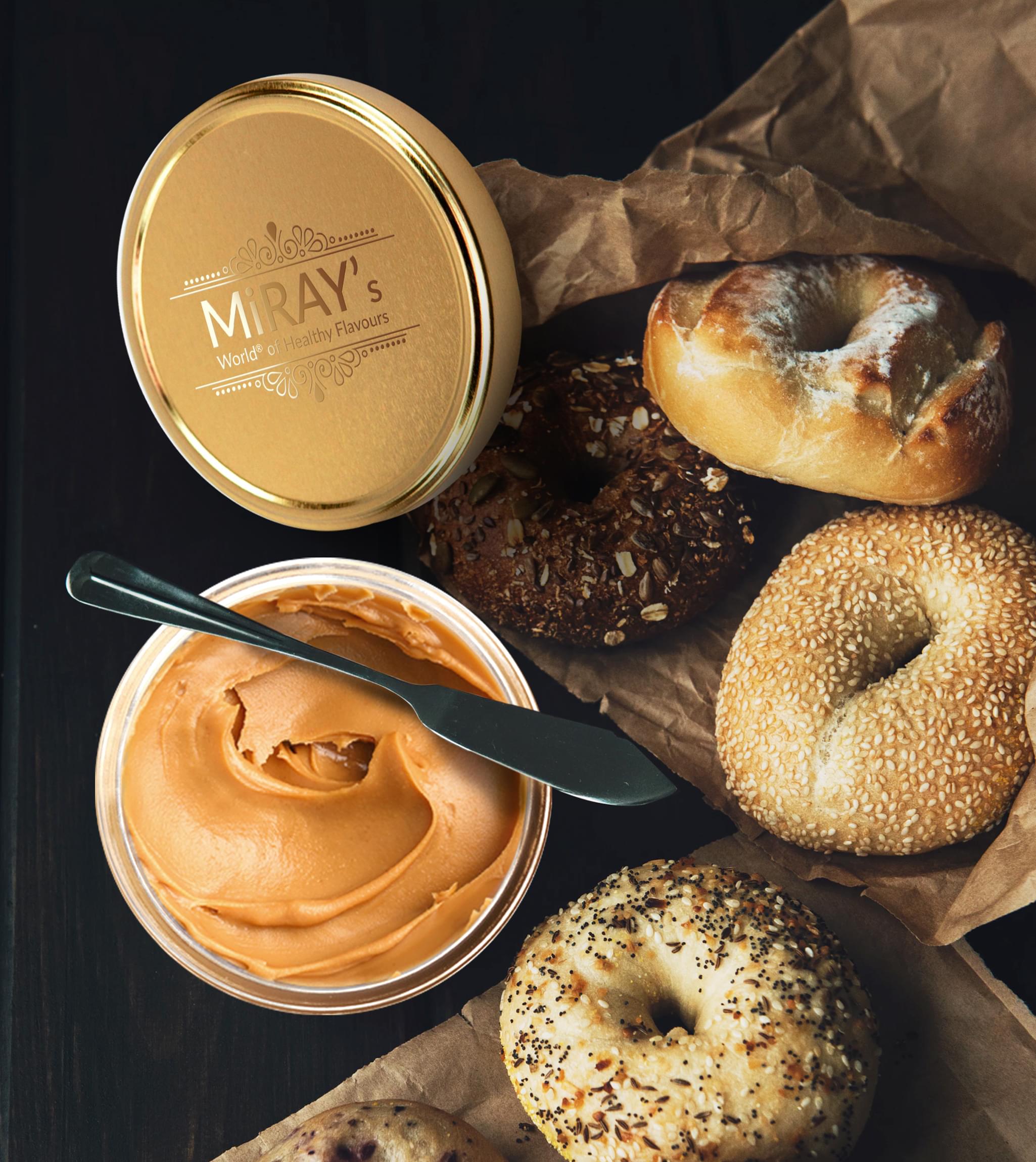
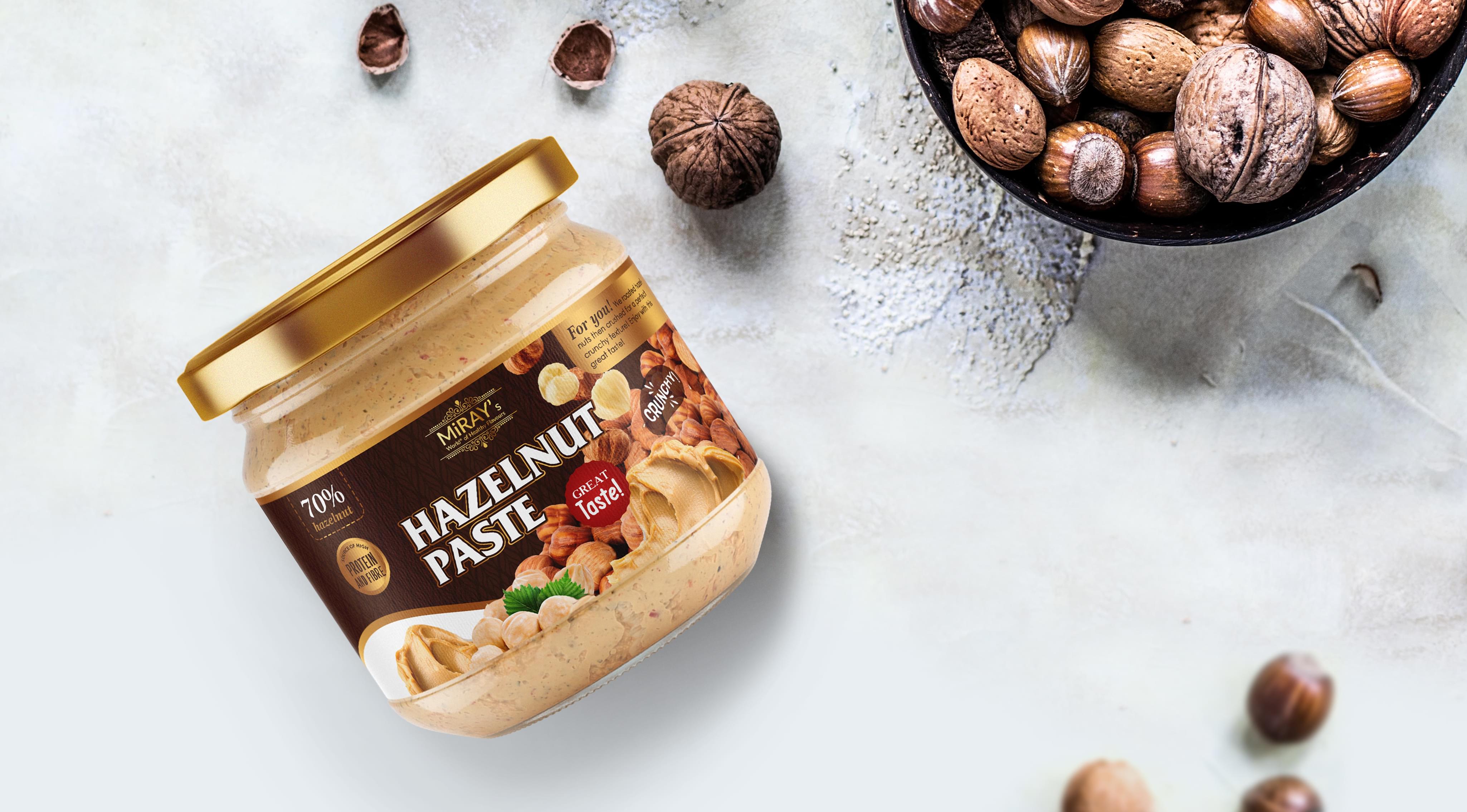
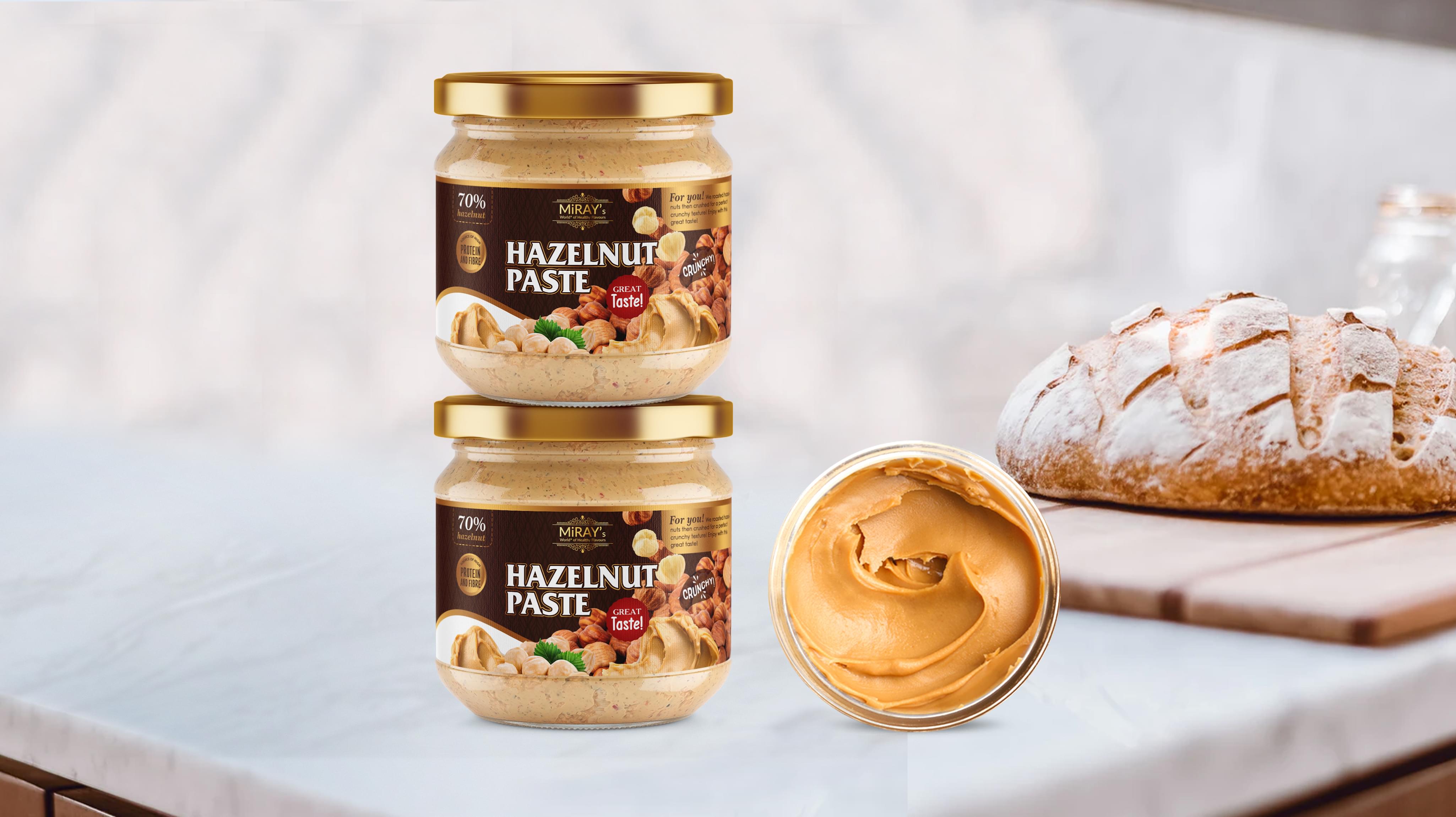
All of the visual elements for Miray’s Hazelnut Paste had to combine together to create a welcoming and appealing image. It was crucial to display the attractiveness of the product and superiority of the ingredients used in the paste without isolating any potential customers. Our goal was to create an effective food label design that would motivate customers to consider purchasing Miray’s Hazelnut Paste and infusing it as a staple food item in their home.
Essential moments in creating design
The intent of the label design for Miray’s was not to appeal only to a select group of food connoisseurs, but rather to market the hazelnut paste as a staple product that should be purchased for use in any home. Therefore, rather than create a food label design using sharp or minimalist visual elements, we designed Miray’s Hazelnut Paste to be warm and trust-worthy. While it was important for us to showcase the great taste of the product, our main goal was to create a global, widespread appeal when designing a food label.
Selected graphics
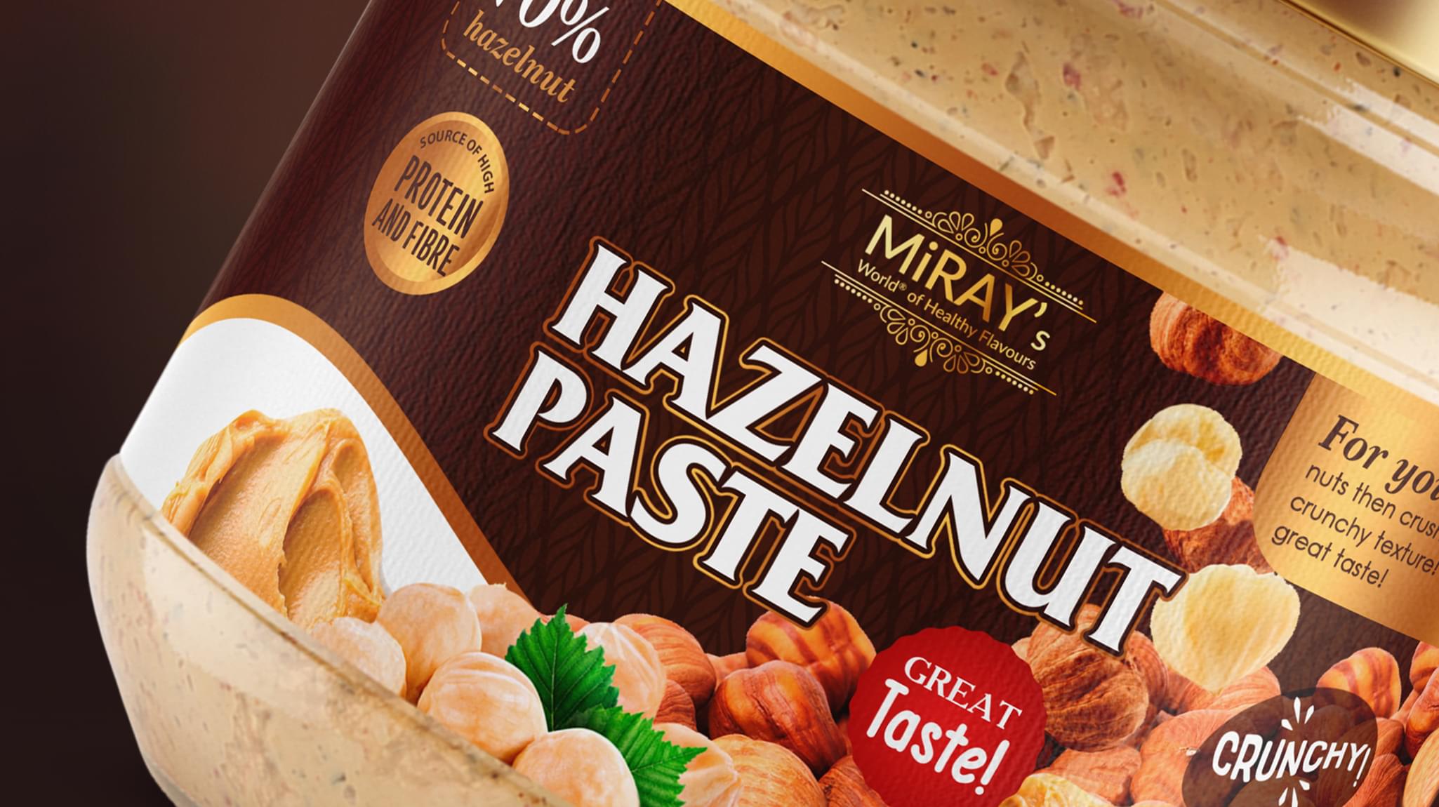
The graphic selected for the food label design showcases two things: the natural ingredients that hazelnut paste is created from as well as the finished hazelnut paste product. This clarity of image therefore attracts customers who are seeking a high-quality hazelnut product while also educating any customers unfamiliar with the exact details of hazelnut paste. Customers know exactly what they are getting when purchasing Miray’s Hazelnut Paste.
Coloring
Selecting an attractive color scheme was also critical in creating the food label design. As the design of the glass jar itself is transparent, showcasing the pale brown color of the hazelnut paste, the color scheme had to make efforts to match. Therefore, our food label design for Miray’s Hazelnut Paste features rich, neutral colors that add depth to the overall design. Customers can vividly imagine the warm, full-bodied taste of the product when viewing the food label designs.
Finalization
When designing a food label, the written content is also important. We kept our inspiration simple and clear when developing concepts for Miray’s Hazelnut Paste. The emphasis was placed on highlighting the type of product, rather than the distinct brand name, along with other persuasive additional information. The bold, easily readable white font catches attention. Additionally, the “great taste” and “source of high protein and fibre” is appealing to health-conscious families seeking satisfying food products.
