DWYPERS Packaging
DWYPERS

VINTAGE PACKAGING DESIGN

Challenge

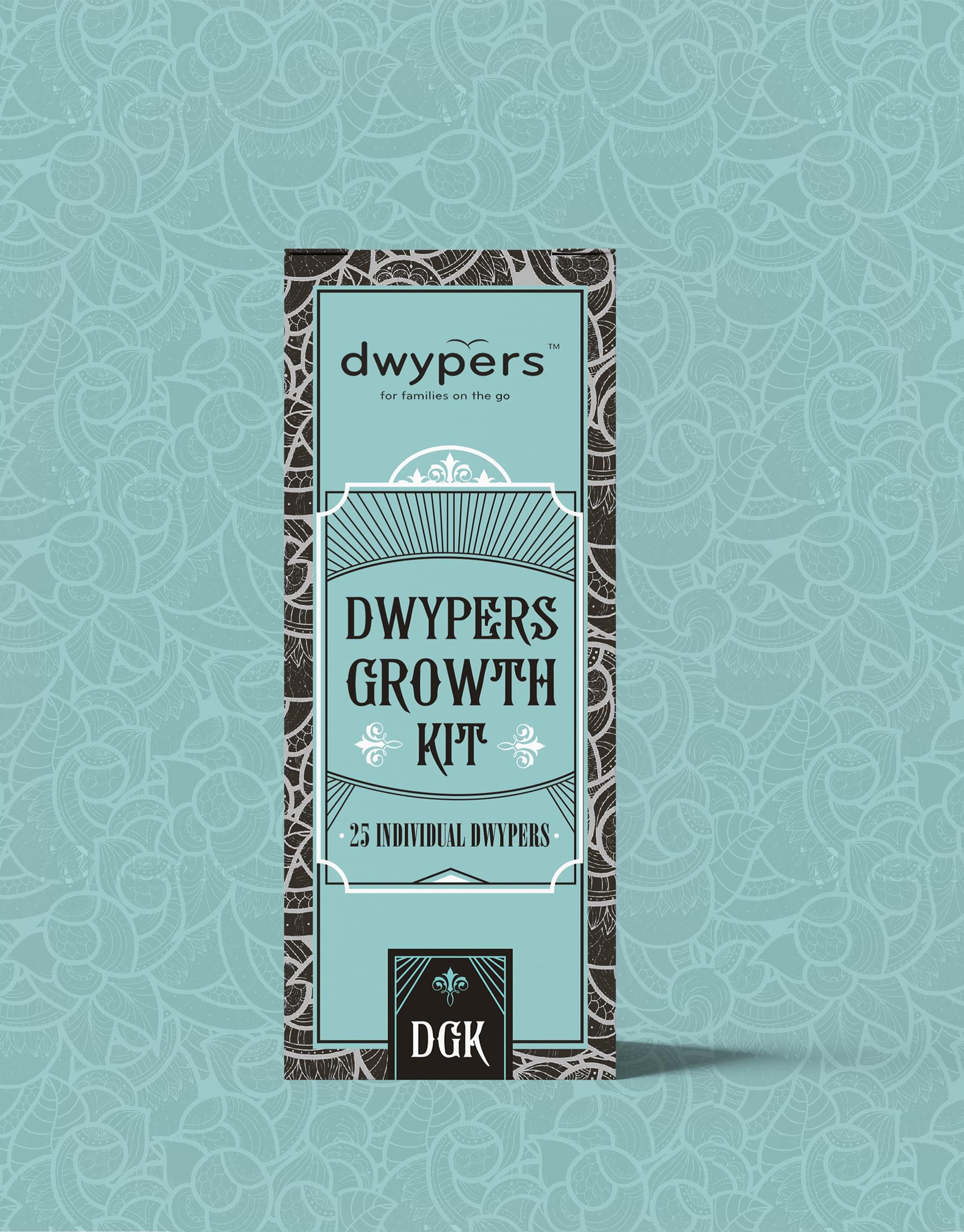
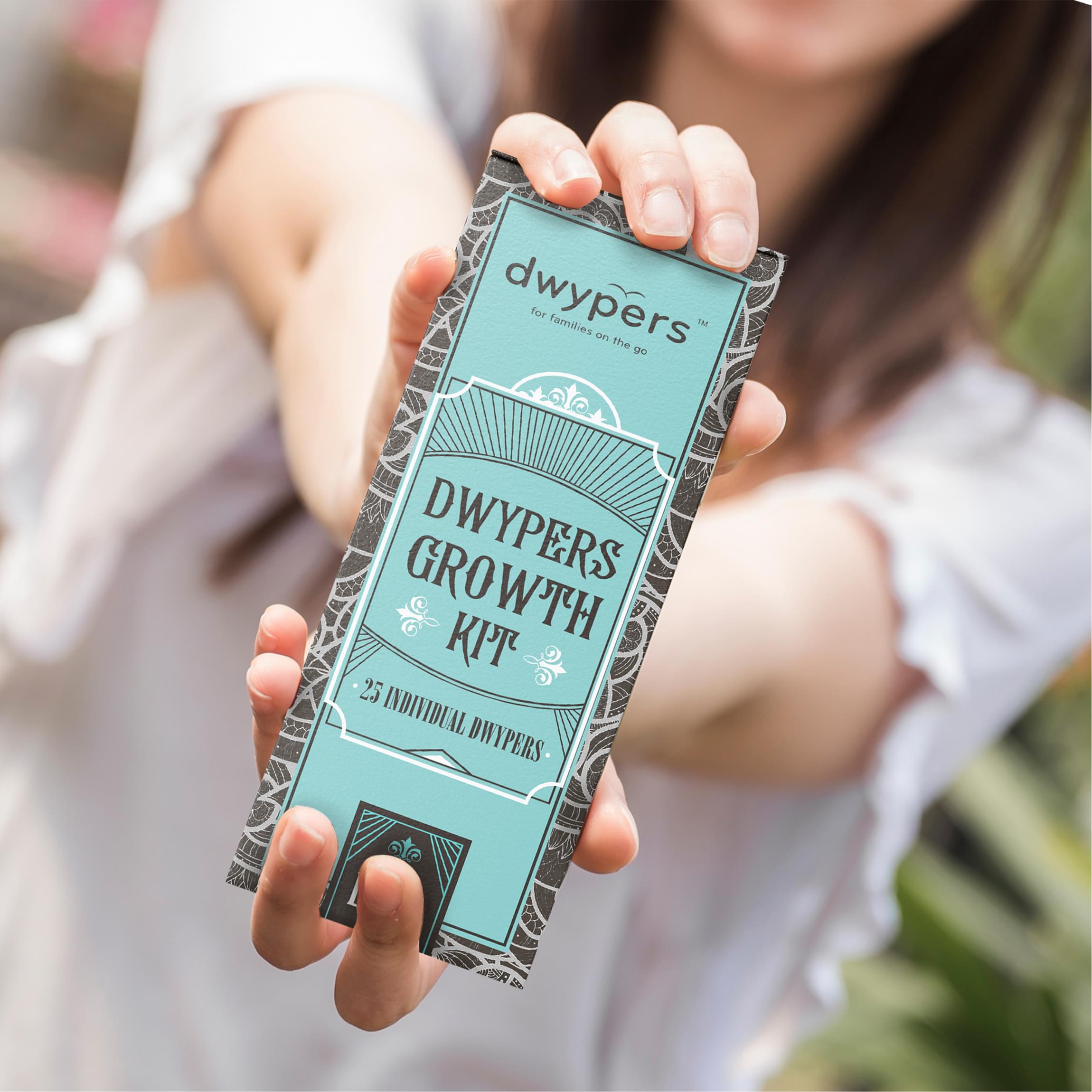
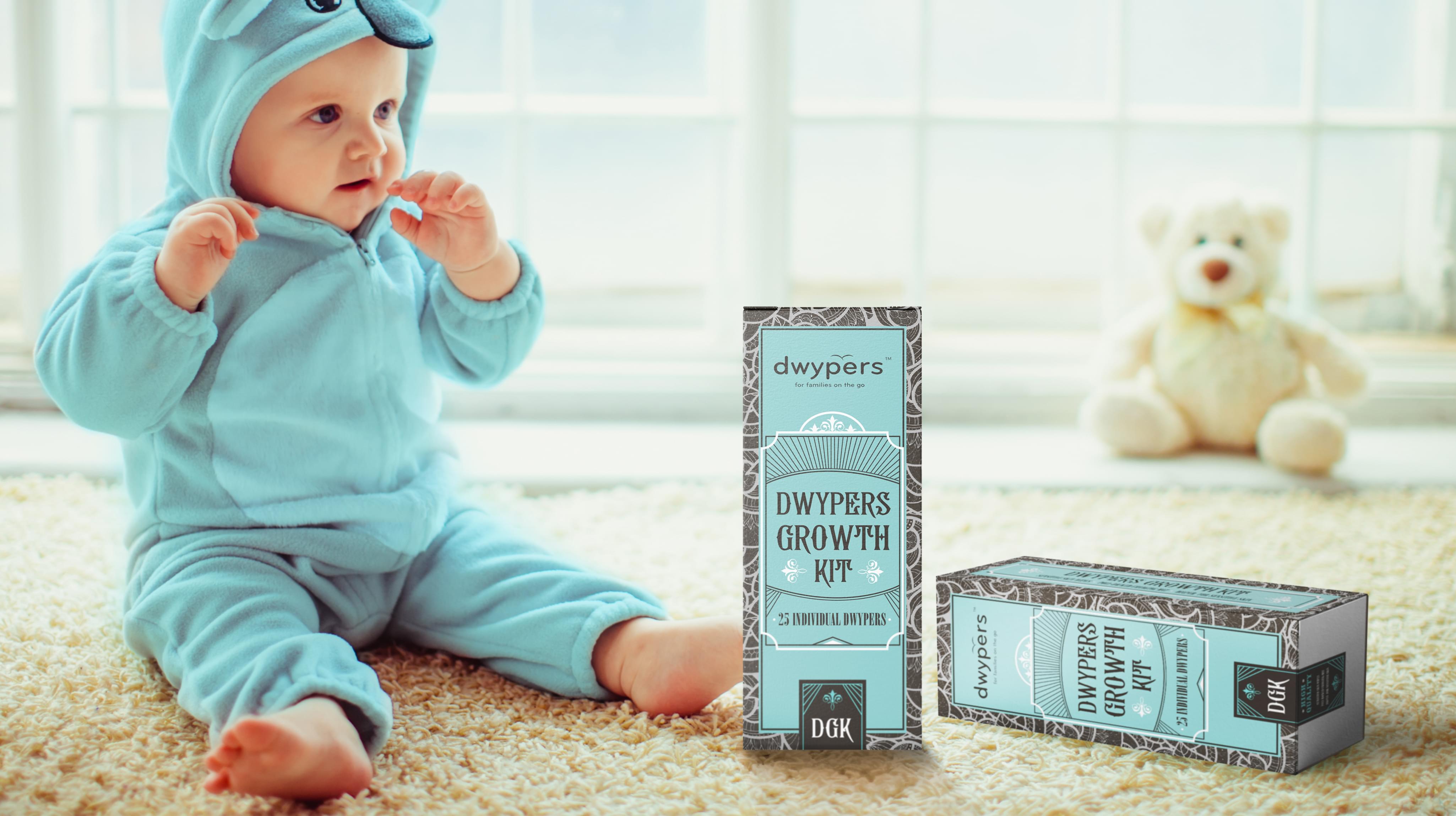
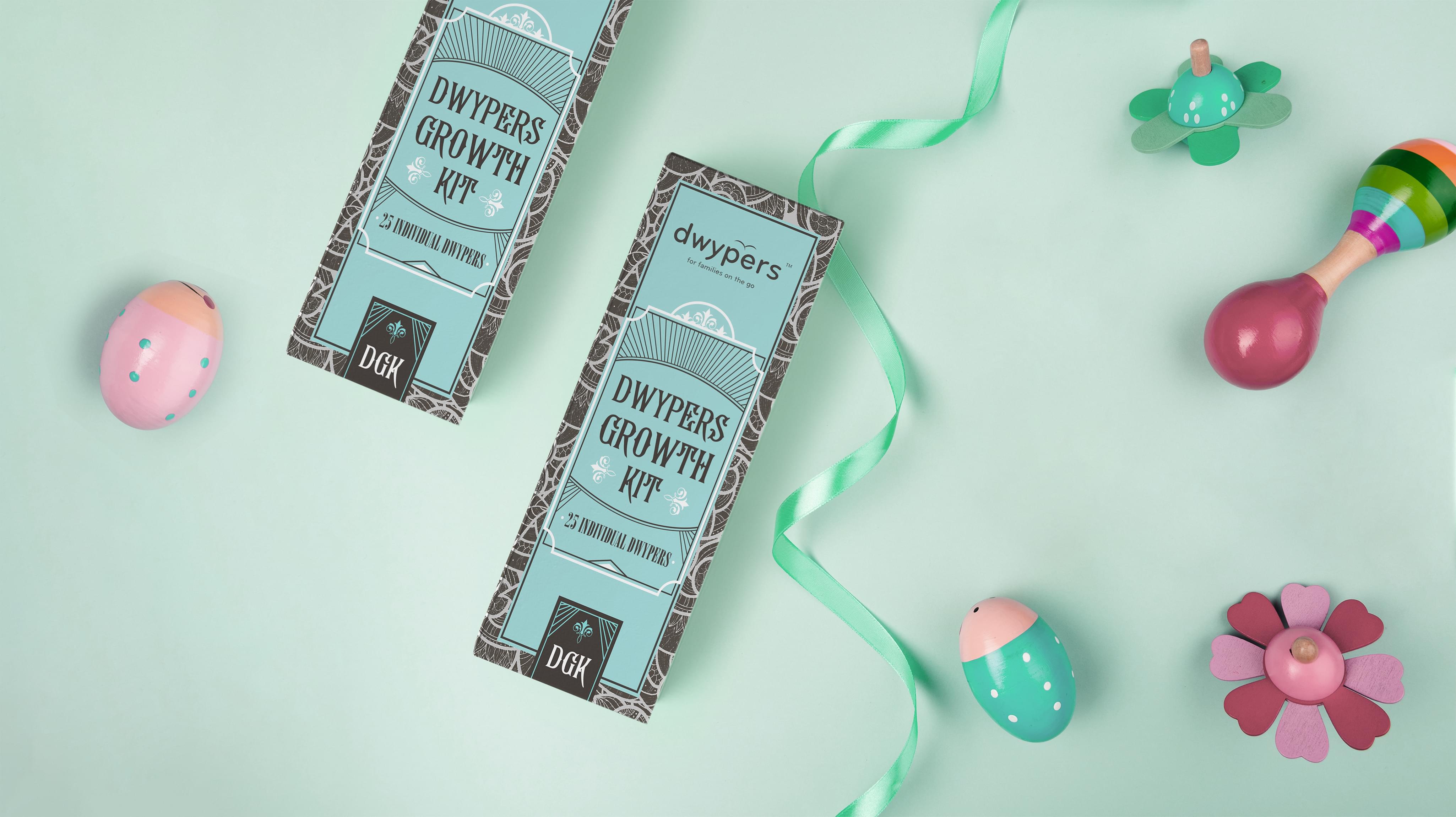
Dwypers presented a unique project to Stan Agency regarding its growth kits. Each kit contained all the essentials to change a baby on the go. This vintage packaging design project was about making the packages attractive, so even the most discerning parent could not resist. We took the challenge and immediately dove into the research.
Challenge Components
  • Saturated market
  • Conveying convenience
  • Consumer supplement wariness

Research as a Custom Packaging Design Firm

Diaper vintage packaging design can be tricky, and each market has different expectations. We examined Dwypers’ intended markets for trends in how diapers are marketed. We also discussed how larger box packaging worked for diapers since Dwypers come in sets of 25. Interestingly, not a lot changed between the box sizes.

Bonus Challenge

The added challenge to this box packaging design project was the saturated market. Disposable diapers are available in most of the company’s target market. Some are even cheaper, so we knew we needed to create a fantastic diaper vintage packaging design so people would choose Dwypers off the shelf.

Design Inspiration

Most of the diaper brands used babies on their labels, so we decided to go in the opposite direction. Instead, we chose to make Dwypers suave. This choice offered a myriad of possible inspiration sources. This lead to the option of mixing minimalism with old fashioned design principles by several team members. So they become look like vintage product.

Narrowing Down the Final Options

Picking a single diaper packaging design from the innovative concepts the design team brought forward was difficult. We began by discarding anything too outlandish that did not fit the Dwypers brand guidelines. Then we did a shelf comparison analysis to see which designs held up best against the competition.

Result

The resulting design was straightforward, and the Dwypers team was able to put it into production without difficulty. The design was even more cost-effective to produce than the old one. As the new vintage packaging entered production, Dwypers did see an increase in the appropriate sales figures.

The Deliverable

The Final Package:
  • One complete custom box packaging design
  • Separate package design elements for reuse
The final design for Dwypers featured a blue label with a few graphic and easy to read text. This panel was surrounded by an abstract pattern of black and white. The box packaging design came out simple but capable of standing out on a crowded shelf. We look forward to supporting Dwypers in its future endeavors.
DWYPERS Packaging
DWYPERS Packaging
DWYPERS Packaging
Scroll