- Company:SP-Vertriebs GmbH
- Location:Germany
- Service:Packaging design
- Category:Food & Drink
Challenge
A USA-based client came to us, Stan Agency, with a product that had been a hit with focus groups but had struggled to stand out in the crowded snack aisle of local grocery stores.
Result
From Bland to Amazing
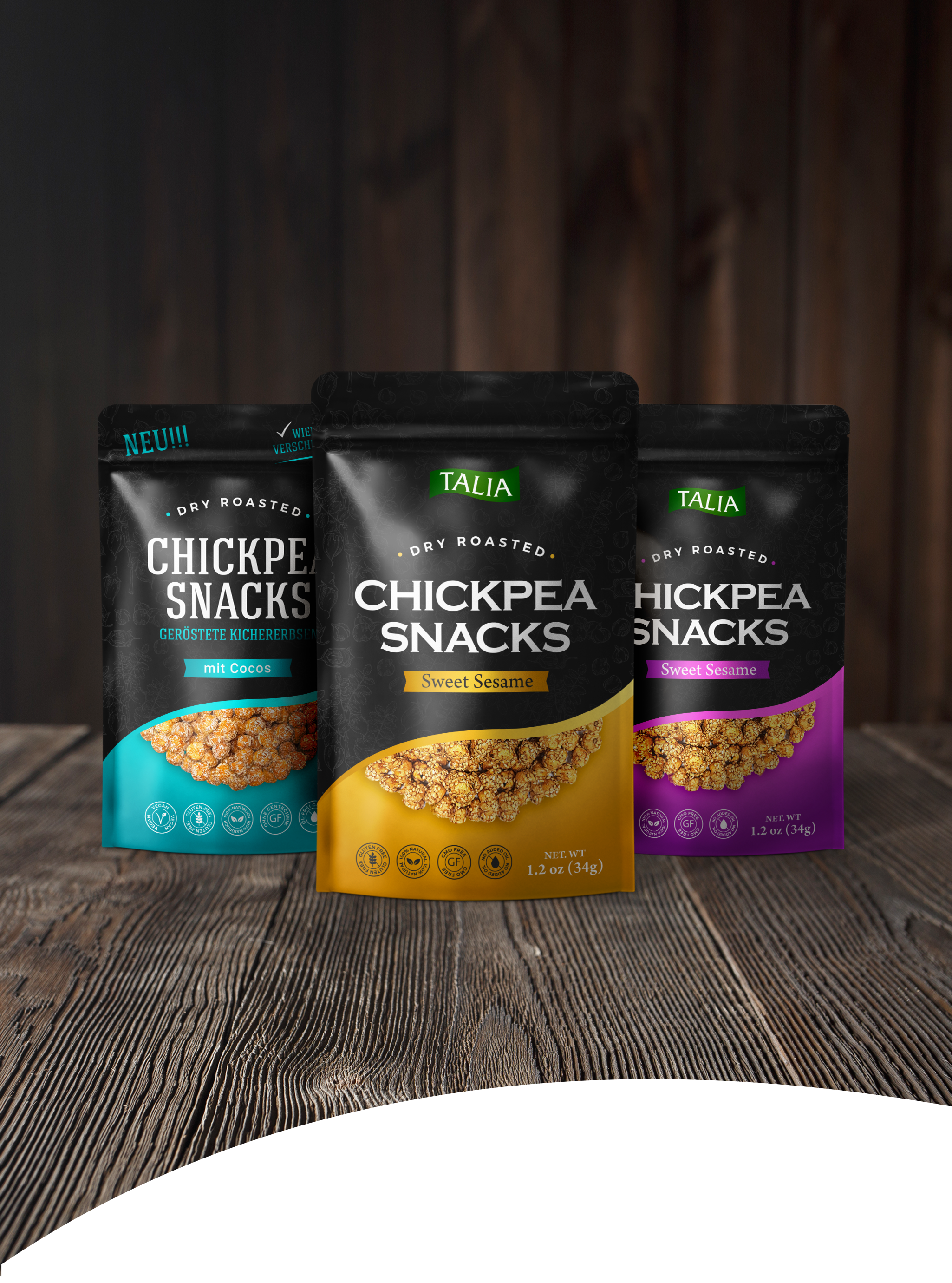
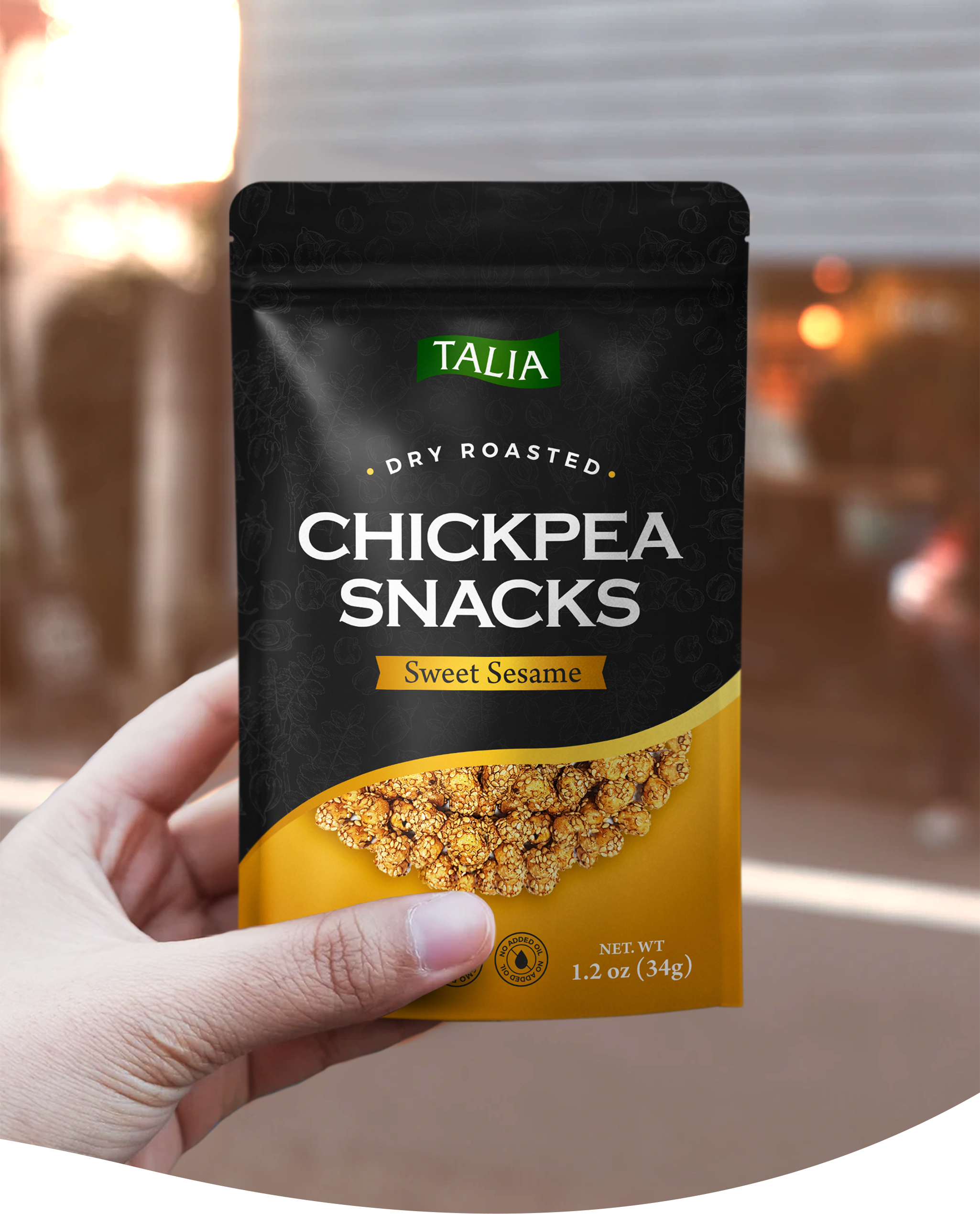
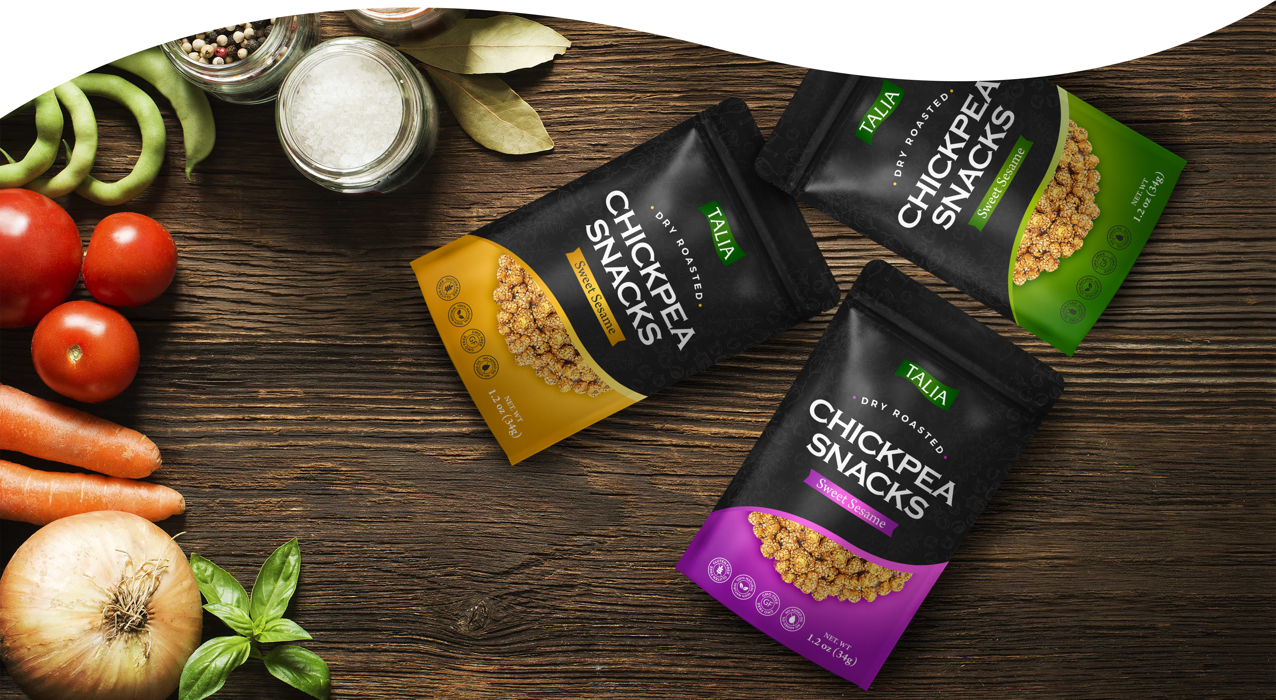
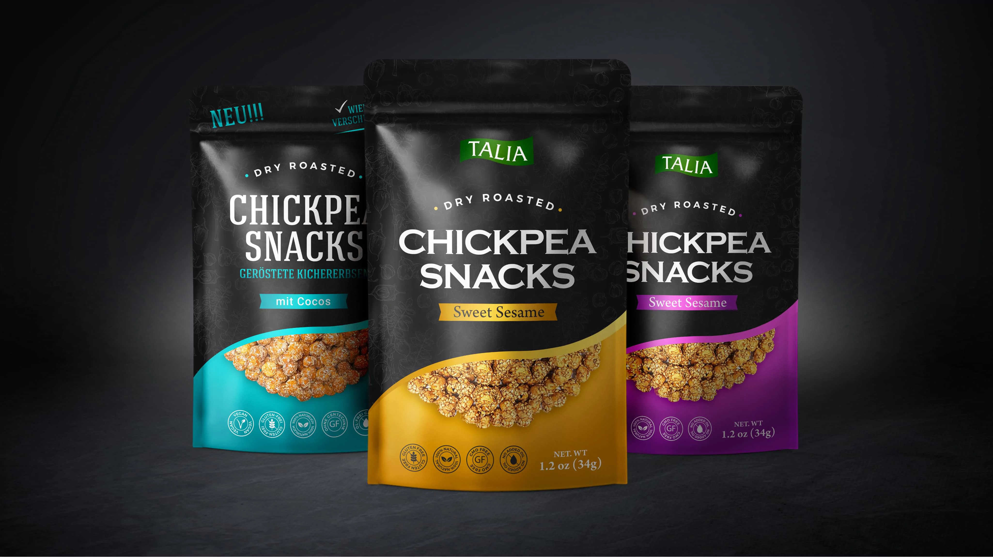
Our first task was crafting a snacks package design that stood out from the competition. We used the most advanced research on how design and color choice impact consumers to select bold, contrasting colors that draw the eye while communicating warmth and comfort.


