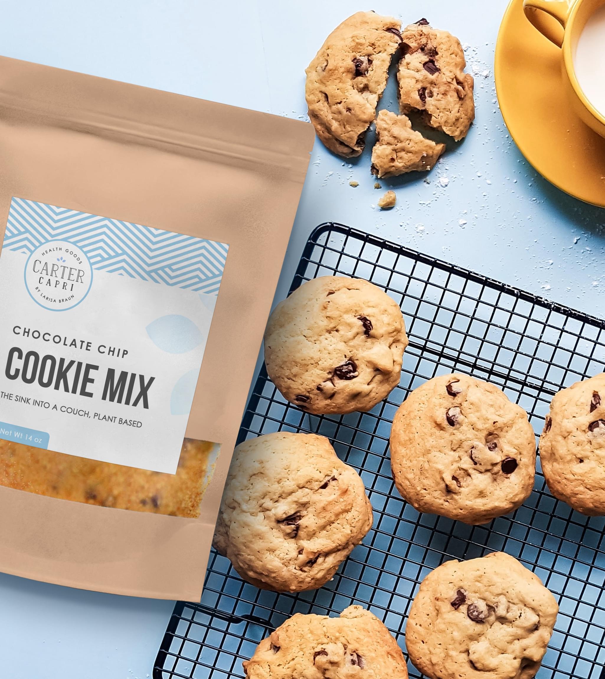
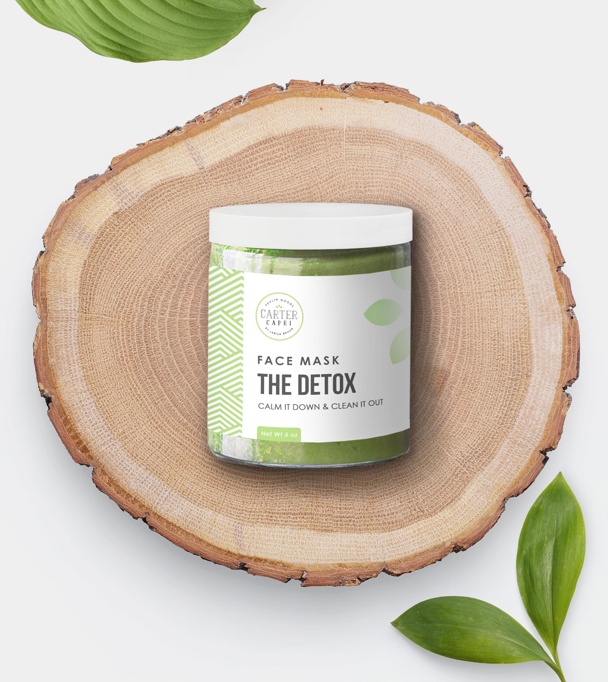
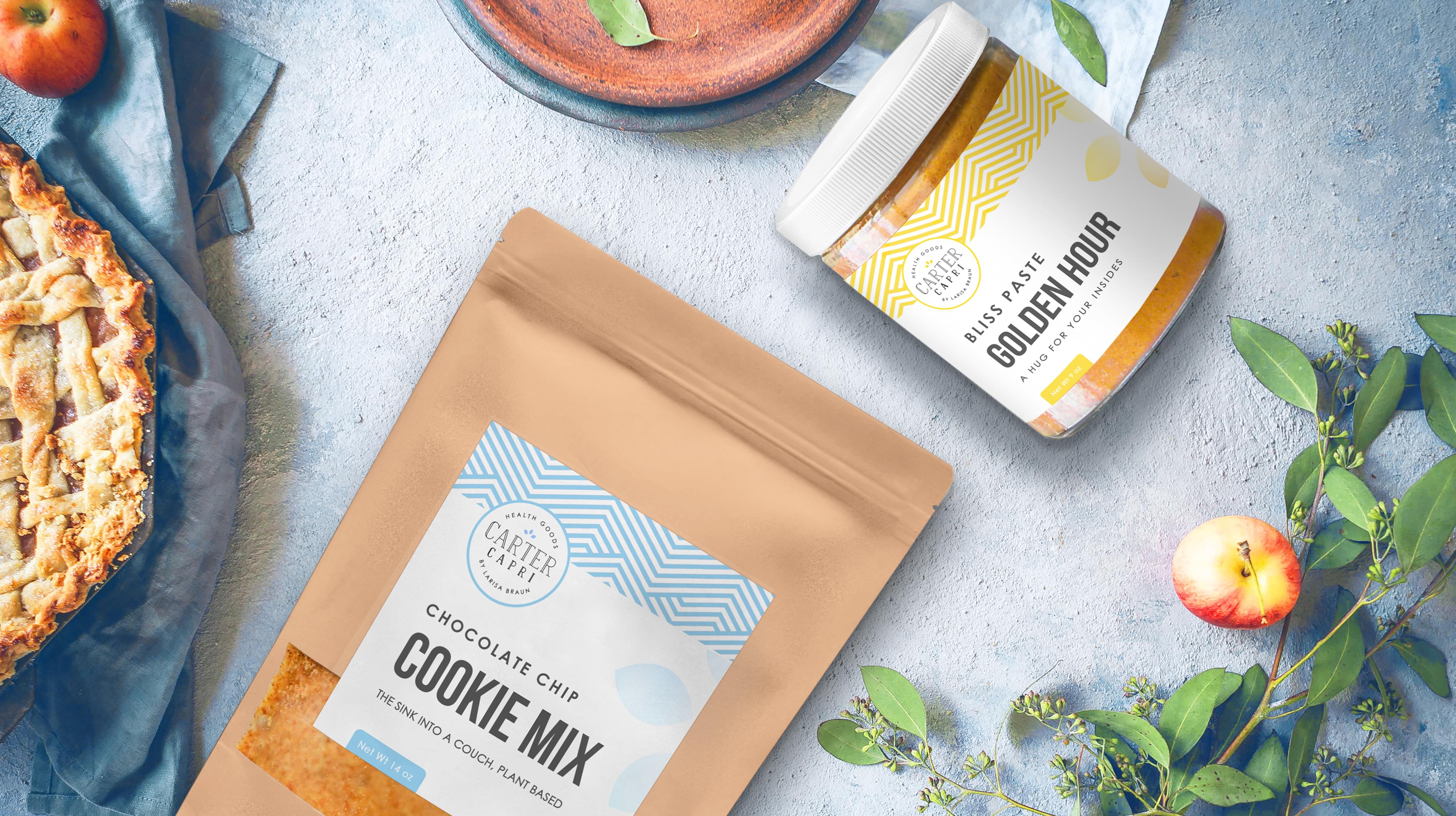
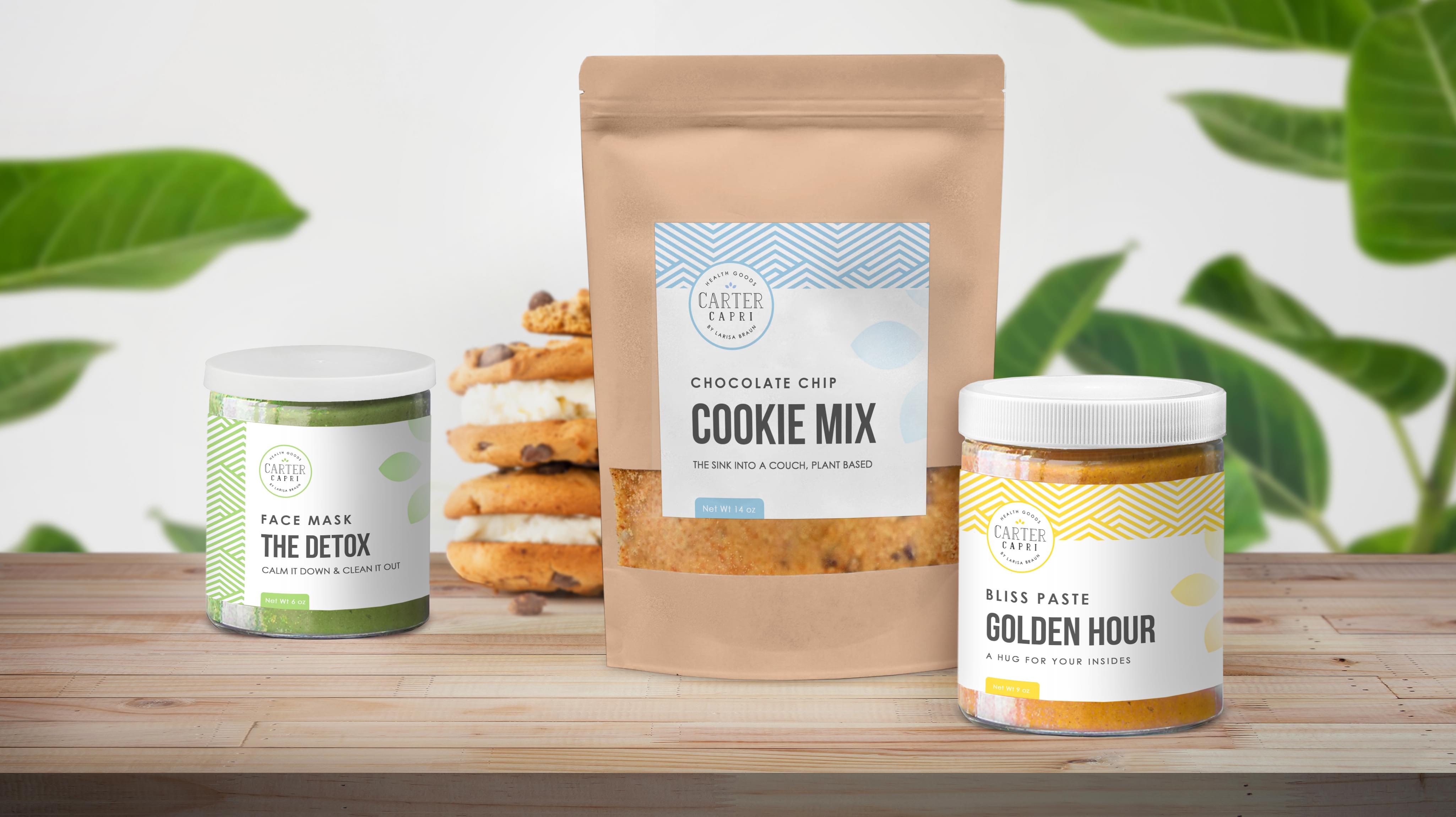
Carter Capri brought us a design challenge for its line of health foods. They wanted a vintage label design that suited its classic approach to branding. At Stan Agency, we love a good challenge. Planning a diverse vintage label design package for various products required an innovative solution.
Challenge Components
- Saturated market
- Vintage design approach
- Diverse product line
Research as a Custom Label Firm
At Stan Agency, we jumped into researching the current design trends for healthy foods. These were many options in the markets Carter Capri entered across the USA. The team examined some of the big wellness brands as well to round out our inspiration search. By the end, our team had several ideas to develop into vintage label designs.
Bonus Challenge
The challenge with Carter Capri’s project was the different products involved. We needed to create a cohesive vintage label design that worked with the various package types and products. To top it off, the products themselves were different colors, and the labels needed to account for that balance as well.
Design Inspiration
In our design file for these vintage labels, we narrowed down the available creative inspiration. As a team, we decided to keep this label design simple so that it fit with more packaging designs. We also decided on a mix of old school and vintage feeling for this label design, since that is part of the company’s branding.
Narrowing Down the Final Options
Picking out a design from our talented label creation team was difficult since they produced many outstanding options. The meeting eliminated some intricate designs and those that would be difficult to enjoy in multiple colors. We ended up picking one of the simplest designs presented, and it fits well.


