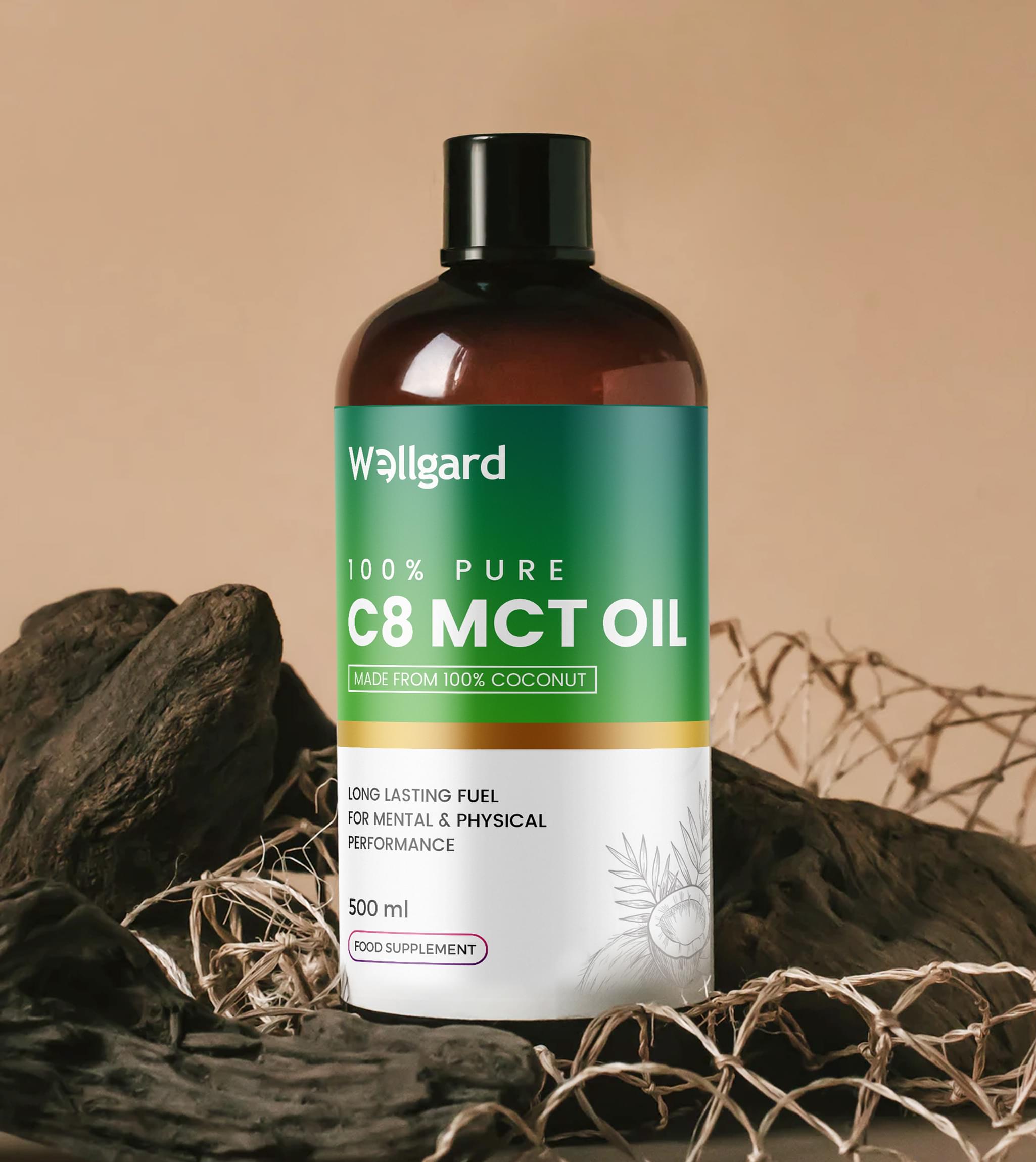
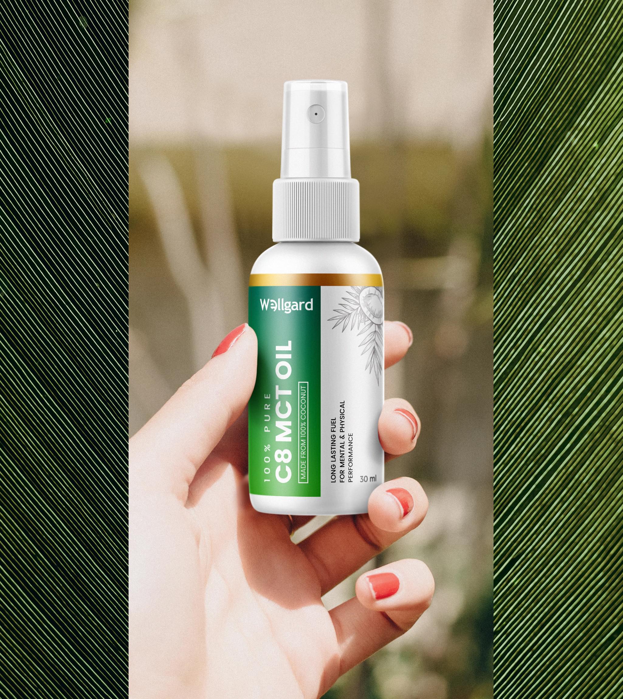
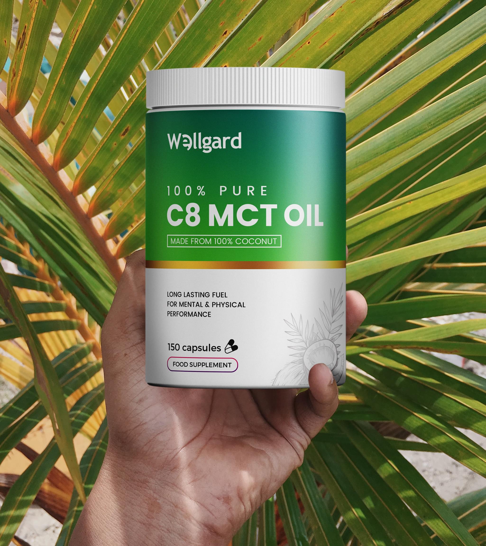
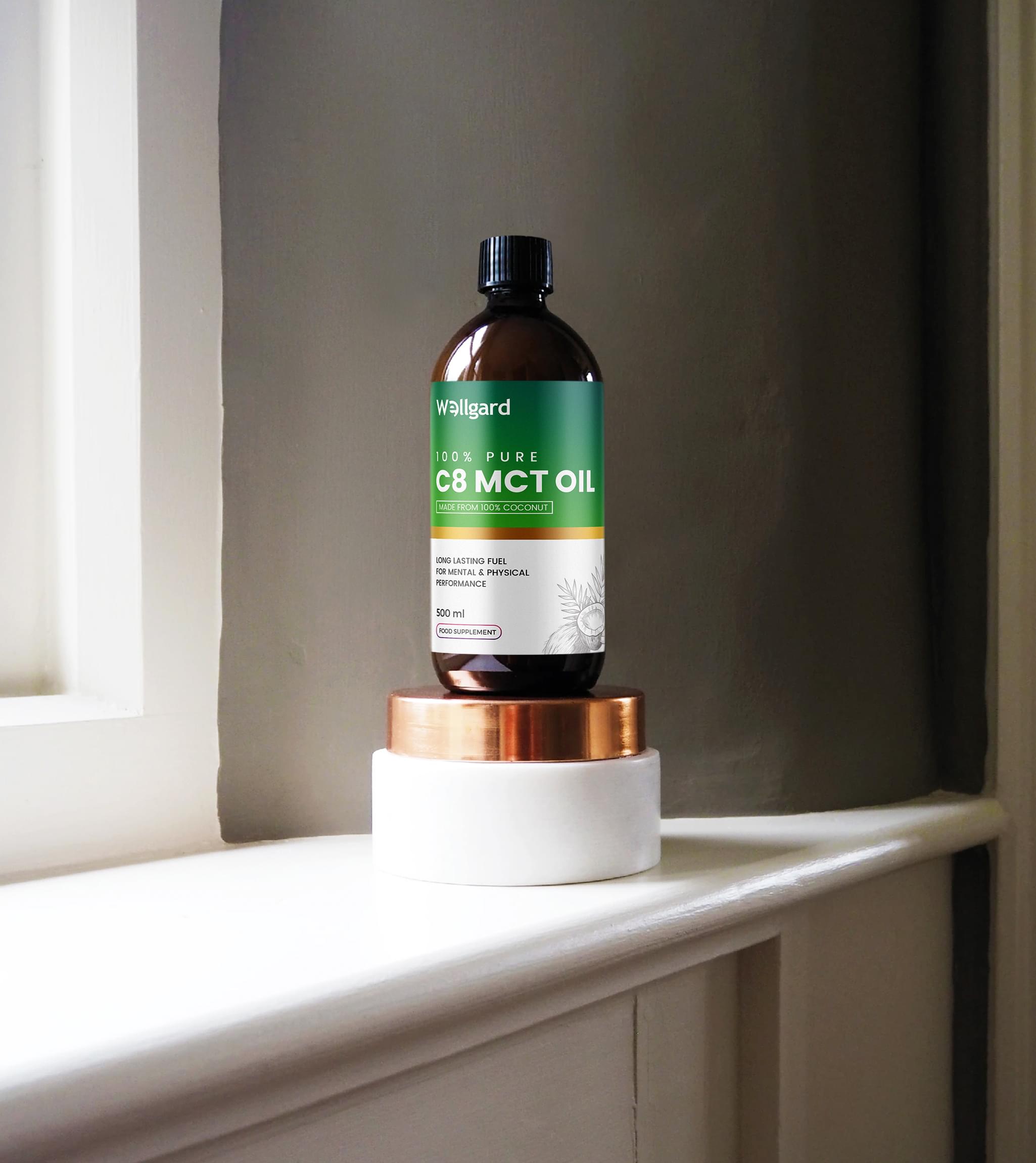
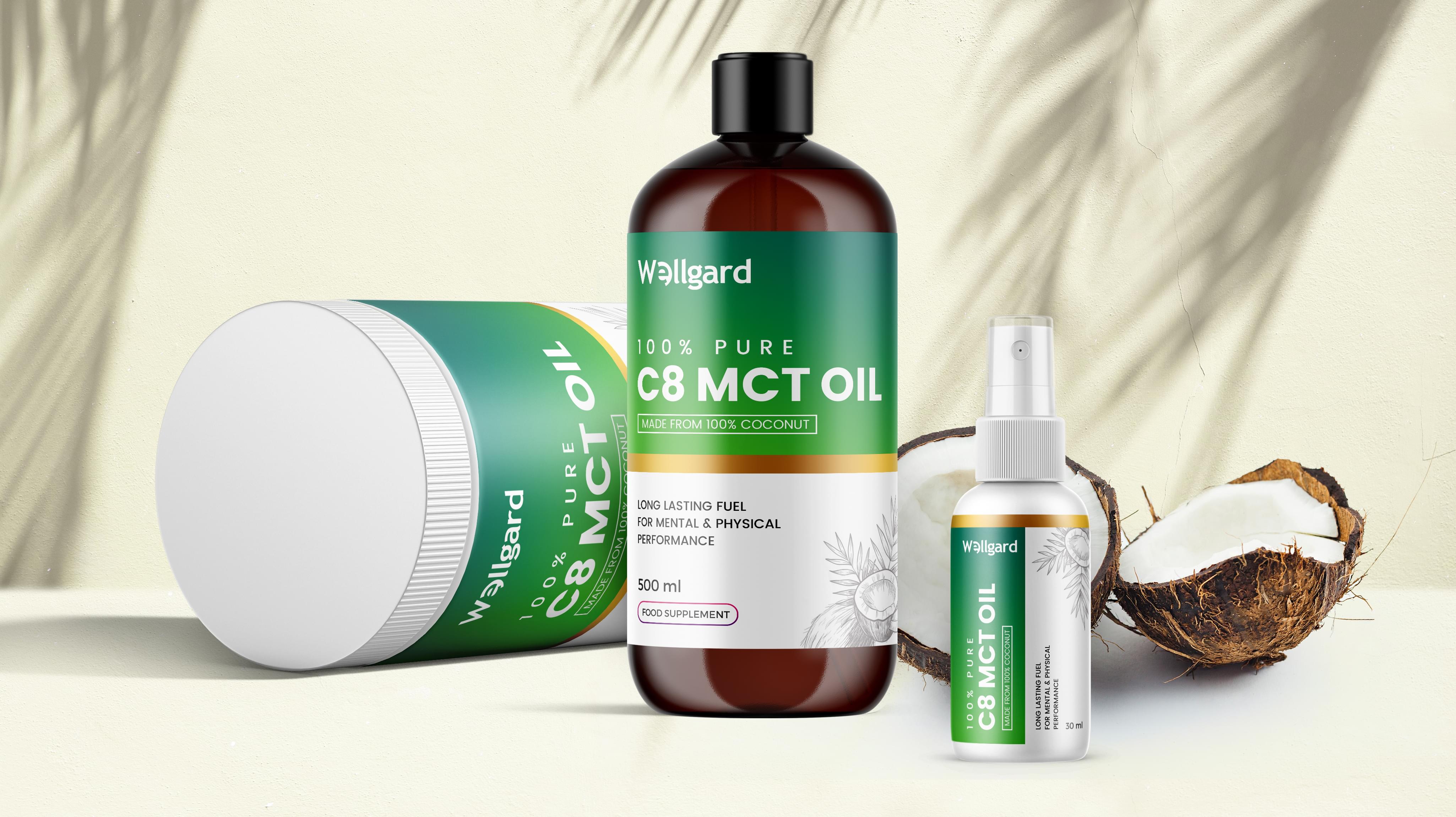
Wellgard proposed a unique order to Stan Agency for a new commercial product label design. The company makes supplements. This time, Wellgard wanted to rebrand its C8 MCT oil, which is used for weight loss and workout endurance. Stan Agency eagerly accepted the challenge.
Challenge Components
- Niche market
- Conveying the importance of the supplement
- Differing sized bottles
Research as a Custom Commercial Product Label Firm
Our first design process step involved looking at competitor commercial product label designs. This informed us about the market trend towards simple labels as well as the ketogenic niche. We also examined Wellgard’s other product labels for cohesion in design.
Bonus Challenge
C8 MCT oil is not a well-known supplement. We needed to create a label that informed consumers as well as attracted their eyes. Otherwise, the product would end up back on the shelves frequently.
Design Inspiration
We drew inspiration from Wellgard’s existing branding in the UK. That gave us ideas on how to expand it inclusively to the US. We also decided that we would employ a more minimalistic design approach with a few elemental twists. The team jumped into this design project with that guidance.
Narrowing Down the Final Options
The commercial product label design team produced several awesome concepts. After eliminating the ones that strayed too far from company branding, we began looking at which ones stood out. Then we found the design idea that best transitioned between the bottle sizes.
