FEMININE BALANCE Packaging
FEMININE BALANCE

JAR LABEL DESIGN

  • Company:Feminine Balance
  • Location:USA, CA
  • Service:Branding, Label design
  • Category:Medical
  • 5.0 Review FEMININE BALANCE Packaging 100+ Reviews

Challenge

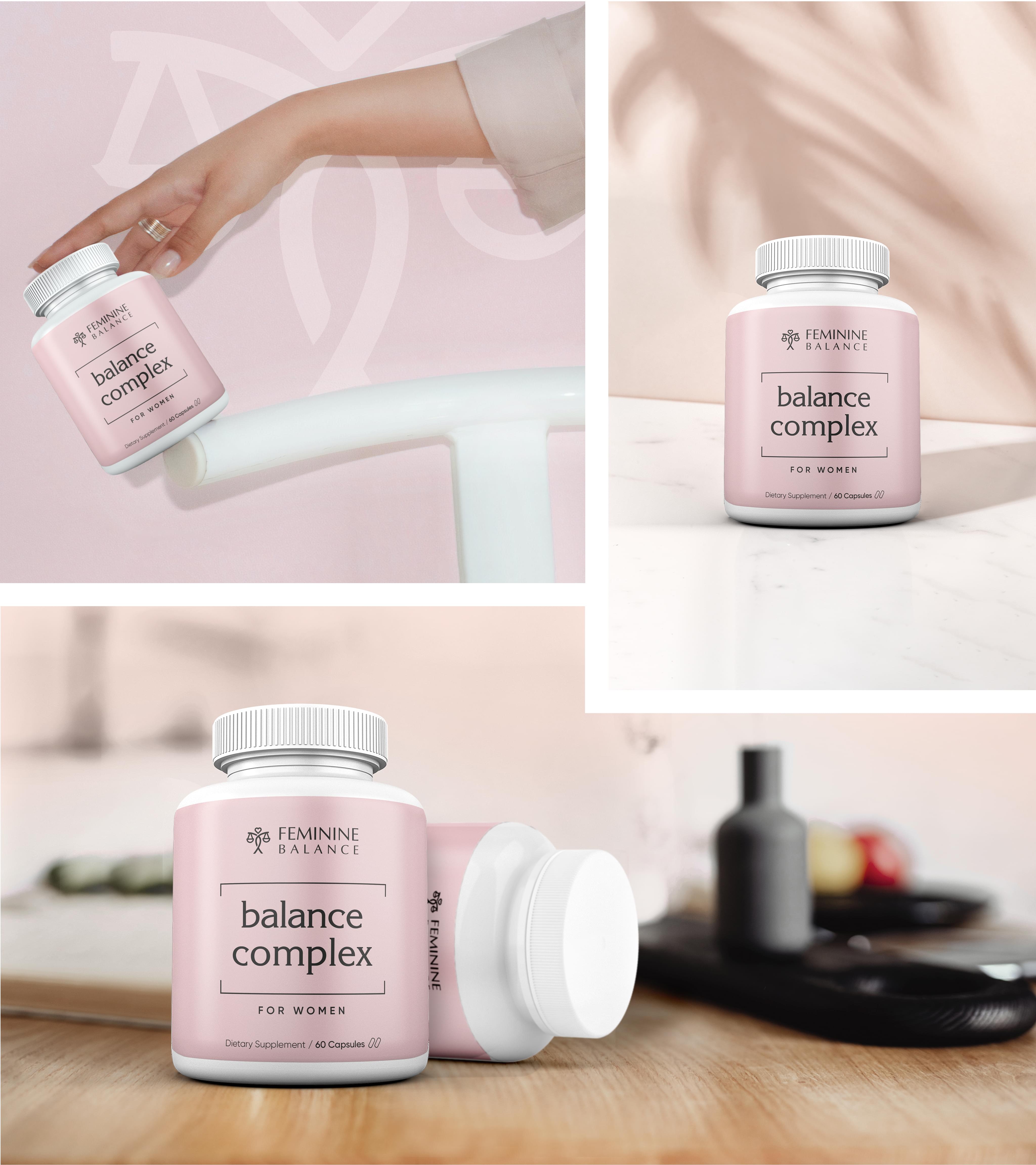
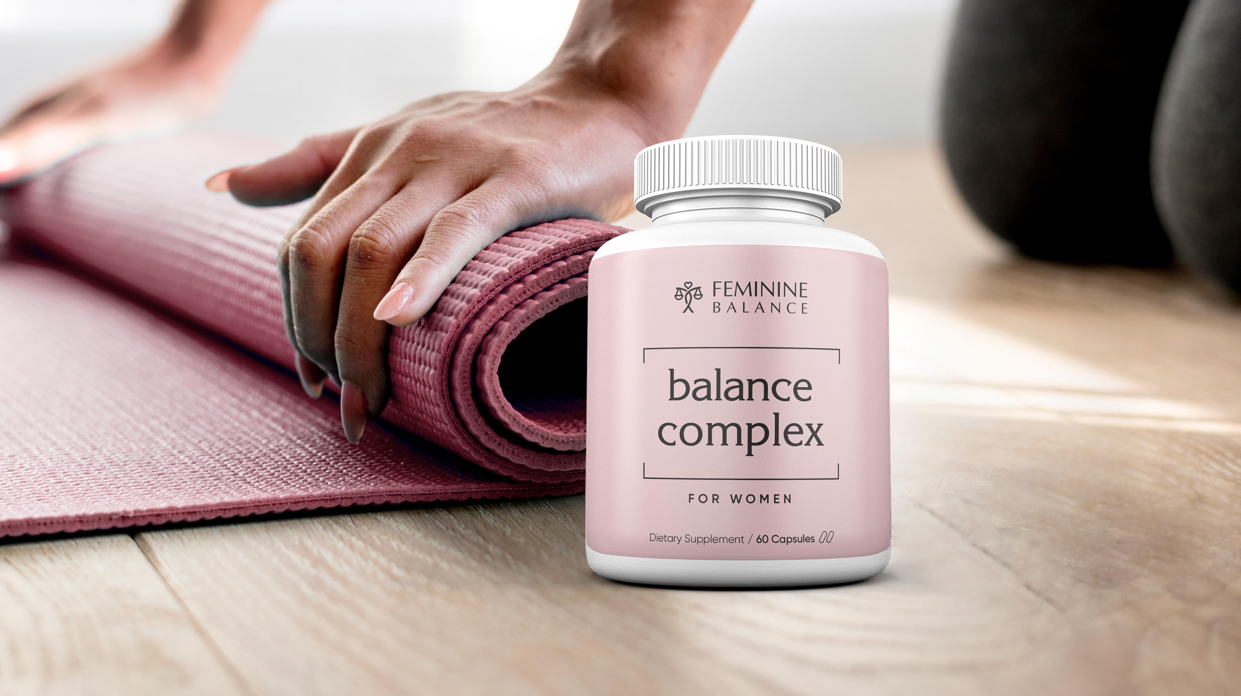
Feminine Balance brought Stan Agency a label design order for new jar labels. The company was aiming for its supplement for women to hit the market can become a quick success. To do that though, the company needed an attractive jar label that stood out on the shelf. We were happy to take the challenge.
Challenge Components
  • Saturated market
  • Supplement labeling requirements
  • Consumer supplement wariness

Research as a Custom Label Design Firm

The first step in good jar label design, even if it’s a sticker design, is proper research. We investigated Feminine Balance’s competitors so we could examine their packaging. We also discussed how women determine which supplements are right for them. Unsurprisingly, the decision has a lot to do with how the information on the jar label design is presented.

Bonus Challenge

The additional challenge with Feminine Balance’s order involved consumer wariness of supplements. The saturated market and general distrust in unproven claims can make new customers leery of buying. It does not help that in markets like the USA, supplements are not required to prove that they work at all.

Design Inspiration

Women’s supplement jar label designs need to fit a lot of information in a small space. We decided we wanted to provide a contrast to the busyness many labels employ. Instead, we looked at minimalist ideas as we considered the best jar label design for Feminine Balance.

Narrowing Down the Final Options

The label design team came back with several innovative options. The first criteria we used to narrow the choices was recognizability since women’s supplements is a saturated field. Then we moved into visual appeal. Lastly, we considered how the label would stack up and draw the eye when placed on the shelf with its competitors.

Result

The result of the jar label design project for Feminine Balance was stunning. Feminine Balance was able to use the label immediately for its balance complex supplements, so the jars hit the stores relatively quickly. Feminine Balance let us know that the product has exceeded company sales projections and that the company is beginning a new production run soon.

The Deliverable

The Final Package:
  • One creative custom jar label design
  • Separate package design elements for reuse
Feminine Balance’s final jar label design was minimalist. It featured pink so women would recognize that the formulation is for them. The design features a few clean lines rather than a mass of information, making the package appear open and inviting. We look forward to helping Feminine Balance expand its business in the future.
FEMININE BALANCE Packaging
Scroll