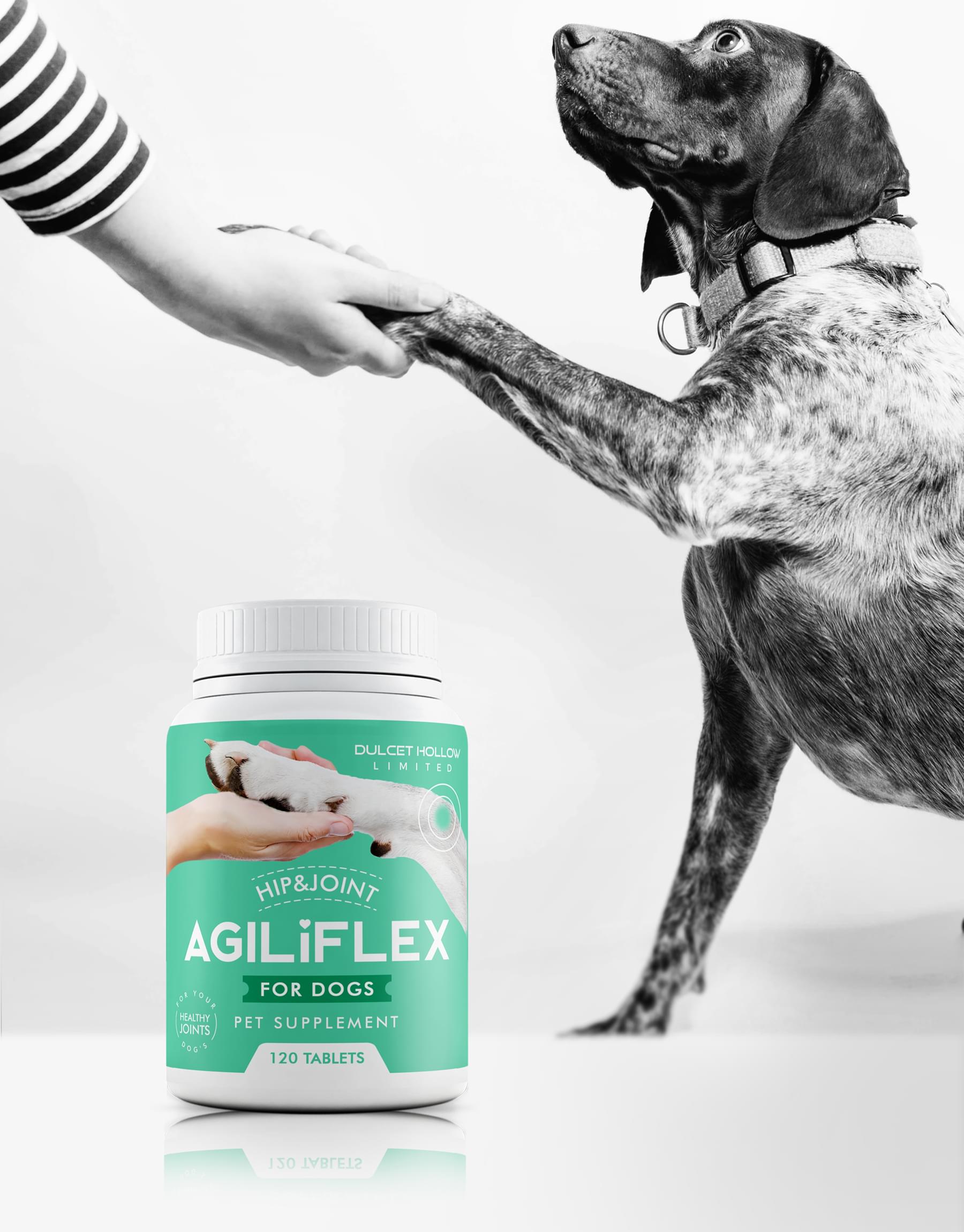
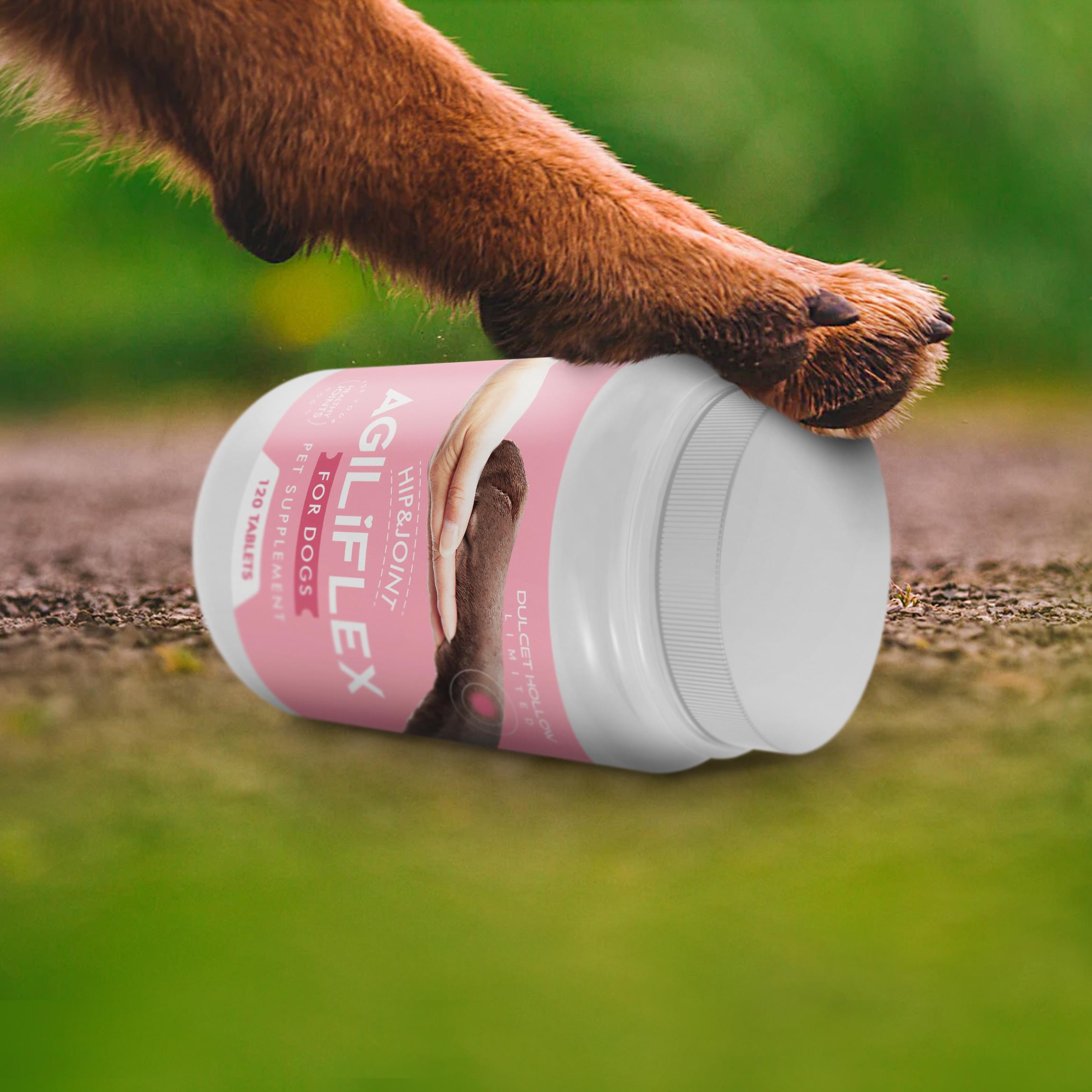
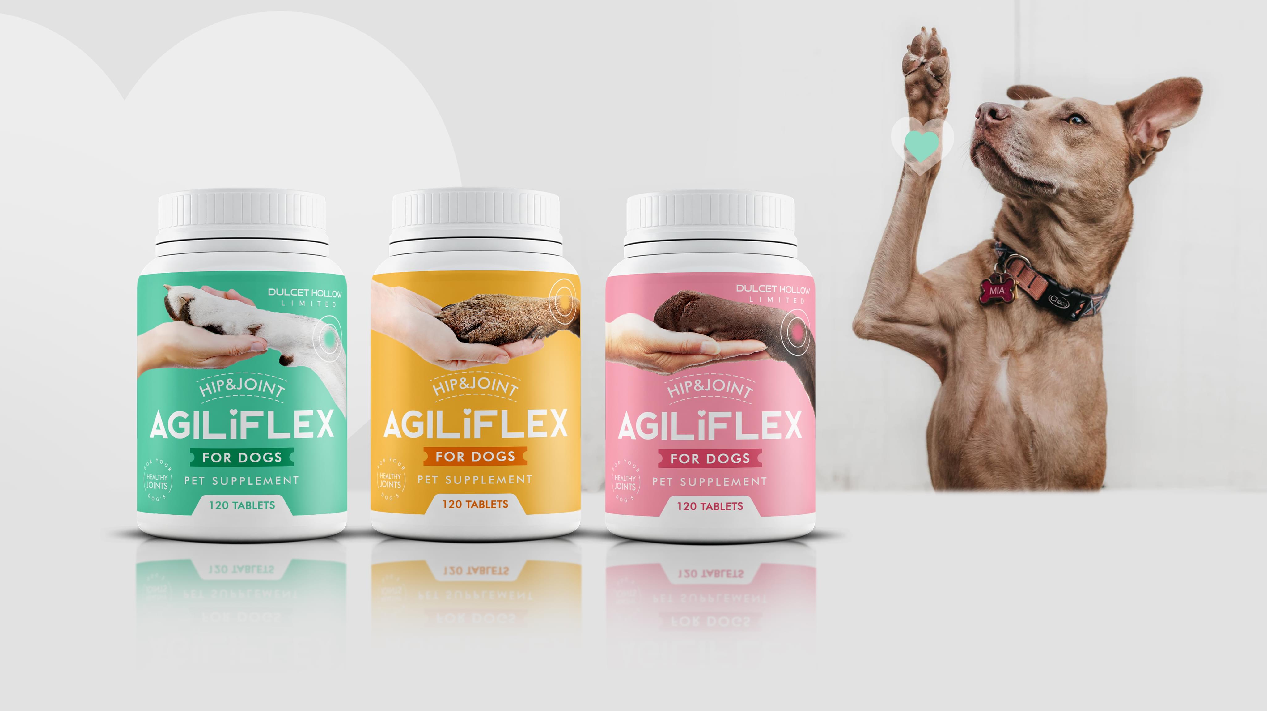
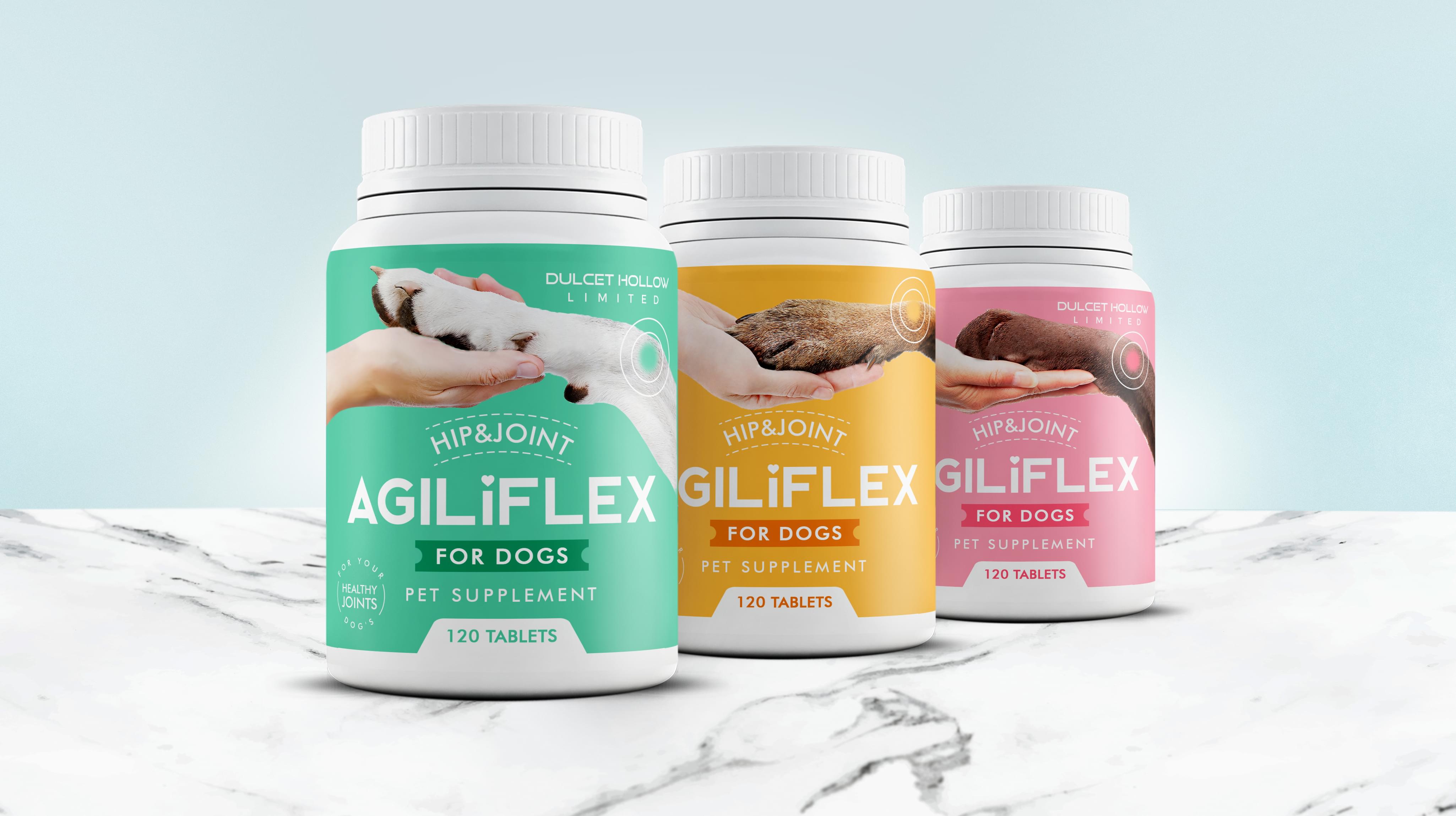
Agiliflex offers a unique concept for dog hip and joint health. The company decided it wanted to commission new packaging graphic design and new labels graphic design so that more people would be attracted to the bottle. Once people picked up the bottle, Agiliflex knew its formula would convince people to buy it. We at the Stan Agency were glad to help with this custom order.
Challenge Components
- Saturated marke
- Memorability
- Efficiency
Research as a Package Design Firm
We began by looking at market trends, specifically in the USA. This market is teeming with examples of hip and joint supplements, so we got a good idea of the existing packaging. In the USA, many supplements use only basic colors like black and white. Additionally, the front of the label tends to be crowded with potential benefits. It’s overwhelming to consumers.
Bonus Challenge
Since there are many distinct joint supplements for dogs, memorability is an enormous issue. We needed to create a distinctive design that worked with Agiliflex’s existing branding so people would remember which bottle they bought last time. Additionally, we also needed to be memorable enough for shop browsers to come back and pick the right container.
Design Inspiration
We drew our inspiration from the dogs that Agiliflex helps with movement. We knew we wanted to incorporate a dog, but we didn’t know how at first. The graphic design packaging team worked on several designs and worked extensively with colors. The bright colors came in when a team member was discussing dog personalities.
Narrowing Down the Final Options
The graphic design packaging team presented several robust designs. We started narrowing them down from a practical standpoint, beginning with the cost of production. Then we moved into figuring out which one best represented what Agiliflex does for dogs. This decision resulted in the single design in three color options we ultimately went with.


