ORTHOFORTIN Packaging
ORTHOFORTIN

TABLET PACKAGING DESIGN

  • Company:German Capital Pharma GmbH
  • Location:USA, Washington
  • Service:Packaging design
  • Category:Medical & Pharmaceutical
  • 5.0 Review ORTHOFORTIN Packaging 100+ Reviews

Challenge

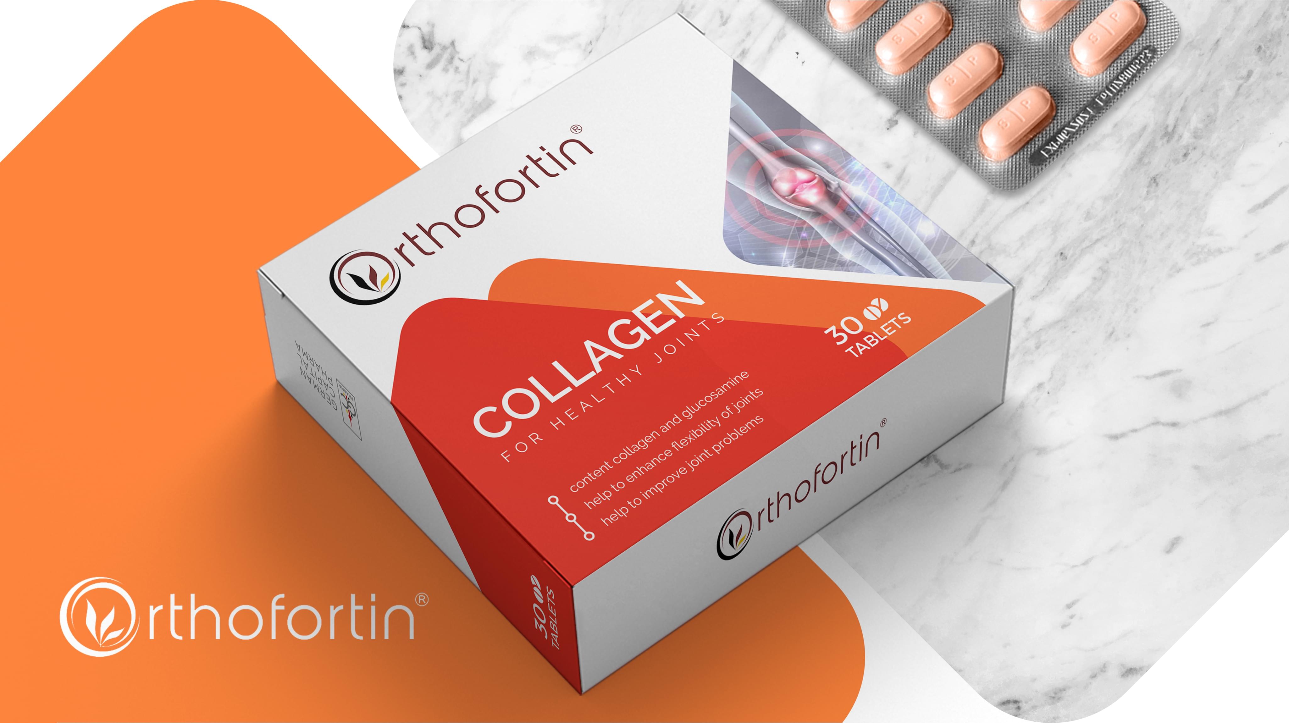
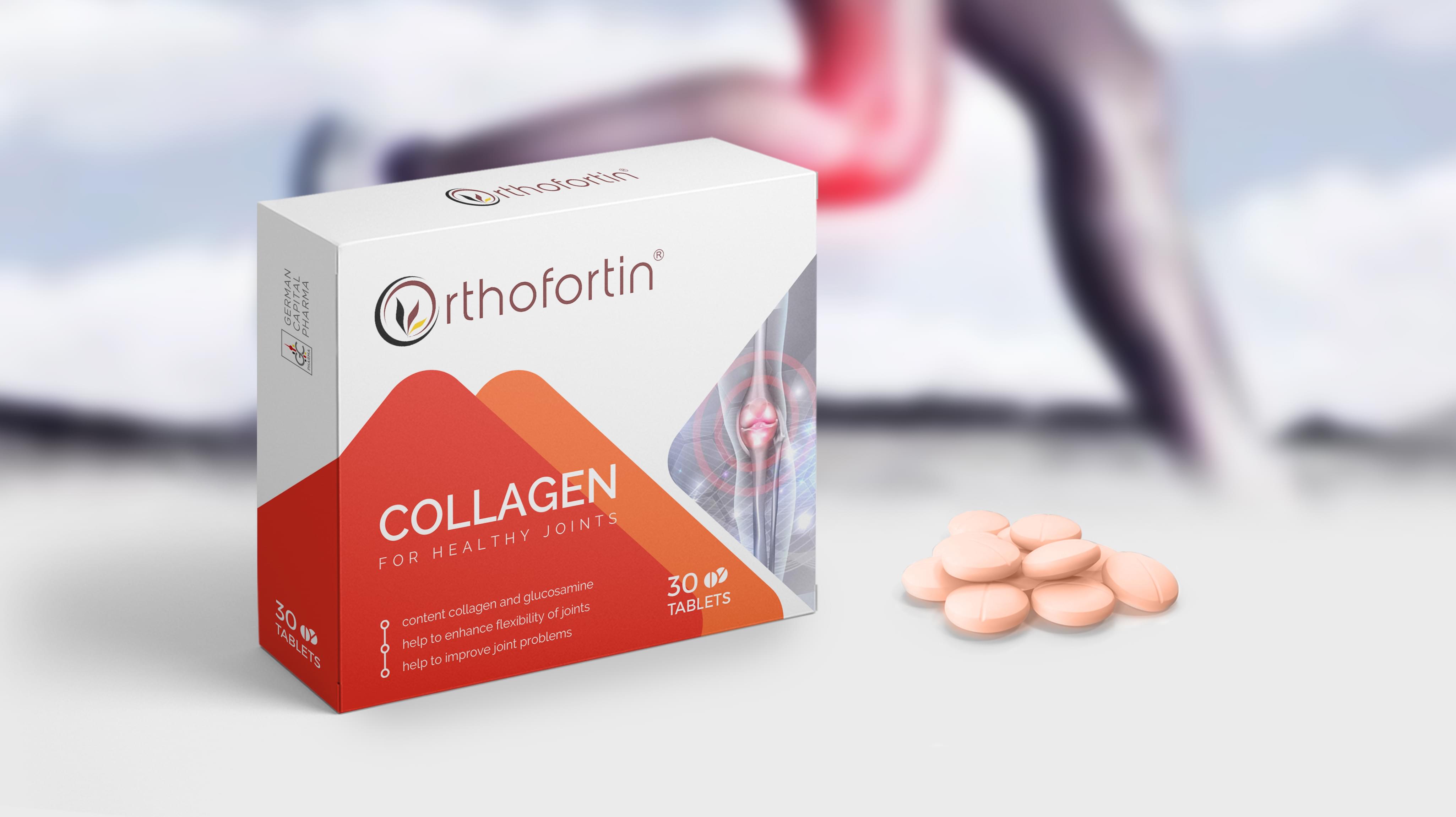
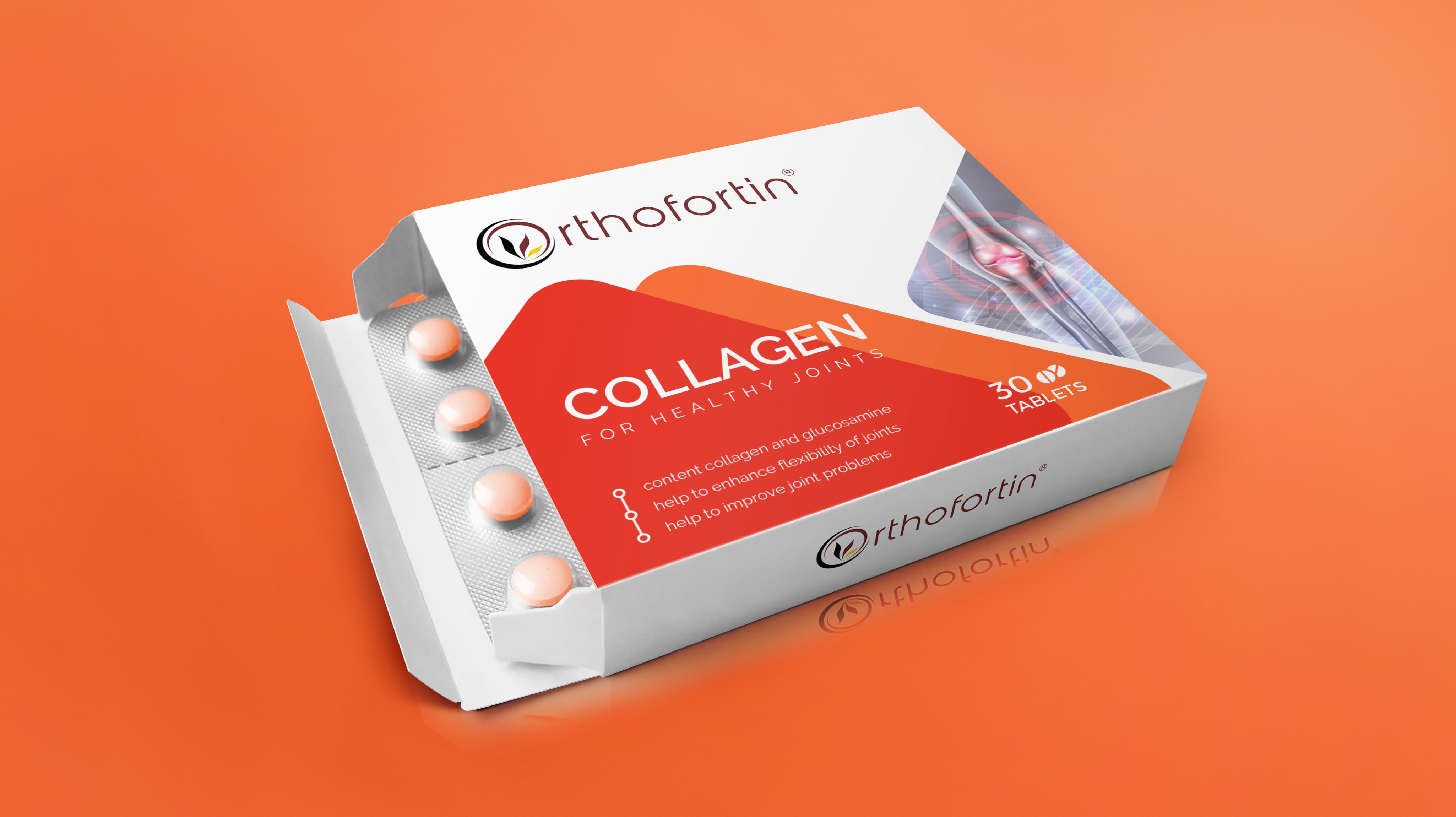
Orthofortin presented a unique order with its collagen joint supplement packaging. This form of tablet packaging design required significant research to help it stand out in the crowded supplement market. Additionally, the tablet packaging design needed to include durability so that it arrived on shelves intact.
Challenge Components
  • Saturated market
  • Durability
  • Consumer supplement wariness

Research as a Custom Packaging Design Firm

Research began with a look at competitors in the joint health business, including in the USA, where supplements have a significant market share. Then the team examined Orthofortin’s existing branding so that we could ensure cohesiveness. From there, we compiled the research and began work on the tablet packaging design.

Bonus Challenge

One of the significant challenges for supplements, in general, is consumer wariness. In markets like the USA, supplements do not need to prove their effectiveness, which in turn means consumers may or may not get what they pay for. We needed to include reassuring elements in our tablet packaging design to help overcome this initial fear that the collagen would not work.

Design Inspiration

Our inspiration for the colors came from health, where warm colors symbolize vitality. Then we examined the tablet packaging design samples from the various competitors. We noticed they tended towards solid color packaging with fluid accent lines. This influence provided the inspiration for the package front.

Narrowing Down the Final Options

The creative team provided many innovative concepts during the meeting on Orthofortin’s tablet packaging design. We first narrowed the field to designs with more uniqueness to help the tablet packaging design stand out on shelves. Then we examined the remaining plans for underlying messaging and labeling space so the packaging would be as strong as possible.

Result

Orthofortin placed the package in use and immediately saw a bump in sales. The unique design received positive customer feedback when presented side by side with competitors. The launch was so successful that Orthofortin needed more to set up more product production to meet the new demand for its collagen supplements.

The Deliverable

The Final Package:
  • One complete custom box design
  • One creative packaging consultation
  • Separate package design elements for reuse
The final design used two distinct warm colors for the primary design, along with a solid white background. This color combination stood out well among the mono-colored tablet packages. We chose a mountain motif to symbolize strength since that’s what the supplements help provide. We look forward to working with Orthofortin again on other projects.
ORTHOFORTIN Packaging
Scroll