
Brand Mission
Sawa Coffee is redefining what the drink and the coffee shop experience can be for dedicated gourmets who value the taste of their cup as much as what the coffee does.
Brand Values
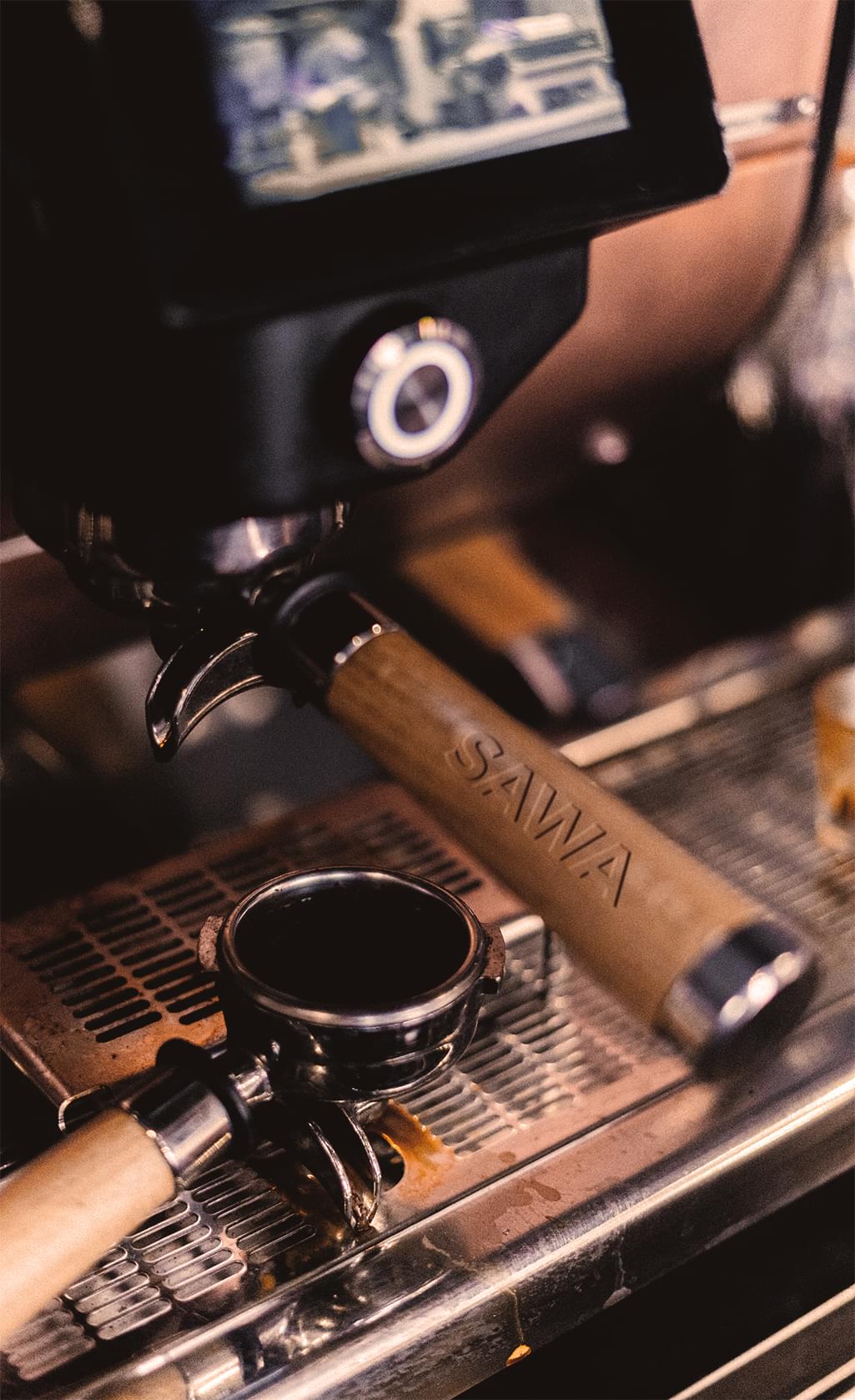
Precision – Sawa Coffee delivers the perfect brew of coffee every time and believes this precision sets its coffee apart from the crowd.
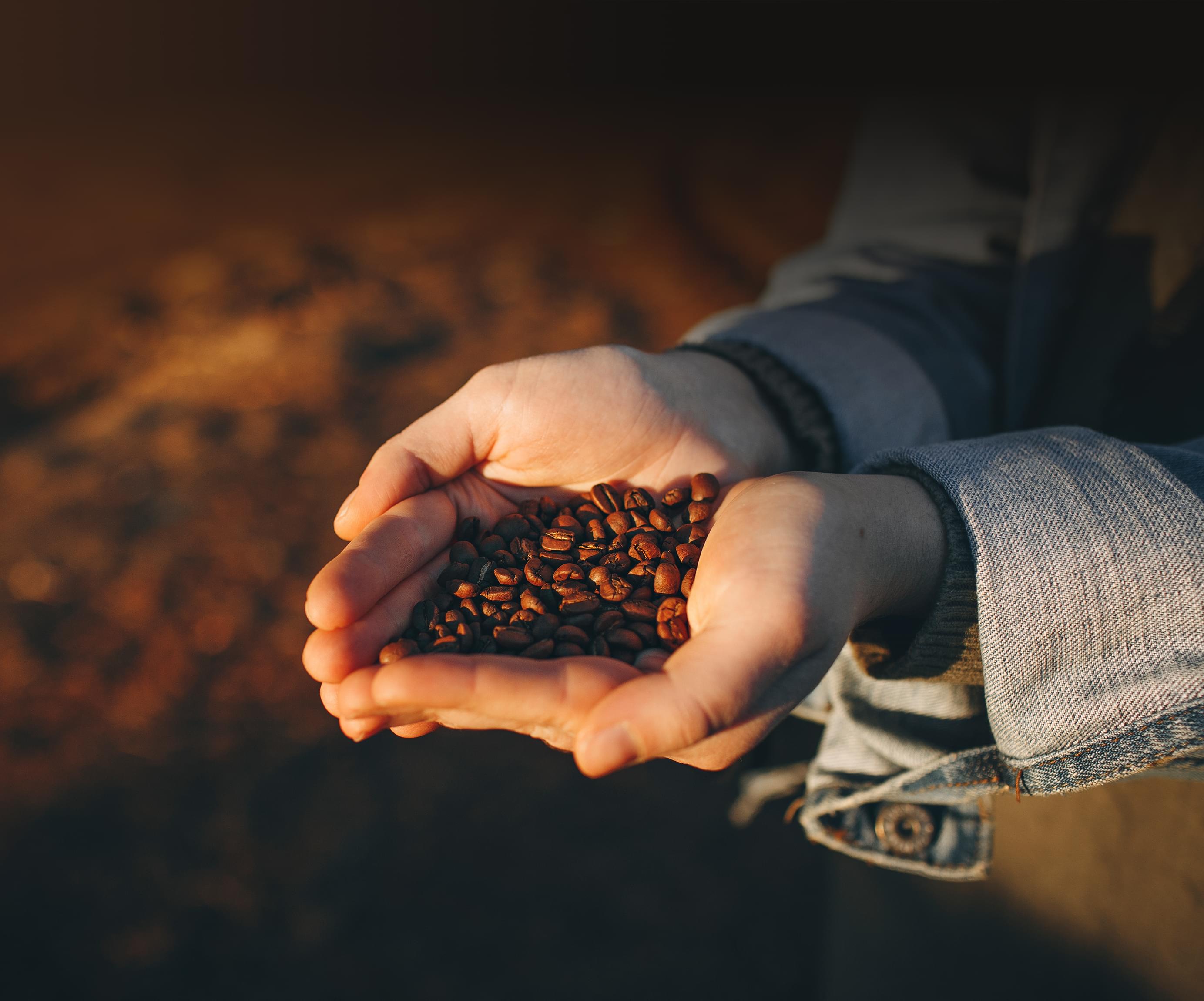
Purity – Sawa Coffee focuses on the purity of its coffee products, from growing to roasting to brewing to deliver a pure cup every time.
Quality – Sawa Coffee uses only the highest quality ingredients to deliver a better sip in every cup of coffee.
Sustainability – Sawa Coffee recognizes that sustainability must be a priority, or the coffee industry will be irreparably damaged.
Brand Differentiation
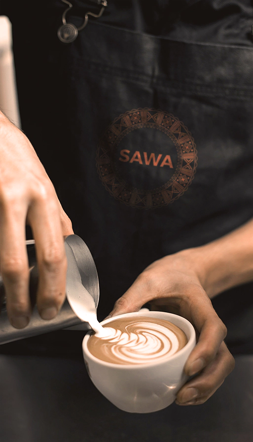
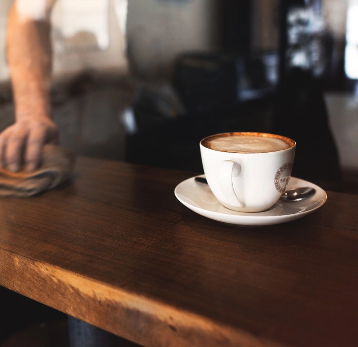
Sawa Coffee caters to coffee gourmets who want the perfect cup of coffee with every order. It’s closer to a boutique coffee shop than a massive chain while still remaining available to customers during their packed days.
Brand Voice
Sawa Coffee uses a professional voice well-versed in everything related to coffee. The brand voice is passionate about creating the perfect cup for every occasion along with educating people about where their coffee comes from.
Packaging Elements
Colors
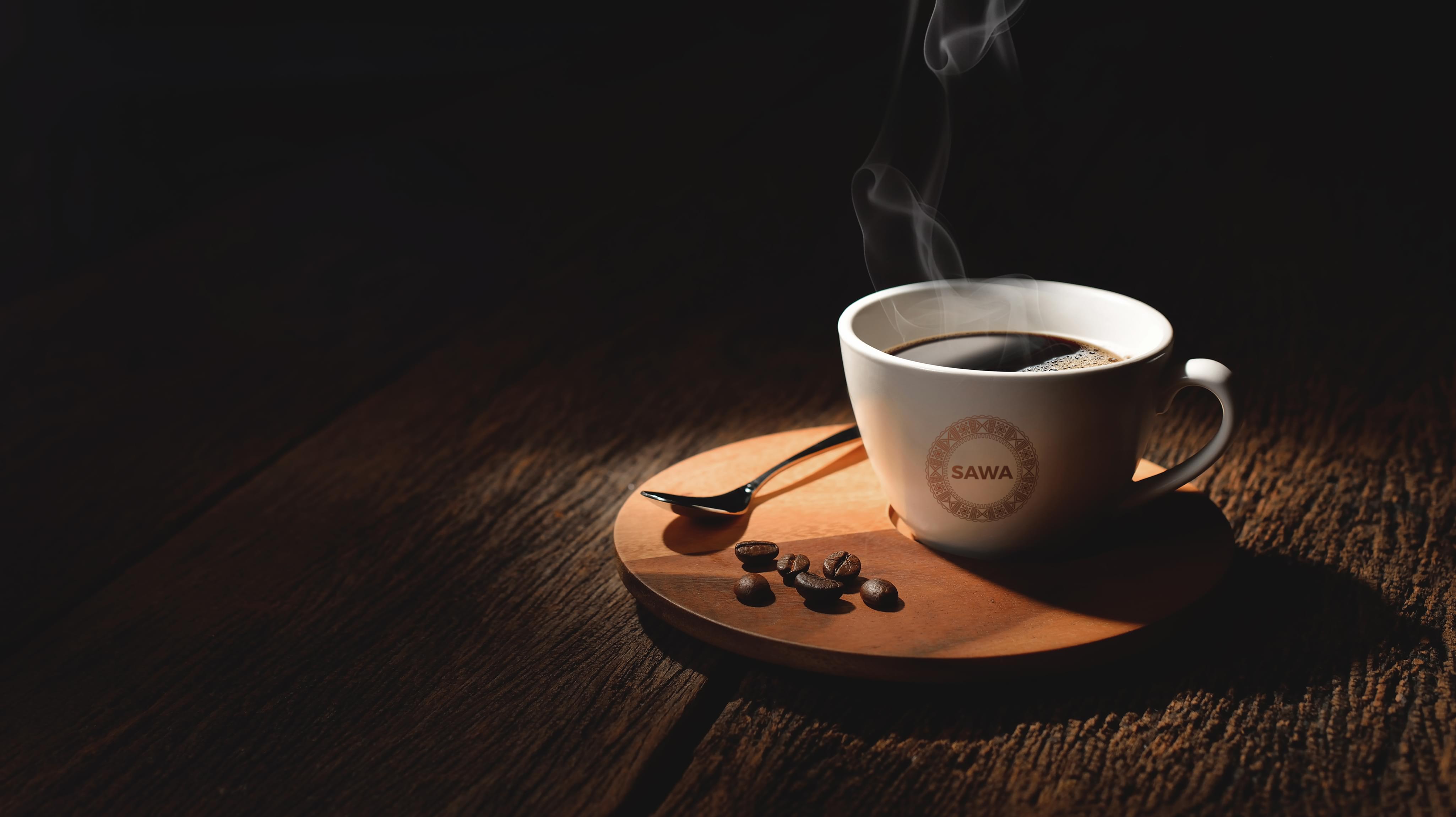
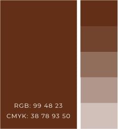
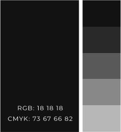
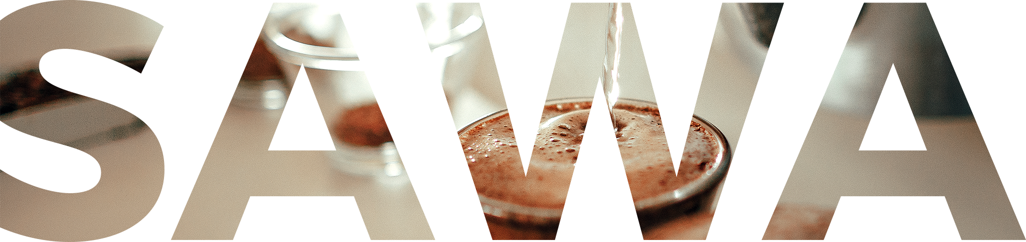
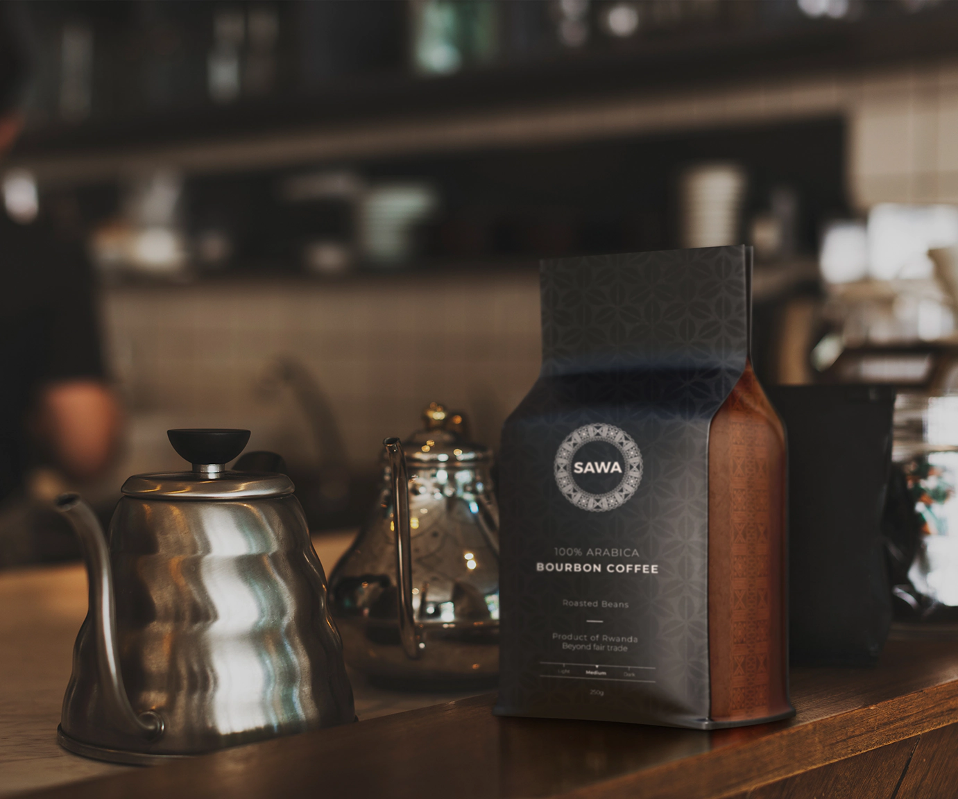
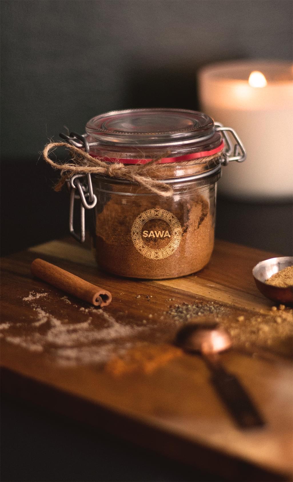
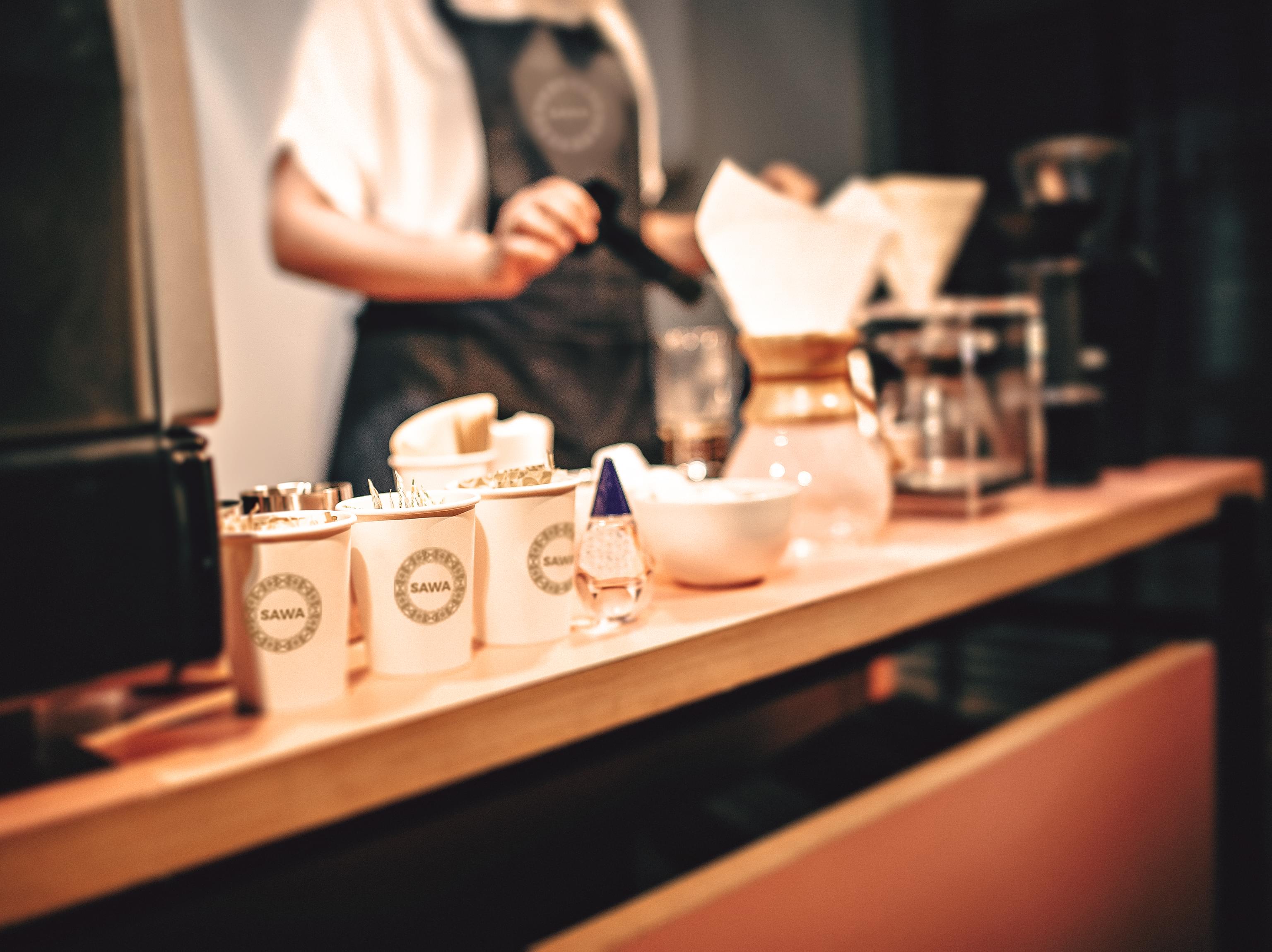
Sawa Coffee uses two gradients, a black to white and a coffee bean-inspired option. The coffee bean browns option is what the company uses for its logo and many of its visuals to convey the purpose of the company.
Visuals
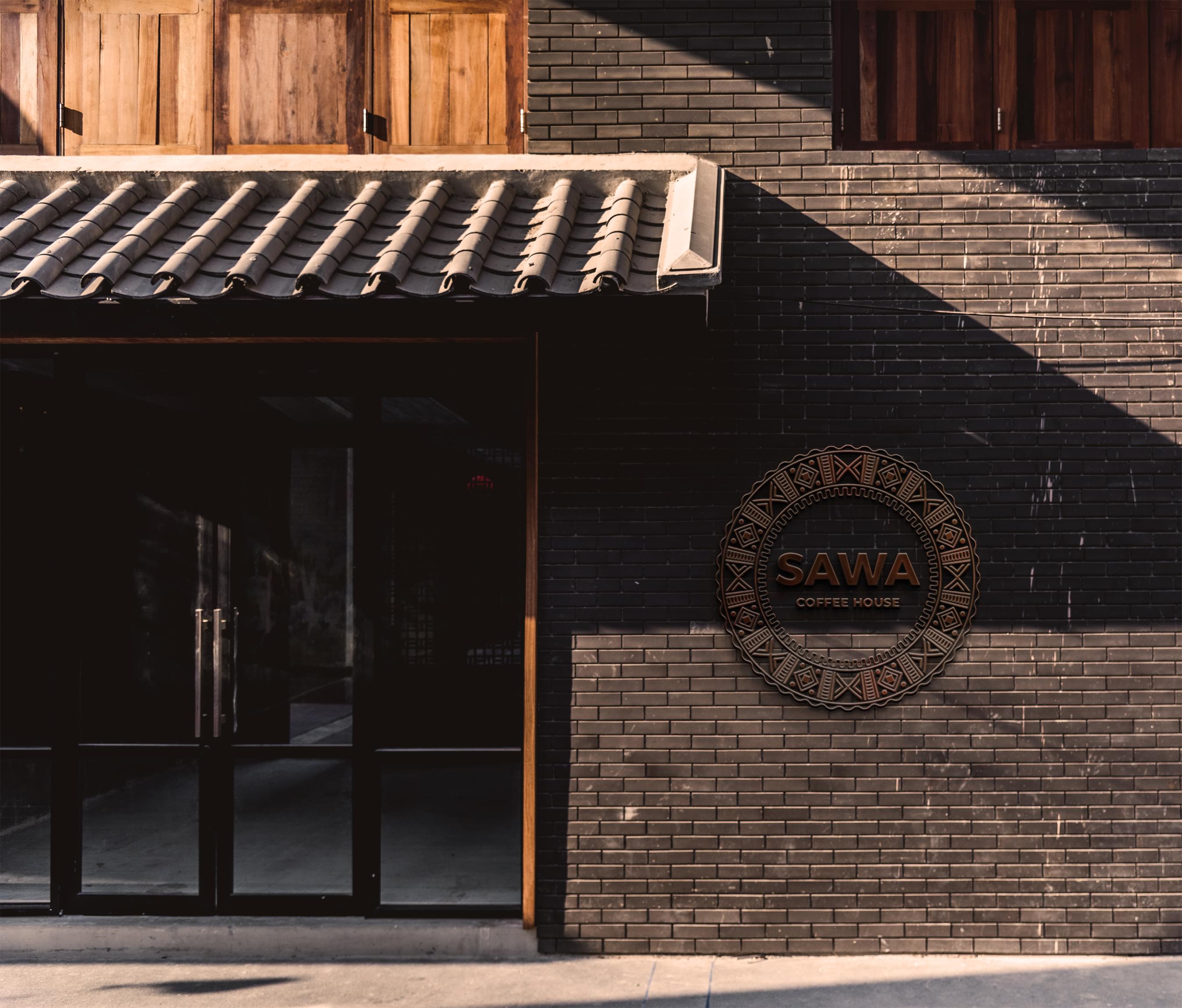
Sawa Coffee uses a mix of visual contrasts but maintains a simple look. The visuals tend to be based around patterns created from common tribal symbols, evoking where the coffee beans are grown.
Typography
Sawa Coffee uses a sans serif font for clarity. The font also contrasts nicely with the patterns present in the company’s logo and packaging designs, which favor geometric shapes.
Format
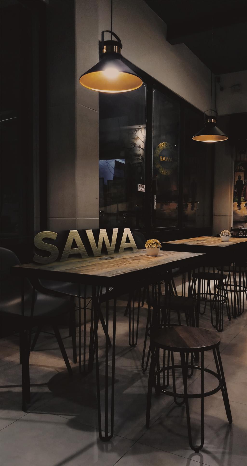
Sawa Coffee’s primary format is the logo, which easily translates to various surfaces. The rounded shape provides sophistication as well as visual intrigue no matter what the logo is on.
Brand Targeting
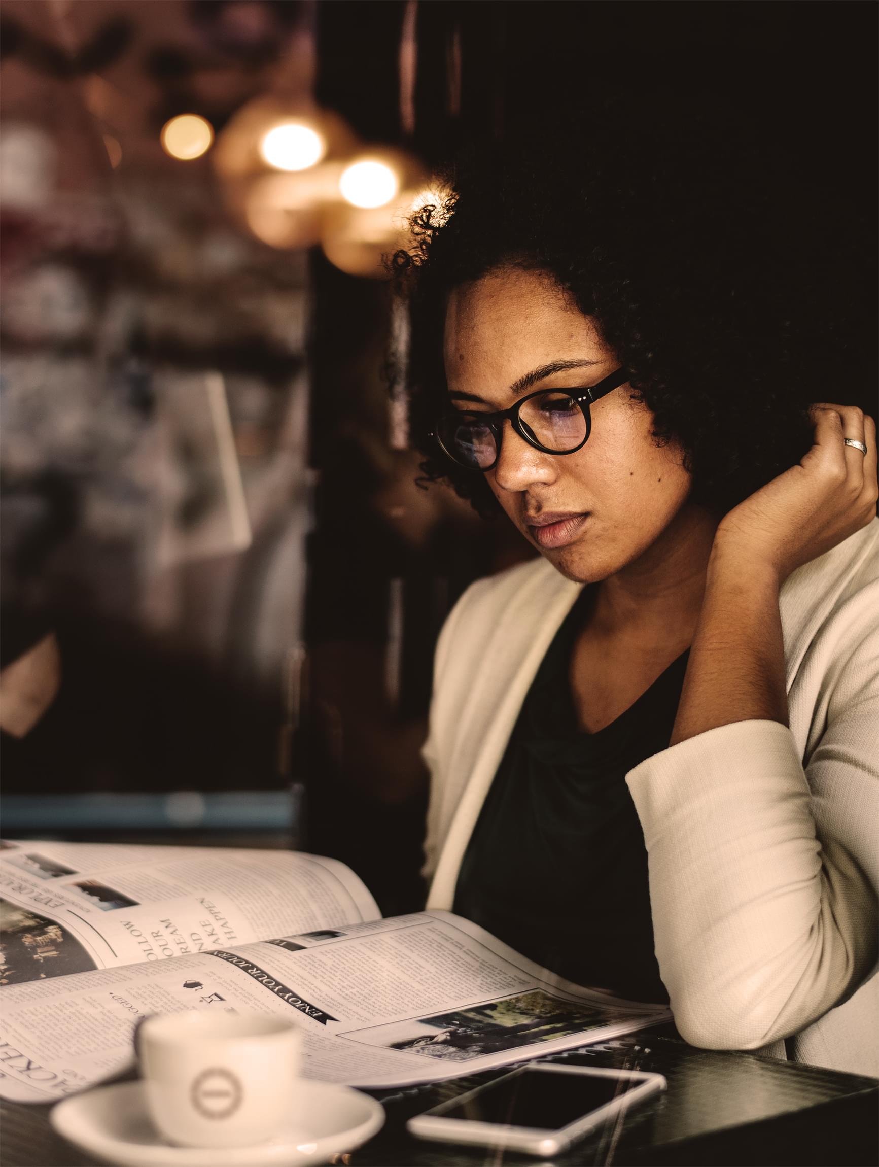
Sawa Coffee targets individuals with disposable income who want a complete coffee experience, not just a fix. These individuals value the work behind their perfect sip and continue to seek new coffee experiences to explore the options.
Brand Positioning
Sawa Coffee positions itself as a luxury purveyor of coffee experiences. The position allows the company to price as a luxury good while attracting a broad range of customers. Additionally, the company projects an upscale position through its branding.