Brand Mission
Beejoya helps people sleep better, wake up refreshed, and have fewer skin problems week after week through mulberry silk bedding.
Brand Story
Beejoya started from the point of founder frustration. The founder woke up with more acne every day, and after trying everything on the market, he decided to find an alternative. After some research, Beejoya’s founder discovered how pillowcases could cause skin and hair problems. He set out to create the perfect pillowcase and kept going.
Brand Values
Health – Beejoya believes that a healthy environment supports the overall health of customers and aims to help create that space.
Imagination – Beejoya imagines a better world and strives to present better options to each person who sees the brand.
Curiosity – Beejoya began from a search for a better solution, and the company aims to maintain that spirit throughout its operations.
Quality – Beejoya actively commits to the quality of every product and finds ways to improve its designs over time.
Brand Differentiation
Beejoya differentiates itself based on product quality and innovation. The company is incredibly devoted to crafting the perfect solution to as many problems with sleep as possible, from acne-causing pillowcases to trouble getting to sleep.
Brand Voice
Beejoya speaks in a middle-of-the-road brand voice that is incredibly passionate about health and solving problems. This passion carries through all messaging and helps Beejoya connect with people, especially those who have already tried every solution they can think of.
Packaging Elements
Colors
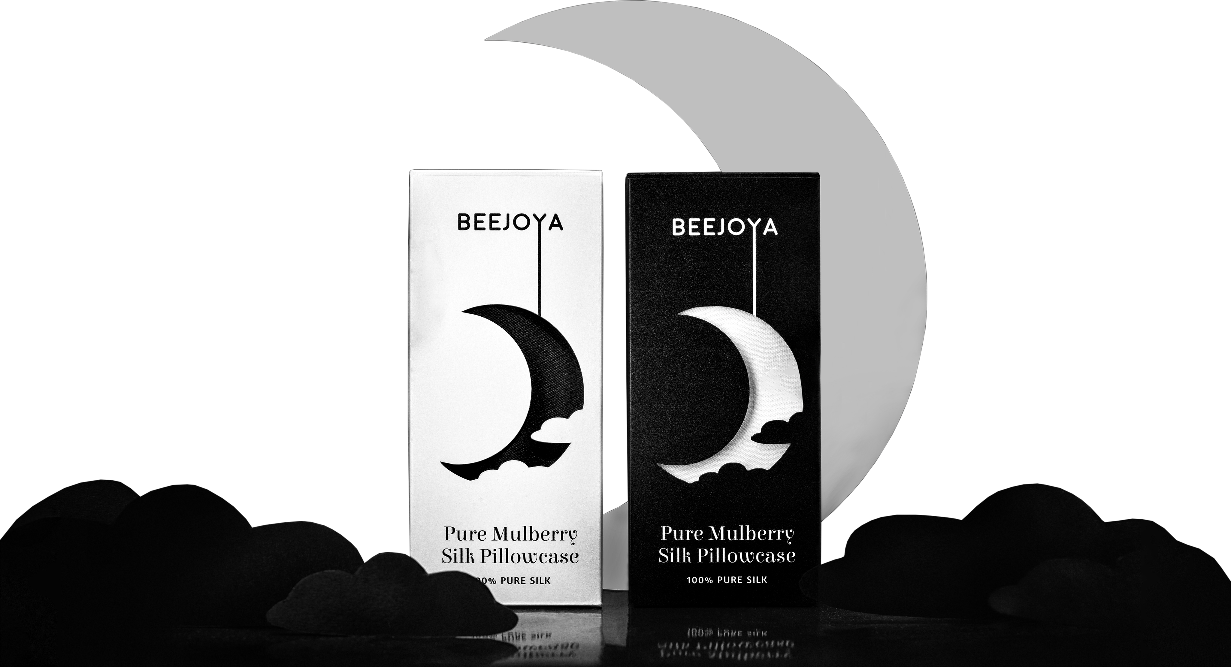
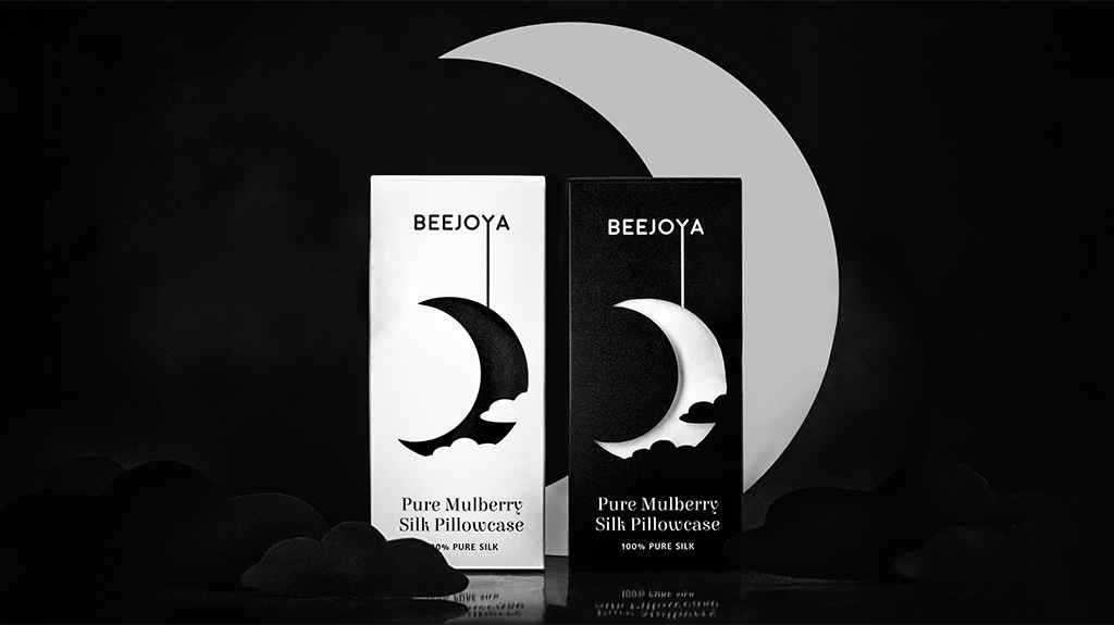
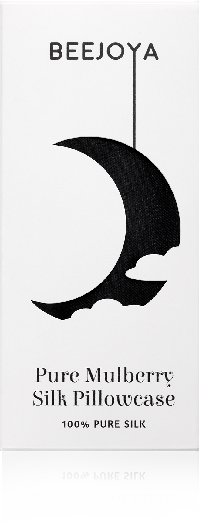
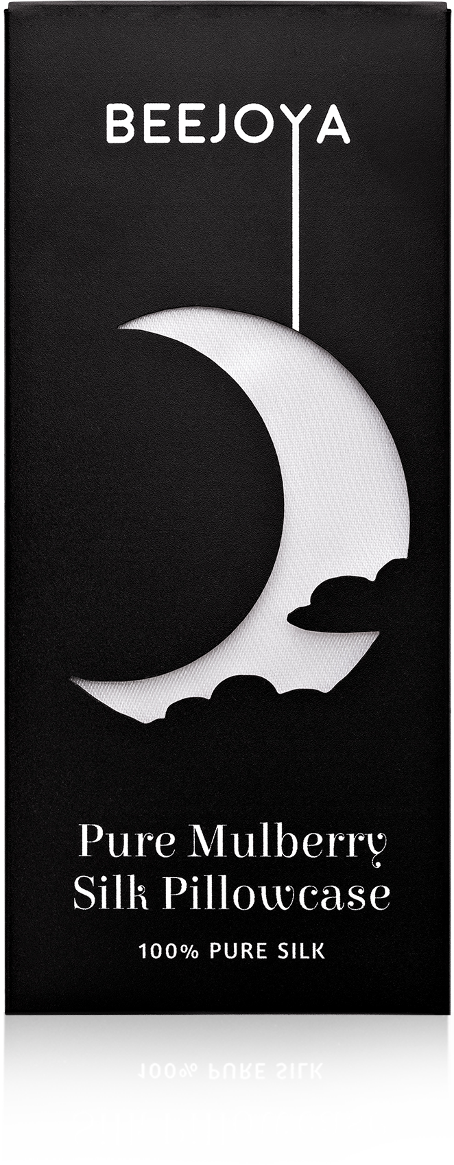
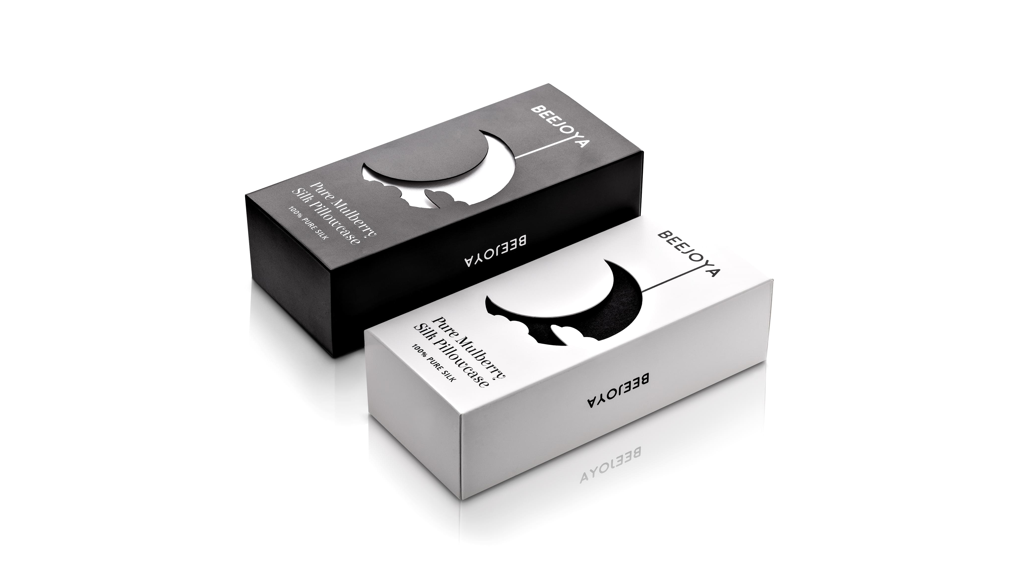
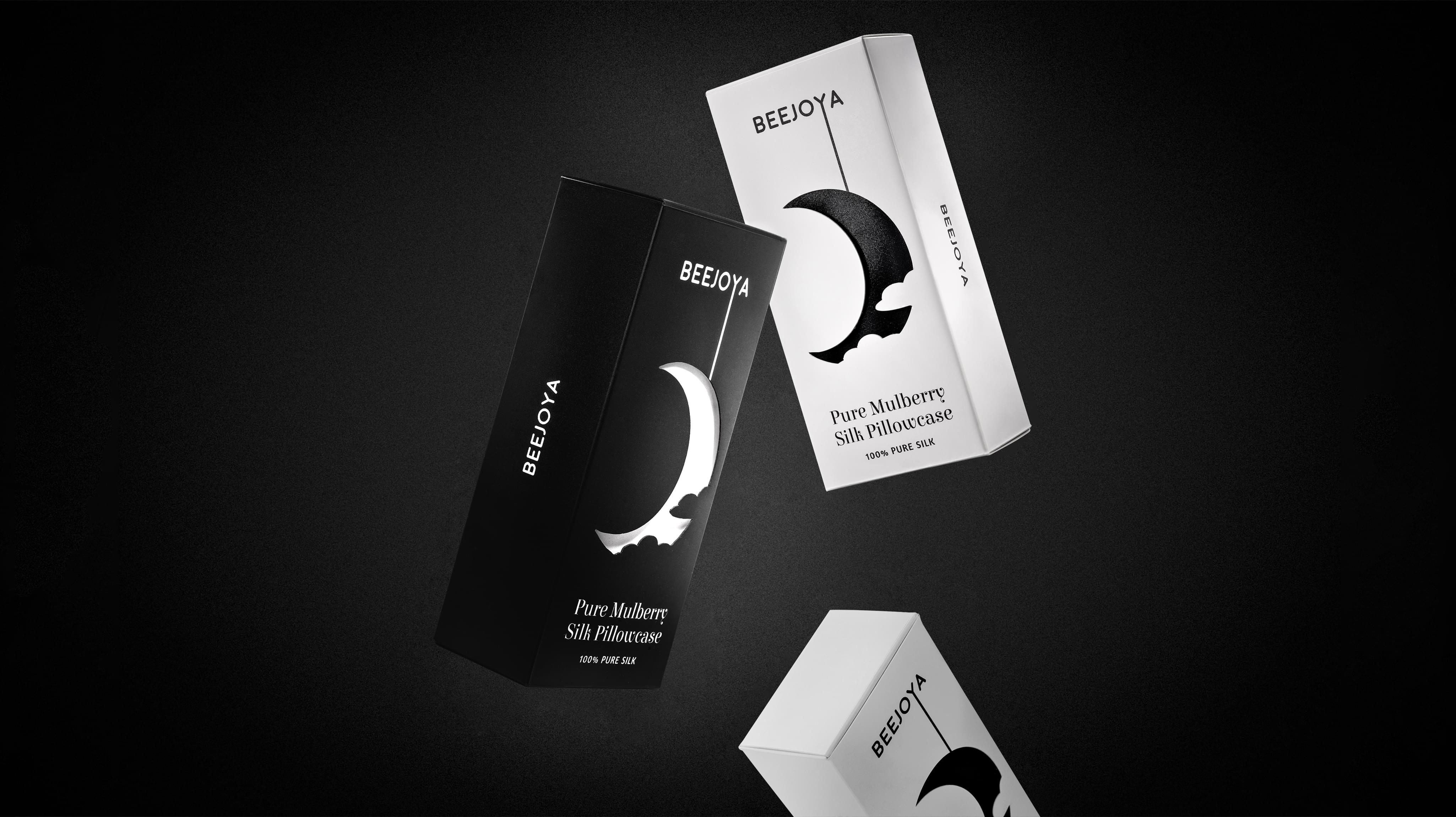
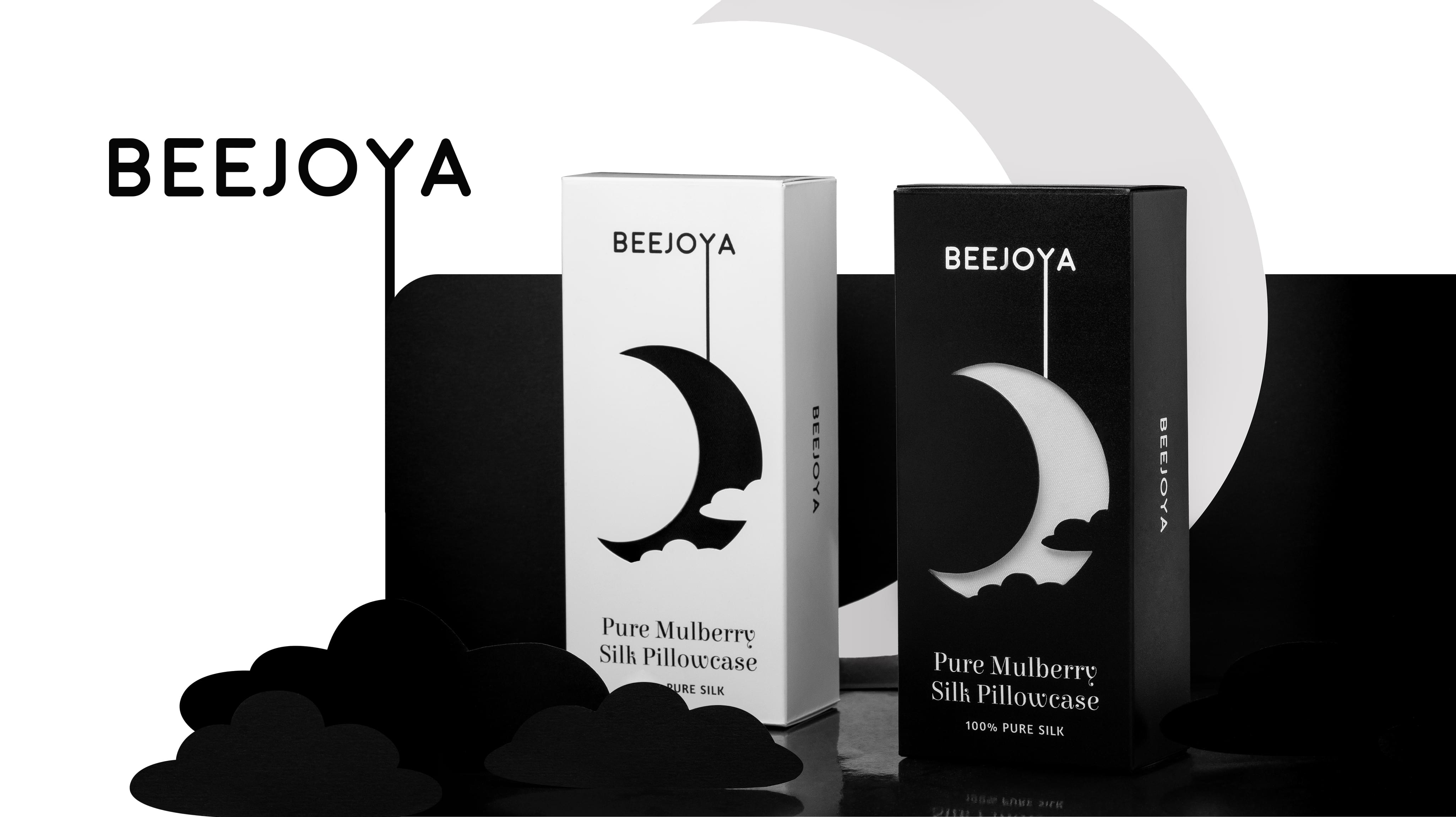
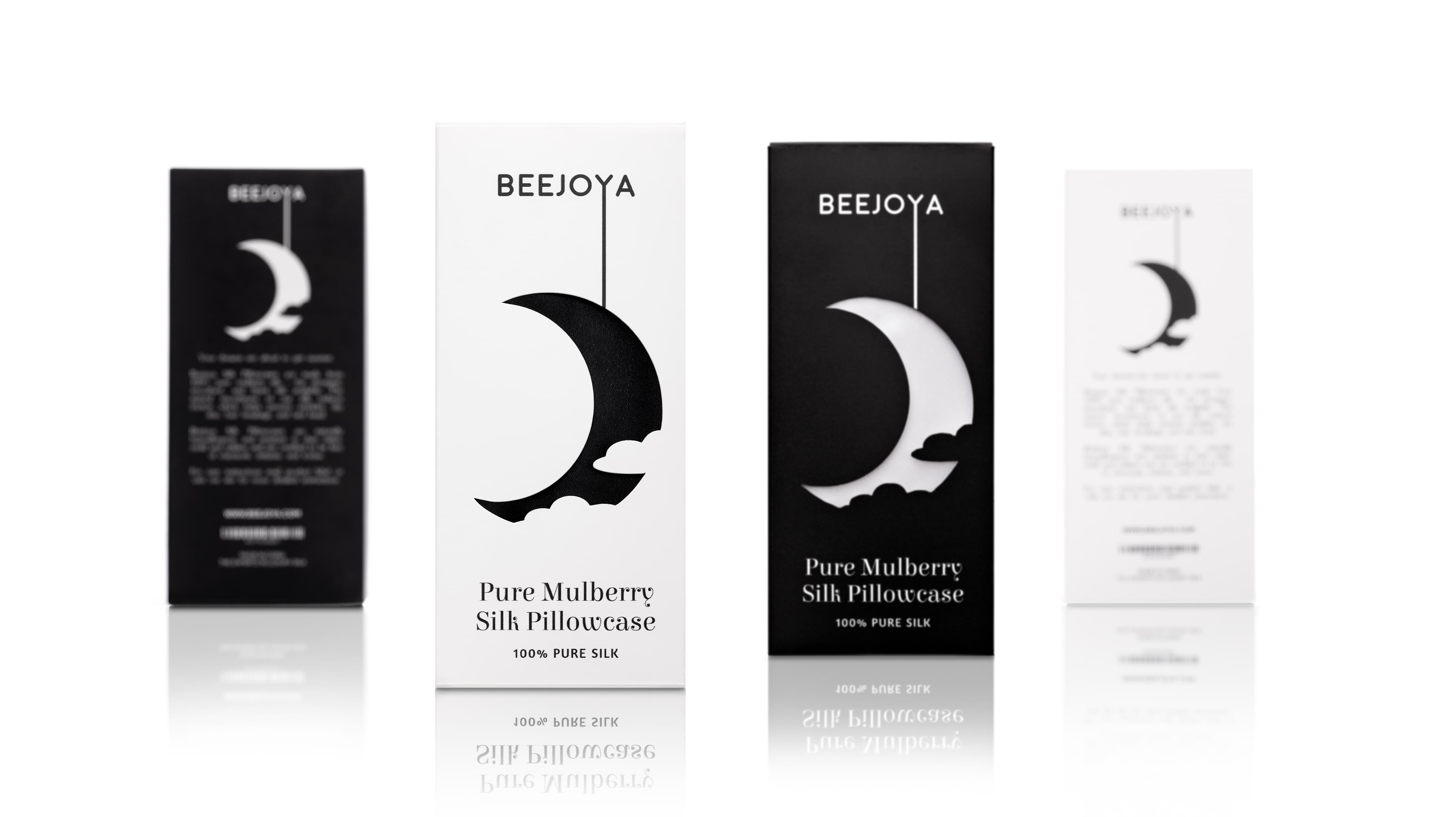
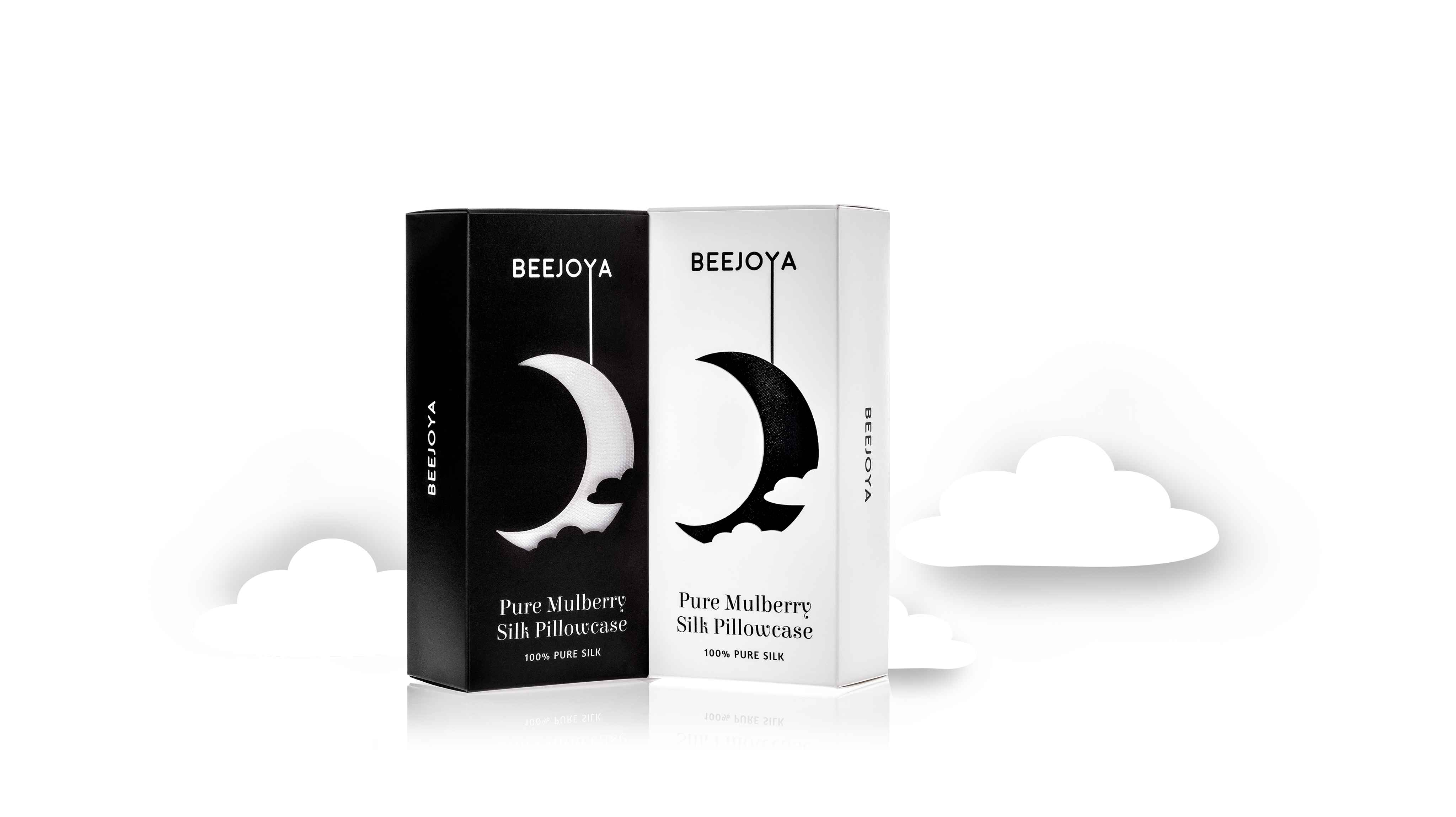
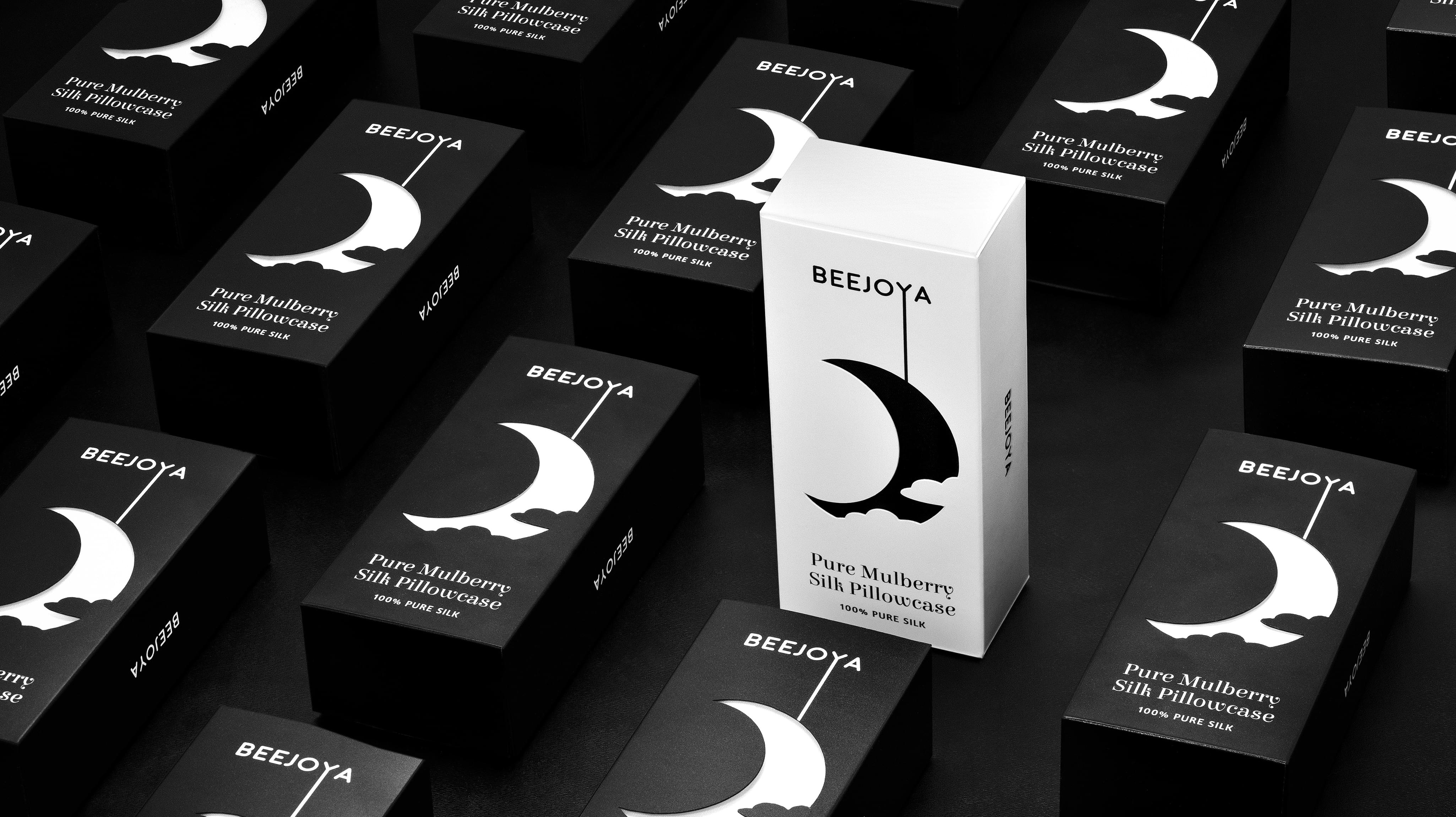
Beejoya focuses on nighttime products, which makes a black and white color palette ideal for the brand. This simple palette makes the brand recognizable on store shelves or on the web.
Visuals
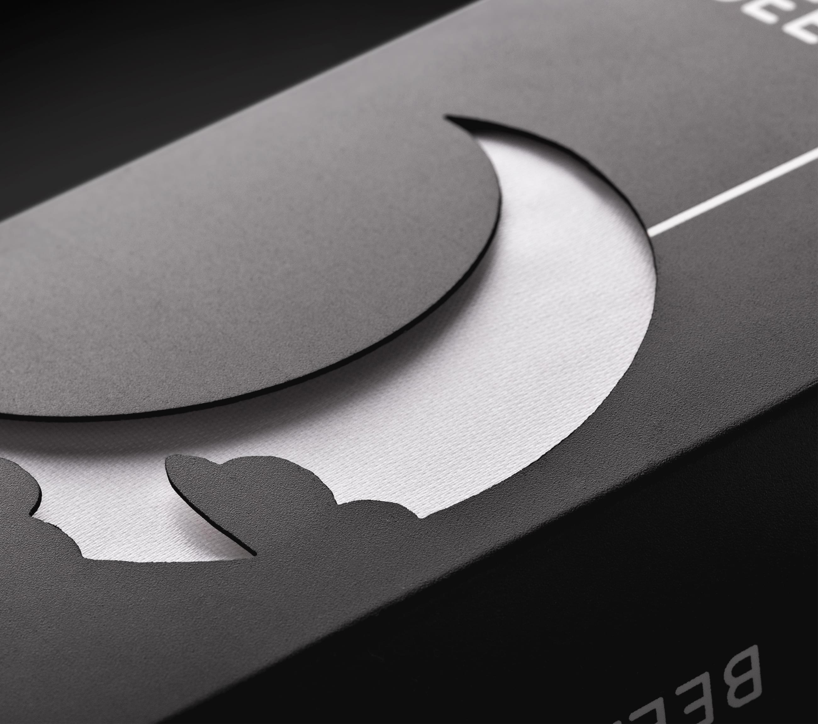
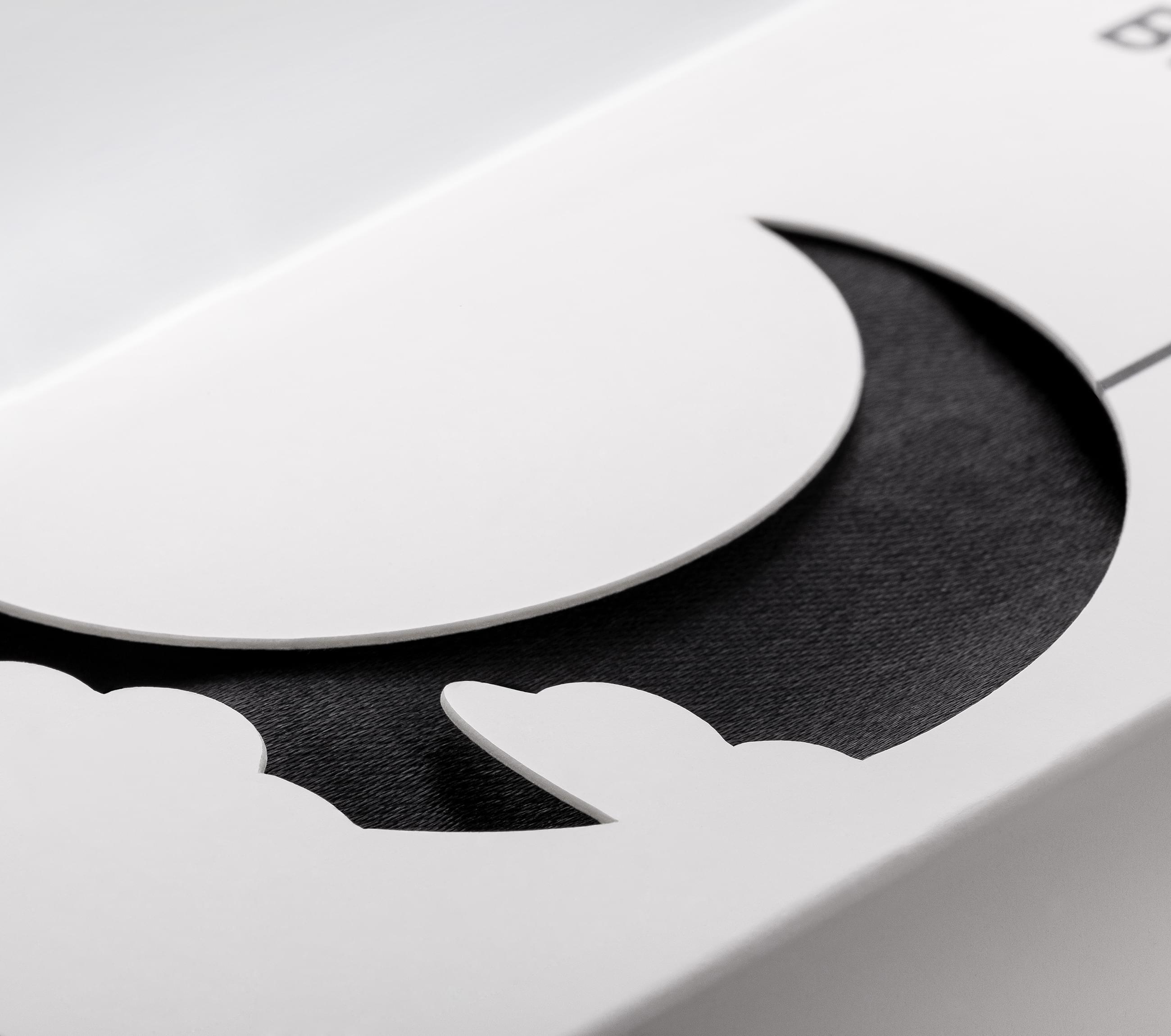
Since Beejoya currently focuses on sleep, the moon and stars made perfect visuals for the brand. The brand conveys sleep on every package by adding a slight dream quality to the visual elements.
Typography
Beejoya employs clean sans serif fonts on its packaging designs. While an element was added to connect the typography to the rest of the design, everything remains easy to read.
Format
Beejoya uses a product window format, which provides exceptional contrast between the moon and the rest of the packaging. This eye-catching format offers spectacular shelf appeal.
Brand Targeting
Beejoya aims for lower middle-age consumers tired of trying every product on the market without results. Unfortunately, these people have developed a skepticism about miracle products and are often self-conscious about what they’re trying to solve, whether it’s acne, frizzy hair, or never feeling rested.
Brand Positioning
Beejoya is positioned as a minor luxury. While the brand does not practice the deliberate scarcity part of luxury branding, Beejoya prices in such a way that consumers tend to examine the purchase. This consideration tends to lead to a more devoted following and repeat purchases.


