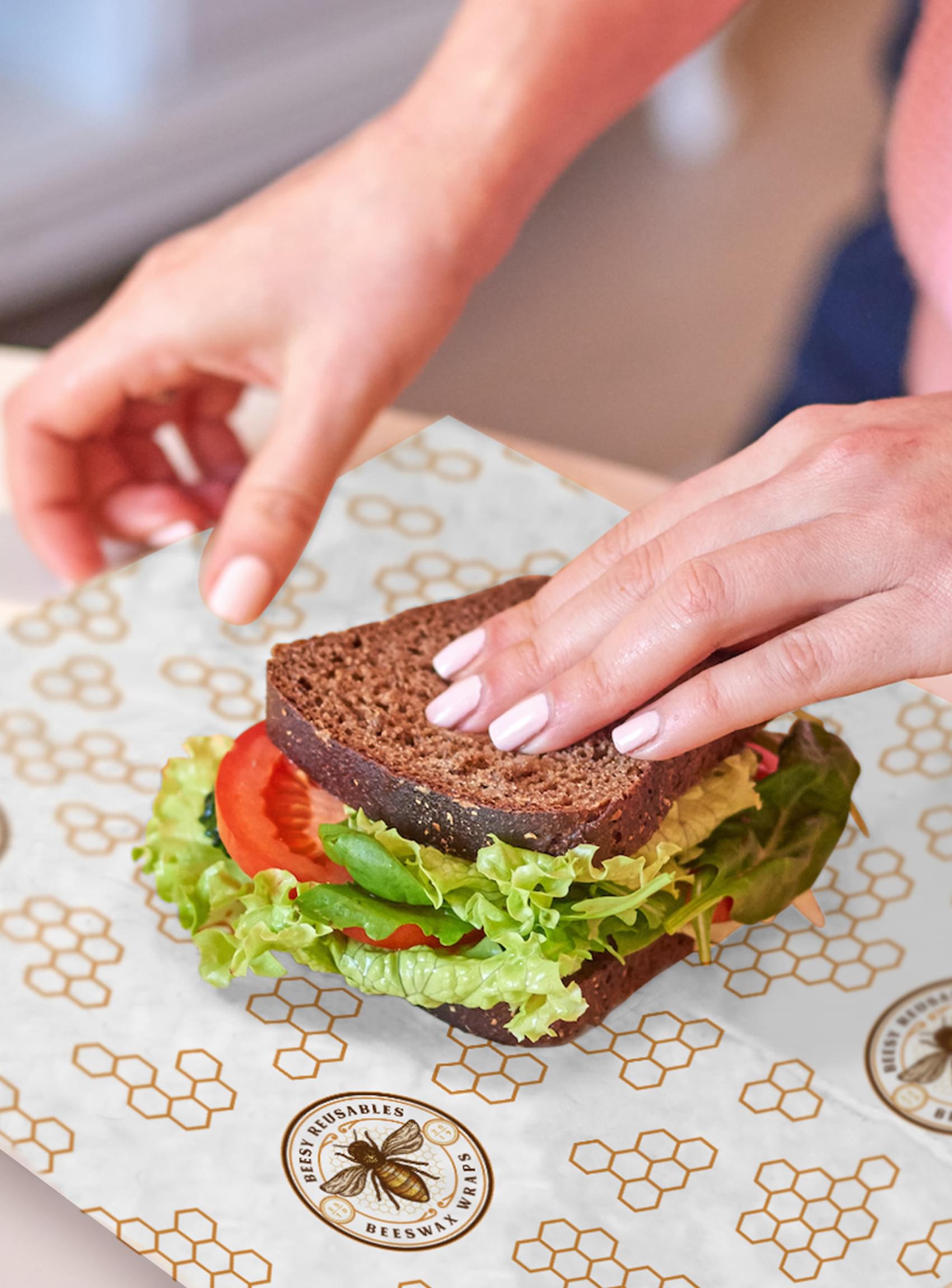
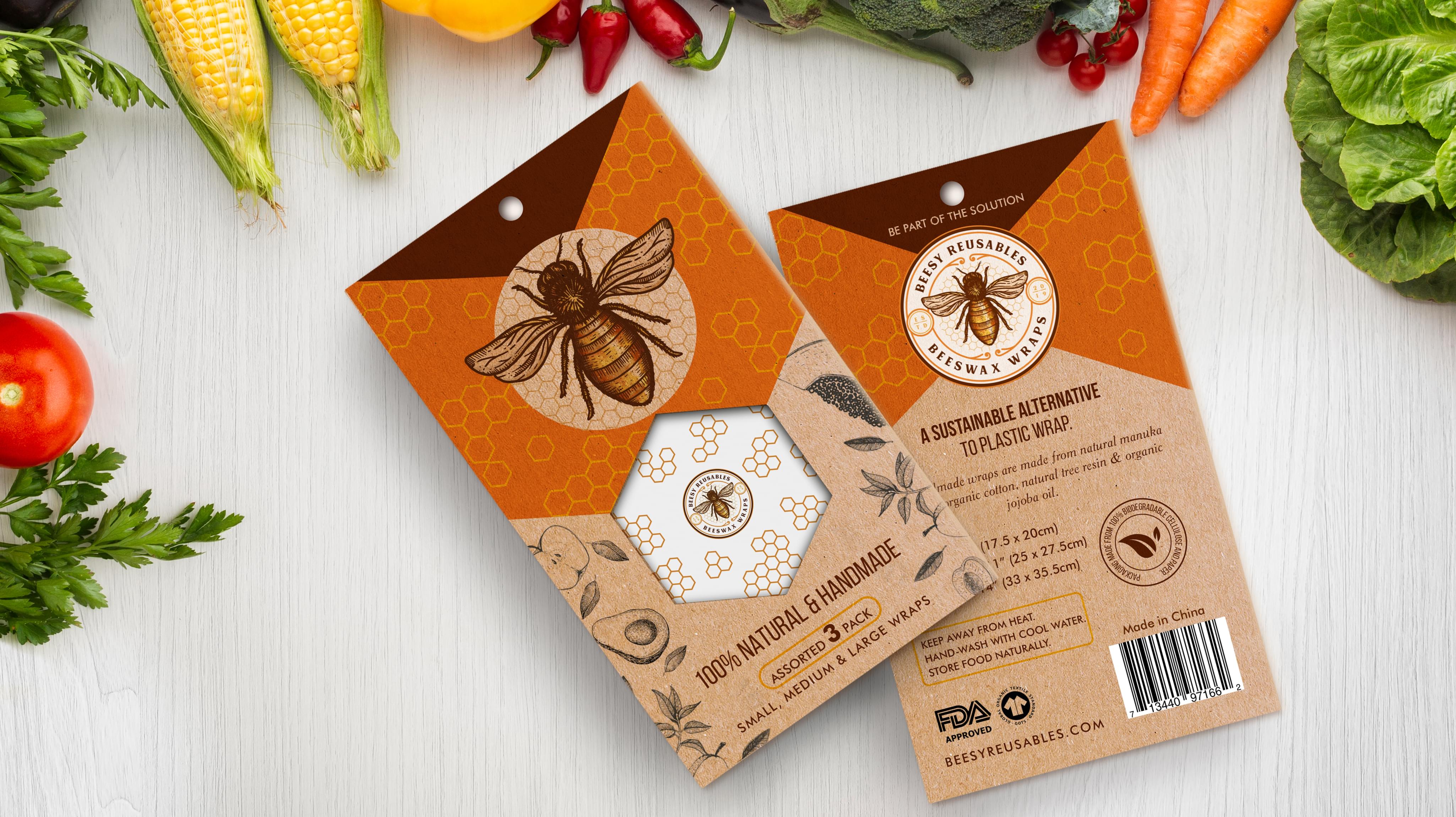
Beesy Reusables presented a unique challenge to Stan Agency for the company’s new insert design. The company makes beeswax wrappers, which are an alternative to plastic wrap. Beesy Reusables needed an insert that was effective but fit with the existing packaging design. We eagerly accepted the challenge.
Challenge Components
- Niche market
- Conveying all necessary instructions
- Available space
Industry Research
Before we get into the design process, we typically look at the industry involved for design trends. The beeswax wrapper industry is relatively new, though the product idea has existed in various forms since the middle ages. Fortunately, modern alternatives appear to be much neater than historical counterparts.
Audience Research
Looking into the audience for beeswax wraps was the first step in the insert design process. We examined the demographic groups that were most likely to use these wrappers. The demographics, at least in the USA, tended to skew younger. However, the insert design and pictures still needed universal appeal.
Research Custom Insert Design Firm
We ended up examining competitor packaging and insert design for trends in the beeswax wrapper industry. This form of market research aids the team in determining which trends we want to follow and which we want to avoid. In this case, we found out that the natural look is in use by many of Beesy Reusables’s competitors.
Bonus Challenge
The added challenge with this order was figuring out how to contain all the necessary information within the limited space of the insert design. Beesy Reusables’s product required careful and easy to understand directions for best use. This led us to consider folding and unique shapes in order to get the ideas across.
Brand Symbology
Beesy Reusables had existing packaging and materials using the bee motifs common to the industry. In the spirit of that branding, we decided to incorporate some or all those motifs. The bee and the hive seemed particularly potent in the team meeting. Each designer made their own decisions on how best to incorporate those themes, especially in the insert picture designs.
Design Inspiration
In addition to Beesy Reusables’s existing branding, the team also used inspiration from other bee products. This inspiration included coloration, shapes, and creative interpretations of packaging examples. We did not restrict the team’s creativity in this project, since bee-related projects tend to share the same elements.
Element Decisions
From the branding, we knew we needed bees on the insert design and in the insert pictures. Additionally, the team knew that we were avoiding the prevalent natural color pattern. Apart from that, each designer made their own decisions. It was one of our more experienced professional designers who suggested the overall insert shape.
Narrowing Down the Final Options
The team produced several exceptional amazing insert concepts. Narrowing that down began with comparing Beesy Reusables’s existing packaging and branding. Then we looked at the innovativeness of the designs. Finally, the group ended up combining the picture designs from one concept with the layout of another idea.


