Maistro Packaging
MAISTRO

SOUP PACKAGING DESIGN

  • Company:Maistro Handels GmbH
  • Location:Germany
  • Service:Packaging design
  • Category:Food & Drink
  • 5.0 Review Maistro Packaging 100+ Reviews

Challenge

Succeeding in a Shrinking Market
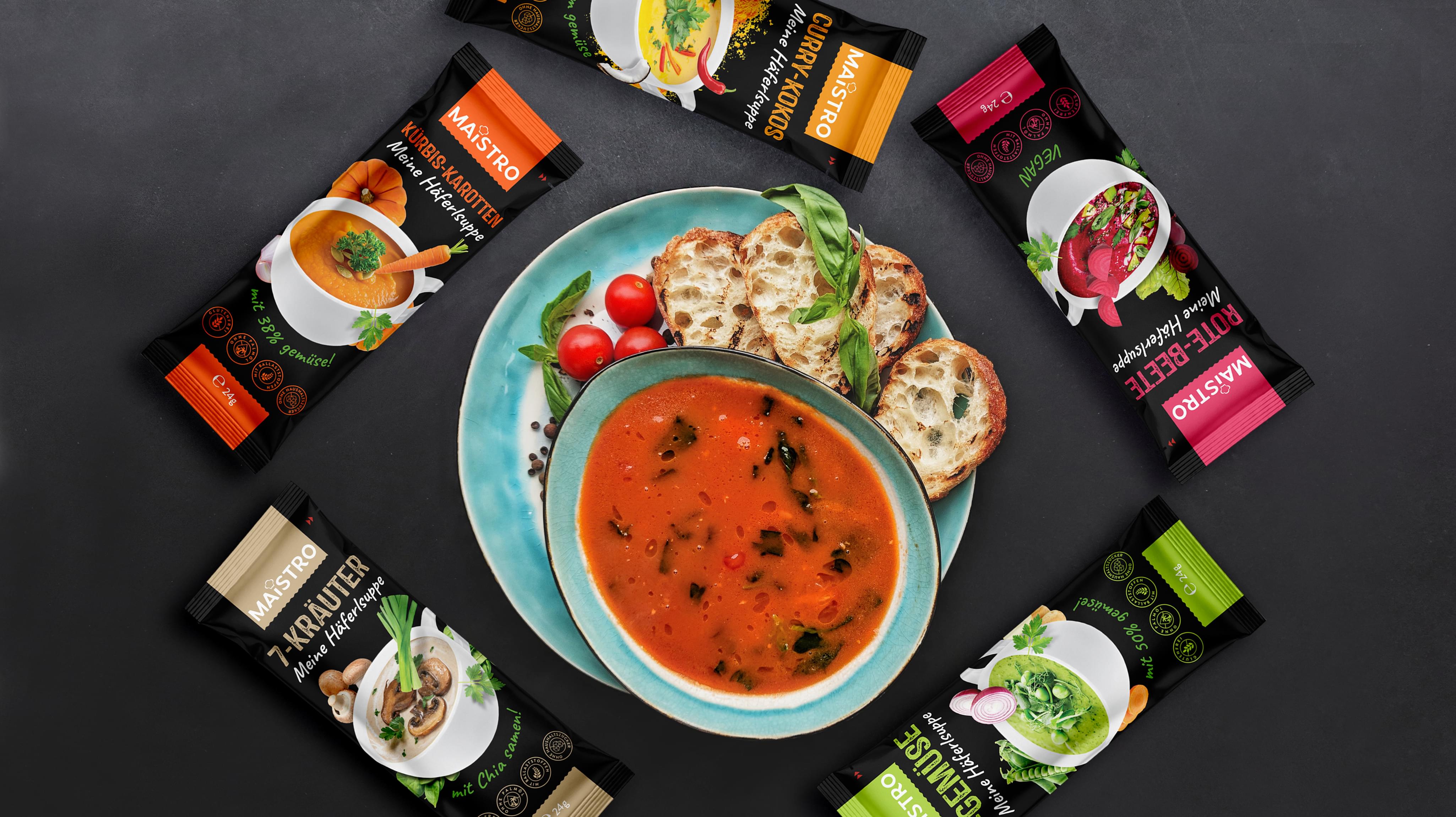
Unlike the USA, Germany’s market for consumer-grade household soups has been plateaued for nearly a decade. There’s no sign it’s headed anywhere but down. Recent estimates have it contracting by 2% yearly for the foreseeable future. So, this isn’t the best moment to launch a brand-new line of soups in Germany. Yet, that’s what Maistro was planning.

Developing a Brand Image that Drives Sales

Maistro contacted Stan Agency with one question on their mind:
  • Can you succeed with a new product that’s entering a contracting market?
  • What kind of innovative brand magic is needed for a marketing miracle like this?
We told them that, while we couldn’t promise them a miracle, we could create a unique, custom soup packaging design that would set them apart from the competition. While they might not be able to tap into a growing market, they could allow a handful of amazing package ideas to steal market share from a complacent competition.

Result

Analyzing the Competition
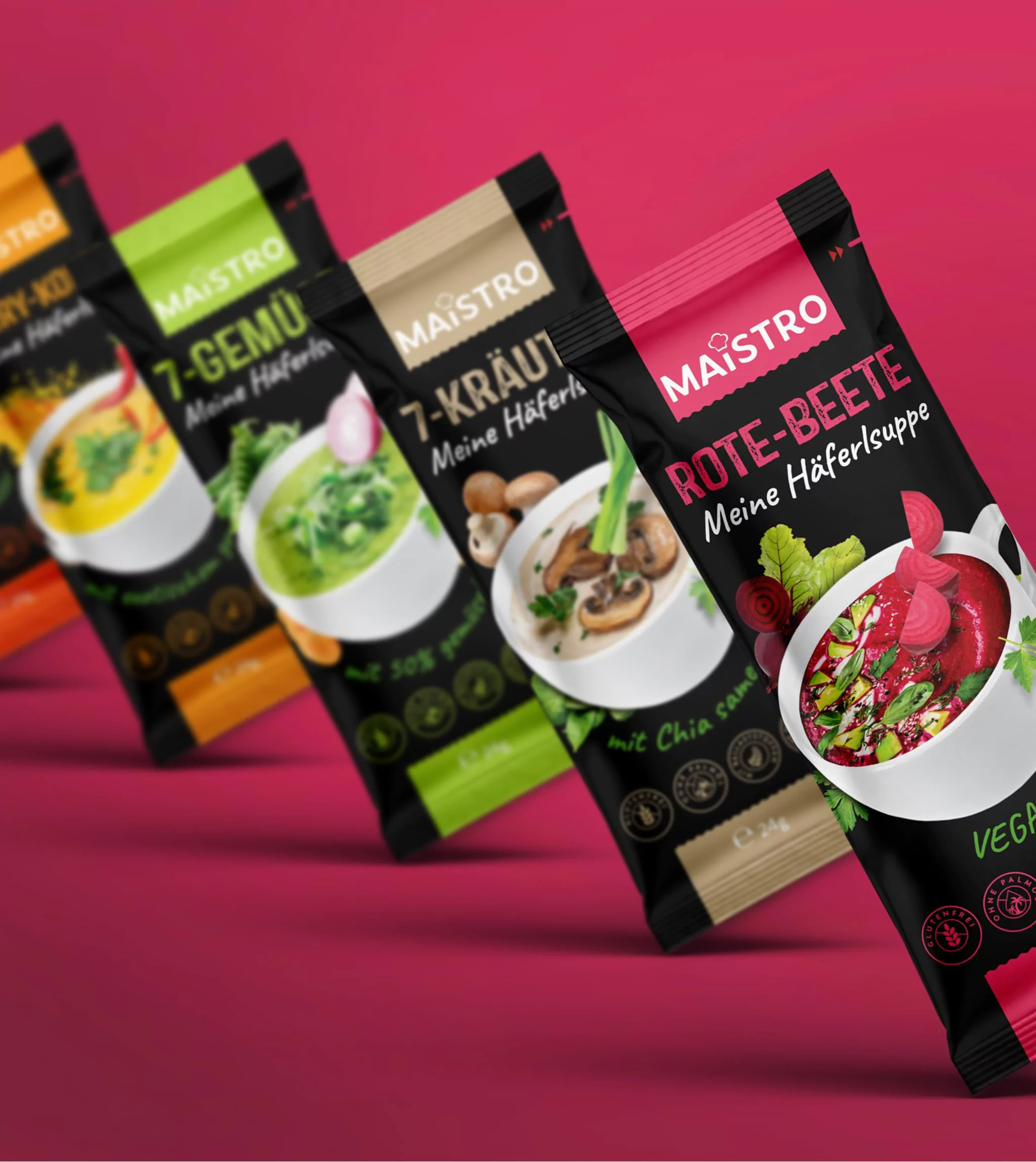
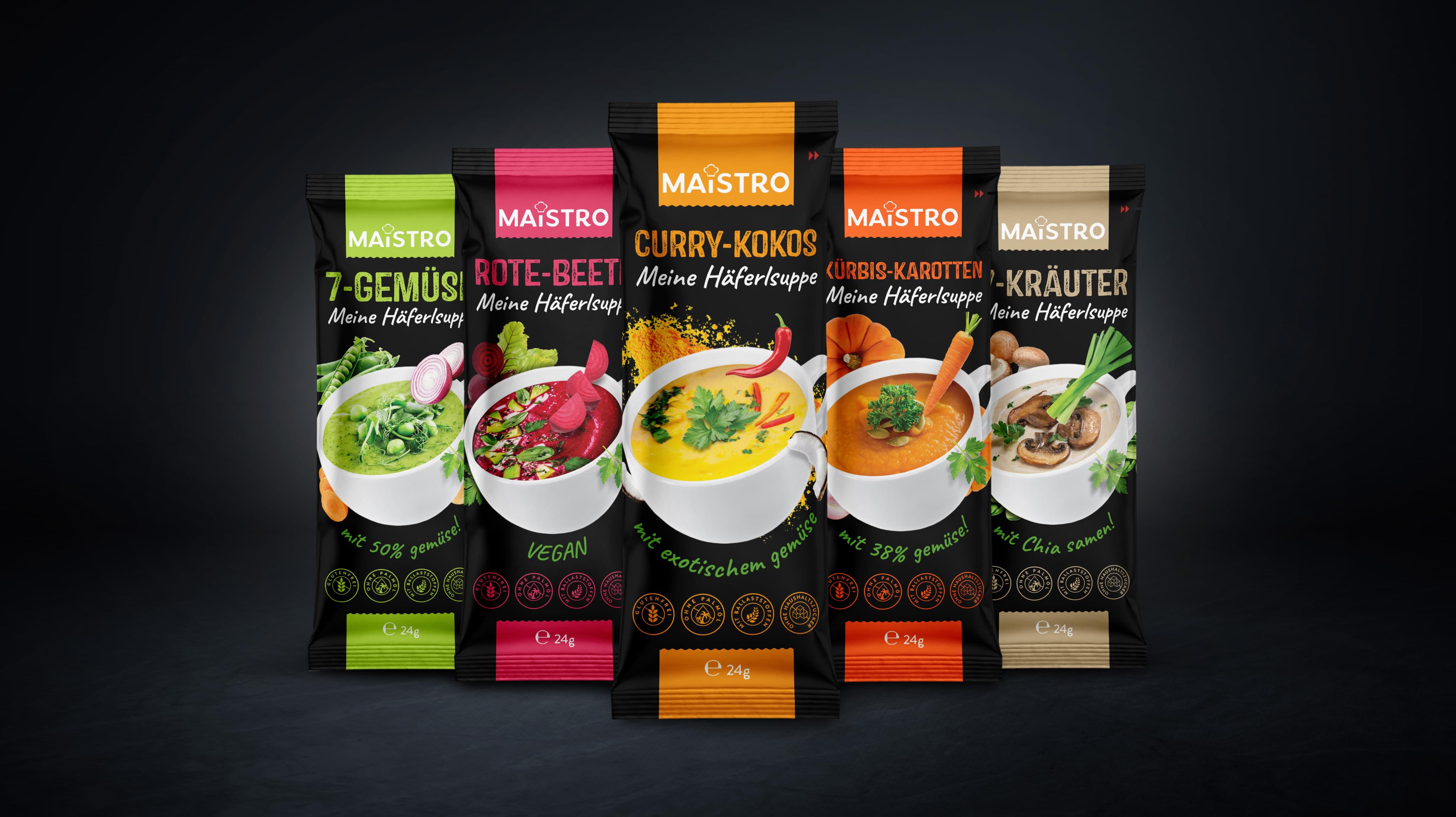
We began this project with a comprehensive market analysis, including trends in consumer and competitor companies’ behavior. We examined every facet of the products currently on the market, including soup varieties, packaging color, design, and typography, and price points. As we studied the market, several things became clear…
  • The competition lacked creative label design, opting instead of stale packaging they had used for years.
  • There was a distinct lack of product images featured, with a greater focus on text and abstract design.
  • Most soups used familiar aluminum cans as packaging, failing to capitalize on more cost-effective options.
After sufficiently analyzing the market, we discussed Maistro’s core values and vision for their new line of soups. Then, we set our designers to work, developing a brief that included professional quality examples of soup packaging that would eat away at competitor market share – and perhaps even reinvigorate the market in a small way.

Crafting a Package Design that Sells

After examining a host of potential options, Maistro finally decided on the concept seen above. It fit their brand image, was attractive and eye-catching, and prominently featured the delicious products they were selling.
How we did it…
  • Each soup packaging design prominently features a high-resolution image of the soup itself on the front. This draws the attention of the eye and creates interest. This soup packaging makes the soup the inspiration.
  • Bold, contrasting colors were chosen and laid out in a way that communicates confidence and highlights the product.
  • An advanced packaging option was chosen instead of traditional cans, lending the soup packaging a contemporary feel – and making it easier to dispose of when finished.
  • Additional features of the product were highlighted via attractive, minimalist seals and simple text, all underneath the product image.
Taken together, this created a packaging design that draws the attention of consumers and makes them feel their hunger, leading to increased sales.
Maistro was able to enter a flailing soup market with boldness. Since the launch of this new line-up, they’ve seen their market share in Germany increase and are considering launches in other European countries.
Maistro Packaging
Maistro Packaging
Maistro Packaging
Scroll