- Company:Biophile
- Location:USA, NY
- Service:Packaging design
- Category:Food & Drink
-
5.0
 100+ Reviews
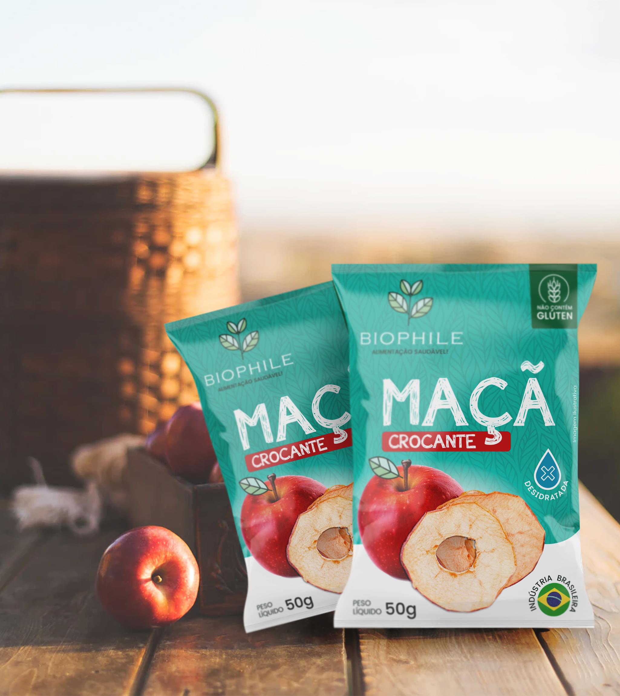
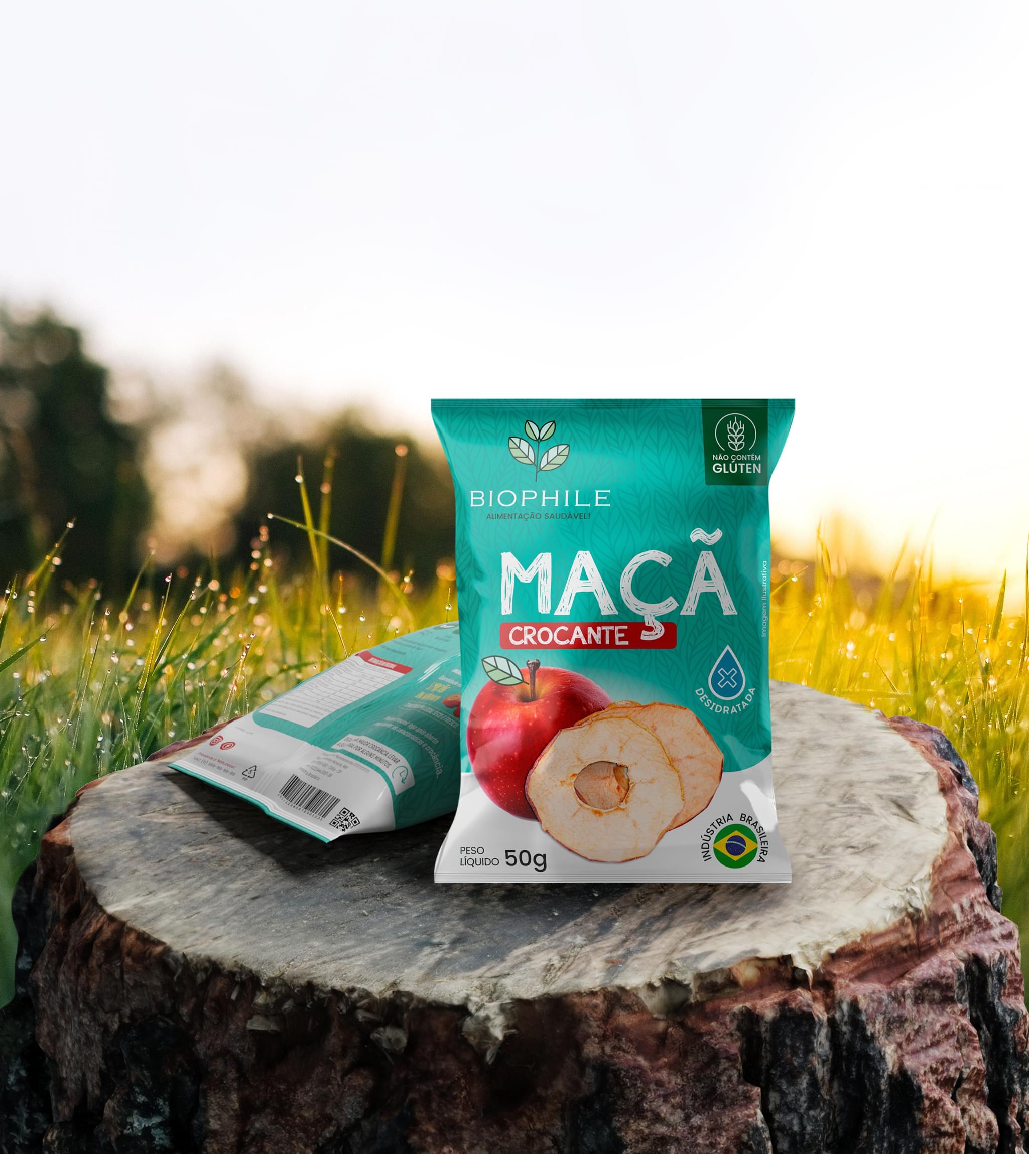
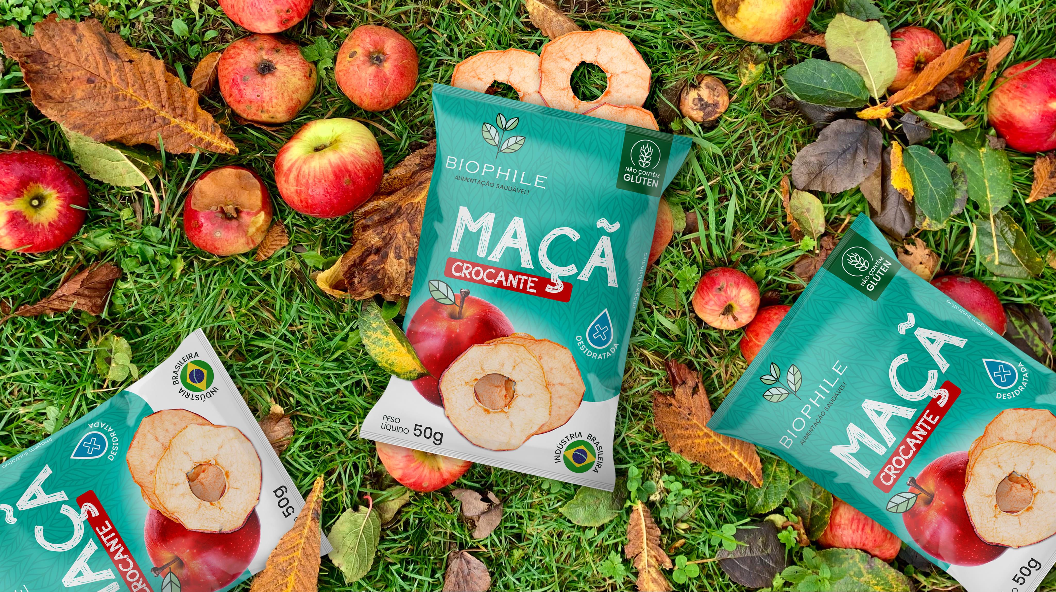
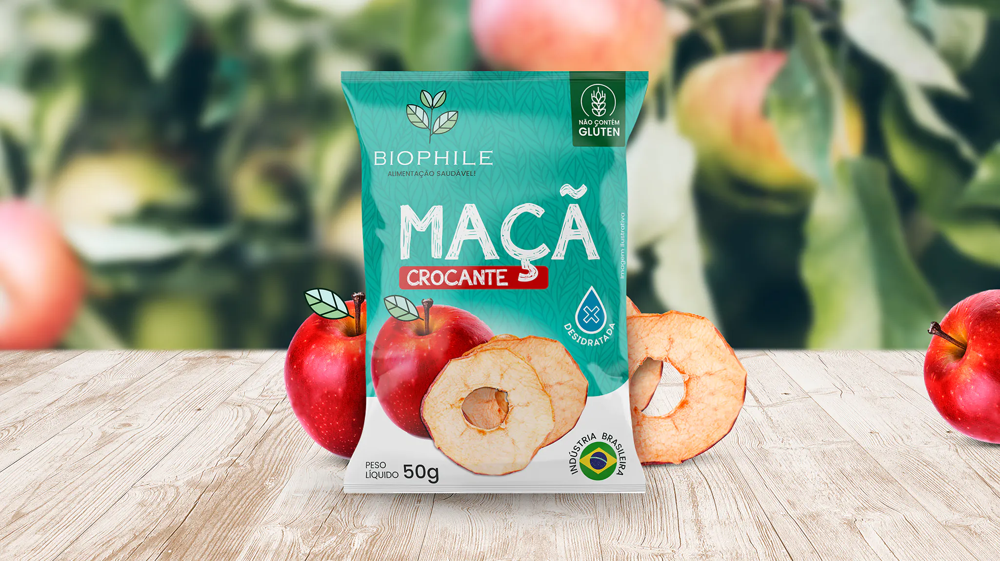
Challenge
Combining the purity of Biophile with a passion for healthier living was at the
forefront of our dry fruit packaging design. The product is simple: delicious, dried
apple slices. A simple product requires simple packaging without narrowing the consumer
base. How do we do it?
Result
Incorporating naturally inspired, simple shapes with hand-drawn lettering and a color palette than invokes nature and youth results in Biophile’s apple packaging design. From the vibrant, contrasting reds and greens to the relatability of hand-written lettering, the simplicity of Biophile is showcased by an inviting, vibrant package that invites the consumer in with a smile.