DME Branding
DME Branding
DME Branding
DME Branding
DME Branding
DME
brand story
values
brand persona
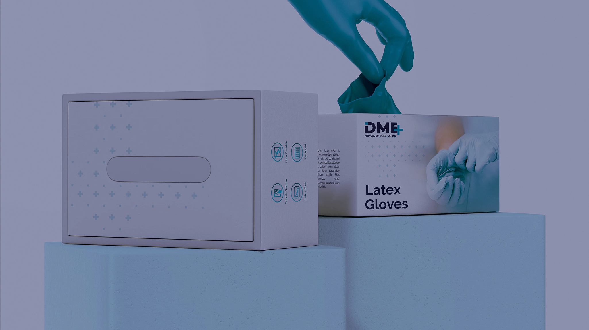
packaging
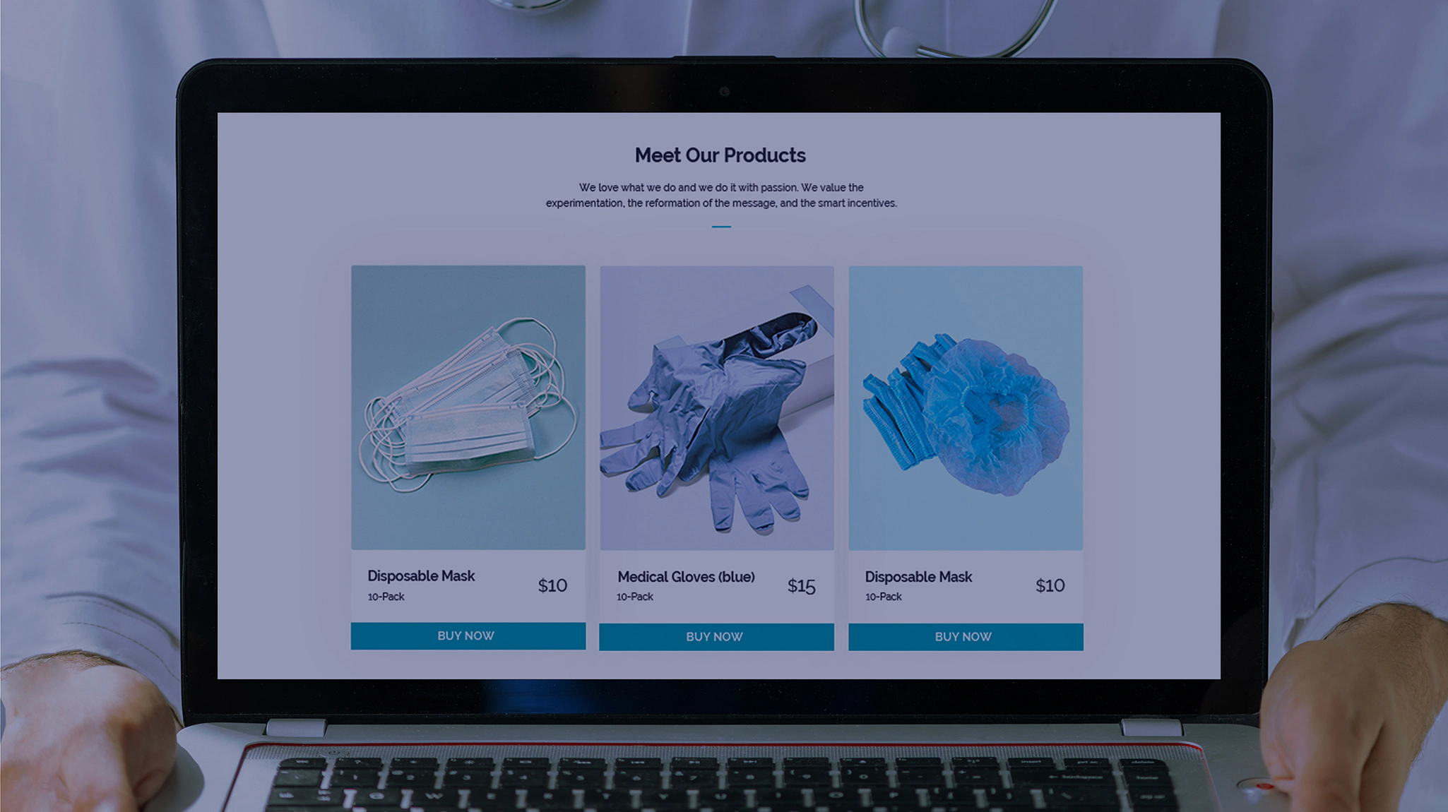
web development
DME Branding

Logo idea 01

colors 03

CMYK 100/93/28/14 RGB 39/45/101
CMYK 73/0/20/0 RGB 14/182/205

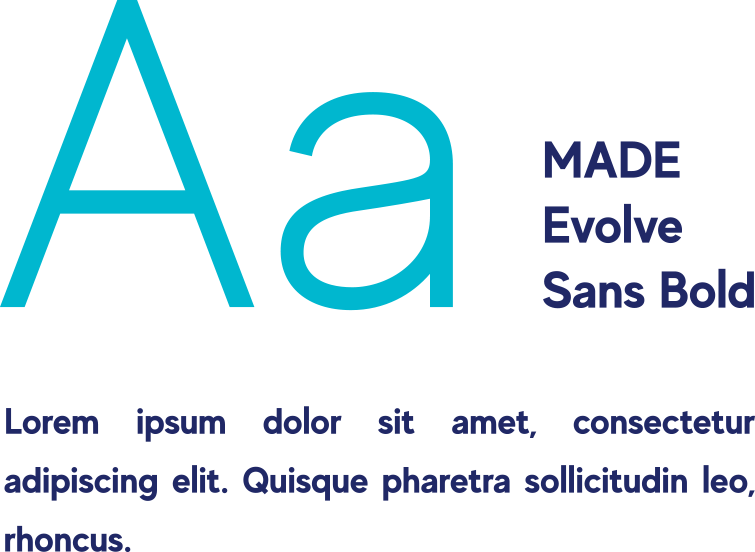
Typography 02

DME Branding DME Branding

brand development 04

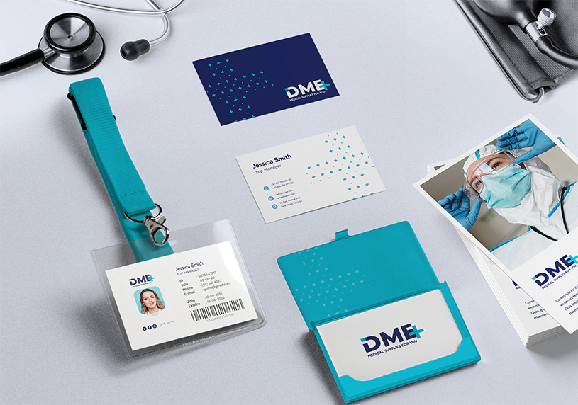
DME’s brand development required careful consideration to ensure the brand was recognizable and separate from the competitors who used DME to describe what they do. Using a distinct color palette and practical typography, Stan Branding crafted a unique brand package that covered all of DME’s activities while distinguishing it in the niche.

brand Mission 05

DME supplies high-quality disposable medical products to healthcare organizations and patients so that everyone is safe during medical treatment. This mission drives DME to source and manufacture the best possible products, such as gloves and medical suits, where even the smallest error can cause long-term health problems.

This mission encompasses a broader goal where DME grows into an internationally recognized organization known for its quality. During this growth, the company aims to maintain its standards and keep more people safe every year, which is a difficult task in a globalized world. DME aims to rise to that challenge quickly.

DME Branding
DME Branding
DME Branding
DME Branding

brand 06

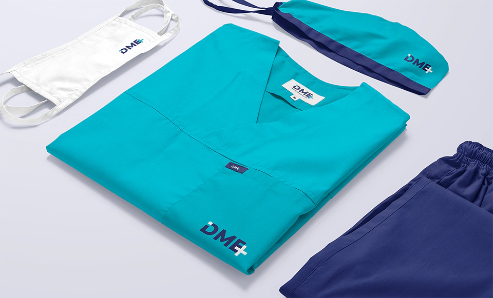
DME’s brand uses blue, like most medical companies and organizations. However, the shades are not as common in the field. This distinction helps the logo stand out without breaking what people expect from a healthcare organization. The logo is also practical and immediately recognizable no matter what size package it’s printed on.

DME Branding

brand Mission 07

DME’s vision includes a world where everyone can access disposable medical supplies when necessary. DME demonstrates an in-depth action plan for achieving this goal as well as handling the manufacturing and waste challenges presented by disposable medical products. This creative planning will help the company use its assets to grow.

DME Branding
DME Branding
DME Branding
DME Branding
DME Branding
info
Stan Branding Design Agency
X

Brand Identity

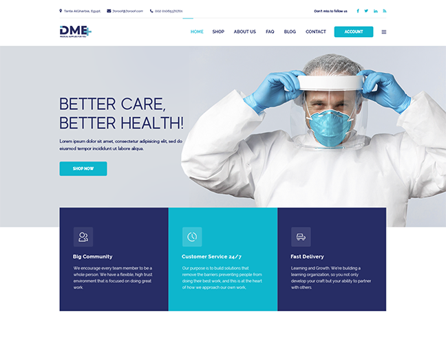
DME aims to project quality, safety, care, and security through its branding. This fact led to the choice of blue many of the brand colors, and the simple logo. DME is immediately recognizable using these elements, especially since the logo features a sans-serif font as the centerpiece. These choices make DME’s brand identity both apparent and accessible.

Brand Voice

DME uses a competent, professional brand voice that reflects genuine warmth and care. This voice helps DME partner with healthcare organizations and work with patients who need its supplies. Additionally, the collected brand voice projects the competence people expect from a medical company, which is often soothing and helps ease business transactions.

Brand Values

Quality – DME devotes itself to sourcing and manufacturing the best disposable medical supplies possible.

Safety – DME procures and produces safe disposable medical supplies that providers trust.

Security – DME builds a stable supply chain that is as secure as possible in a changing world.

Care – DME cares about patients and providers, which drives the company forward.

Brand Targeting

DME targets patients and people in decision-making positions at healthcare organizations. While patients may not buy directly, their familiarity with DME can be comforting. Meanwhile, healthcare decision-makers and supply coordinators make up the bulk of purchases. These individuals tend to be in their 30s and 40s, and they must follow department procedures to purchase.

Brand Position

DME aims to provide high-quality disposable medical supplies everywhere. While pricing is competitive, it tends to be slightly above average to reflect the quality of the supplies. This decision ensures that DME can continue to grow and requires a sophisticated branding package.

Scroll