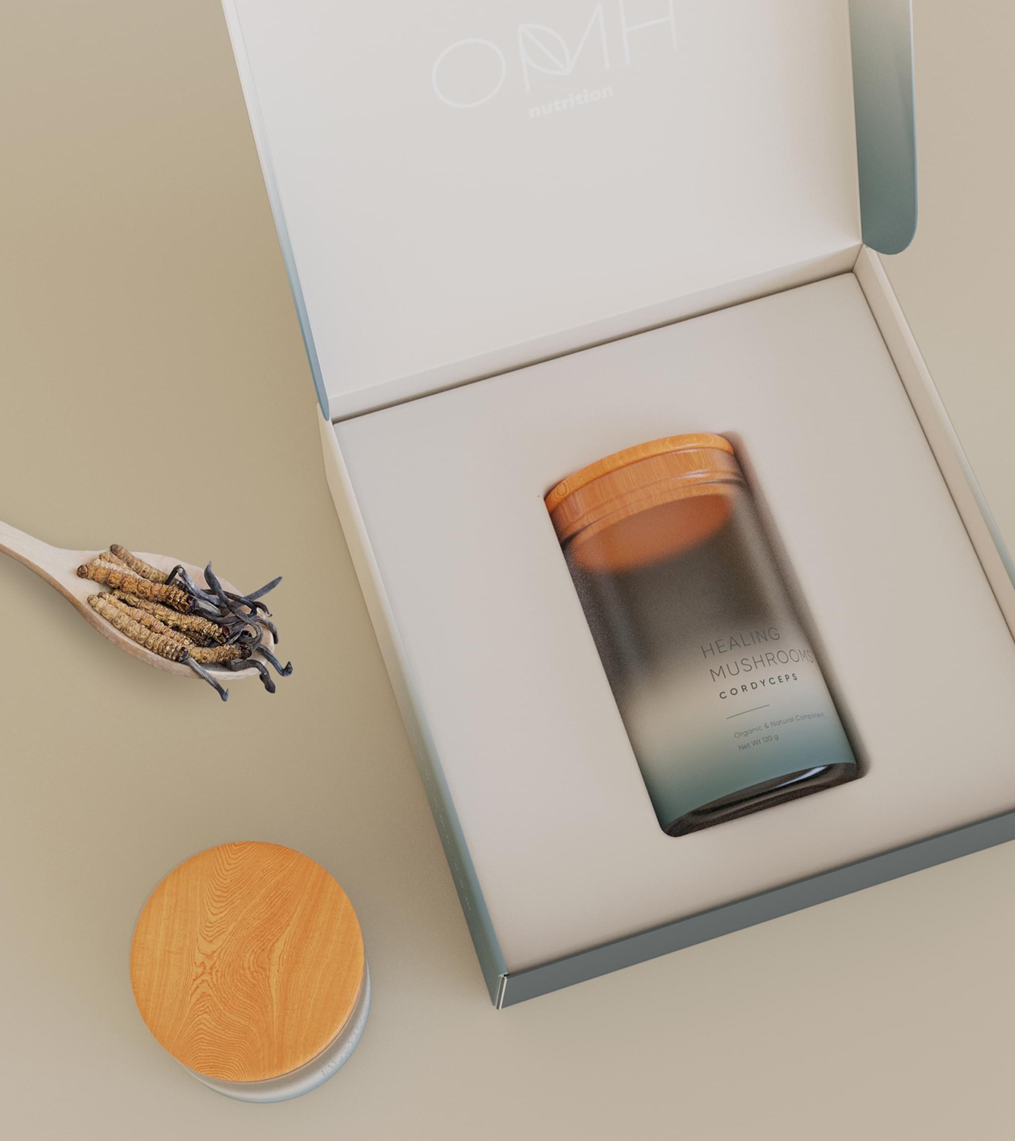
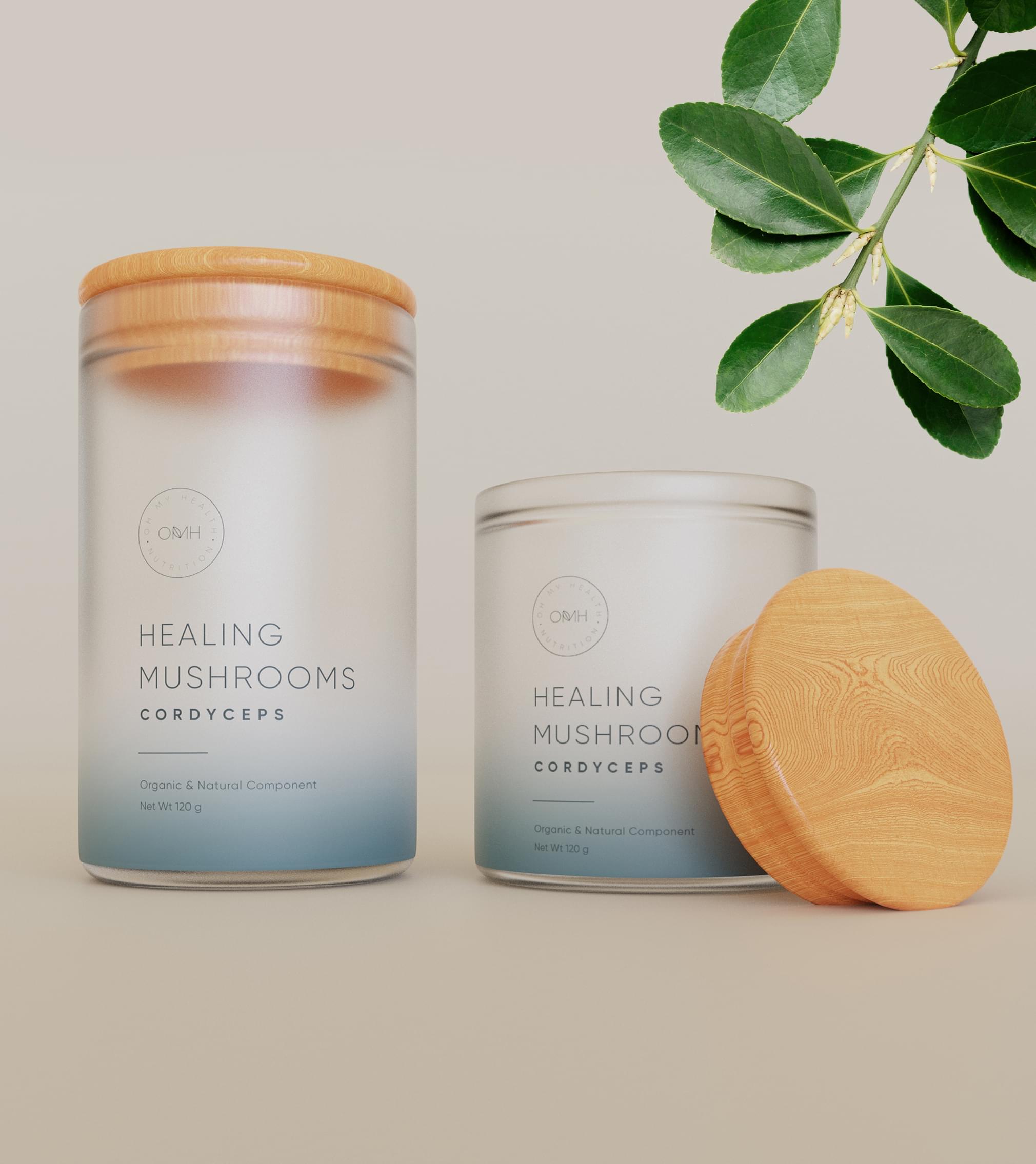
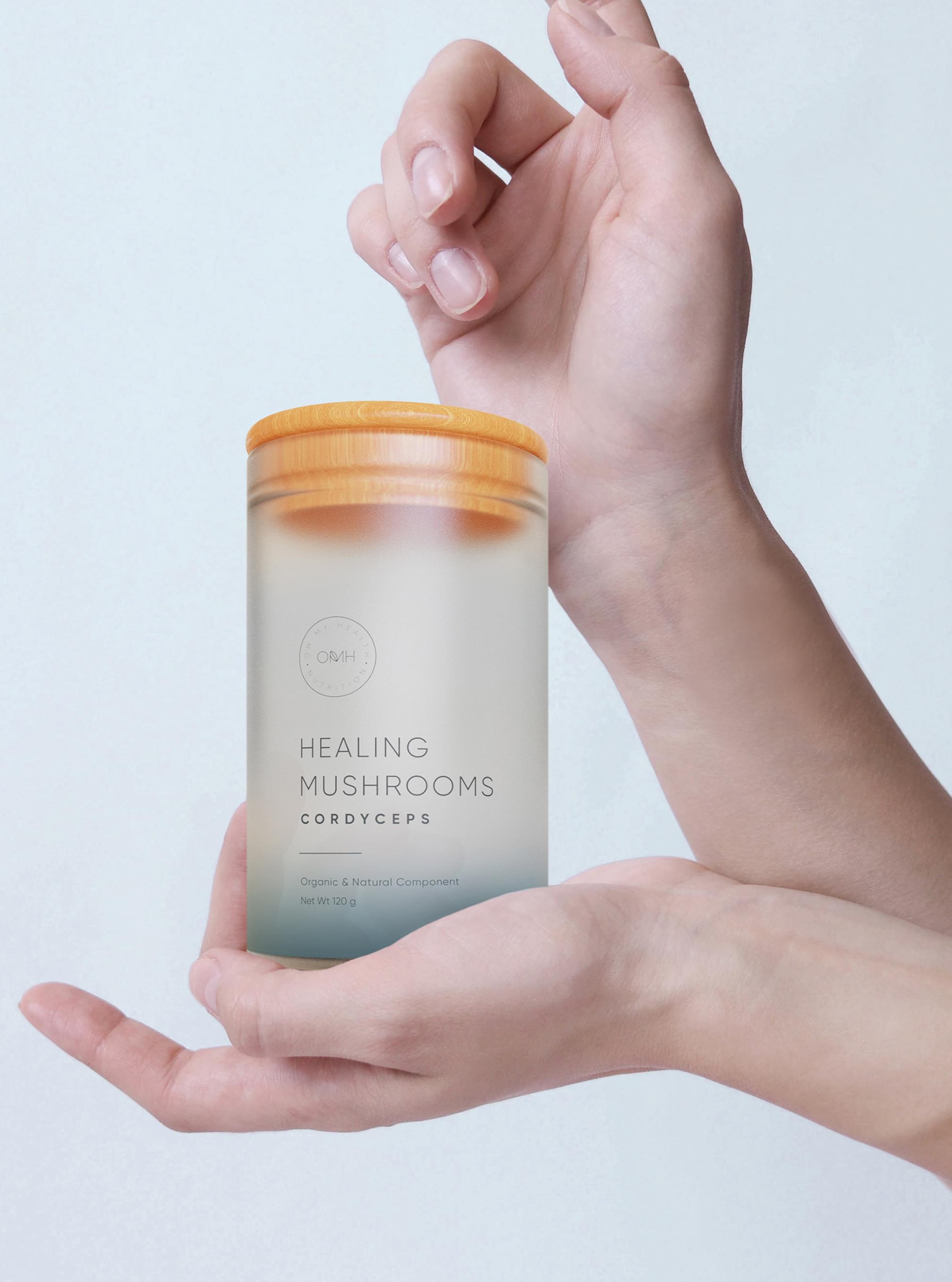
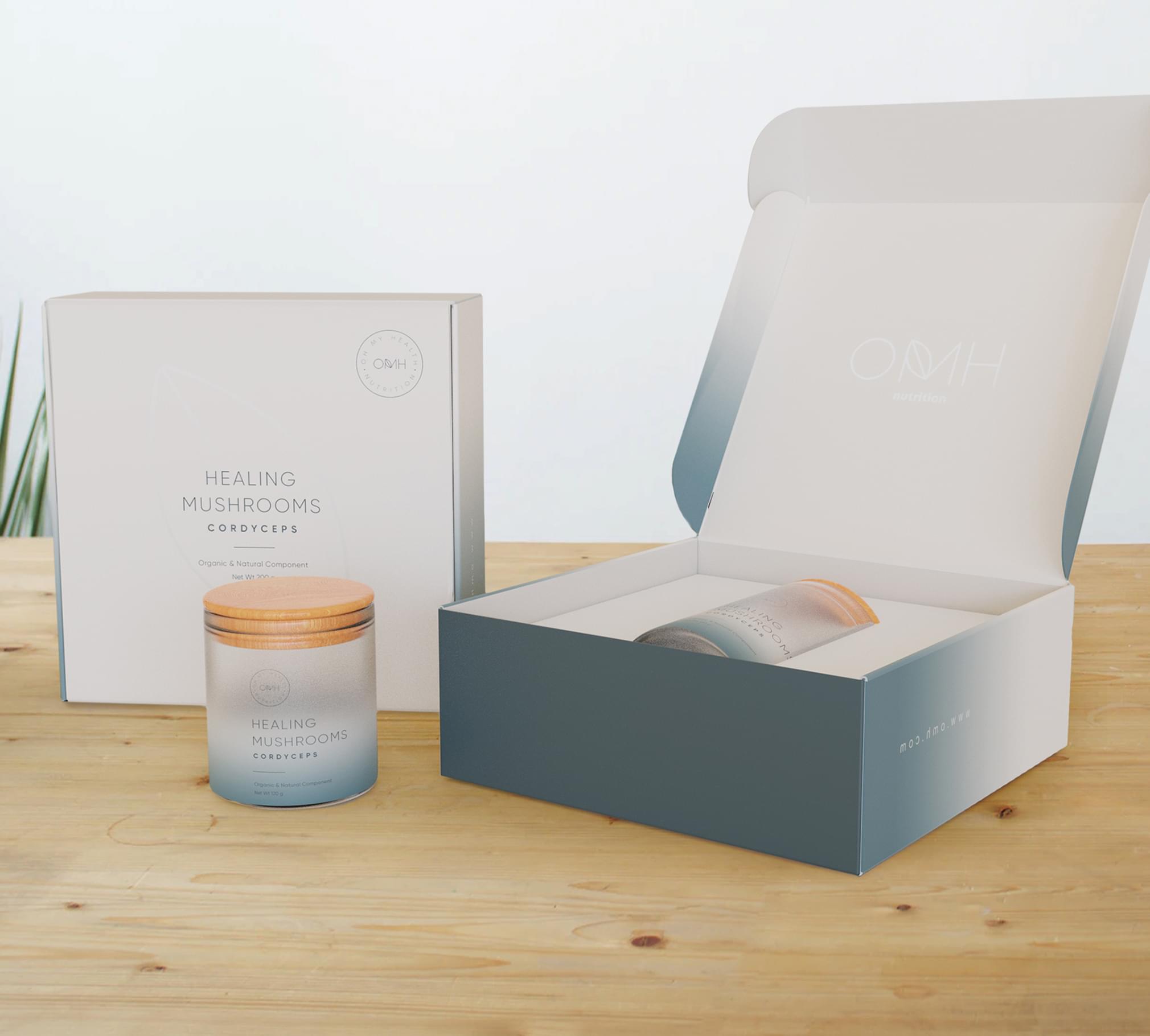
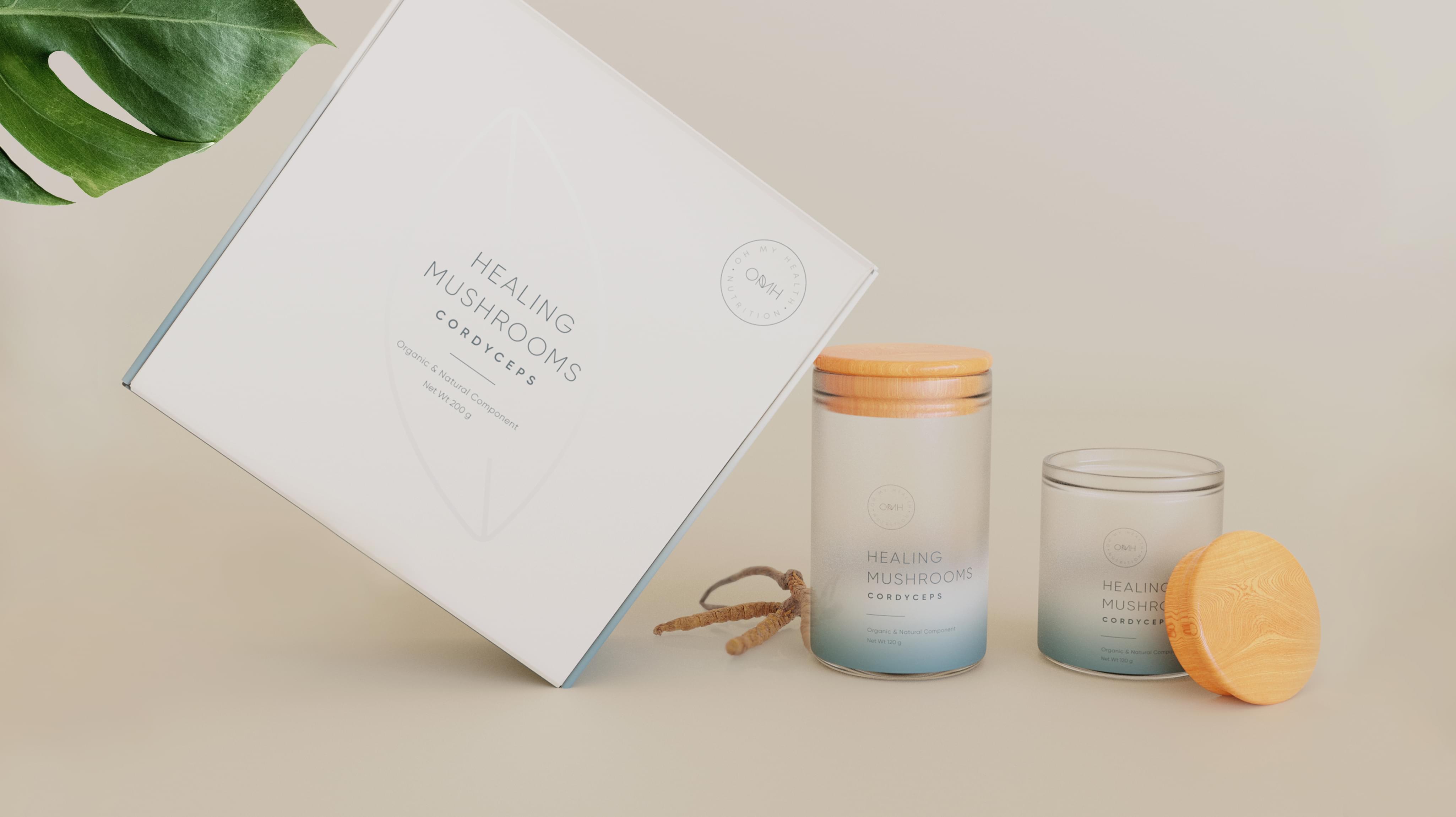
OMH nutrition presented a unique custom order to Stan Agency. The company creates alternative medicine, and this specific product is mushroom capsules. OMH nutrition needed a typography packaging design, so we accepted the assignment.
Challenge Components
- Niche market
- Simple label
- Consumer supplement wariness
Research as a Custom Bakery Packaging Firm
The Stan Agency design team researched the alternative medicine and mushroom capsule markets. We also examined direct competitor typography packaging design. We discovered that many companies use crowded labels and bright colors, especially in the USA.
Bonus Challenge
The additional challenge with this typography packaging design is consumer wariness. Supplements like mushrooms do not have significant amounts of traction. We knew we were convincing stressed out and health-conscious consumers with the typography packaging design and that made the planning more complicated.
Design Inspiration
OMH nutrition knew it wanted a simple typography packaging design. We selected the font family based on existing branding. Then the team worked through distinct layout options and inspired each other, culminating in amazing concepts.
Narrowing Down the Final Options
The Stan Agency team produced several quality typography packaging design concepts. We compared the ideas to the brand. Then we selected the best designs that matched the existing OMH nutrition products.
 100+ Reviews